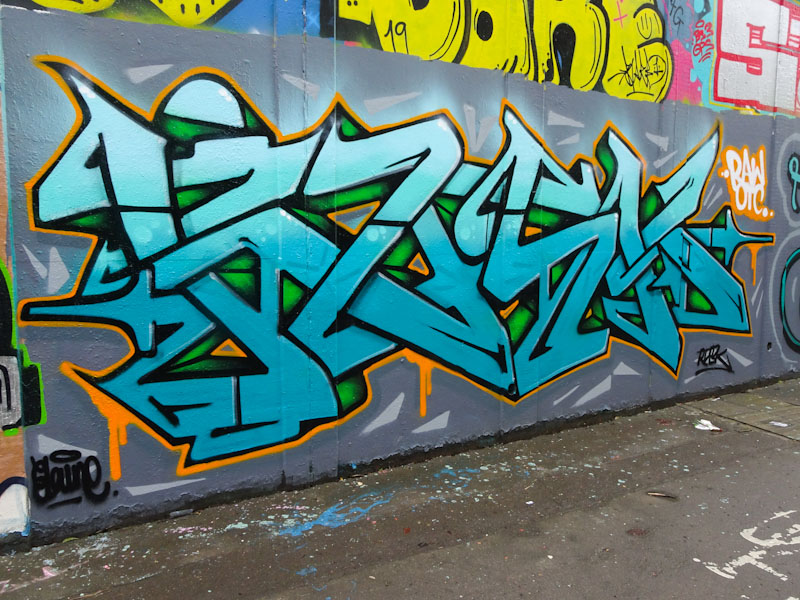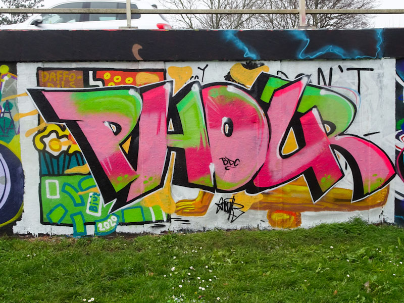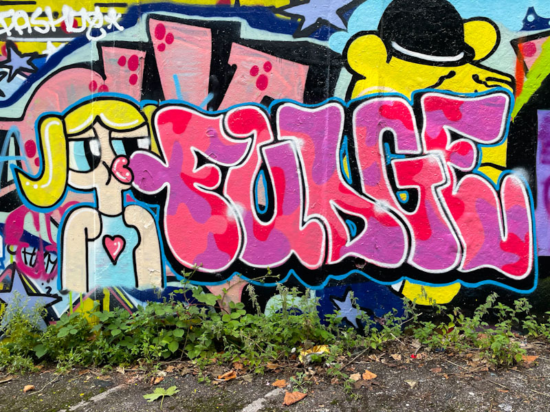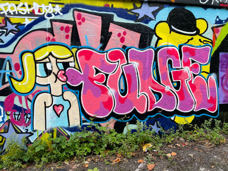
I prepared today’s posts yesterday, because I am (at the time of scheduled publication) on my way to Cornwall for a few days away with a fine friend who I have been fishing with every year for more than 35 years. My posts may become a little erratic over the next few days, but with the earlier dark evenings I should have a little time to write them.
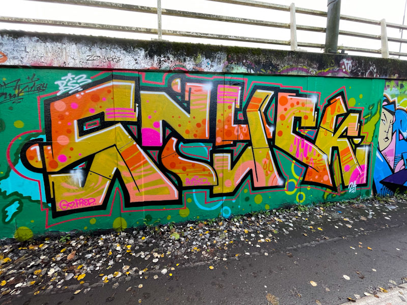
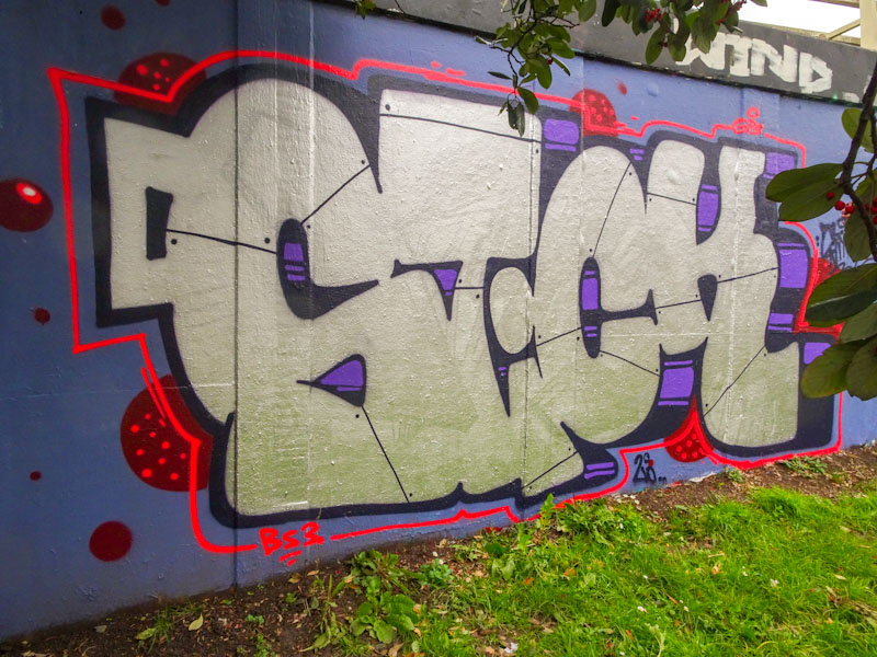
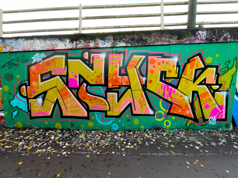
I really don’t get to post enough work by Corupt, so it feels good when I do get round to it. This is a lovely piece spelling STICK, but this time he has taken a homonym approach and replaced the ‘I’ with a ‘Y’. The letters are blocky and rigid and beautifully filled with colourful spots, stripes and drips. The whole thing is bordered with a thick black line and then reinforced with a red outline a couple of inched further out, framing the piece nicely. It is always great to see Corupt’s work, and to chat when I bump into him, which seems to be quite frequently these days.