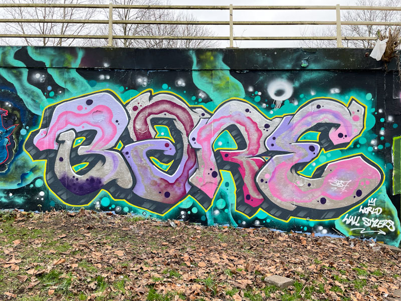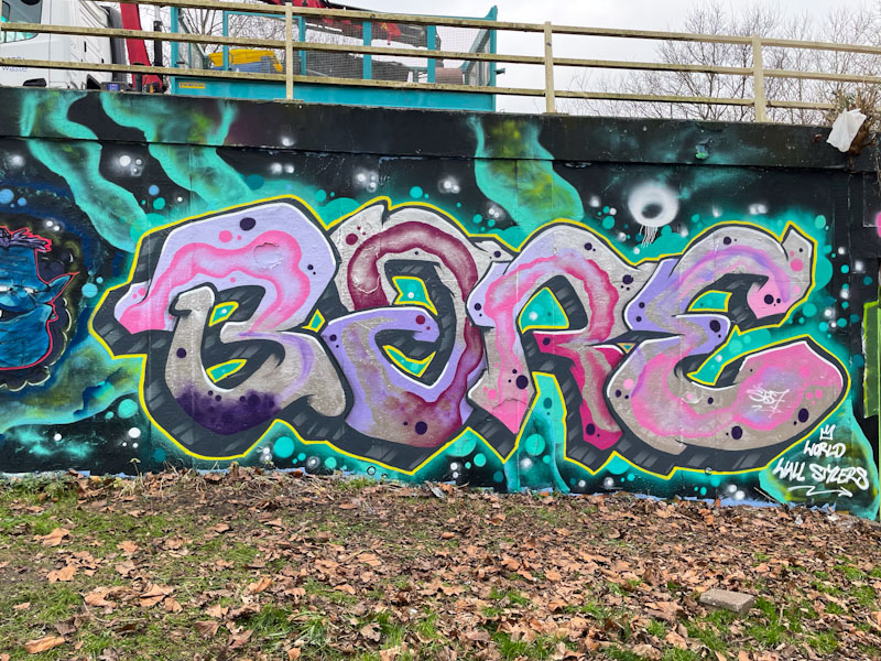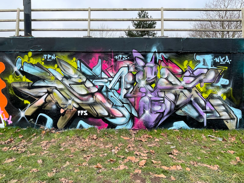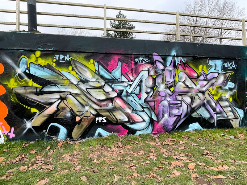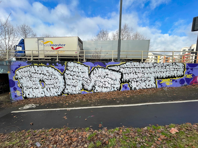
I was lucky enough to be admiring this piece when, by chance, Stivs ambled by. He wasn’t painting, but had come along to look at a few new pieces that had recently been painted. As it turns out, he used to paint with this artist, Nigel, when he lived in the Reading area, or at least I think that is what he said.
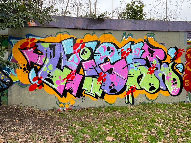
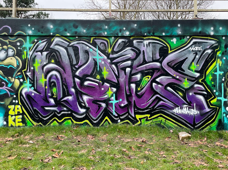
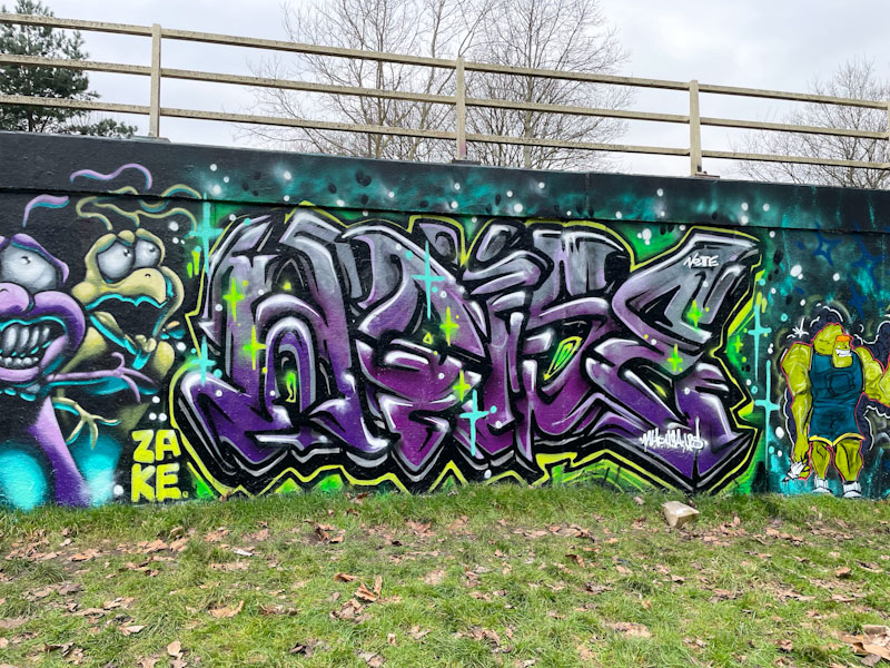
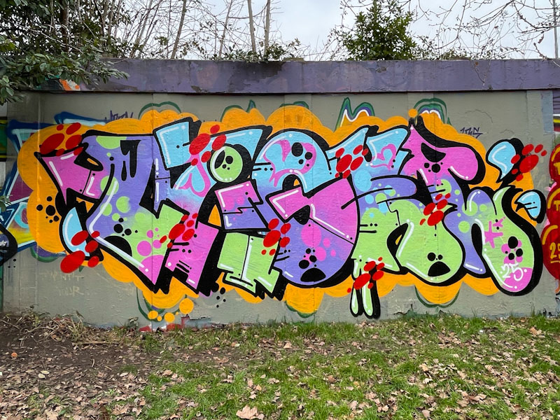
Looking at Nigel’s Instagram, it looks like that he is a bit of a bomber, with a penchant for quick ones, so this piece is perhaps one of his more considered ‘high end’ pieces of graffiti writing. Loads of colour and movement set on a contrasting orange background, bring a little bit of M4 corridor joy to the roundabout.