A few weeks back there was a bit of an informal paint jam at the M32, with artists from Swansea, Cardiff, Tiverton and Taunton all represented. I managed to be there at the right time and photograph the artists at work. The interesting thing for me was that most of these artists/graff writers were completely new to me.
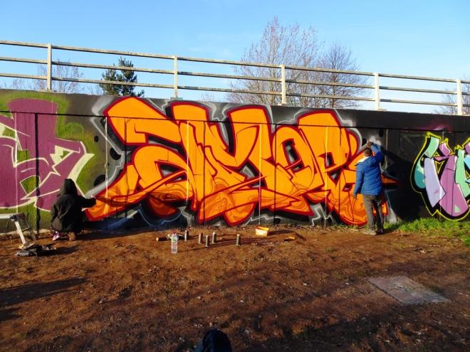
Amoe, M32, Bristol, February 2018
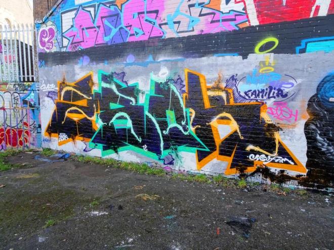
This is a lovely piece by Karm Amoe from Cardiff. He has a website, but it doesn’t say too much and appears to be incomplete, so I really don’t have too much information on the artist.
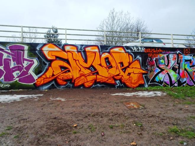
Amoe, M32, Bristol, March 2018
There is something very pleasing about the form of his letters, and the colours he has selected are outstanding. The swirly pattern at the base of the piece and white at the top adds some real class. Nice to be able to see something new (to me).
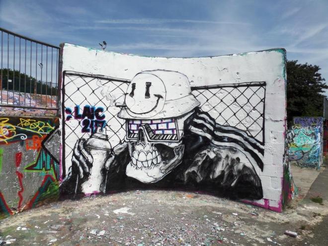
Another Laic217 piece, this time on the long wall at Dean Lane which was sprayed at the same time as the NEVERGIVEUP piece just to the left. Both artists are part of the vibrant community of Polish street artists in Bristol, which also includes Hire and Skor85. It is nice when they work together.
Laic217, Dean Lane, Bristol, March 2018
This is only a small piece, but what a fabulous piece it is. I particularly like the folds in the leather (PVC?) jacket the skeleton is wearing. Laic217 has been improving so much over the last couple of years, but it is his understanding of materials that has really developed…his skeletons parading an extensive wardrobe. I look forward to seeing one wearing a fur coat…a challenge.
Laic217, Dean Lane, Bristol, March 2018
Laic217 has been busy lately, which is always a good thing in my book.
Going back just a little, I found this unusual collaboration between Decay and Dirtystreetart. QI know a lot about the former and have posted a lot of his work here, the latter though is new to me, and I am guessing that he was visiting Bristol.
Decay and Dirtystreetart, The Bearpit, Bristol, November 2017
I think this collaboration works really well, Decay adding some green to his usual red white and black abstract work fusing brilliantly with the photorealistic ant in the middle of the piece by Dirtystreetart.
Decay and Dirtystreetart, The Bearpit, Bristol, November 2017
I was pleased to get this shot of the piece, because it didn’t get to hang around for too long before getting sprayed over. I’m not sure if these two have collaborated before, but I think this works well, and I would certainly like to see more from the pair.
Decay and Dirtystreetart, The Bearpit, Bristol, November 2017
Having just checked out Dirtystreetart on the Interweb, it turns out he comes from Cheltenham, as does Decay, before he made his home in Bristol, which would go some way to explaining this collaboration.
Getting back into the groove with some more contemporary work. This is a recent piece by Laic217 on the curved wall in Dean Lane skate park. He did a similar black and white piece here in July last year, just before Upfest.
Laic217, Dean Lane, Bristol, March 2018
This time his skeleton character, rather than holding a spray can is shouldering a ghetto blaster (which I recently called a boogie box in a previous post) – booming out the lyrics ‘ice ice baby’ by Vanilla Ice. Seeing this, I just had to go onto YouTube to remind myself of the video, which features a lot of graffiti in it. The video is terribly dated (already) and the song itself so incredibly reliant on a great riff from Queen underpinning the whole thing. It is a catchy tune though.
Laic217, Dean Lane, Bristol, March 2018
I don’t think I will ever tire of Laic217’s work – it somehow feels representative of the whole Bristol scene – an overseas artist who has settled here and is really becoming part of Bristol’s new wave which is vibrant and exciting, but sits comfortably alongside the longer established street/graffiti artists. There is room for everyone here.
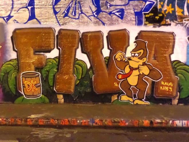
Photograps taken in St Werburghs tunnel are a real challenge. The colours are yellowed out if you don’t use a flash, and when you do use a flash (a non-sophisticated one like I use) you get horrible reflections obscuring the art. This piece by Fiver (Fiva) looks a bit dreary, but it was far from that in the flesh.
Fiva, St Werburghs tunnel, Bristol, June 2016
Fiver is an artist I have featured a couple of times this winter, having not seen much from him for quite a long while. This is an old one, full of charm. I believe the character is Donkey Kong of Nintendo fame. A fun piece.
Back to the more recent stuff now. I am not used to seeing writing from NEVERGIVEUP, who is better known for his bunnies and monsters, so this one in Dean Lane comes as a bit of a surprise.
NEVERGIVEUP, Dean Lane, Bristol, March 2018
I can’t really make out what the letters say, probably because I haven’t seen much of his writing before and the style is typically unique. He does like to do things his way and is fast establishing himself into the Bristol street art scene.
I write my posts in batches, getting a few done in advance, when I have a moment to do them. This can be tricky while juggling a full-time job, two teenage children, a cat, a dog, a chameleon, an extremely hard-working wife, housework, an allotment, decorating and so on. Life is full, and it would be impossible to find the time to write two posts a day every day. Doing them in batches also carries economies of scale, where I can process a batch of photographs in one go and writing tends to come more freely once you are on a roll.
Why am I mentioning this? Well, by the time I publish this post on a fabulous piece by Kleiner Shames, I will be on a special short break trip in Barcelona with my daughter, and I wanted to say ‘hello from Barcelona’, but to say this I have had to think ahead and I am saying ‘hello from Barcelona’ from the comfort of my study which all feels a bit artificial really, but is helping me to get very excited about our trip.
Kleiner Shames, Upper York Street, Bristol, May 2016
This is a fine piece of writing from one of my favourite Bristol artists who now lives in London. I have posted many of his works on this blog, and each of them is a winner. Concealed in this splash of colour is the word ‘FOIS’…time in French. Most of his pieces have this word, and at first I thought his street art name was Fois.
Kleiner Shames, Upper York Street, Bristol, May 2016
This is another one that I have dug out of my archive, because it is simply just too good not to share.
Oh and ‘Hi from Barcelona’ I think I’m having a wonderful time.