I took this picture on election day a couple of years back. The result of this photograph was great, the election result rather less so. I remember it was a gorgeous day, and I had been tipped-off about a whole load of great street art in Devon Road, Easton. I was not disappointed. Then at the top of the road was this beautiful wall piece by Deamze. A really classy piece it is too.
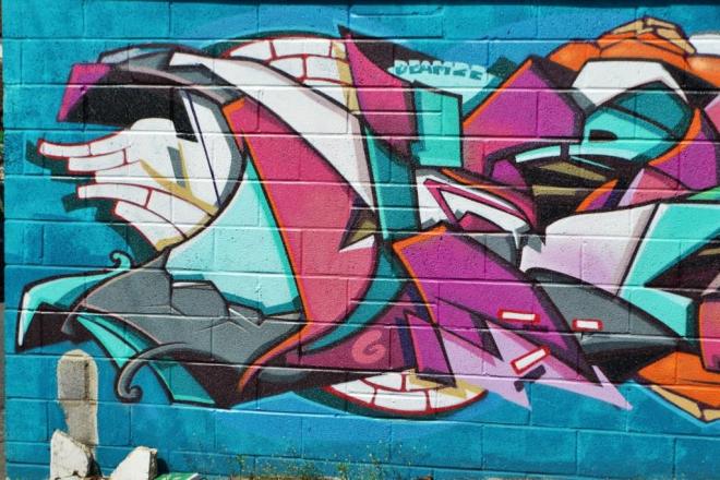
I haven’t been back there for a while now, and don’t know if this is still there. I guess I ought to get myself over to Easton soon to take a look. Deamze at his creative best.