.
Nine jays in three trees
early morning station treat
off to a good start
.
by Scooj
.
Nine jays in three trees
early morning station treat
off to a good start
.
by Scooj
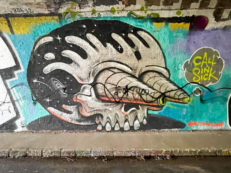
Not so long ago, this huge chrome piece by 3Dom appeared alongside one by Stivs in the tunnel. It didn’t take long for someone to run a black line through them, but it didn’t do too much damage to the overall look of the piece.
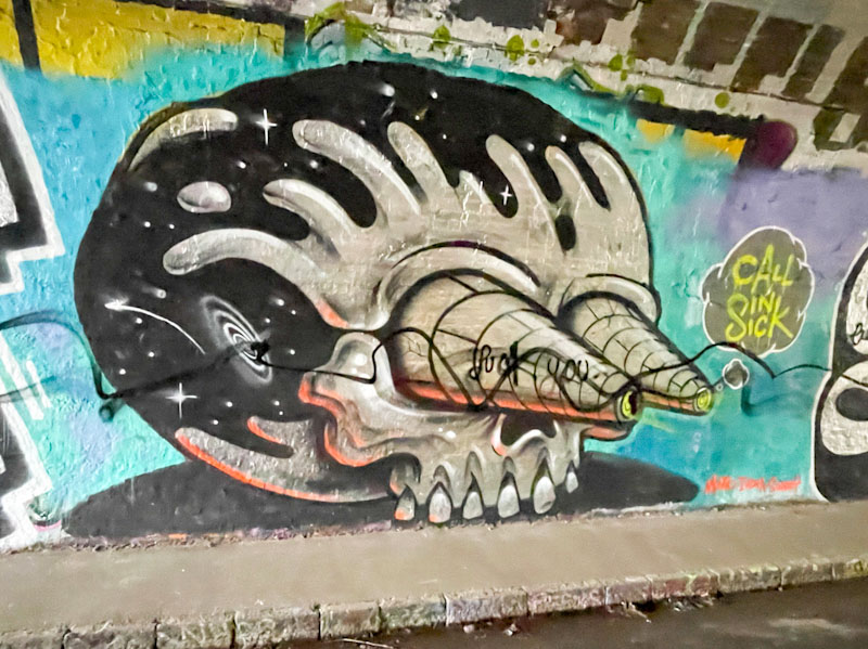
I am going to break from tradition and say that I don’t really like this piece, there is a first for everything I suppose. For me it is just too big, and reduces any impact of the fine details and nuances that 3Dom has made his own. The skull, with a galactic space for a cranium, has cone walls for eyes. Obviously, there is some symbolism here, but I am not too clear what the story is. 3Dom’s catchphrase ‘call in sick’ makes an appearance alongside the piece. Not his best in my opinion.
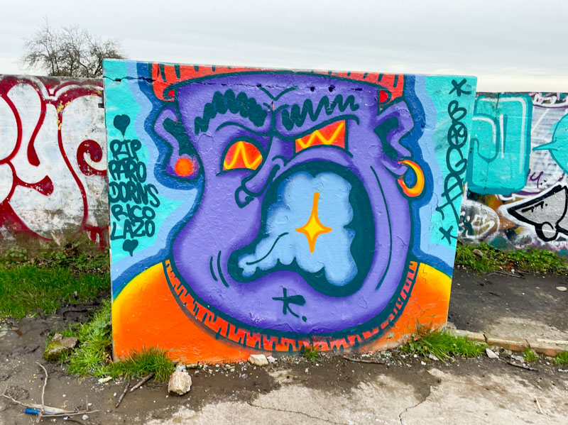
It has been difficult to walk the dog so far this year, all the parks I usually go to are waterlogged mud-baths, and cleaning him afterwards is a bit of a palaver. Purdown is perhaps the best bet, because it is at the top of a hill and the water drains off it reasonably well, so I went up there a couple of weekends ago, and was met with several new pieces, which I was not really expecting.
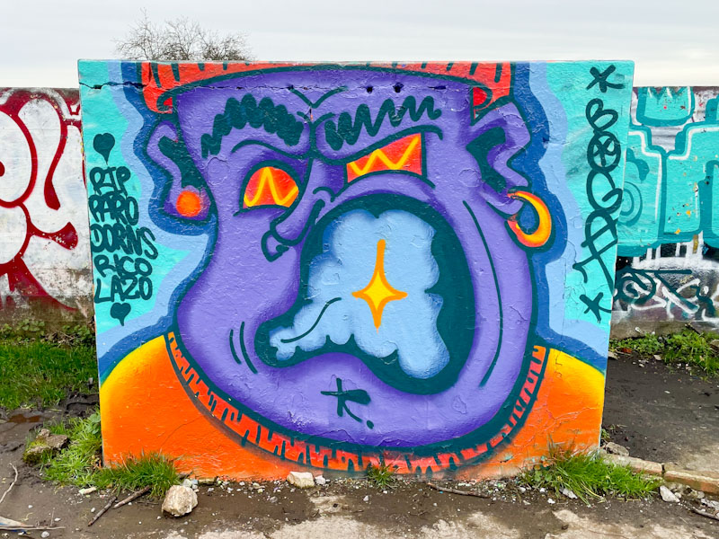
This is a shouty piece by Bogat, who is known for his characters with woolly hats and large mouths. I don’t see his work all that often, but pretty much always post it when I do, because it has a simplicity and authenticity that I really like. Some bold colours and a good fit for the square concrete slab, and a few RIP shout-outs.
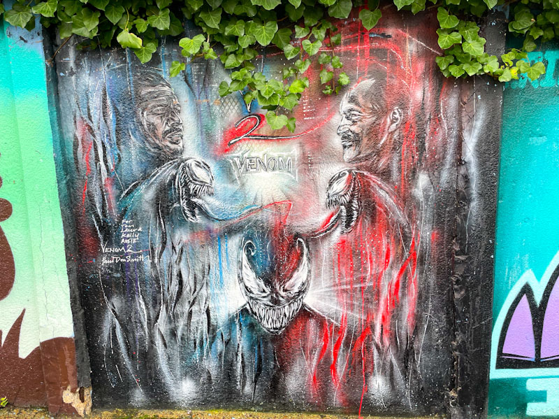
Another piece from Paul Don Smith on the wall opposite Surbiton Station car park. This is a piece that looks like it might have been there for quite a while, judging from the ivy drooping down from the top of the piece, like a theatrical green curtain.
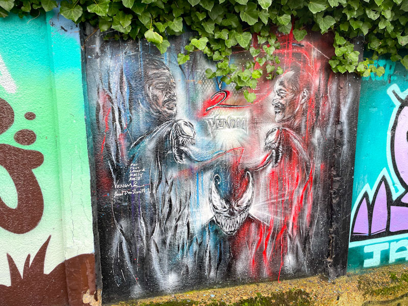
The piece is a collage of images and ideas from the Hollywood movie Venom, which I have never actually watched from start to finish, but have picked up a few scenes while channel-hopping. Paul Don Smith’s style is curious, with a blend of patterns and sketches, spray paint and pens for the finer detail. Definitely a different take on street art, taking a more ‘studio’ approach.
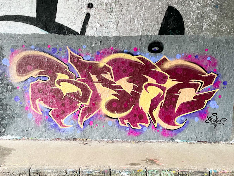
Sait Bare is an artist I haven’t yet met, so I can offer little insight into him or his motivations, but his unusual work is constantly developing and improving. Recently he has switched things up a little and changed from writing the letters SAIT to writing the letters BARE, as in this case.
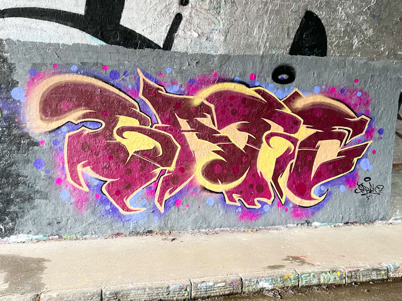
The colours he ha selected for this piece have a wonderfully rich quality, with the two tones of deep red and the reversed out spots contrasting really well with the sandy yellow. . The letters are set in a grey buffed wall with some nice pink and blue (that winning combo) spots. This is a lovely looking piece from Sait Bare.
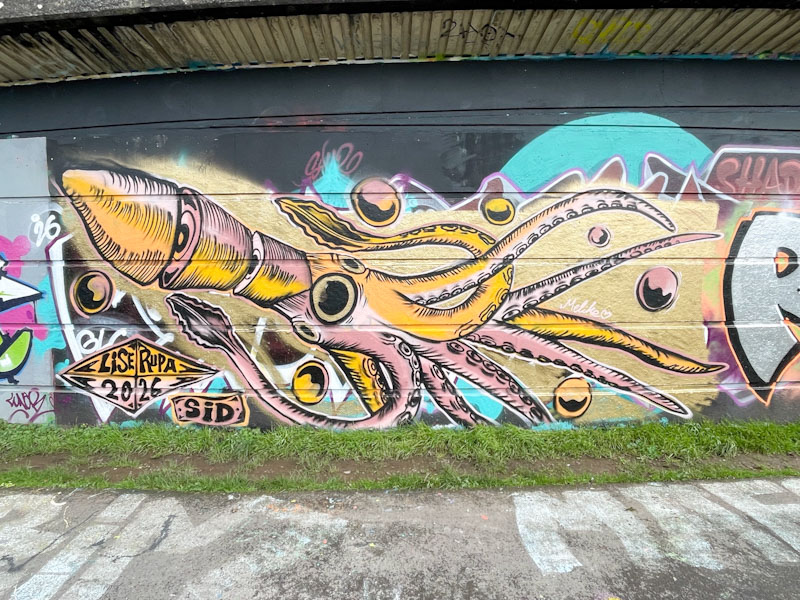
Finding work by artists that are new to me is one of the great pleasures of this hobby. I rarely tire of the great work of Bristol artists, and we are truly blessed in the city to have such a wide spectrum of talent and styles. Visiting and new artists are, however, a refreshing addition to the scene, and this piece by Lise Rupa is something special.
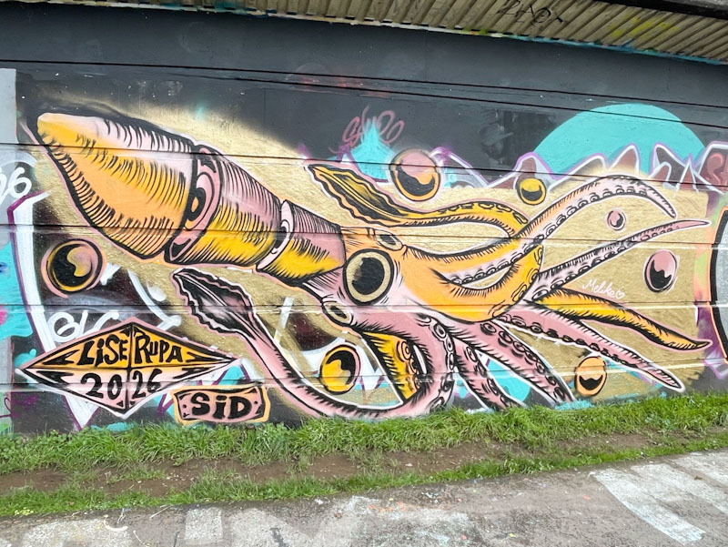
I have an affinity with squid, having worked on a Japanese squid fishing boat for a year, (but that is another story). This unusual piece has a sketch-like quality to it, or almost looke like a wood-cut piece, with its two-tone colours and black hatching. The squid is anatomically correct, which pleases me greatly. What a wonderful way to make your presence known.
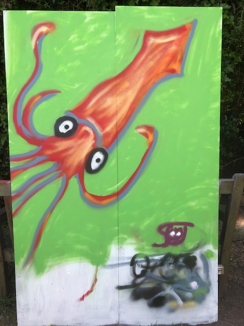
Below is my second ever attempt to paint with spray cans, it happens to be a squid, which is why I include it here:
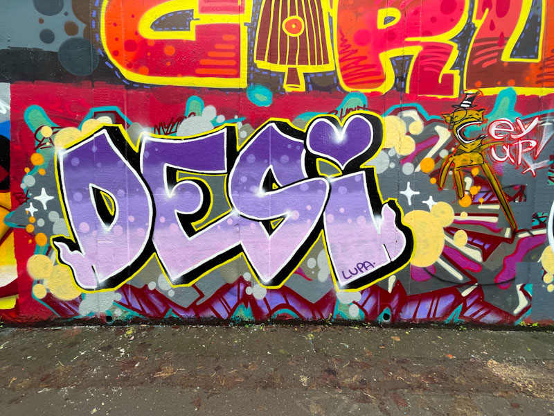
Here we have a lovely Desi piece which reverts back to her DESI letters, rather than her VEIL letters that she has been favouring in recent months. If you look closely, you will notice that she has been joined with an impish addition by Posh.
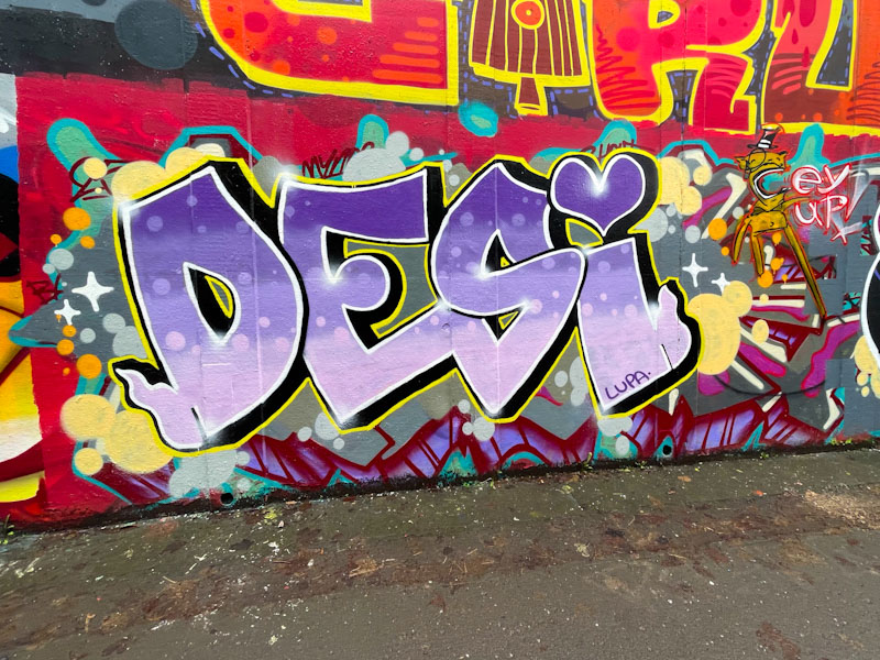
Desi’s letters are filled with four shades of purple containing reversed out spots through the colour courses. The letters are finished well with a black drop shadow and fine yellow border.
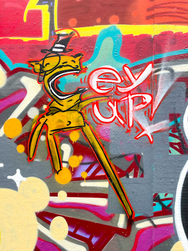
The addition of a Posh character exclaiming the words ‘eh up’, perhaps betraying a Derbyshire or Yorkshire origin, is a bonus bit of fun. Different artists, different styles, most likely painted at different times.
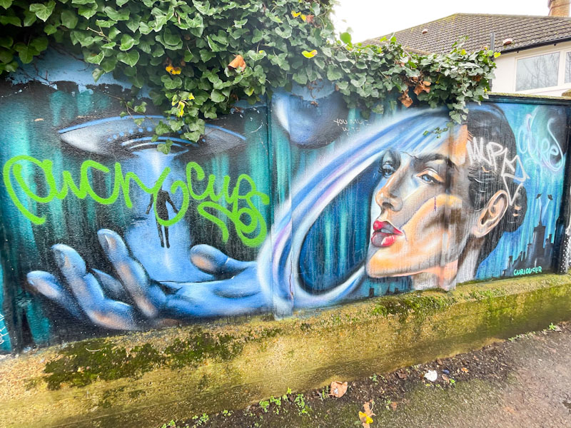
Although I came across this wall at Surbiton Station only a couple of weeks ago, I think that some of the pieces there have survived a long while, and in Curiouser’s Instagram, she posted this piece way back in December 2021. Although the piece has suffered a little from the weather and some light tagging, her talent and story shine through.
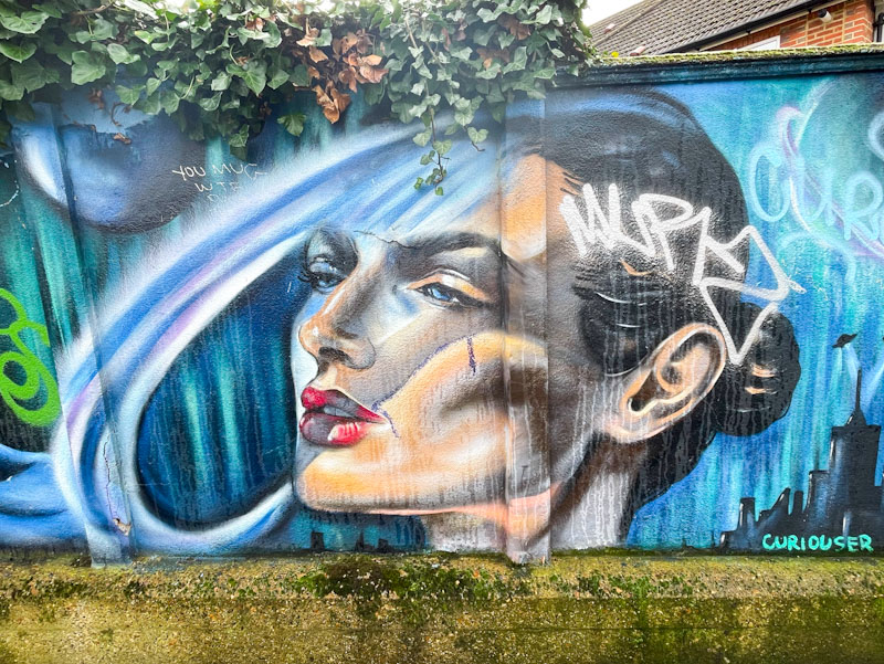
The portrait is stunning, with a great understanding of light, shade and depth. The picture depicts a story of aliens and spaceships. I don’t think I have seen any work by the artist before, but she would be perfect candidate for Upfest I would have thought. I’ll be looking out for her work next time I visit and spots in London.
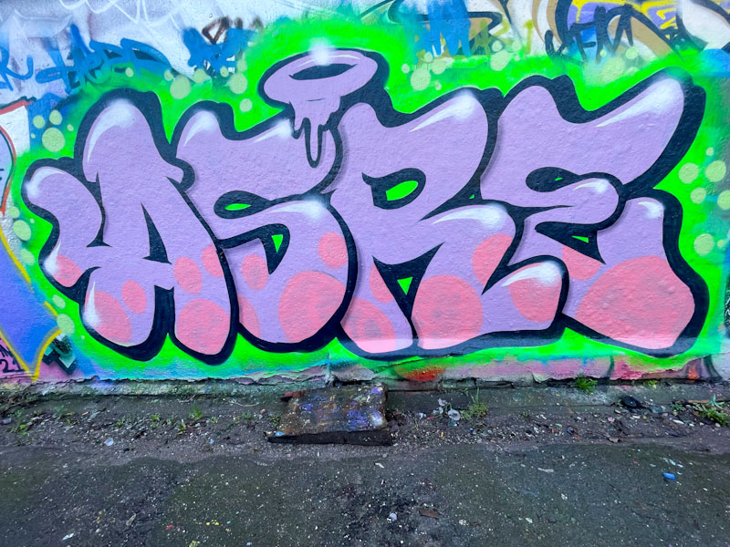
Two artists that have had a great and productive year are Asre and Zinso, and I guess that their friendship/collaboration has in part helped each to keep at it. This is a nice, gentle piece by Asre in one of his favoured spots in Dean Lane.
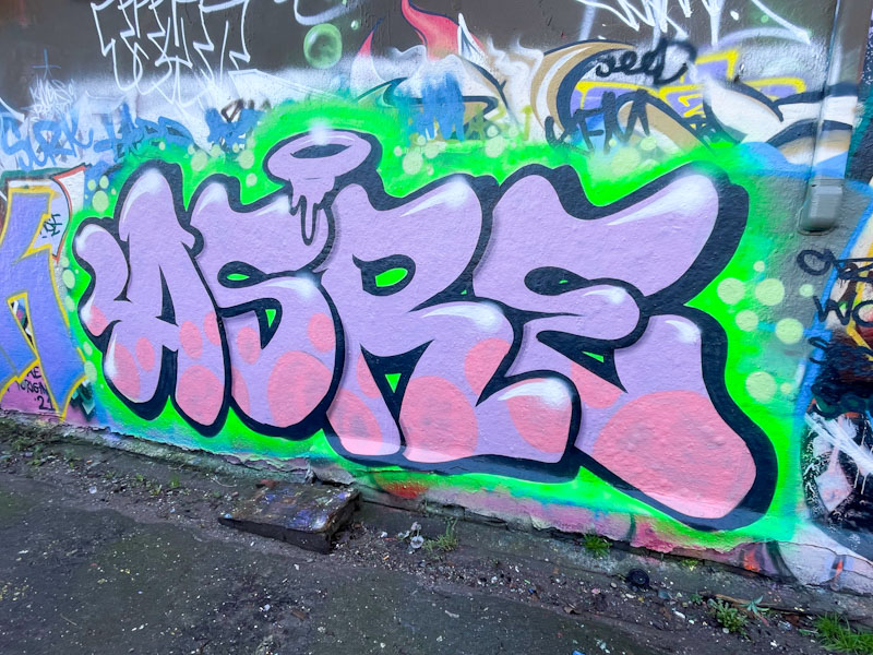
The large letters are forgiving in form and filled with a subtle combination of lilac and soft pink ‘bubbles’. Two further things come to the aid of the letters, the black drop shadow and the vibrant green providing contrast. An uplifting piece from Asre.
.
Beaver releases
licensed reintroductions
hearty welcome back
.
by Scooj


