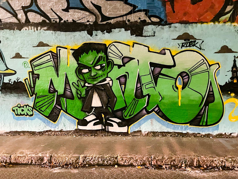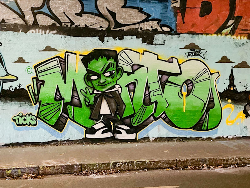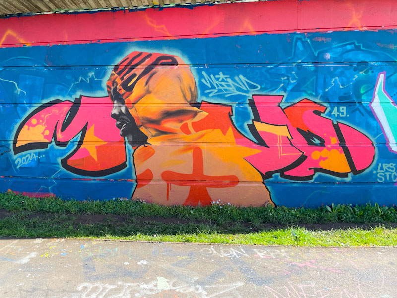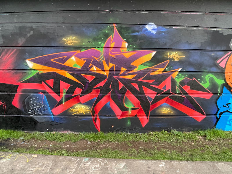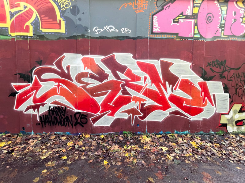
Serm is a Bristol graffiti writer whose work I don’t get to see all that often, and I think he is probably on the lower end of the productivity scale. His quality, however, shines through, and it is always great to see his pieces when they do appear.
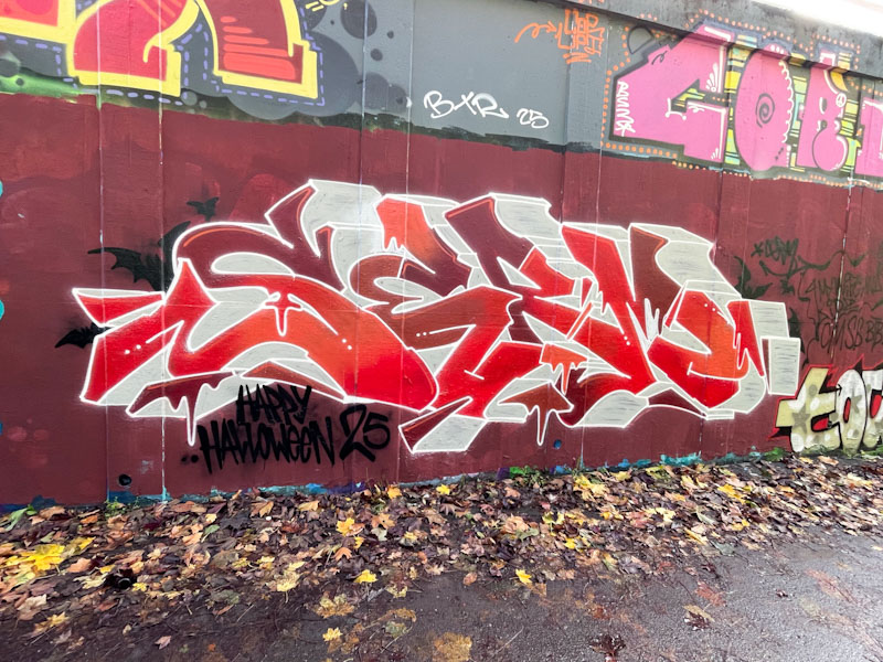
This is a fine red and white piece (colours close to my heart) spelling out SERM, which has a few small hints at Halloween, the biggest of which is the ‘happy Halloween’ message bottom left, and a scattering of bats and bloody drips. His 3D drop shadow is customarily deep, and it looks like he was running low on grey-white paint, an occupational hazard for graffiti/street artists. Another fine piece to add to his gallery.