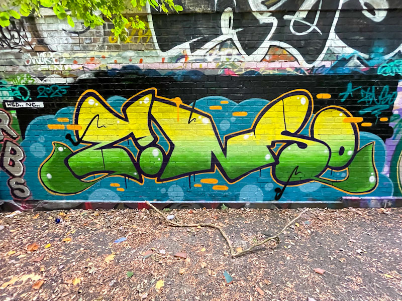
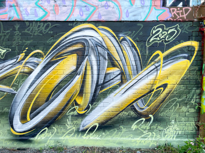
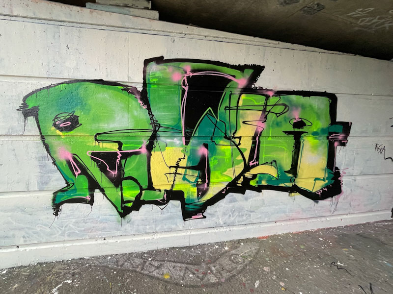
Zinso’s return to painting walls in Bristol has been nothing short of heroic. His writing is always technically beautifully worked, with tight lines and well considered fills. He manages to present clean and crisp graffiti writing every time he ventures out.
Zinso, Dean Lane, Bristol, October 2025
In this piece his letters ZINSO are painted with horizontal layers of colour fills, nicely blended, running from dark green to yellow. The thought that has gone into the background is as thorough as the letters themselves, and as a whole the presentation is excellent. Zinso is both productive and tidy.
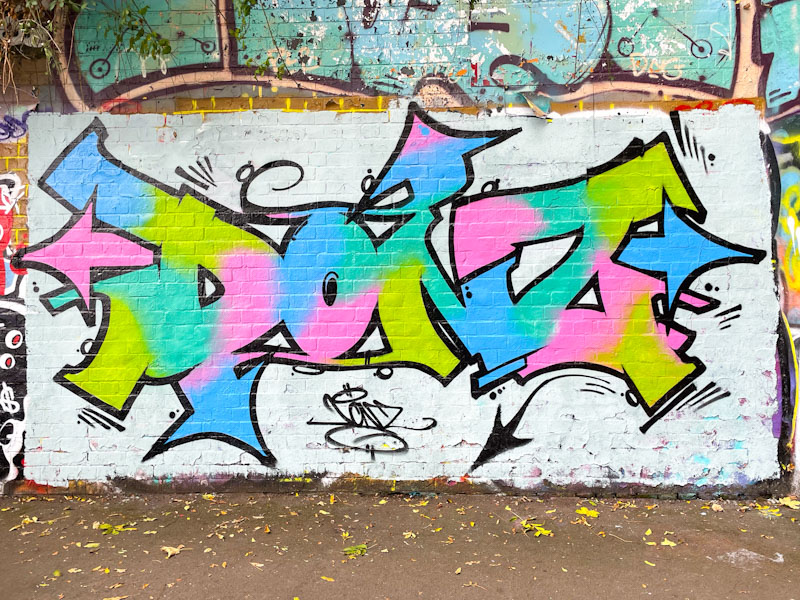
It is always a rather pleasant surprise to find a Donz piece in town because he tends to enjoy painting in his ‘manor’ of L Dub (Lawrence Weston), to the north of the city. Something you can predict quite safely is that anything by Donz is going to be colourful and bright.
Donz, St Werburghs, Bristol, October 2025
First up, the white wall works really well with his colourful design, which could get lost without it. His letters DONZ are beautifully framed within a consistent solid black border and some fine black highlights and details. The pastel colours are nicely distributed as fills throughout. All in all, a great piece from Donz.
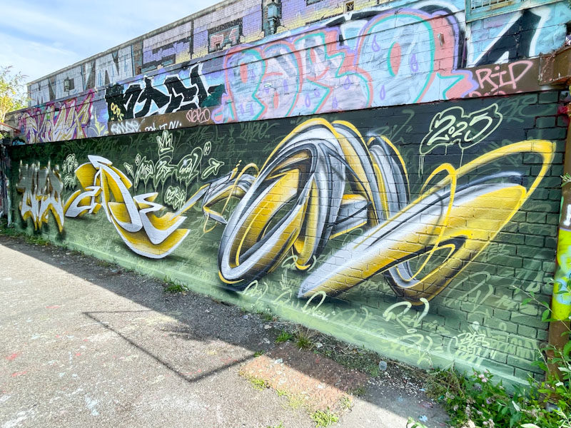
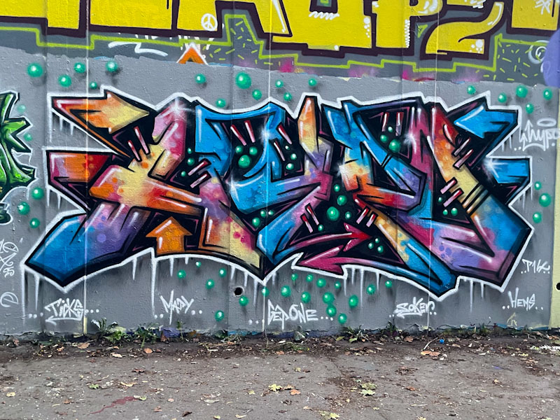
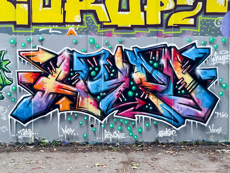
Miso, Zase and Real143, Dean Lane, Bristol, September 2025
For a short period in September, we were privileged to see a few pieces from Zase, a well known Bristol street artist, painting alongside what I assume were friends who were visiting. It would seem that it took the enthusiasm of these friends to encourage Zase to his some walls – good news indeed. This is a collaborative wall on the side of the swimming pool at Dean Lane by Miso, Zase and Real 143.
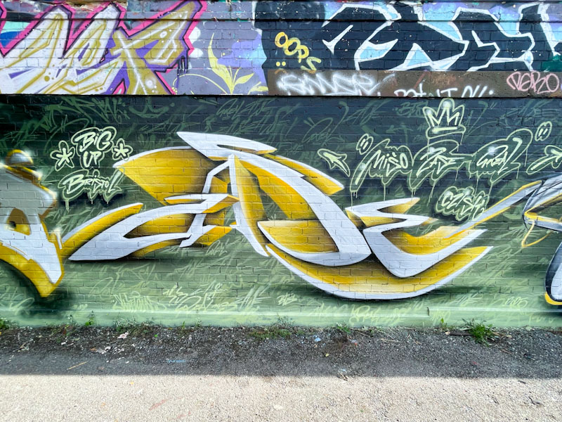
Miso, Dean Lane, Bristol, September 2025
First up, and setting the tone with an unusual colour scheme, is this rather nice blocky piece by Miso. The piece cleverly plays with light and shade, giving the impression that the upper half is in shadow, which it isn’t. The effect is accentuated by darker shades on the upper half, and bright highlights glowing like lights. Playful stuff.
Zase, Dean Lane, Bristol, September 2025
In the middle Zase has written out his name in his anamorphic style, playing tricks with the eyes, creating an extraordinary three-dimensional effect. Again, the use of light and shade helps to create this illusion.
Real143, Dean Lane, Bristol, September 2025
To the right, and continuing the colour scheme, is another anamorphic piece, this time by Real143, and adopting a quite different overall style. This piece is much softer, with flowing rounded lines that together build an object with depth running deep into the wall. All three pieces play tricks with our eyes and this is a very special collaboration indeed.
There is not a lot more I can say about Hypo that I haven’t said in numerous previous posts. He has upped his game considerably over the last two years or so, both in terms of quality and quantity of pieces. During that time he has jumped up a couple of levels, which you can see if you take a glance at this revised gallery of his work.
Hypo, M32 roundabout, Bristol, September 2025
In this piece, Hypo uses loads of colours, indicating that it could be a ‘dregs’ piece (one which uses up what is left in spray cans) although, Hypo typically does like to use a wide range of colours. Some of his recent pieces have incorporated small spheres for decoration, and they do a great job of adding something a little extra in this work. More magnificent graffiti writing from Hypo.
Every once in a while I find a piece of graffiti or street art and I say to myself, ‘I really like that’. This is one of those pieces. It is by a graffiti writer I haven’t come across before, Rusta, and I am guessing that they were visiting Bristol and took the opportunity to have a little paint.
Rusta, Cumberland Basin, Bristol, October 2025
I love the big fat letters and rather sketchy style of the piece, and I also like the way it has been painted on a clean white buffed background to help it make its mark. The colour selection is great and the way the colours blend and jump about is rather cool. The little pink shock lines through the piece give it that little something extra. A very nice piece indeed.
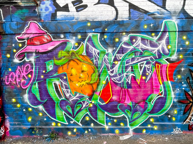
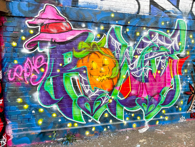
It is not often that I post Halloween pieces in time for the festival, but fortunately this one by Rowzgraff was painted a little while ago and has made it through my pipeline process just in time. I am not familiar with the artist, who I believe was painting alongside Lis and Ozuk.s in a mini paint jam on the swimming pool wall in Dean Lane.
Rowzgraff, Dean Lane, Bristol, October 2025
The Halloween piece is nicely worked with the letters ROWZ incorporating a happy pumpkin and a wizard’s hat. The whole piece is set on a starry night sky – just the thing to get you into the mood for tomorrow night. There will be more Halloween pieces to share, but they won’t feature here for a little while, such is the backlog.
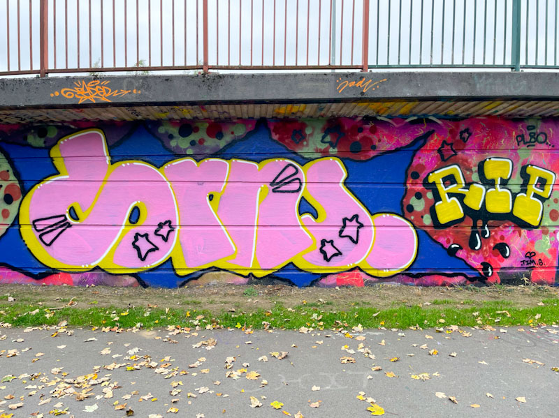
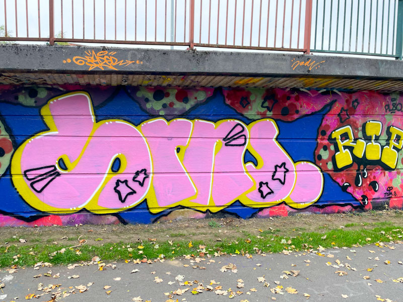
I have included this piece, not because it is amazing, but because it is by PL8o whose work I like and because it is representative of a great many tribute pieces in Bristol to Dorns who recently passed away.
Pl8o, Cumberland Basin, Bristol, October 2025
There is something easy and accessible about PL8o’s letter style, and the colours in this piece certainly stand out. It is a nice tribute. Interestingly, this piece was over-painted by an artist who is not local and who probably didn’t know about Dorns or the tributes to him. That piece has since been tagged with ‘Dorns’ written all over it, and a comment which reads ‘You had the whole wall…’ basically telling the artist off for painting over a tribute piece – an example of the politics and rules (there are no rules) of street/graffiti art.
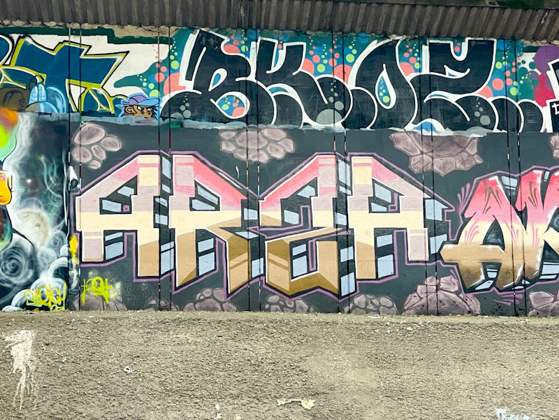
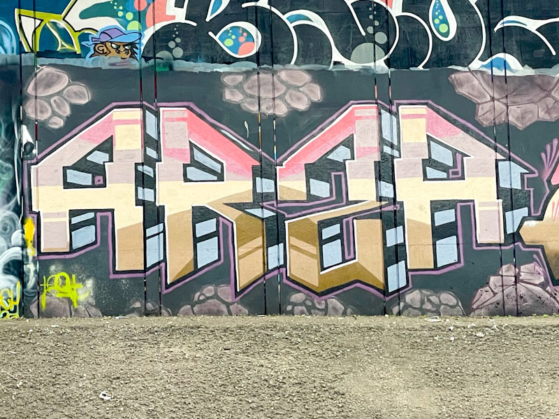
Frome Side, as I like to call it, is a spot that runs underneath a stretch of the M32. The concrete walls are on either side of the canalised River Frome, and crossing from one side to the other is perilous to say the least, across slender concrete slabs, about 2ft wide without a handrail. I tend to remain on the east bank, where the access is, and photograph the west bank from there, looking across the river. This piece from Totosoapcity was on the far west bank.
Totosoapcity, Frome Side, Bristol, September 2025
Totosoapcity has a unique and easy to recognise letter style which tends to remain pretty much as standard from piece to piece, and it is the decoration and fill that provides variation. The letters ARS(Z)A have a symmetry about them, and are filled with an unusual selection of colours in a radiating geometric pattern. The background is decorated with what looks like piles of rocks. Interesting stuff from Totosoapcity.
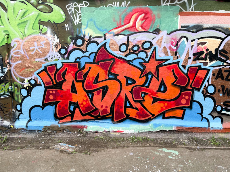
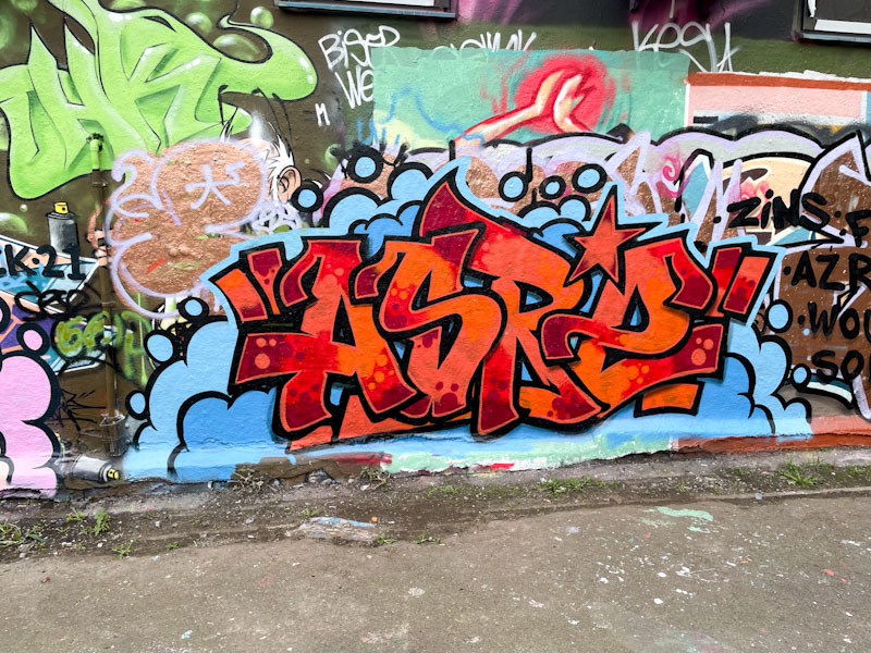
It feels like Asre’s comeback is complete. He is painting pretty frequently all over Bristol, although he has switched in the large part from his character portraits to his writing, and appears to be enjoying it.
Asre, Dean Lane, Bristol, October 2025
This is a particularly neat piece from Asre, with some great colours, and precision throughout. The letters are beautifully filled reds and oranges decorated with reversed-out spots. The bold black border is thick and strong, helping the letters to stand out. The piece is set on blue ‘clouds’ which also have strong black outlines – a typical element of Asre’s work. Lots more to come from the artist.
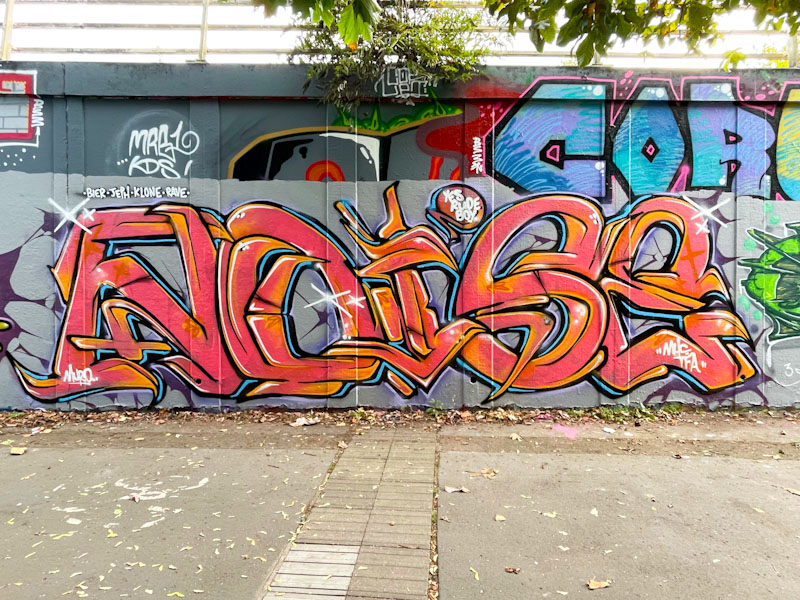
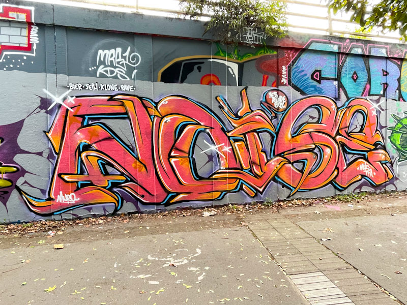
Although the letters in this piece are a little skinnier than one might expect from Noise, they are nonetheless unmistakably his. Of course, the fact that the letters spell NOISE removes any doubt whatsoever about the artist.
Noise, M32 roundabout, Bristol, October 2025
I would say that this is, in my view, one of Noise’s best pieces yet. By thinning his letters, he has created more scope for borders and intricate design, that perhaps his fatter letters restrict a little. The two tones of red and orange throughout are beautifully blended, and perfectly offset by the light blue border highlight. Even the grey buffed wall has been disrupted and made more interesting with some cracks. A really nice piece.