A gallery of characters and sharp graffiti writing from Bristol artist Zinso
Instagram: @zinso.1
All photographs by Scooj




A gallery of characters and sharp graffiti writing from Bristol artist Zinso
Instagram: @zinso.1
All photographs by Scooj
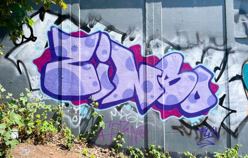
This beautiful piece of graffiti writing by Zinso didn’t last very long t all, I don’t know why it was painted over so quickly, but I am pleased I got a shot of it before it disappeared. It is remarkable how quickly, since his return to writing to walls in Bristol, Zinso has become a part of the furniture.

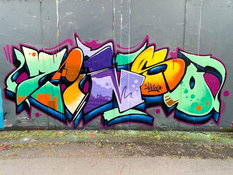
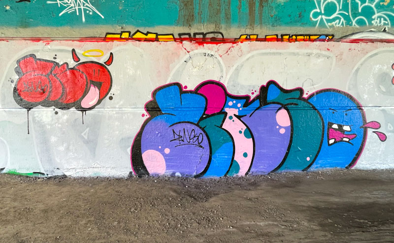
His writing is always beautifully finished, but also he manages to generate creative fills that demonstrate a very accomplished hand. Here his cartoon style letters are filled with light purple spots on a lilac base. Very pretty to look at and fulfilling.
Although it is as inevitable as night following day, I am thoroughly bored by graffiti wars. It is such adolescent posturing that is one of the worst aspects of the graffiti and street art scene, especially for those who appreciate the work of artists, whoever they are. It would seem that some artists like to feel they are tough, or perhaps they have delicate egos, and tagging another artist’s work appears to be the only way they can assert themselves or express their anger. A pity.

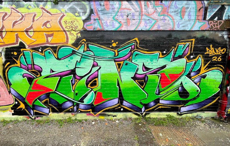
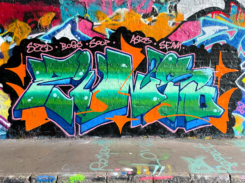
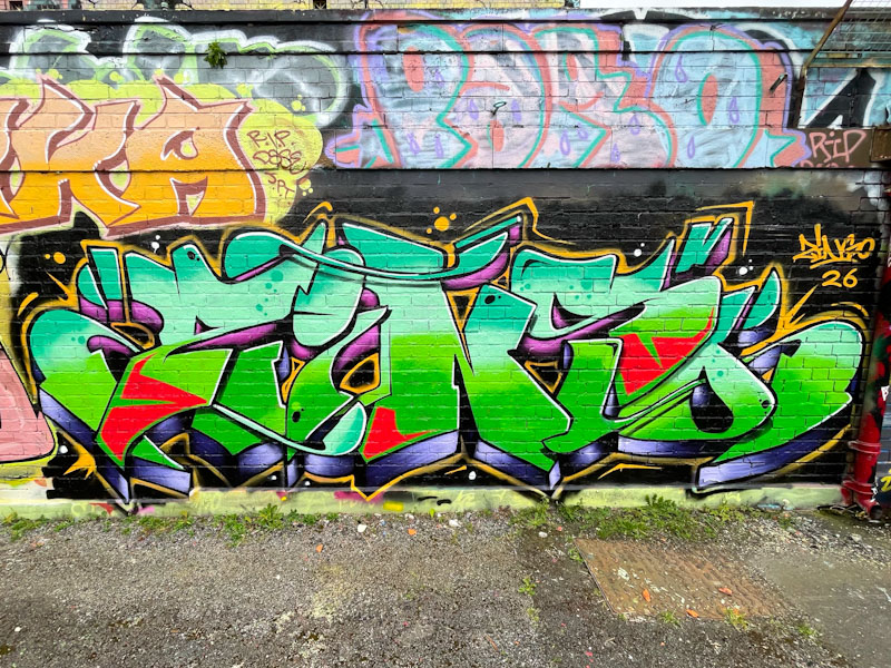
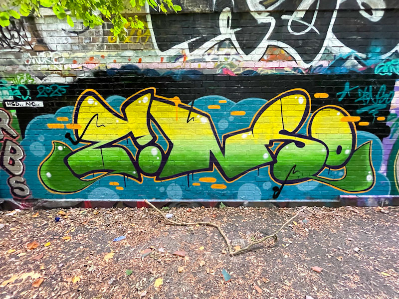
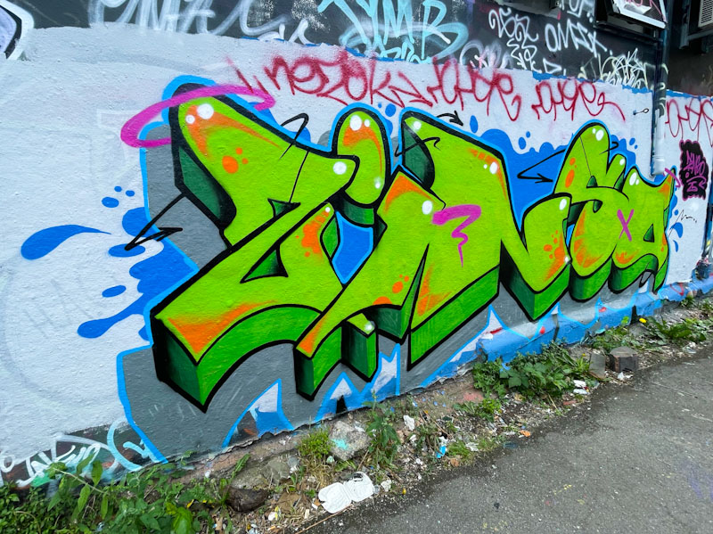
Zinso has been hitting the walls of Bristol pretty hard for the last 18 months or so, and in my view getting better and better along the way. This green piece of cartoonish writing with a great drop shadow and yellow decorative bars is a fine example of Zinso’s tight work. What a shame that someone has felt the urge to write JENGA through the middle of it. The quality of Zinso’s work, however, shines through.
I can’t seem to say it often enough at the moment, but Zinso is absolutely smashing it with his graffiti writing this spring. He has an interesting style at the heart of which is his clean lines and fills – everything is really neat and tidy, offering a beautiful polished finish to all of his work.
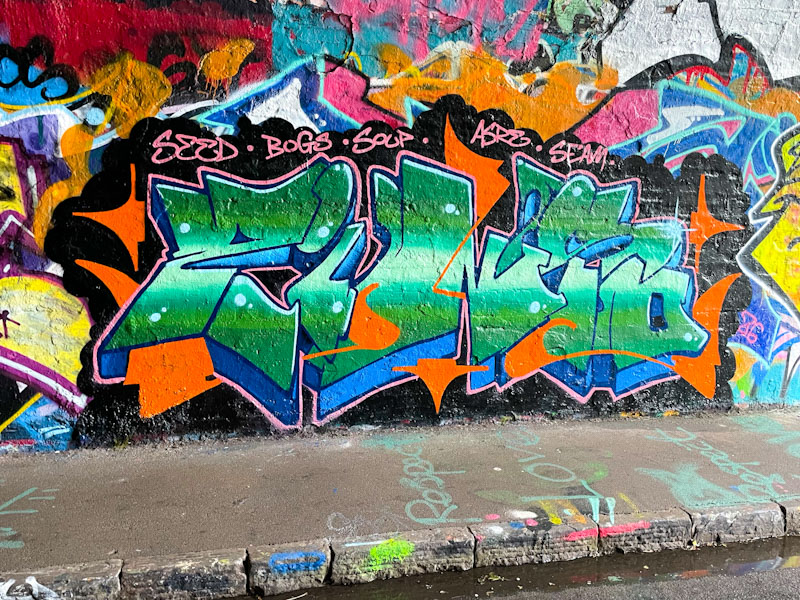
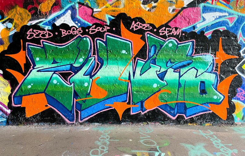
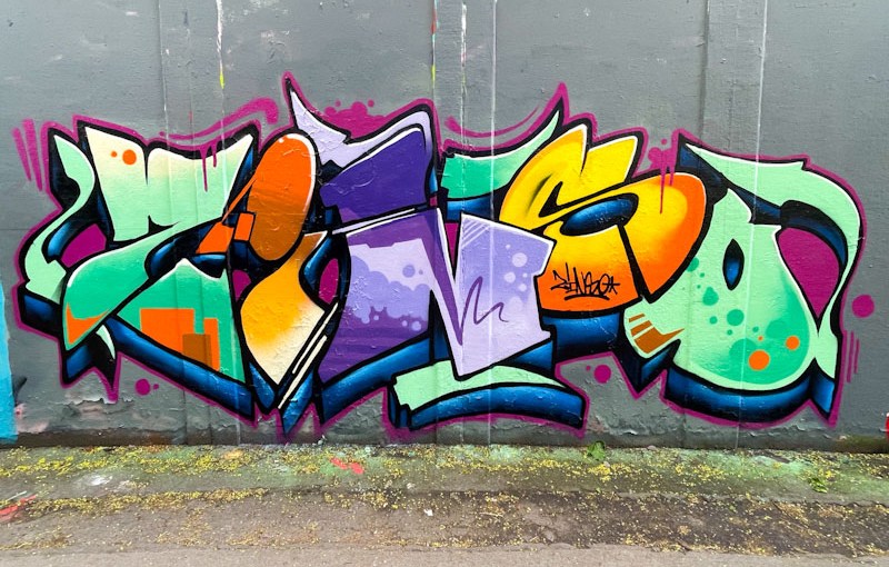
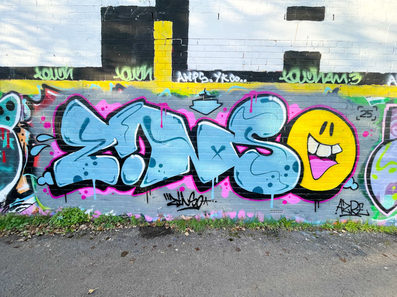
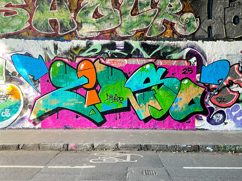
The colour selection here is interesting, I wouldn’t have thought that a combination of orange and green (ok so far) with blue and black would work, the blue jarring a bit with the other colours, but, by jingo, Zinso has carried it off in style. Another head-turner from the artist who is enjoying a fine purple patch.
At this moment in time, I think that I am deriving the most pleasure from the rise and rise of Zinso. He returned to painting walls in Bristol last year, and has been turning our pieces on a regular basis, each one an improvement on the last. Zinso brings together a great sense of form and colour in his letters, and his crisp finishing is a joy.
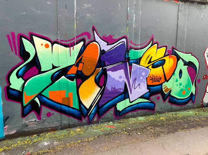
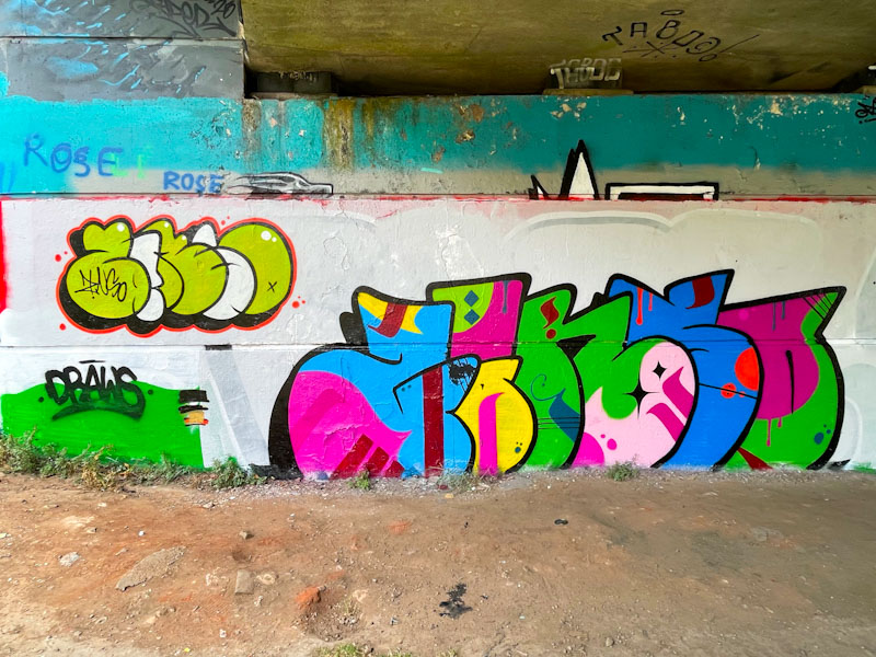
There is a nice pattern to the colour fills in this piece, running from greens to oranges to purples to oranges to greens. The fill patterns are different in each letter and each is beautifully executed. Set on a nicely buffed wall, this, in my view is a great piece of graffiti writing. Eyecatching.
Lately, Zinso has been completely smashing it with his clean and colourful pieces of graffiti writing, and this recent piece serves to confirm his place as a one of the tidiest writers in town.
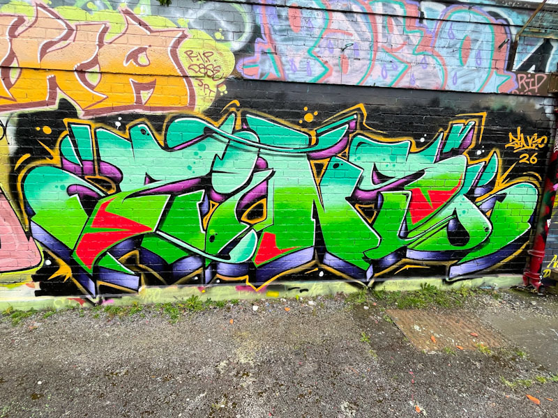
Pretty much hidden from view on the swimming pool wall, this piece deserves to be seen by more passing eyes. The combination of turquoise, light blue, green and red is masterful, and the mauve and black drop shadow have a metallic appearance. I rate this particular piece of artwork very highly and look forward to more this spring/summer.
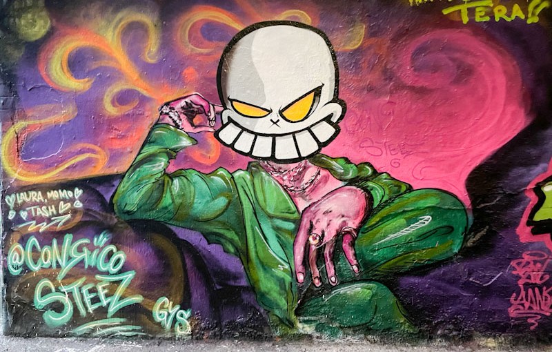
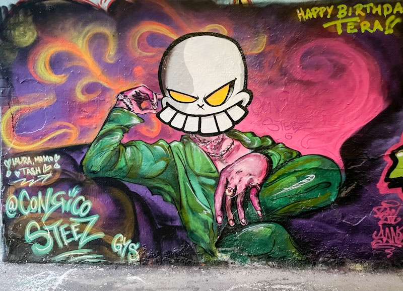
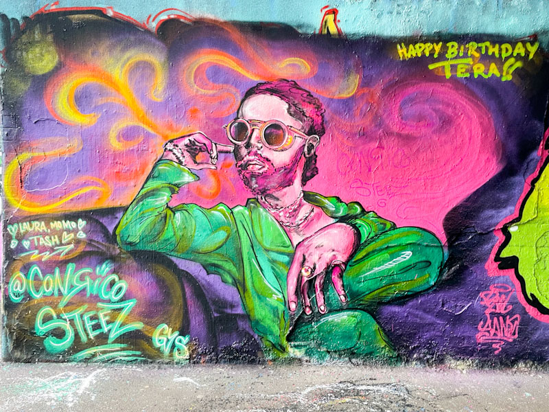
This is an interesting augmentation piece by Zinso, using the underlying work by Conrico to make his mark. This kind of addition takes us into the murky waters of convention and respect, particularly with this Conrico piece, which had only been present for a few days, celebrating Tera’s birthday. While I rather like augmentation pieces, I do feel that they should have a period of clear space between the original and the addition.
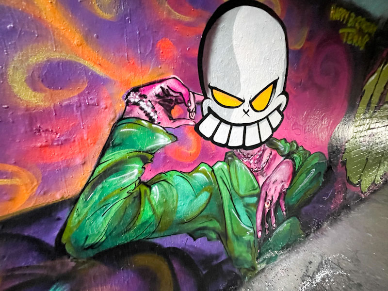
The skull face that has been added is neat and crisp, and very much what you’d expect from Zinso. It also provides a totally different look and feel from the original by Conrico. As I have said many, many times on Natural Adventures, it is a jungle out there.
Another quick one from me, as my time is a little compressed. Zinso is becoming one of the most productive writers in Bristol at the moment, and turning out some impressively clean pieces, like this one.
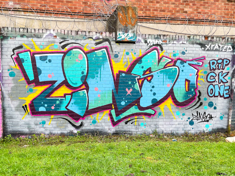
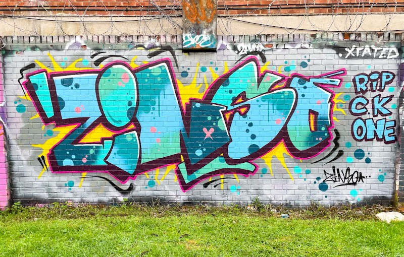
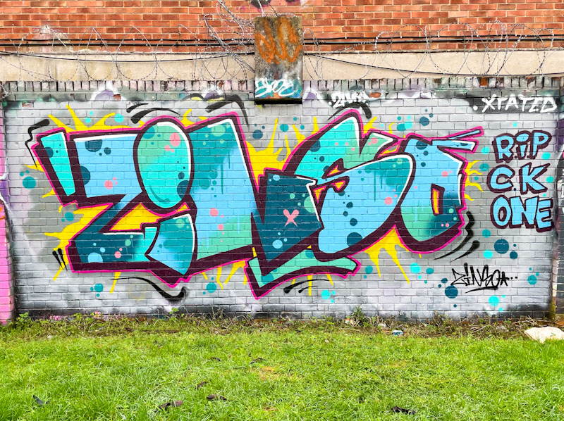
There is so much to admire here, the colour selection, the fill patterns and the explosive yellow flashes surrounding the piece. First class work.
Haha! I love this tidy piece of graffiti writing from Zinso alongside the banks of the River Avon. Every element of this nicely thought out piece works well and from my perspective, the best thing to do is respect it and enjoy it.
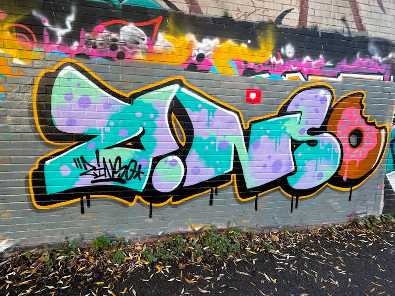
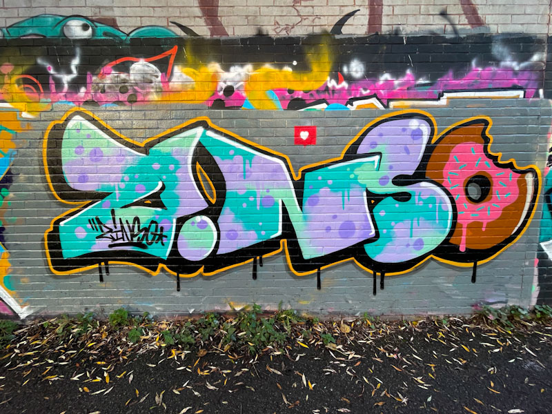
It was a sensible move to buff the wall first, because a cool piece like this could be lost if simply dropped onto existing graffiti. The letter fills are made up of a lovely blend of blues, greens and purples, including spots and drips. The doughnut at the end is simply perfect and adds a touch of humour to the piece. A black drop shadow and orange border round the piece off nicely. I also like the inverted ‘i’ and the little heart above the writing. Very nice work from Zinso.
It is absolutely no surprise that Zinso and Asre have teamed up and tend to paint together quite a lot these days. Both have a similar tidy style and both like to use bright and vibrant colour palettes in their work.
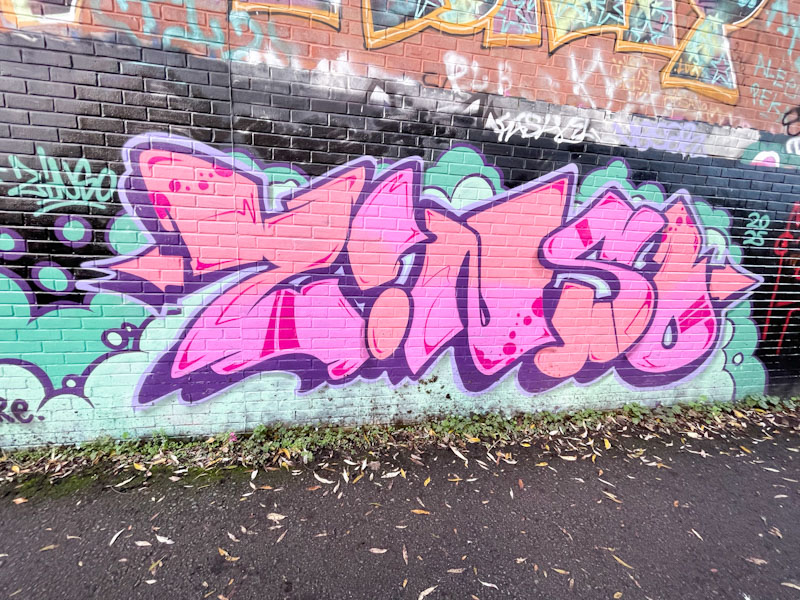
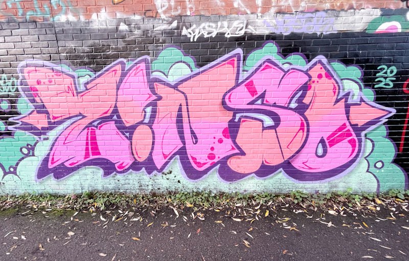
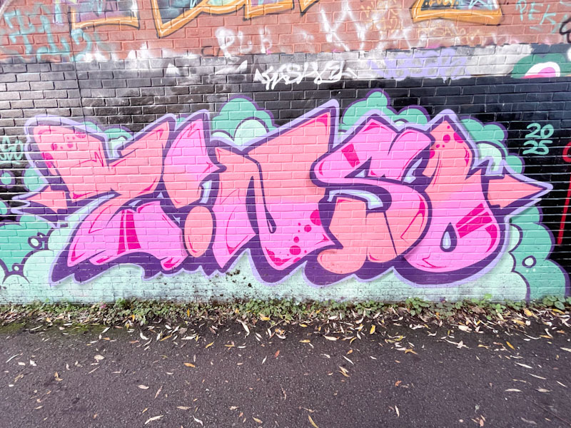
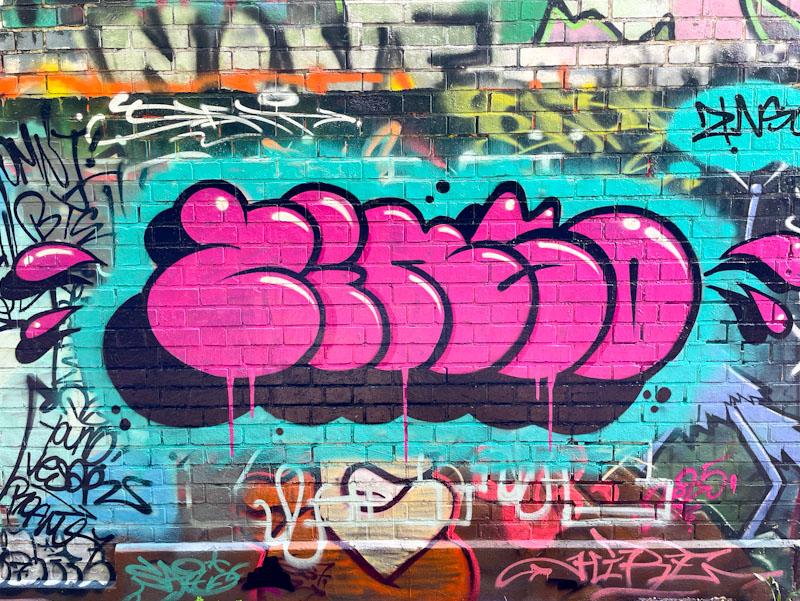
This is a beauty from Zinso painted in the tried and tested pink and blue combination of colours. The letters, fills and borders are tight as a nut, and the cartoon-style writing definitely stands out from the crowd. The piece looks really fresh, as if it had been painted moments before the photograph, which, of course, it might have been. I now have more than enough of his work for a gallery – join the queue.