
A gallery of fabulous graffiti writing and a selection of vampire teeth from Bristol/Spanish artist and tattooist, Pura Decadencia.
Instagram: puratattoos
All photographs by Scooj

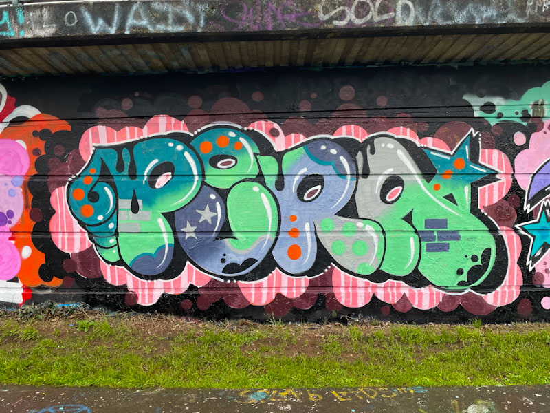
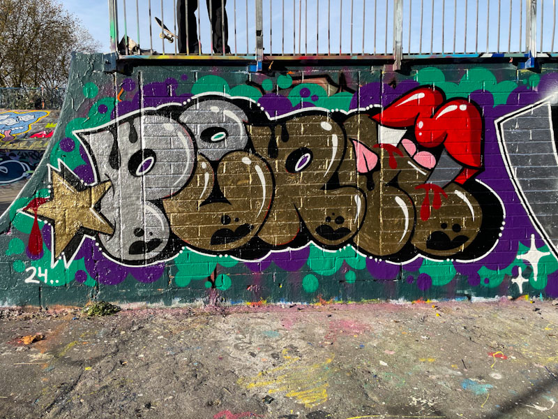
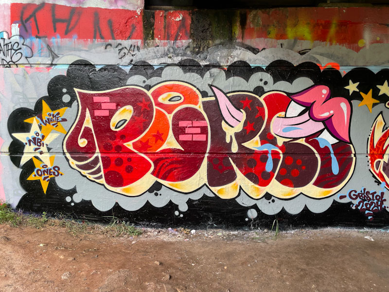

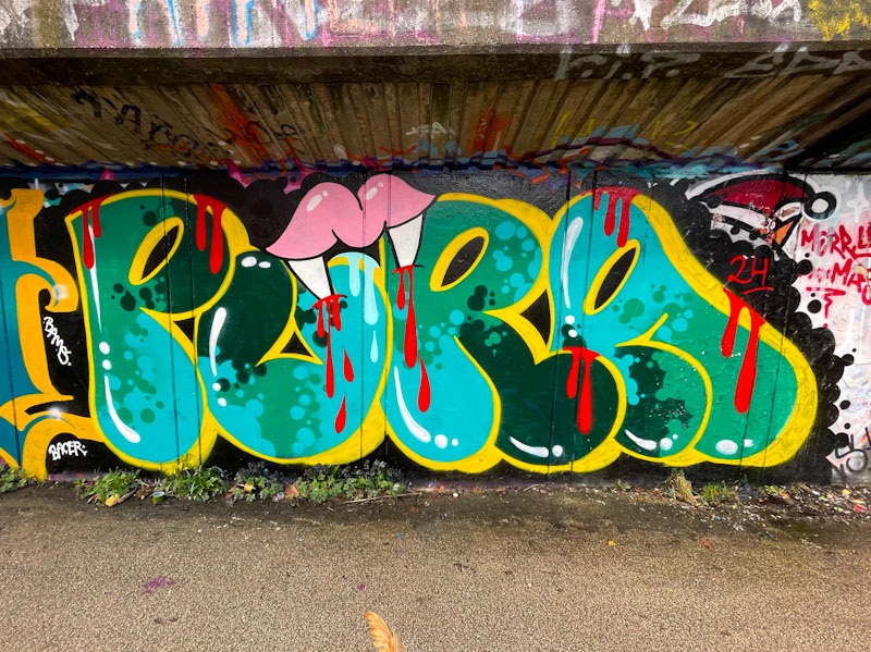

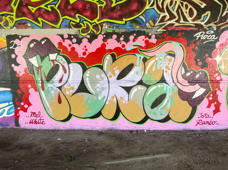
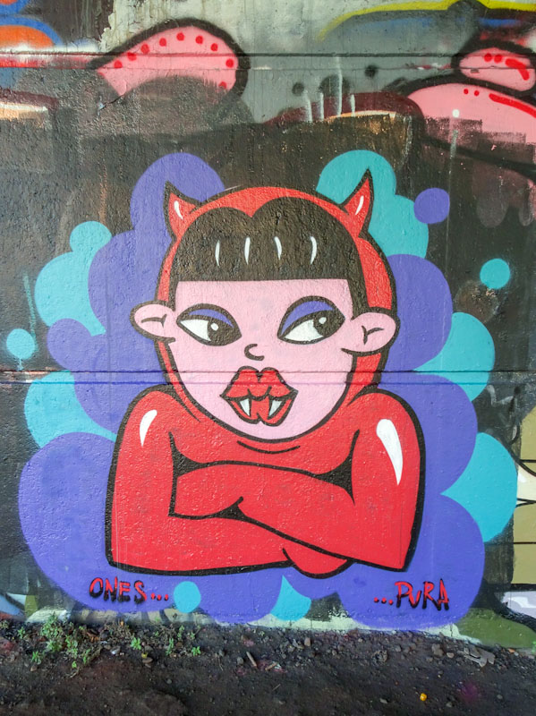


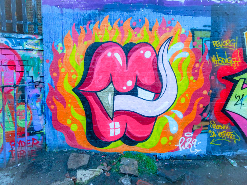
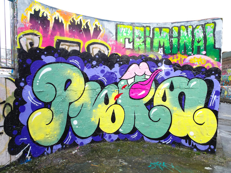
A gallery of fabulous graffiti writing and a selection of vampire teeth from Bristol/Spanish artist and tattooist, Pura Decadencia.
Instagram: puratattoos
All photographs by Scooj

Tucked away behind the iron fence of the swimming pool at Dean Lane is this fabulous collaboration combination piece from Werm and Zake. Werm, more than adequately providing the symmetrical letters, and Zake offering a couple of different cheeky characters peering over the top of them.

The horizontal band colour scheme, painted on an off-white background, works really well, and Zake has cleverly incorporated the band of colour into his characters. I’m not quite sure what it is about it, but this feels like a really classy piece to me, and I really like it.
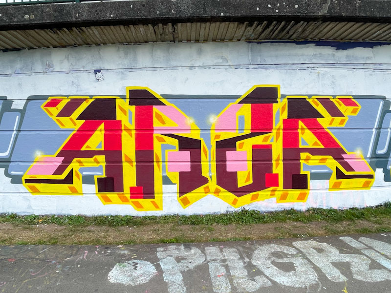
I have seen quite a few pieces by Totosoapcity in Bristol before, but hadn’t known who the artist was, so haven’t posted them. This could mark the opening of a little floodgate for when I do some digging in my archives, which I like to do from time to time. I’m not sure that Totosoapcity is from Bristol, but must be reasonably local I would think, because we see visits every few months.

This piece is part of a large collaboration from a group of artists I am not too familiar with, but who have done a great job on this wall, selecting a themed colour approach to all their writing. I think the letters here spell ARS(Z)A, and have a pleasing symmetry to them. The red, pink, black, brown, yellow and orange colours are not my favourite combinations, but work reasonably well – not sure about the pink. They do, however, contrast perfectly with the themed grey banner background, which is consistent through the entire collaboration.
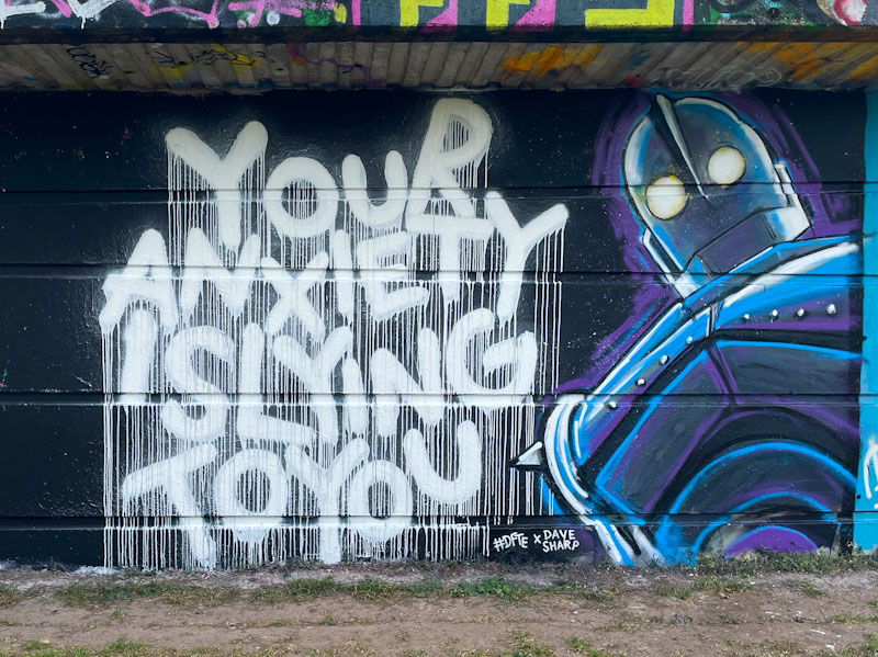
These two artists collaborated on almost this exact spot back in July 2022 – how time flies, I had it in my mind that it was last year. From what I can gather #DFTE and Dave Sharp are good friends, and this fine collaboration ‘anxious iron giants’ combines the distinctive writing of #DFTE with the artistic talents of Dave Sharp.
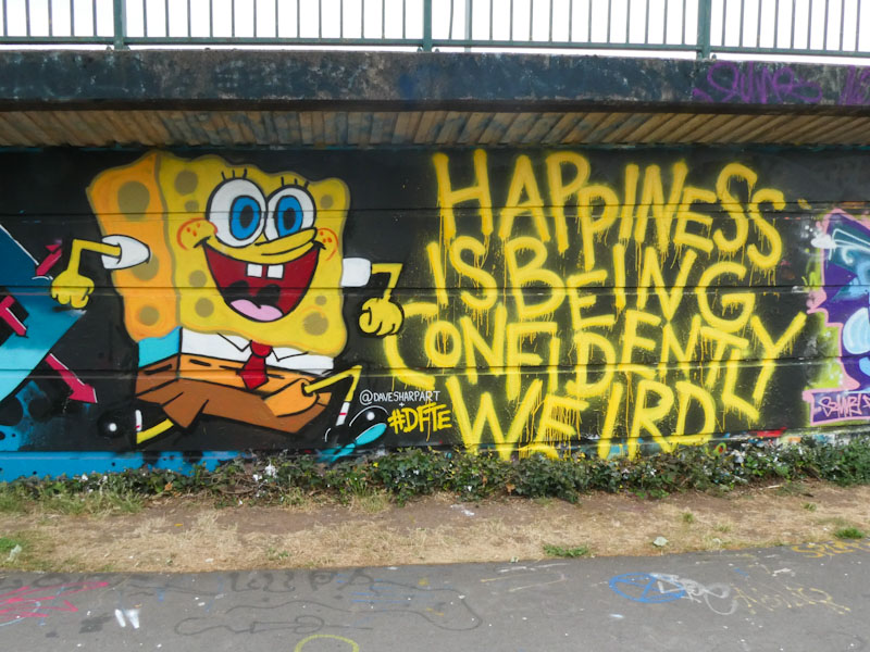
I would love to see more from #DFTE – the power of words is so beautifully presented with his unique style, going big on the drips, but he doesn’t seem to paint all that often. Dave Sharp, I don’t know much about, but he has captured the Iron Giant robot really well, perhaps tinged with a little anxiety… who knows. Their combination works really well, and as a bonus, here is their last one…

This is an outstanding piece of graffiti writing from Minto, and is a great example of what is not there as being as important as what is there – if that makes any kind of sense. There is a lot of empty space alongside multiple illustrations and decorations throughout.
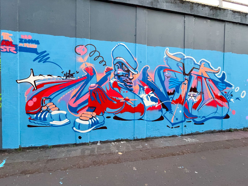
The letters spell out MINTO, and there are some regular motifs that the artist has used before, such as the character and a pair of sneakers at the base of the letter M. I’m not sure whether there is a coherent story or whether the piece is simply a collection of ideas and thoughts bundled up together. Either way, there is plenty to look at in this energetic piece.

There are many parallels between Bristol and Liverpool, in part due to the established trading routes with America and the West Indies. Unfortunately, both cities prospered through the trade in slaves, alcohol and tobacco, along with a huge amount of other less controversial goods. Place and street names tend to reflect the development of a city, and it is no surprise that both Bristol and Liverpool have a Jamaica Street, and that both are in areas that have seen a lot of change.
In Liverpool, the area around Jamaica street is a hotspot for street art, and I was lucky enough to find some superb pieces during my recent visit there, including this old piece by Liam Bononi.

Liam Bononi has become one of the great high-end artists in Europe and is a favourite for premium walls and festivals, and this piece, I think, was painted sometime last year. Much of his work contains contorted, agonised or corrupted portraits, perhaps reflecting an inner struggle. This beautiful portrait piece appears to be cracked and disfigured as if it were a broken mirror, and as a result is a little unsettling. Although based in the North of England, Liam Bononi does manage to travel around the country a little, which is great news.

Now that Face 1st isn’t living in Bristol, and he paints less frequently, he appears to be a little more judicious in what he paints, and seems to be experimenting a lot more with his writing and his fonts.

This is a wonderful chrome combination piece with Face 1st’s trademark laughing girl character and hair made up of the word FACE. This time though the letters have more of a calligraffiti style to them, and are nicely finished. Somehow, Face 1st is, for me at least, emblematic of the Bristol scene, and I am so pleased that he comes back reasonably regularly to remind us of his talent and style.

I have met ESKA on a couple of occasions, and he is a genuinely nice bloke. In our chats, I was under the impression that he was passing through Bristol, as he has quite an itinerant lifestyle. However, it seems that he is hanging around longer than I thought, which is brilliant news, because his work is outstanding, and quite different from the Bristol style we are used to seeing here.

This is a fine piece on the back of the long ramp in the skate park. Normally, his letters spell out ESKA, but I am not convinced that is the case here. His colour choices are superb, and there is a remarkable anamorphic effect, with great depth in the piece.

One of the special features of Eska’s writing is hidden in the small details, such as the little figures watching on at some futuristic spaceships or something like that. Always, his work contains plenty of hidden messages and symbolism, and of course they are finished to an incredibly high standard. Long may his stay in Bristol last.

Keeping up with Dibz and Fade, even over the winter months, has been challenging. Their high-end graffiti writing is creative and imaginative, and some of the best you’ll see in Bristol and beyond. Sometimes the pair paint in themed colour schemes and play off one another, but this collaboration presents two very different pieces with only a shared background to link them.

On the left, Fade has painted a stunning tribute piece for Chaos, who in his own words is ‘lost but not forgotten’. The yellow letters are filled with three horizontal stripes, nicely blended, without any hard edges. The little white trims do a lot to create depth, as does the thick black border. A beautifully finished piece, as you’d expect from Fade.

To the right, Dibz has painted a crazy colourful explosion of a piece, which is a ‘heavenly birthday’ tribute piece for Benson Much, and knowing this, you can make out the letters BENSON. This is an absolute stunner, there are no two ways about it. Each component of the work has been allocated a different colour, not only on the surface, but also in the drop shadow. This demonstrates Dibz’ complete understanding of light and shade and colour matches and when combined with his extraordinary talent you are left with something that you can’t help but admire. A fabulous collaboration.

I have a feeling that Short, like many other graffiti writers who stick to a general style of letter shapes and play with the colours and fills, will be making regular appearances in this blog. While this is only the second piece I have posted, I have plenty more in my files, and they seem to be coming at a steady rate.
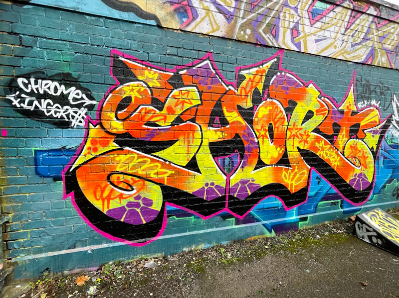
The fat script-style letters, with a nice deep drop shadow are beautifully filled with a burst of yellow and orange colour and some purple decorative touches, are nicely arranged and presented. The piece is painted over a Hire piece which acts as a contrasting background – no buffing here for Short. Watch out for more.


