Turoe is nowhere near as productive as he has been at certain times in the past, so it is always great to come across a new piece. Although the frequency has dipped, the quality of his writing hasn’t diminished one iota.
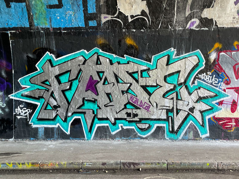
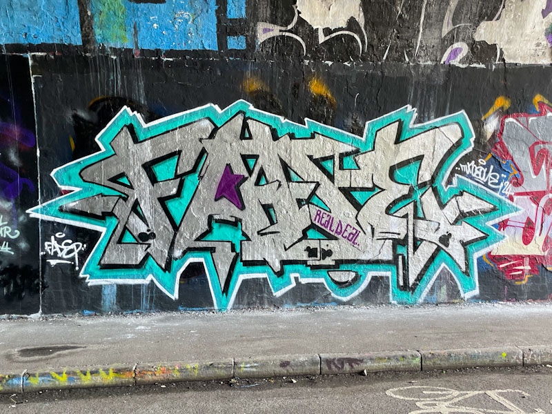
Turoe, St Werburghs, Bristol, May 2024
This is a lovely chrome piece in the tunnel, which is really brought to life with the steel blue border, without which the writing would disappear on the wall, and struggle to be noticed. Small things like this come so easily to experienced writers, and the thought that goes into design, colours and site location contribute to the final outcome. A fine piece of graffiti writing from one of the best.
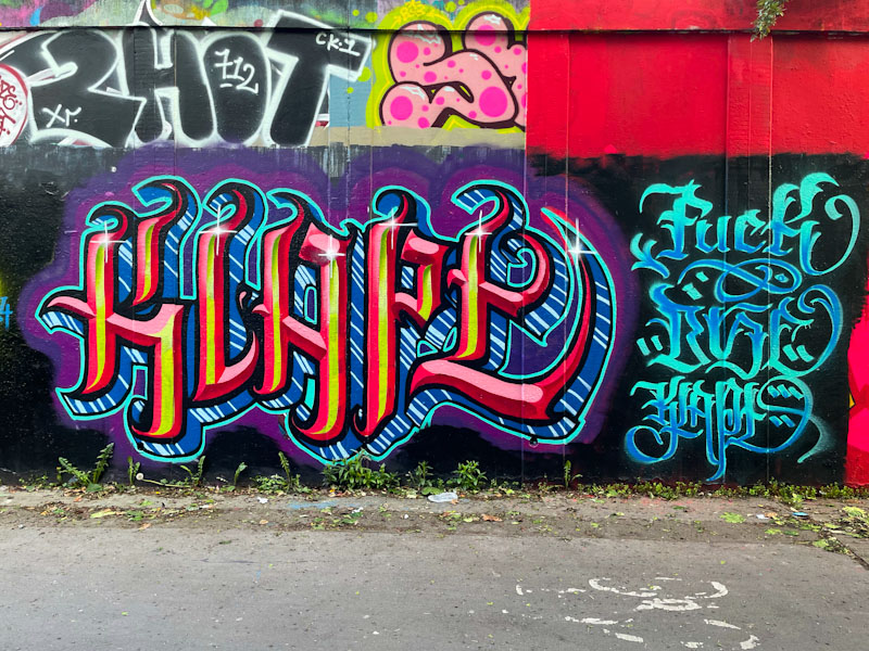
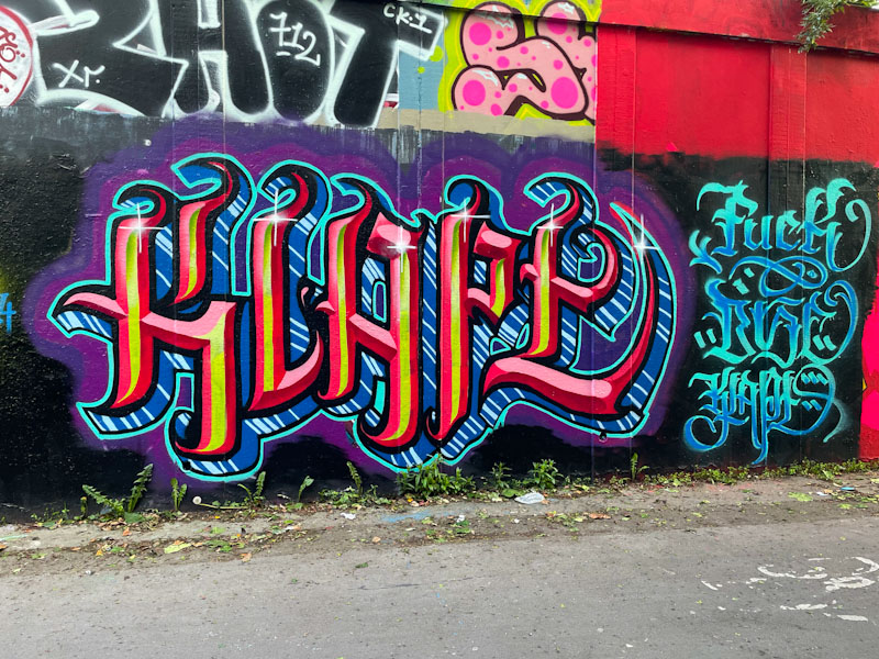
Here we have some more calligraffiti writing from Stivs, who appears to have had a bit of a rebirth lately and is painting furiously all over the place. I use the word ‘furiously’ deliberately because the words he is choosing to write recently are on the bluer end of the scale and play into the passive-aggressive arena, contrasting the beautiful writing with the potty mouth language.
Stivs, M32 roundabout, Bristol, May 2024
I believe this piece says KLAPE or KLAPY, which I think is just another way of saying CRAP, although I might be mistaken. The writing is, as ever, very neat and tidy, and has a sparkle about it, helped along with the little starbursts at the top of each letter. Much more to come from Stivs, and I am struggling to keep up as it is.
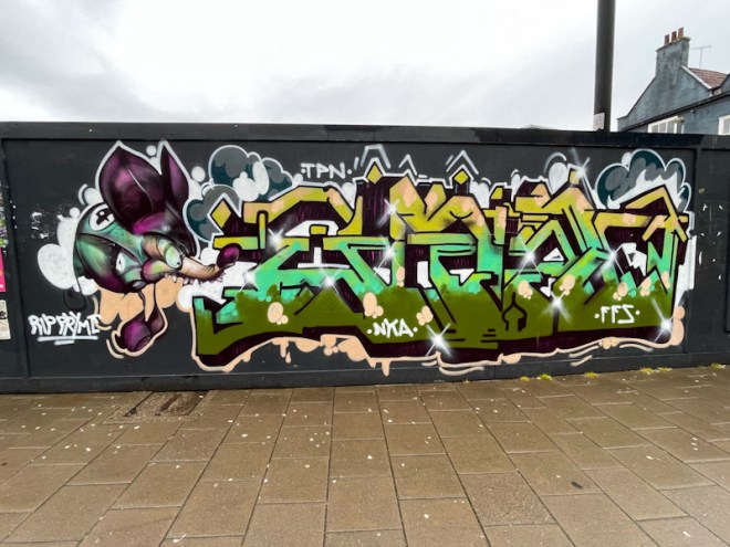
It took me rather a long while to photograph this magnificent writing/character combination piece by Kid Krishna, but parking near this spot is a real issue, so I waited until I walked in to work (a reasonably rare occurrence since Covid) before snapping it up. Fortunately it has been respected and remained untagged since it was painted.
Kid Krishna, Stokes Croft, Bristol, May 2024
The Tribute piece almost looks like it has been created by two different artists, and it brings out the artistically ‘bipolar’ aspects of Kid Krishna’s skill sets. The character, which looks like a beetle-mole mash up is detailed, sharp and clean, whereas the writing looks much more fluid and spontaneous. This is a really classy combination piece from an artist who is red-hot at the moment.
Dibz, Jody and Fade, Brunel Way, Bristol, May 2024
This extraordinary collaboration from Dibz, Jody and Fade, in my view, approaches graffiti/character combination perfection, and I feel that the more I say about it, the more I risk devaluing it. This piece, is adjacent to an earlier collaboration by these three which I haven’t yet had the space to post…
Dibz, Brunel Way, Bristol, May 2024
The classic triptych begins with some stunning writing from Dibz with an outstanding deep 3D drop shadow, full of shades creating loads of depth. There are some nice dark highlights in the corner of some of the letters too.
Fade, Brunel Way, Bristol, May 2024
Bookending the central character on the other side is some writing from Fade which closely mirrors Dibz’ writing. The main difference between the two is the colour of the drop shadow. Their work is deliberately merged into one.
Jody, Brunel Way, Bristol, May 2024
Arguably, the star of the show is the portrait piece from Jody in the centre. I don’t know what it is that makes this one so special, maybe it is the colours, maybe it is the writing either side, I just don’t know, but it is truly outstanding and captivating. The portrait is full of mystery and power, with the flowing hair and wispy flowers providing plenty of movement. This is really great work from the three. How often have I said that over the last year or two?
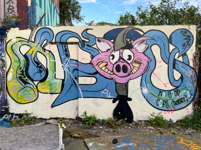
I had to return to this spot to get some decent photographs of this unusual piece by Taboo, as the first lot were covered in shadows, but that is how it works. I work on the principle of always taking pictures of a new piece, whatever the light conditions, because it could be tagged or overpainted within hours. If I get a second chance to take better pictures, then that is a bonus.
Taboo, M32 cycle path, Bristol, May 2024
Taboo has had quite a quiet period over the last six months or so, so it was good to find this one on the Cycle path. In his unique antistyle graffiti writing, Taboo manages to combine his unusual letters with characters, in this case a kind of grinning pig. I suspect the pig reference relates to the police, because he has included the words “No good cops. (Sorry)” which I guess is a polite way of saying ACAB. Looking forward to seeing more from Taboo as the summer unfolds.
This container, behind the Watershed, is one of the more curious spots in Bristol. I am not sure who owns the container, nor do I understand quite why the council has given permission for it to be sited here, but here it is and fortunately for us, it has played host to a series of high-end commissions over the years. Inkie replaced the Paul Monsters piece that had been here before a little while back, but I have only recently photographed it.
Inkie, Anchor Road, Bristol, May 2024
There are several Inkie elements that have come together in perfect harmony in this combination piece. The print background runs through the whole piece and sets a regular patterned backdrop. Of course the distinctive writing in very Inkie colours is as good as you’ll see and to the right is one of his beautiful Art Nouveau style characters. The only board of the piece that leaves me scratching my head is the cartoon-style spray can, which doesn’t look like an Inkie piece at all and doesn’t quite fit with the rest of it.
There are one or two artists that are on fire at the moment, and I am really struggling to keep up with their work, which vexes me a little, because I want to share it all – I’ll need to find a way of sharing moor, possibly through mini galleries or something like that. Kid Krishna, has been going nuts lately, and I must have seven or eight recent pieces in my archive, all waiting to be posted.
Kid Krishna, M32 roundabout, Bristol, April 2024
This is a bright and colourful piece of graffiti writing spelling out CRIE, which you can see more clearly in this one than in some of Kid Krishna’s other pieces. There is so much intricate work, and a flow that runs through the letters both in design and colour. Kid Krishna’s work always comes across as quite organic, chaotic and unplanned. I don’t know if that is the case or not, but it is also consistently good.
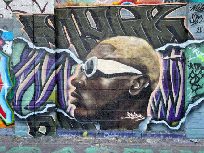
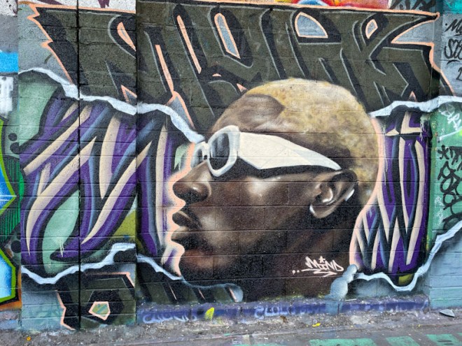
Mind 49 and Wxttsart, M32 Cycle path, Bristol, April 2024
Regular readers may be experiencing ‘déjà vu’ on seeing this fine collaboration from Wxttsart and Mind 49, as they have overwritten and incorporated elements of their last collaboration on this exact spot, and the unobservant might have missed the ‘update’ altogether.
Mind 49 and Wxttsart, M32 Cycle path, Bristol, April 2024
The ‘old’ work is the purple and cream script by Wxttsart running through the middle of the piece which has a clever ‘ripped wallpaper’ look to it and has been augmented with fresh writing at the top and bottom of the piece that appears to spell out MYLK, (milk being Wxttsart’s moniker). The portrait, by Mind 49, is rather larger than its predecessor and beautifully executed. Mind 49 manages to paint informal portraits in a photorealistic style while retaining a softness about them, and this is a prime example. Both artists have combined (again) perfectly to create this striking collaboration piece.
Wxttsart and Mind 49, M32 Cycle path, Bristol, January 2024
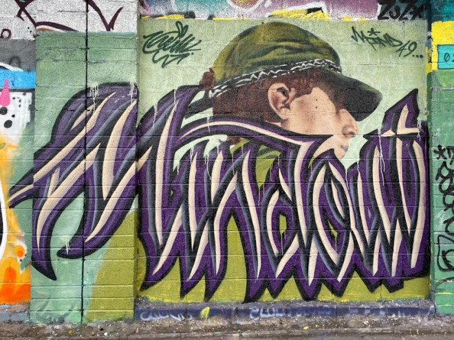
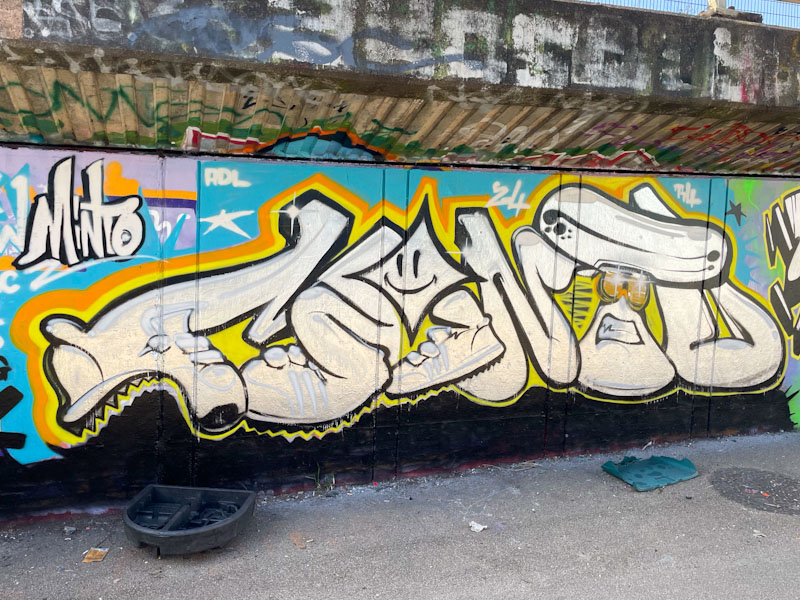
Minto keeps his work ticking over nicely with a fairly regular weekly/fortnightly contribution, and each and every piece is a cracker. Minto has a distinctive style and creative streak that makes for outstanding graffiti writing – character combinations and mash-ups.
Minto, M32 Cycle path, Bristol, April 2024
This piece, on the Cycle path behind the Black Swan, looks like a bit of a quick one and features trainers, something of a theme for the artist at the moment… that and camper vans – perhaps we can read into that a profile of his lifestyle. The letters, which spell out Minto, are nicely rounded off with a yellow and orange border. So good to have him back in Bristol.
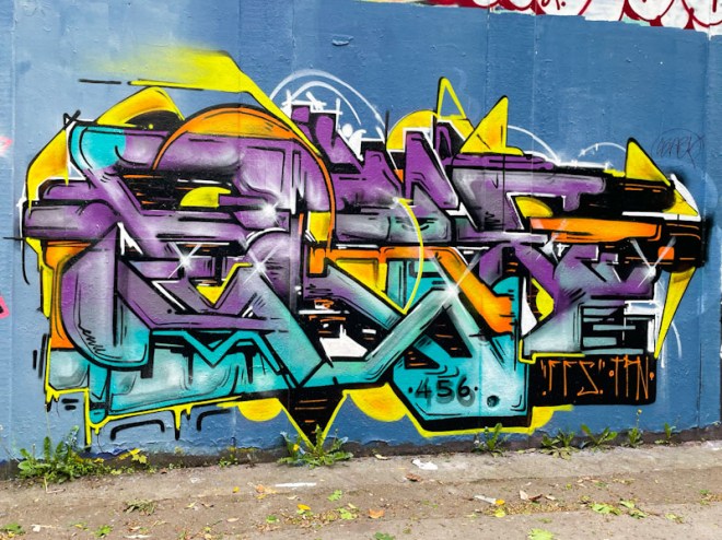
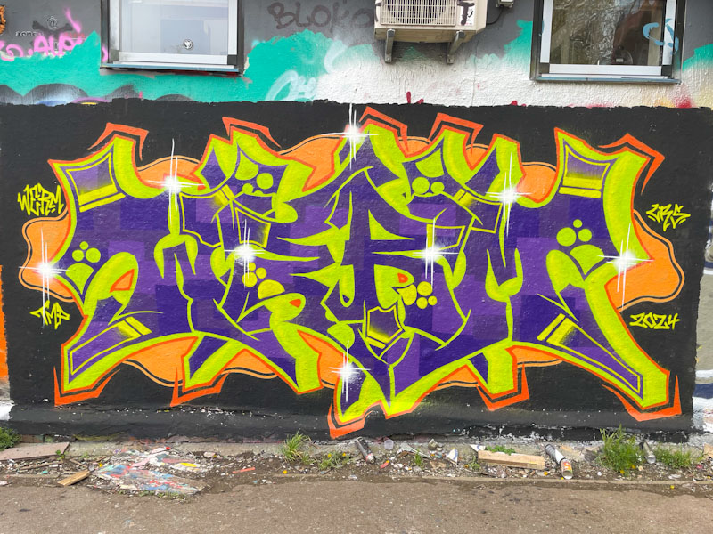
Werm is producing, in my view, some of his best writing work at the moment, having pulled back a little from his highly technical and complex pieces. There is something a little more accessible about his graffiti writing now, that hasn’t always been the case.
Werm, Dean Lane, Bristol, April 2024
The colours in this piece spelling out WERM are certainly eye-catching and benefit from the buffed black wall, which enhances the impact of the writing. I suspect, consciously or otherwise, that the selection of purple and yellow for the letters might be related to the colour wheel, where they are complementary colours – they do work well together. I wonder if we’ll get to see Werm incorporating characters in his work, he would be more than capable of doing it and has done so once or twice in the past. I’ll ask him next time I see him.