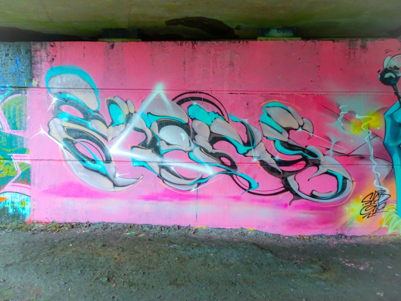
His is only the third piece I have posted by Benjimagnetic although I have quite a few of his older pieces in my archive. His style is quite unique and more about outlines than solid fills. The sketchy appearance makes it difficult to decipher the letters, but they are there somewhere. It definitely starts with a B.
Benjimagnetic, St Werburghs, Bristol, August 2020
The colours in this piece are nicely thought out and the splashes of light blue and orange add some interest. In a funny way, this style is a bit like an angular version of the abstract writing we see from Mr Klue – there is a wispish, ghostly quality to it. Watch this space for more from Benjimagnetic.
If you can’t find a wall to paint, then you just have to get creative and find something else. In Bristol there are many people who live in vans and caravans and park up in quiet side streets. For some this is a lifestyle choice, for others it is borne out of necessity. Many occupants are open to having their homes decorated, and these guys got a fabulous makeover from Face 1st.
Face 1st, M32 roundabout, Bristol, August 2020
I understand that Face 1st has fun painting this and got on well with the occupants of the caravan. The piece itself is colourful and happy and in the style of a girl’s face with hair spelling out FACE, which is one of his regular compositions. I like this for so many reasons.
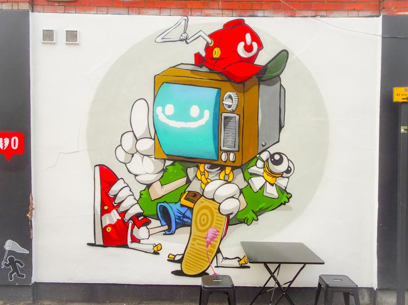
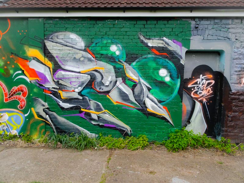
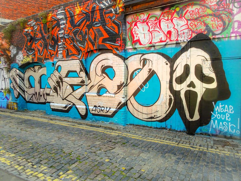
At last Cheo has broken cover. He seems to have spent much of the last six months on his studio work and commercial activities and painting walls has taken a back seat. This new piece on the wall outside the Souk Kitchen (a favourite for Upfest) is actually a kind of promotion for an augmented reality piece he has done recently.
Cheo, Raleigh Road, Bristol, August 2020
The crisp piece shows a character fusion with a television set – a proper old one like we grew up with… It is called ‘Retro Flow’ and is the first time Cheo has worked with augmented reality. It is so good to see something on the street from Cheo after such a long break, looking forward to more soon.
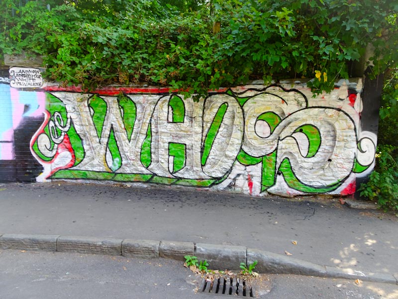
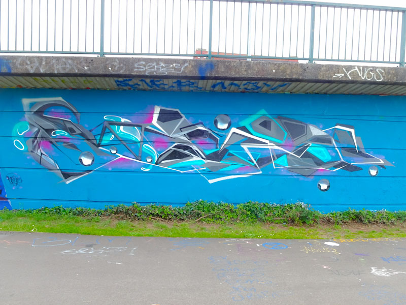
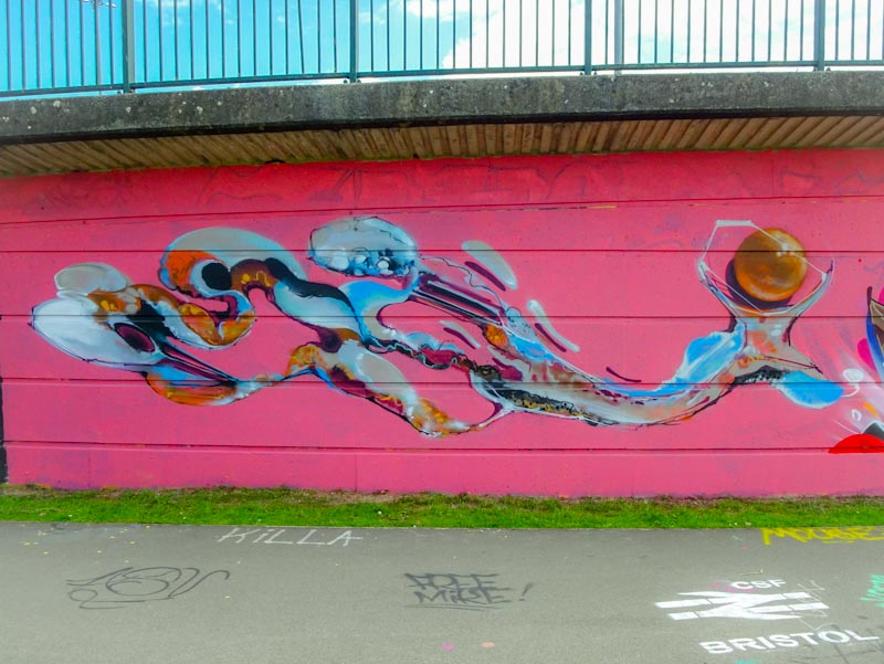
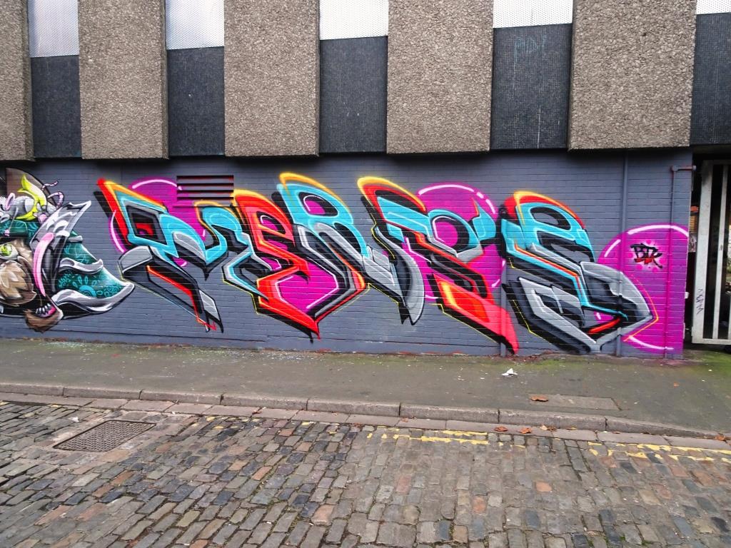
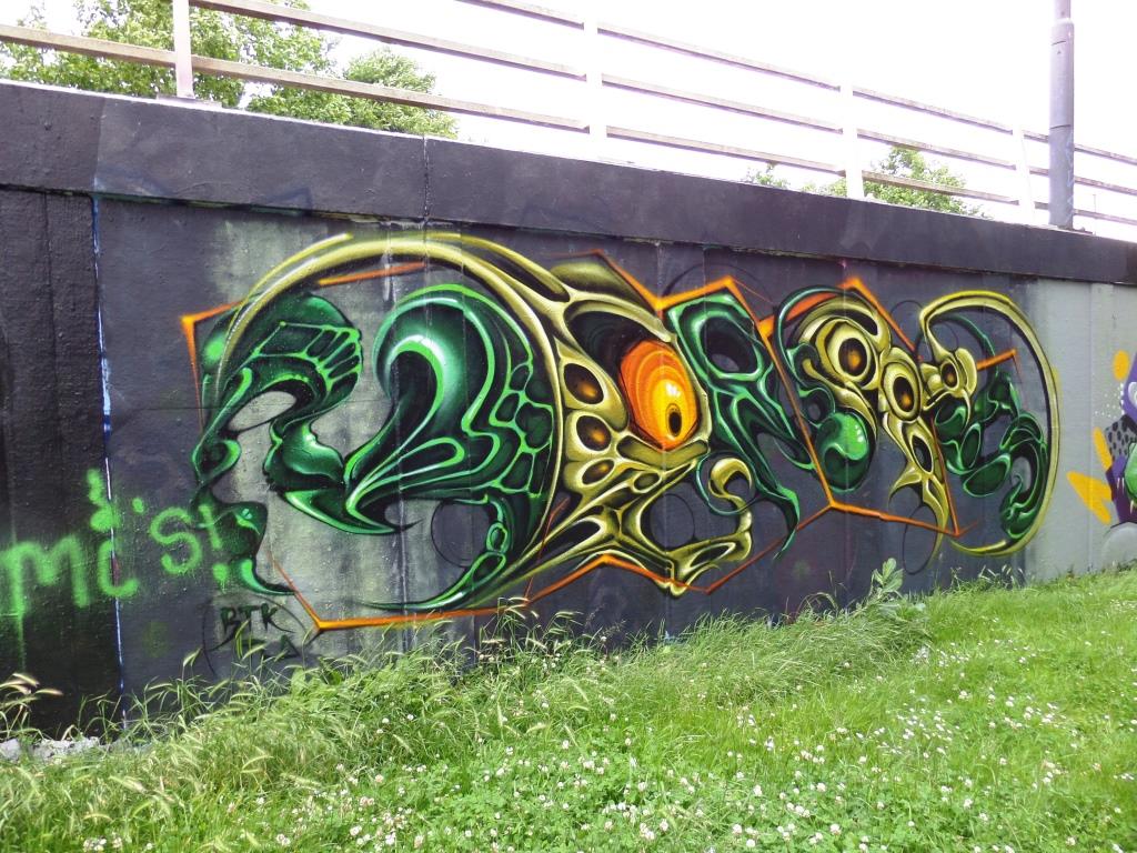
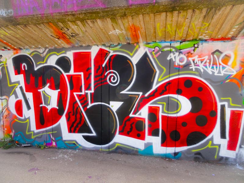
I have a feeling that this is the third piece I have posted by Whos and I am rather enjoying what I see. This unconventional writing style feels very ‘New Bristol School’ if there is such a thing, along with Taboo and Alos. I am full of admiration for this piece, because any kind of spraying on a heavily textured wall is not going to be easy.
Whos, St Werburghs, Bristol, August 2020
The piece is located at the entrance to St Werburghs tunnel, and I expect it to stay there for a while due to the nature of the wall. The letters are large and bold with a clever shaded ridge down the middle giving a nice 3D effect. The silver/white and green colours work well together. Altogether a nice piece of writing the likes of which I expect to see more of.
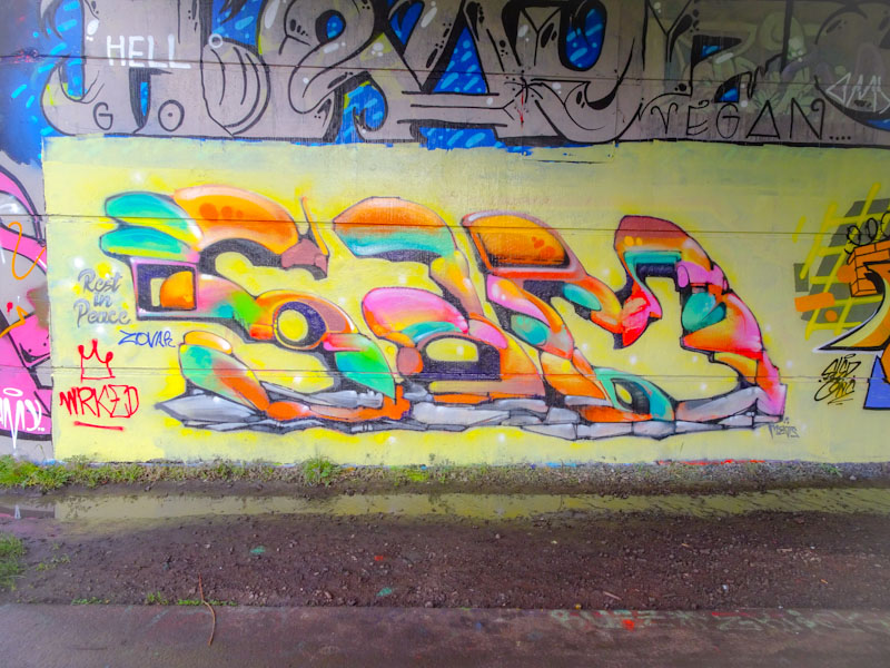
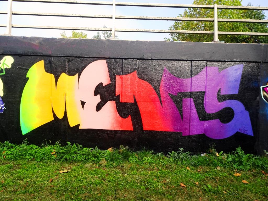
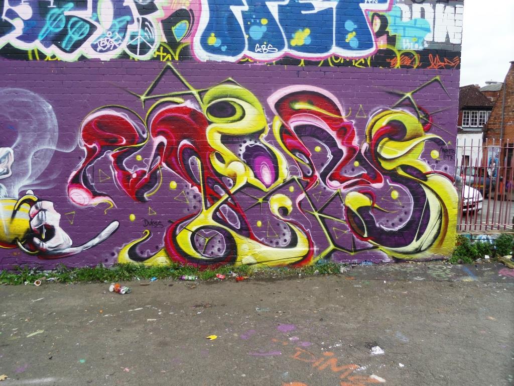
Moon Street still holds an important place in my heart. Although it rarely hosts ‘top end’ pieces it represents, for me anyway, the beating heart of the Bristol graffiti scene. The area around Moon Street is steadily being gentrified, and in time these images of street/graffiti art will be distant memories. I don’t recall seeing a Taboo piece in this street before, so I was thrilled to come across this one recently.
Taboo, Moon Street, Bristol, August 2020
This new piece is beautifully laid out on a blue background that gives it some prominence. In typical fashion, Taboo’s unconventional lettering style spells out TABOO with a long-nosed character on the left and a ghostly face constituting the second O. As is often the case, there is a little shout-out to his girlfriend Amy. I’m really enjoying Taboo’s work at the moment.
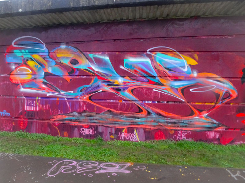
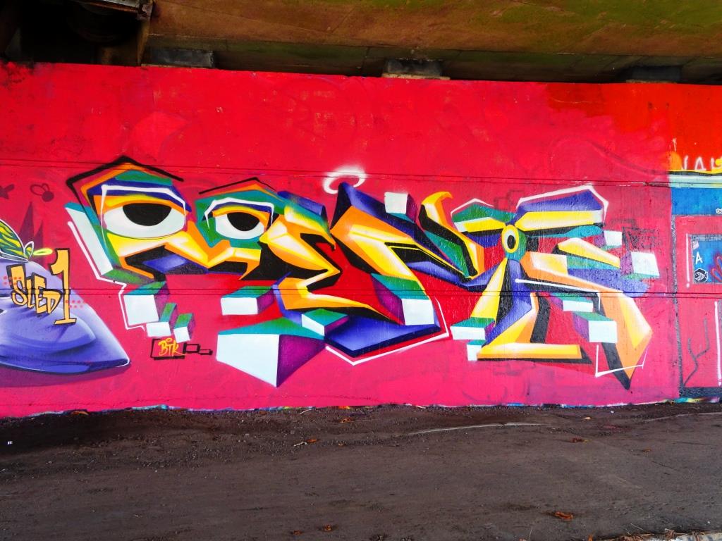
It feels like an eternity since I last saw a Biers piece that actually spelled out ‘BIERS’ rather than ‘OhYeah’, and I have to say it makes me very happy. I remember the first piece I ever posted by Biers – it had a piece of toast in it, and shortly after that I met him on several occasions while he was painting and we struck it off really well – it has been a while since I last saw him though.
Biers, M32 cycle path, Bristol, August 2020
This is a regulation piece of Biers writing and all the more splendid for it. His irregular sized letters are expertly filled with black and red patterning. This is a most satisfying piece.