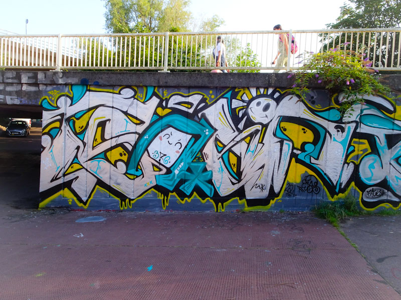
.
I just don’t like it
it’s ok not to like it
and guess what, I don’t
.
by Scooj
.
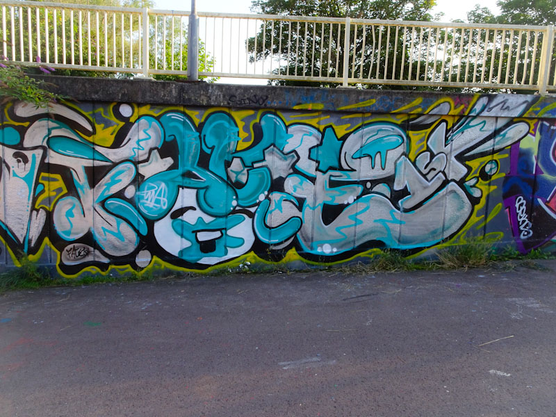
I just don’t like it
it’s ok not to like it
and guess what, I don’t
.
by Scooj
Finding pieces like this one adds to the genuine fun of hunting out street art. I was on a bit of a wander in Bedminster and I took a look up a little alleyway I hadn’t noticed before, and my reward was this new graffiti piece by Pura Decadencia. I am guessing it is new, because the artist posted it on her Instagram account a day or two later.

Pura Decadencia has been quite quiet lately, but that might be simply because she doesn’t paint walls all that often, which makes finding this one all the more satisfying. This is graffiti art at its very best – unexpected and sprayed directly onto an unprepared wall. The piece features a mouth with vampire teeth and long tongue, a theme that she returns to again and again. I love this raw piece.
Never too far from my mind are the exploits of Soap and Face 1st, hardly surprising really considering that I see their work on such a regular basis. I must admit though that I was a little surprised to find this collaboration recently, because this isn’t a wall I would normally associate with the pair.
I would start by saying I don’t think that this is one of their best collaborative efforts, but I think that is mainly down to the colour selections which are a bit muted, they don’t really shout out from the wall. On the left are the letters SOAP from Soap with some nice little details like the sun and the little face in the O. There is a quality and an assuredness about Soap’s work that makes it quite easy on the eye.
To the right is a classic face from Face 1st. He certainly seems to be enjoying his ‘splats’ at the moment, and the girl’s face has a blue mess about her mouth. Surrounding the face are the letters FACE. It looks like the PWA boys had some fun painting this one.
.
End of summer’s shift
marked by dozy bumblebees
and bowed sunflowers
.
by Scooj
Curtis Hylton is a superstar, and this mural confirms his status as a worldie and no mistake. He has been to Bristol a few times in recent years, both for Upfest events and for painting with his mates, he has also painted at the Cheltenham Paint Festival where a couple of his works are still on show.
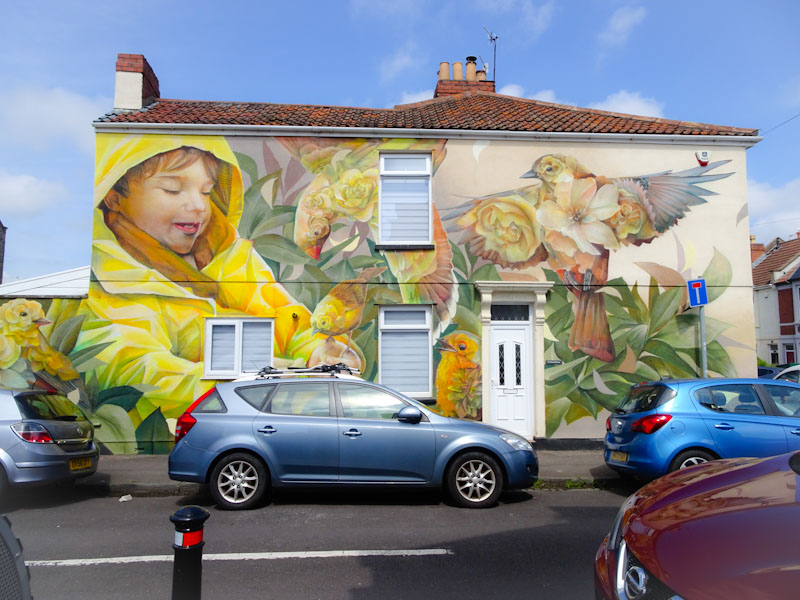
This piece, tucked away in one of the residential streets in Bedminster, is simply stunning. The owners of this property have been blessed with a magnificent piece of artwork to call their own and share with their local community.

The mural features a little boy in a yellow raincoat feeding a collection of yellow birds that are partially composed of flowers – a theme that lies at the heart of Curtis Hylton pieces. This combination of petals and feathers is so effective and creates a wonderful connection with nature.
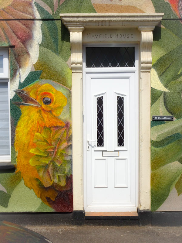
Next to the front door is a cheeky little robin painted in slightly more russet tones, but well-matched with the rest of the piece. This photograph will undoubtedly be making an appearance in Thursday Doors sometime in the future – a fairly ordinary door enhanced by its surroundings.

To the right of the piece is a beautiful finch with its wings spread out wide and its chest revealing a couple of roses and a magnolia flower. Amazing. This is a ‘must-visit’ mural from Upfest’s 75 walls in 75 years event, and I hope that it remains well beyond the usual one-year life cycle for these things.

All of this activity and the little boy watches on.
Ah! Sweet joy – another splendid piece from Bristol’s reliable and faithful Laic217. Of all the artists in Bristol, I think that the one that brings me most pleasure is Laic217, because I have been following his progress closely and watched him develop into a first class graffiti artist.
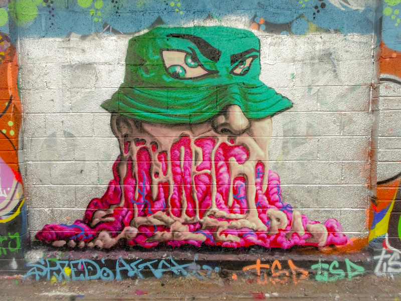
This classy piece on the M32 cycle path returns to a melting face theme that Laic217 was rather fond of a few years ago, but it is now embellished with so much more detail and technique. His name is concealed in the melting face, and there is a nod to his crew PAD too. The bucket hat has some slightly peculiar eyes peering through, and I love the way he has painted the ridges in the brim. Another wonderful piece from Laic217.
.
Determination
and I am brimming with pride
today she smashed it
.
by Scooj
Another debut on Natural Adventures – crumbs, there have been so many of those this year, it is no wonder that I am having difficulty with keeping up. This is a rather charming piece by The Mole, who come to Bristol for Eman’s birthday paint jam at the end of July.
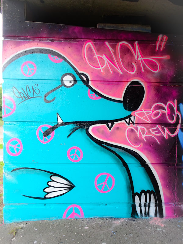
Naturally enough, The Mole likes to paint moles, and this one is sporting a rather fetching collection of pink peace symbols. The signature says Inca, and to give the artist his full name it is ‘Inca the Mole’. I like these kinds of megatag pieces, where an artist settles on a theme and then replicates it with variations. Lovely to see, and definitely not the last I will be posting from this west of England artist.
For a large wall, this one gets fairly frequent facelifts, usually, but not always, linked to Upfest. This time for 75 walls in 75 days, it is the turn of Philth and N4T4, and they have created something rather special.
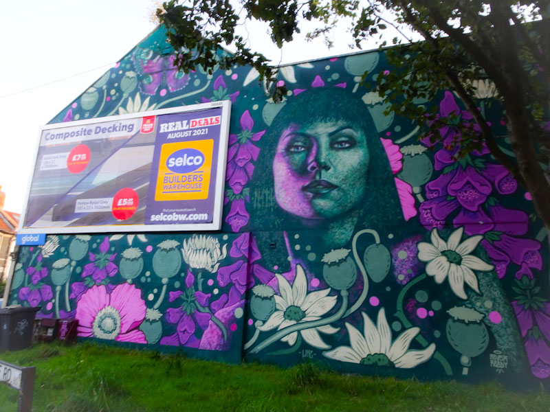
The two artists are no strangers to collaborating with one another, and indeed my first introduction to their talents was at an Upfest festival a few years back. In this mural, their work integrates really well, assisted by the colour palette both artists are using.

The portrait is by N4T4 and is typical of his work, where the face is composed of a whole load of tiny detailed patterns, in this case floral patterns. It is so clever the way he does this. Not so clever is the terrible photograph. I’ll have to go and take another one.
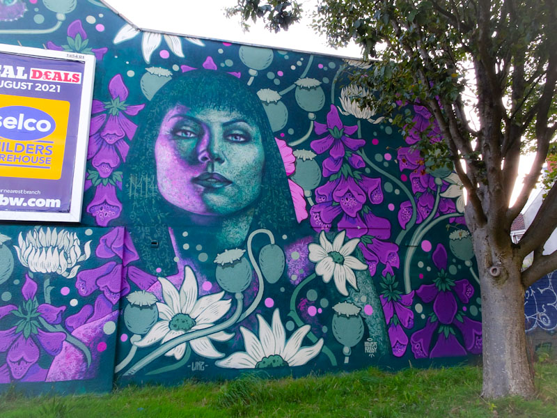
The extraordinary floral backdrop is by Philth and is surely inspired by William Morris wallpaper designs. Rich and sumptuous, the poppy heads, sunflowers, foxgloves and daisies make for a stunning piece, and it is amazing how powerful the whole effect is, being created with so few colours.
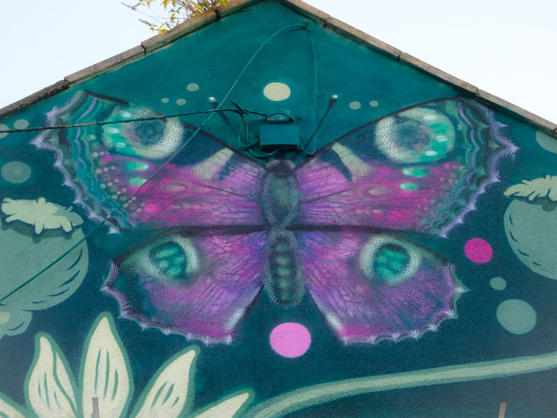
For good measure, topping the mural there is a butterfly which I think is by N4T4. The wing spots give this away as being a peacock butterfly, which again is superbly created using a limited colour palette. This is a joyful and uplifting collaboration that greets motorists on one of the busier roads in Bedminster and thoroughly deserving of its place on this premium wall.
This is a curious collaboration from painting pals CD.TC and Daz Cat. I don’t know why, but the whole thing doesn’t quite work for me. I love the work of both of these artists, so it is surprising to me when I see something that looks a little bit clunky.

The piece on the left is by CD.TC in which he combines his letters, in full caps, with one of his trademark monster faces breaking the letters up in thee middle. The monster is nicely done and the letter details and decorations well thought out.
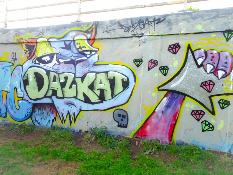
To the right is the Daz Cat contribution, and I think that this is where I have a bit of an issue. I don’t like the letters in the mouth, and I’m not too sure the paw clutching an arrow adds much to the piece. Also, the way that the two pieces join I feel is a bit average really. I can only put this down to Daz Cat having a bit of a bad hair day when he painted this, because it bucks the trend of some truly outstanding pieces he has painted recently.


