.
Prize for our planet
rewarding innovation
our planet the prize
.
by Scooj
.
Prize for our planet
rewarding innovation
our planet the prize
.
by Scooj
On the wall adjacent to the recent Irony piece that I posted last week is this Upfest 21 contribution from John Curtis, a well-known Bristol artist who seems to be as comfortable painting large walls as he is with his canvasses.

John Curtis’s USP is recreating Bristol urban landscapes, full of movement and light and chiming with locals because the subjects are usually familiar landmarks. This piece beautifully captures the M Shed and the old cranes that stand to attention on the harbourside.

This sight would warm the hearts of any native of the city and is beautifully captured. A fine contribution to the 75 walls in 75 days event.
This leaves me with only three more pieces to post from Upfest’s 75×75. Two of them I know about, but haven’t yet been able to photograph, but the last one evades me, so I am going to have to do some detective work before I can complete the whole set.
What you see is what you get from Merny (Morny). This is a fun piece painted in his illustrative style that contains little lines and points as if it were a set of instructions for an Airfix model or a diagram in a Haynes Manual.

In this piece it would appear that a story is unfolding of a nuclear family having a day out. ‘Dad’ is chilling and drinking a beer. ‘The kids’ are calling out “wait for me Linda!” And Linda (or mum) or dad are going on about parallel parking. I suspect that Merny based the concept on a real life event, but I have no evidence for that. All good fun though and wonderfully animated and vibrant.
.
One point five degrees
such a low aspiration
too much latitude
.
by Scooj
This wonderful portrait piece by Rosalita (Rozalita) is part of a collaborative effort with Conrico. Unfortunately, by the time I got to see it, Conrico’s contribution had been overpainted with a rather substandard throw up. Luckily, though, Rosalita’s piece was left intact.
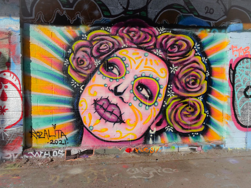
This is a Halloween piece, or more accurately a Dia de Los Muertos portrait, with a representation of a Mammacita (Conrico’s word, not mine). The decorated face with stitched lips is a familiar sight these days, as these Day of the Dead festivals become more internationalised. The roses in the hair round the portrait off nicely. Rosalita just keeps on turning out these amazing portraits.
Although I haven’t posted much from Turow for a while, he is still churning out his work pretty regularly and switching it up as he goes along, as you can see from this rather different stylised block writing piece.
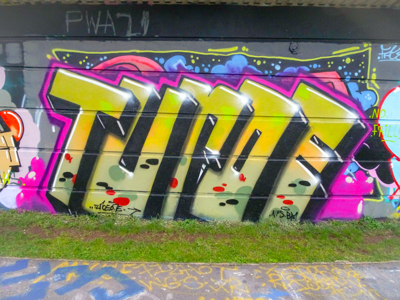
Looking like ancient monuments on the lean, these large golden letters with a pink border certainly stand out, and the white line and shimmer across the top of the letters helps to create a nice 3D illusion. Some interesting little blobs across the bottom add a stylish finishing touch. Another one for the gallery.
Recently, at the top end of City Road, there has been a whole bunch of new painting going on for the launch of Stoked Food, an ethical food outlet in Stokes Croft. Among the wonderful fresh new pieces is this quirky piece from one of my favourite artists, Maesyhook.

Perhaps better known for her Kawaii style, this is something altogether a little more surreal from Maesyhook. The portrait, in black and white, looking like a giant stencil, is overshadowed by a large cloud with an eye and shedding pink raindrops and fork lightening. The purple heart choker just adds an element of interest. Unusual, quirky and fun.
I happened to meet Eman (Werm) yesterday down by the river, under Brunel Way, and mentioned to him that I had lined this piece up to publish today. We spent a while discussing his array of styles, but he said he has moved away from this spiky, complex writing to something a bit more blocky.
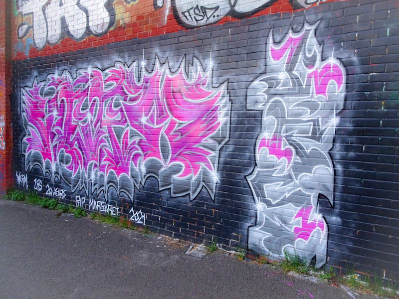
I am always full of admiration for writers who produce such complex work, it seems utterly baffling how they go about it, but I guess that is where the hours and hours of practice come in. The main body of writing spells out WERM, which is the name Eman is now painting under, and to the right are the letters LRS, which is the crew Eman belongs to. All very nicely executed and a great addition to his incredibly varied portfolio.


