.
Blankets laid in the
last of the afternoon sun
casting long shadows
.
by Scooj
.
Blankets laid in the
last of the afternoon sun
casting long shadows
.
by Scooj

This post is a quick nostalgic trip down memory lane comprising three wonderful pieces painted in Dean Lane, photographed way back in May 2019, that inexplicably weren’t posted at the time. The first is by Dasco, whose short time in Bristol saw the production of several outstanding pieces, you can see his gallery here.

Taboo has long been a favourite on the pages of Natural Adventures, and here is an old one in monochrome, complete with skull and right ball. Nice stuff.
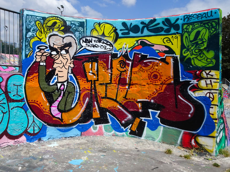
Somehow this fabulous Biers piece missed the boat back in 2019, and I guess it was in a sense it was a prediction of things to come. ‘Nigel Farage – snake oil’ it says, and it isn’t wrong. The Clacton MP still hasn’t set up office in his constituency since the election and hasn’t held a single surgery, but then I don’t think anyone in their right mind would have expected that from the uber-opportunist.
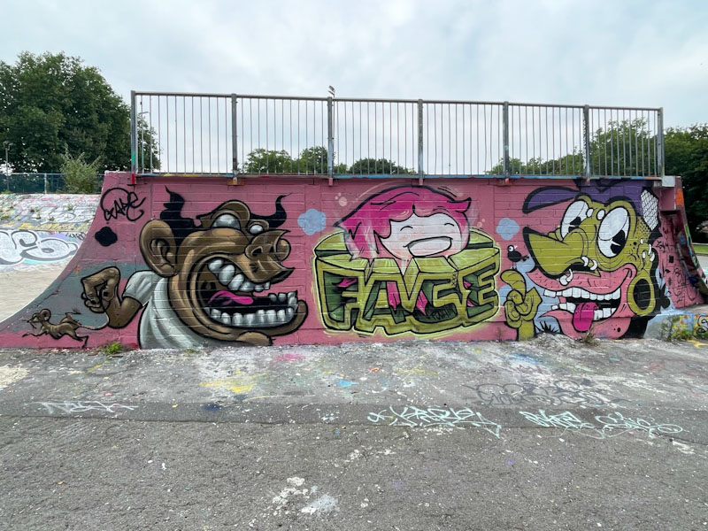
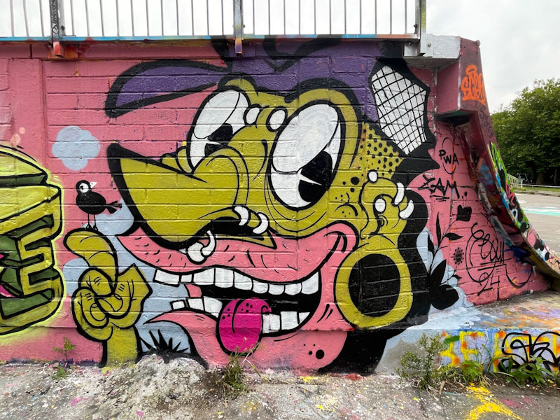
When the PWA boys get together, you often end up with something quite quirky, and this fine collaboration from last month is an peculiar as they come. This piece on the bricked up rear of the large ramp in Dean Lane skate park has been decorated by Zake, Face 1st and Chill.
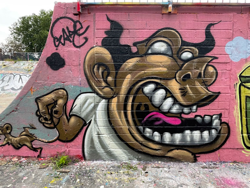
Zake has been pushing the boundaries a lot with his cartoon portrait pieces lately, and this crazy character is no exception. Big teeth and wild hair generate a sense of madness in this character, which is further exaggerated by the lack of pupils in the eyes. Adding to this sense of the unhinged, yer man is holding onto a rat by its tail. Weird fun.
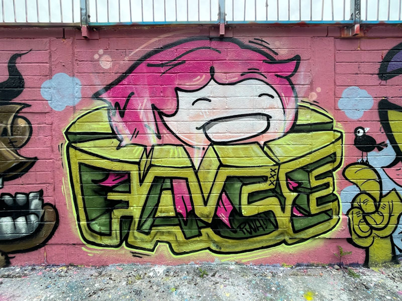
The centrepiece is beautifully occupied by a classic piece of writing and character combination work from Face 1st. His letters are in a 3D block style, topped with a giggling girl character that we have come to know and love.
Rounding off the wall is a cartoon character complete with detailed fine lines and coloursul solid fills. The character is a nicely observed caricature of a young man with a baseball cap, short back and sides and plenty of piercings. A little bird sitting on the forefinger of the character rounds things off nicely. As ever a fine collaboration from this threesome.

The Muriel Alleyway mini street art festival organised by Rtiiika at the end of July was a perfect opportunity to see the work of artists that tend only to make occasional appearances on Bristol’s streets. This piece is a lovely collaboration from Rtiiika and Mr Penfold, right at the bottom of the alleyway.
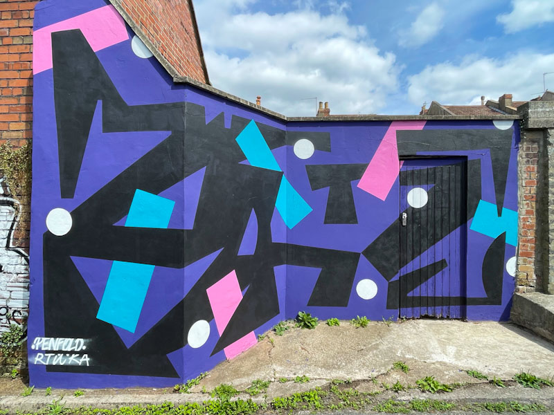
The piece is a true collaboration, a fusion of the styles of the two artists to create a whole which presents their work as one. The black bits are most likely by Rtiiika and the pink and blue bars and white spots by Mr Penfold, but actually it matters not, because the piece is by both of them. A fine abstract mural, showing off the huge spectrum of styles we see in the city.

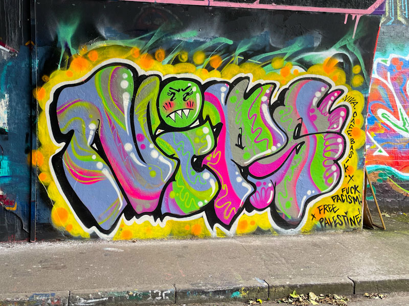
One of the more productive writers in Bristol over the past year has been Noise, whether painting alone or collaborating. Noise has settled into the Bristol scene seamlessly and feels like part of the furniture, even though I only really became aware of his work in the summer of 2023.
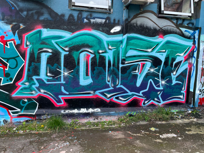
Noise generally paints quite large, expansive letters, and this time he has had to squeeze his letters into a fairly compressed spot and has managed pretty well. The fills in the letters are worth a closer look, with the lower fills looking like greeny-blue clouds and the upper fills cold and frosty icicles. Definitely time for a Noise gallery.
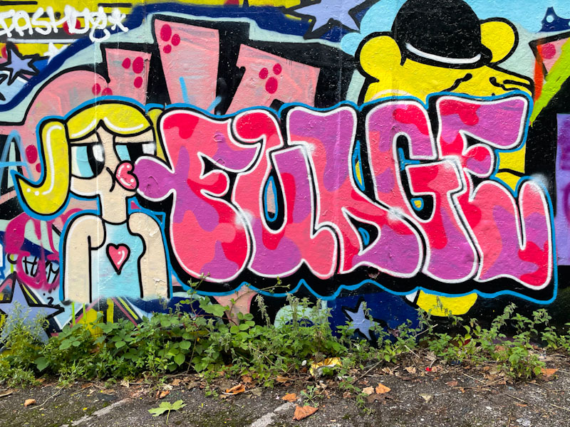
Ooh, it looks like we have another writer on the streets in Bristol, possibly two, and the subject of this post is Fudge. I think I may have spotted her getting ready to paint this piece (slightly controversially covering up Haka’s wonderful Pooh Bear piece, but I think she is new in town, so that is ok), with a friend (Mare?), but as they didn’t have any paints out of their bags, I didn’t approach them, because that might have seemed a bit weird (one of the challenges of being a white male of a certain age, I’m afraid).
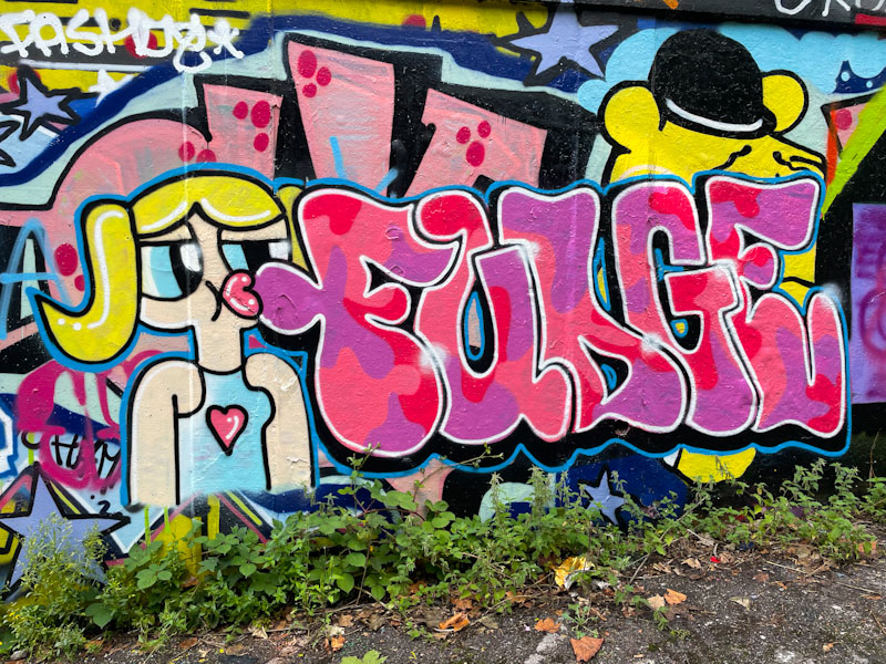
I have to say that this combination piece ticks a lot of my boxes. Full of fun and joy a large-eyed character appears to be blowing a bubble gum FUDGE, or at least pursing her lips are pursed in the direction of the letters. The character is well drawn and the letters, fills and borders indicate a certain amount of experience. I am very much looking forward to seeing more from Fudge, and have at least one other piece ready to post.
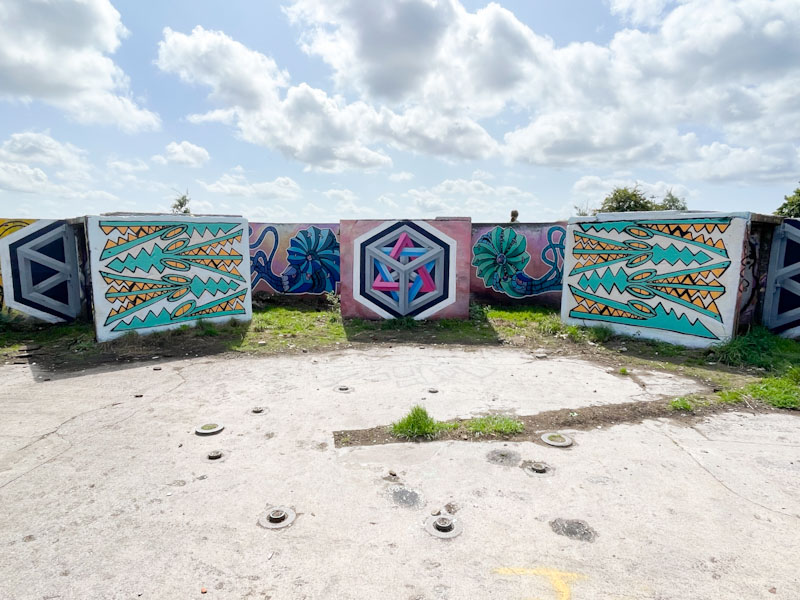
You don’t expect to see production collaborations up at Purdown, so it was wonderful to see this ‘take-over’ by Rowdy, Acer One and Andy Council on the concrete slabs of the derelict anti-aircraft gun emplacement. The light conditions were tricky on both occasions that I went up there, and the photographs don’t really do justice to this creative display.
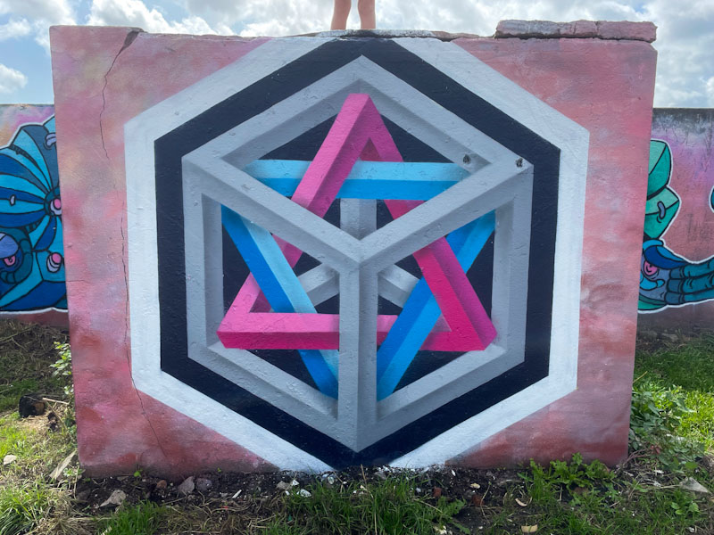
Starting in the Centre and on the margins, Acer One has painted one of his mind-boggling impossible triangle pieces, displaying great technical skills and accuracy. This is the third such piece I am aware of that he has painted in this spot.

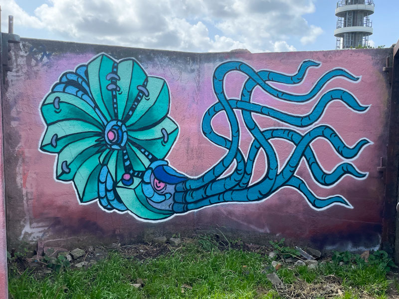
On either side of Acer One’s centrepiece, Andy Council has painted his trademark ammonites in living-fossil form, each using his composite method to stitch together the creatures from components to make a whole. The dusky pink background used by Acer One and Andy Council works very nicely with their respective colour schemes.
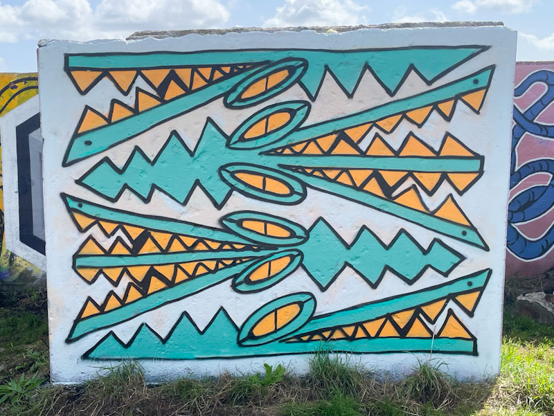
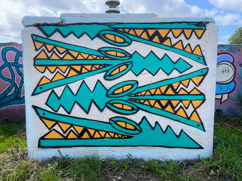
Finally, bookending the collaboration, Rowdy has joined in the fun with a fabulous collection of Bristol crocodiles. More than any other active artist in Bristol, I think that Rowdy represents that raw, quirky, subversive and original talent that underpins the whole graffiti/street art scene in the city, and long may it last. This is a fabulous production piece from the trio of great artists.
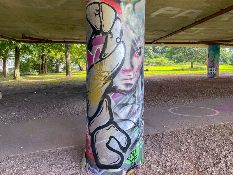
This rather delicate column collaboration from Jee See and Annika Pixie is the second from the pair that was painted over a period of a few days. Difficult to photograph, as all rounded columns are, you can just about make out the letters SEISMIC painted by Jee See and a feint portrait, that looks like it has been painted over from Annika Pixie.
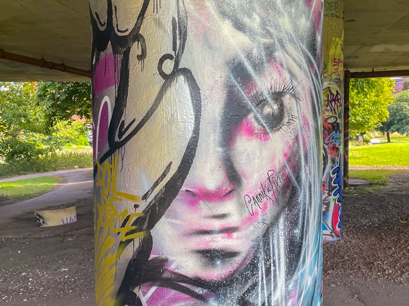
The portrait is full of mystery and has a rather sad expression, or distant look about it. There is a blur to it as well that gives it a hurries snapshot or selfie feel. Annika Pixie’s work is always ephemeral, and leaves one wanting to know more. It is good to see these two out painting the streets after a very long quiet period.

I can’t explain why, but there is something that I really like about Nips’ graffiti writing. She first came onto my radar less than a year ago, but in that time her colourful and characterful work has really grown on me. She is an artist I have not yet met, but look forward to doing so some time and asking her about her work.
While Nips tends to keep her letter style fairly consistent, it is the fills where the magic happens, and in this piece she has created a stunning kaleidoscope of colour and patterns. A simple bit of background patterning and a drop shadow help the piece to stand out, along with some white highlighting in the letters. This is a notable piece from a creative writer.

Recently I have become more organised and started writing my blog posts the day before, giving myself a buffer if things get a bit tight before I start work. So far this revised approach seems to be working really well. What it means is that I wrote this post yesterday and that any references to weather or the news might well be a little out of kilter. However, I am pleased to report that it looks like we will be having a bit of a dry spell in Bristol for the next week or so, and Donald Trump continues to be weird.

I don’t think that I post nearly enough pieces by Mr Two Gram, and Desi seems to have had a slightly slower summer, so it is great to be posting this collaboration from them. Desi presents her letters in a uniform style, filling them with a patchwork of greens, blended in a ‘paintbrush’ style. A generous smattering of pink hearts finishes the piece nicely.

Mr Two Gram has painted a fair bit over the summer, but inexplicably I haven’t posted much of his work. I might need to do a trawl at some point and present a mini-gallery of his work. His letters are consistent in form and here spell 2GRAM and his fills composed of blues, purples and magenta. The piece is tight and the collaboration modest, tucked away on a wall with little footfall. Great work from the pair.


