.
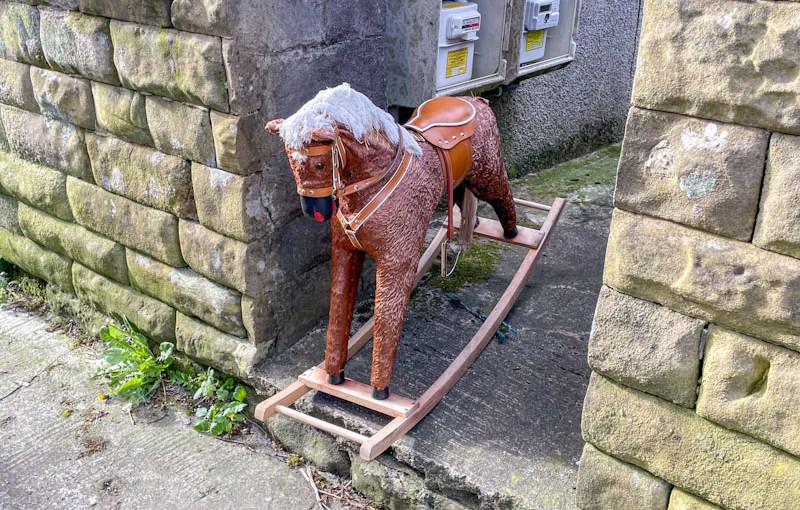
Bedraggled, unloved
and surplus to requirements
second life awaits
.
by Scooj
.
Bedraggled, unloved
and surplus to requirements
second life awaits
.
by Scooj
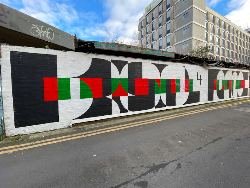
I don’t get to visit this spot all that often, but in fairness neither do many artists, so what gets painted here tends to last a reasonably long time, and although I photographed this beauty by Acer One back in January this year, I think it had been painted some time before that.

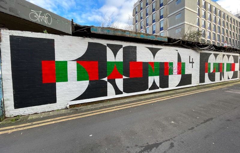
The piece is obviously a protest statement about the war in Gaza and a powerful reminder of just how long innocent Palestinians have been suffering for since Hamas attacked Israel on 7 October 2023. When I think about what is happening over there, my head bursts, and like so many people I simply want the suffering to stop.
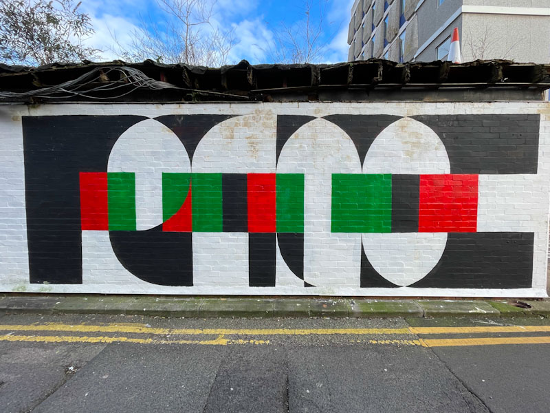
The letters spell out BRISTOL 4 PEACE, speaking loudly and clearly to the people of Bristol. The letters are beautifully designed and cleverly concealed, and the incorporation of the colours of the Palestinian flag speaks for itself, really. A fine piece of commentary art from Acer One.
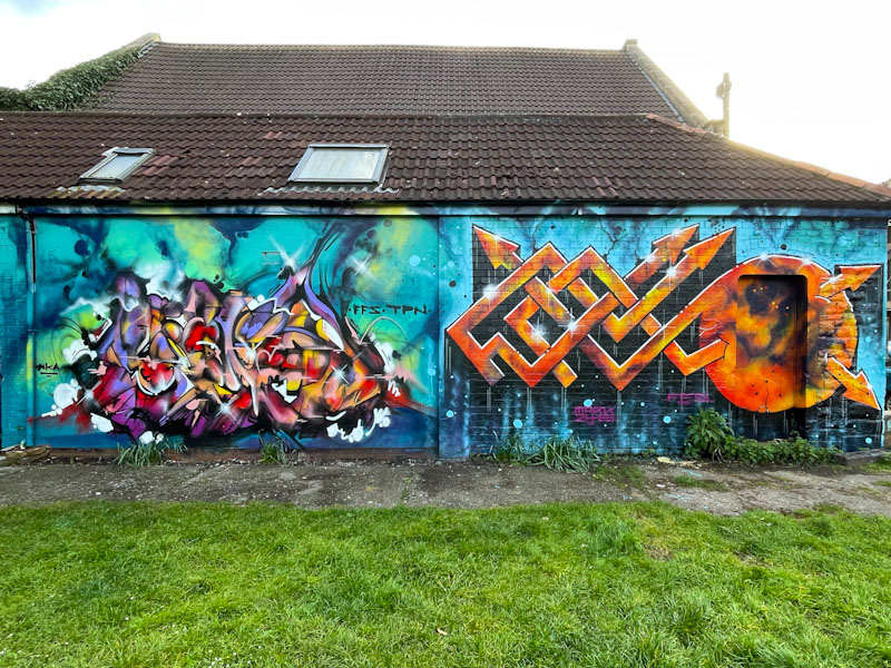
Those boys have been smashing it lately, and by those boys I mean Kid Krishna and Marckinetic. It doesn’t seem to matter what spot I go to, with the exception of Dean Lane, I can usually expect to find something from this pair. And this one in the green adjacent to the Star and Garter in Montpelier/St Paul’s is an absolute beauty.
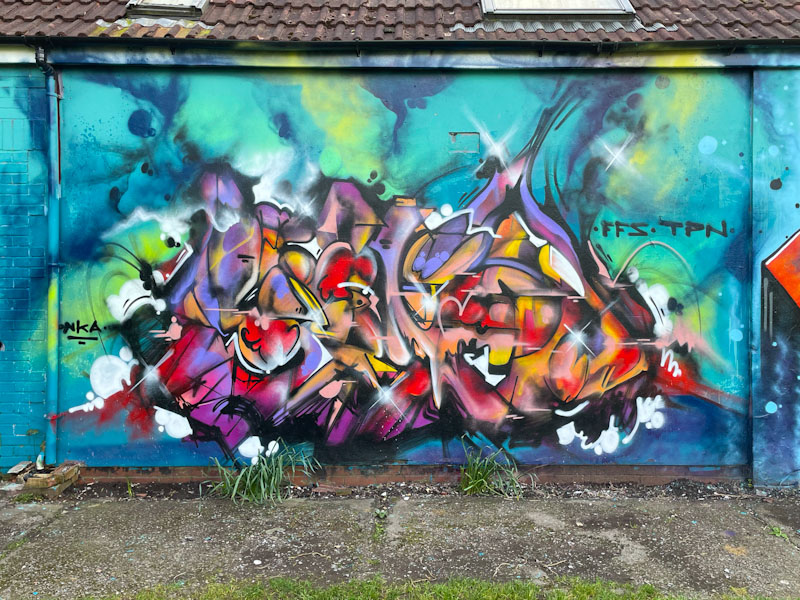
Kid Krishna is a prolific artist once he is on a roll, but can be prone to stopping altogether for a while… it can very much be fits and starts from him. This one is a cornucopia piece, so full of wonderful colours and movement, it almost feels like the whole thing is swirling around in front of your eyes. This takes abstract writing to another level and verges on the trippy. The focal point of this organic ball of colour is perfectly offset by the atmospheric cosmic style background. This is truly wonderful work from Kid Krishna.

Next to Kid Krishna is something a little more formulaic, but only by comparison, by Marckinetic that highlights his unusual approach to writing the letters FFS (I think). The characteristic long straight letters are interlocked and slightly juxtaposed with the circular element at the end. His cosmic fills are sensational and like Kid Krishna’s piece the letters contrast perfectly with the background. Long may this purple patch continue.
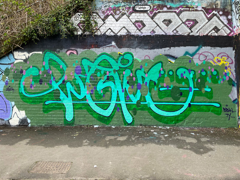
Logoe has been visiting Bristol again recently, and that generally means that he painted several pieces over a weekend. Unfortunately this time I goofed up some of my photographs and on returning to the pieces they had already gone. Not to worry though, he is so prolific and this is the first of a few posts from his trip earlier in the month
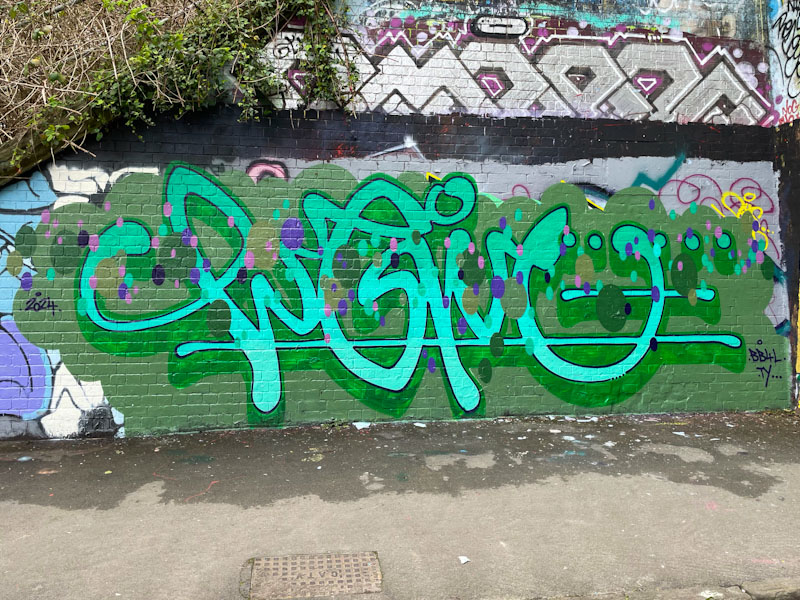
This is a particularly fine example of his work; beautiful, clean script writing, spelling out LOGOE in turquoise, set on a grey-green background. He has painted a subtle patterned green drop shadow, that complements rather than dominates the writing. No contemporary Logoe piece is complete without a string of oval spots running through the middle of the writing. All great stuff.
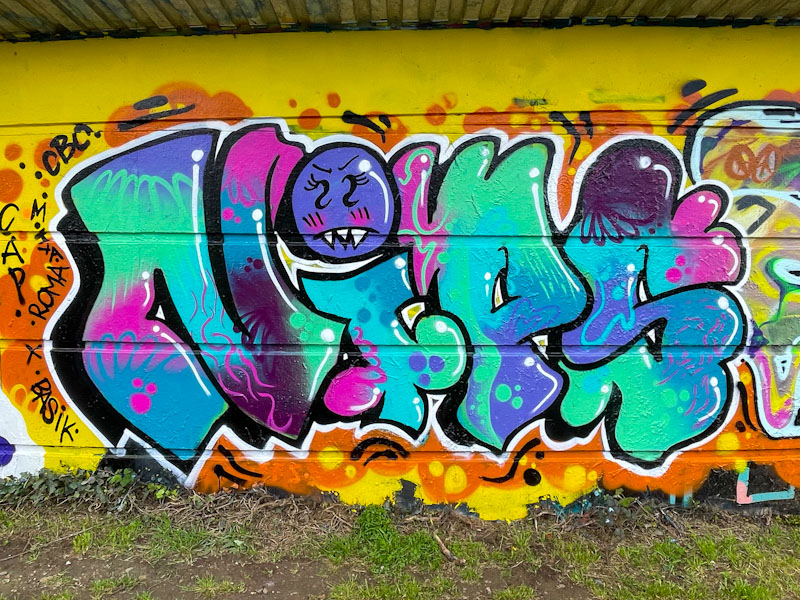
Although she has only relatively recently come under my radar, Nips is a definite favourite whose work I always feel pleased to see. I often wonder whether I would be able to identify writers’ work if they didn’t use their customary letters, and the truth is I don’t know, some have a style that is easier to recognise than others. I would like to think that I would always recognise a Nips piece even if other letters were used.
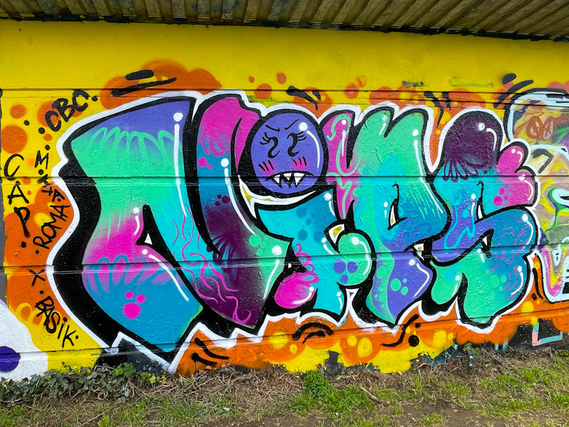
Nips’ graffiti writing here has used a wonderful palette of colours that work incredibly well together and, as ever, her fill patterns and ideas are superb. The character ‘dot’ on top of her ‘i’ is one of the identifying features of her work. This is a great piece that stands out well from the noise of the messy background wall.
Doors 262 – Doors from Highgate, London, November 2023 (Part I)
Last November I went to London to visit one of my uncles who has been rather unwell. He lives in Highgate in North London, where I lived for much of the first eighteen years of my life. After paying my uncle a visit, I thought I’d nip up to Highgate Village which was once so familiar to me when I was growing up, and where I went to secondary school.
Of course when I lived there I never really took in the special place, the architecture and of course the doors – I think appreciation of doors is something that comes with age. This post is the first of several selections of doors that I managed to snap in the space of an hour, before a rapid retreat back to Bristol. My uncle, in case you are wondering, is recovering well albeit quite slowly. I hope you enjoy this week’s selection:
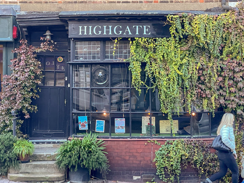
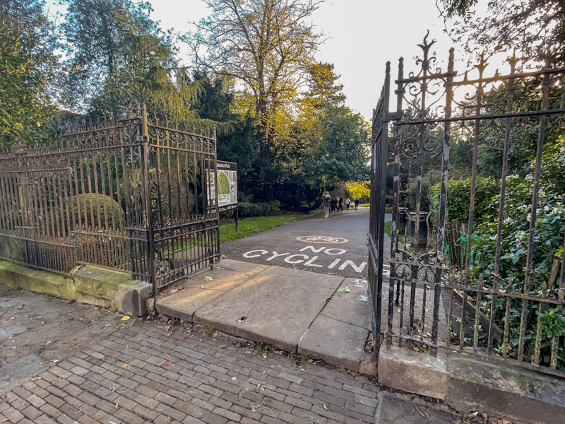

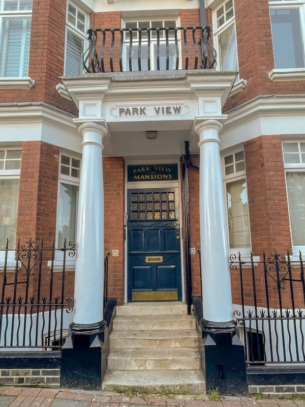
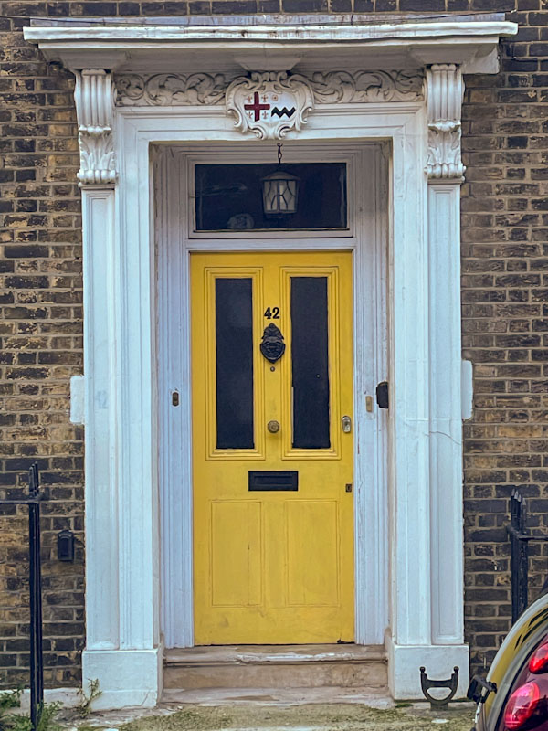
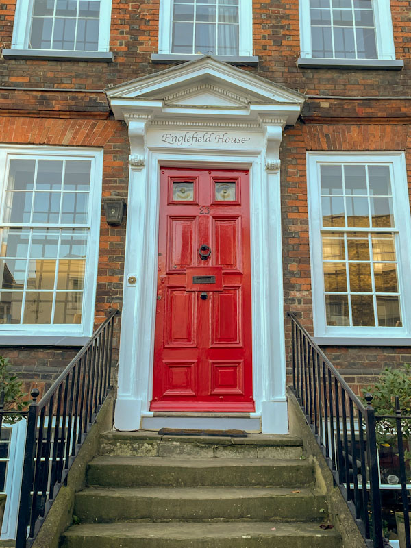
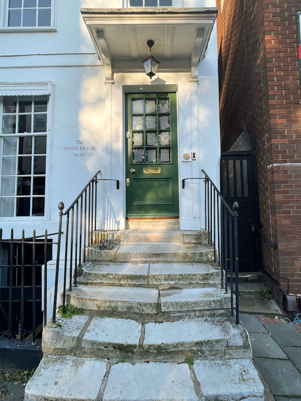

Spending time in Highgate and writing this post now fills me with nostalgia. There will be plenty more doors to come from Highgate in the next few weeks. May I wish you a very happy weekend.
If you have made it this far, you probably like doors, and you really ought to take a look at the No Facilities blog by Dan Anton who has taken over the hosting of Thursday Doors from Norm 2.0 blog. Links to more doorscursions can be found in the comments section of Dan Anton’s Thursday Doors post.
by Scooj
.
Oak, cherry and elm
I’ll be pushing up daisies
before they mature
.
by Scooj
• after a day spent planting trees on a hillside in the Peak District National Park
By the time this post is published I will be half way through a team away day in Derbyshire, planting trees. I have to leave right now so that I am not late for my lift.
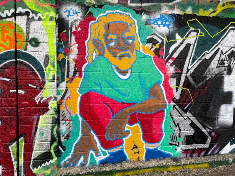
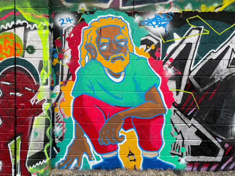
This is another magnificent piece by Bean whose Easter break return to Bristol has been both productive and seen some real improvements in his work. I love the character’s hair in this piece. Norma’s service resumes tomorrow I hope.
I don’t do this too often, but I forgot about today’s posts until just now (8.42am). I have a lot on my mind. I am in Buxton in Derbyshire with work. Today’s posts are going to be super-short.
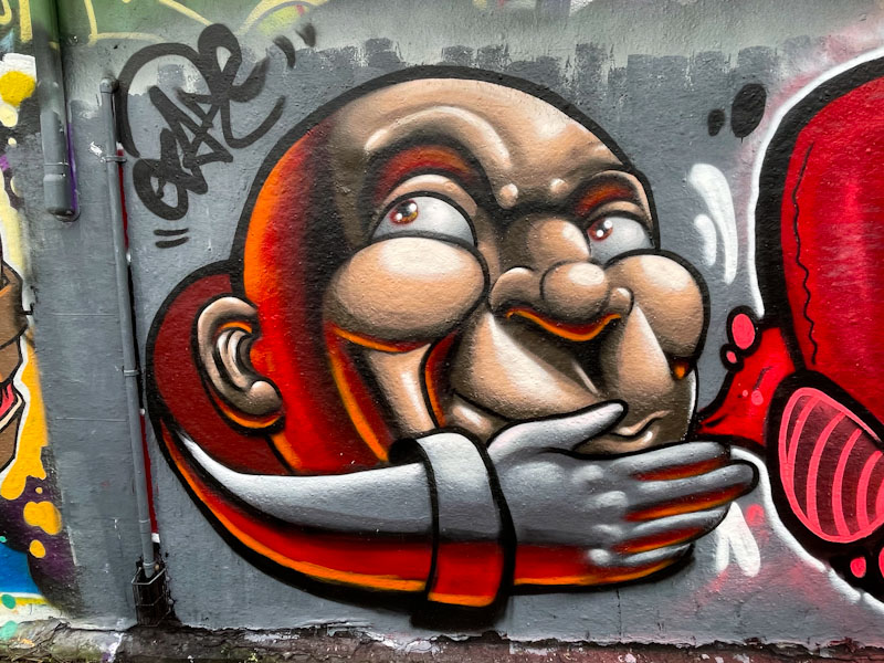
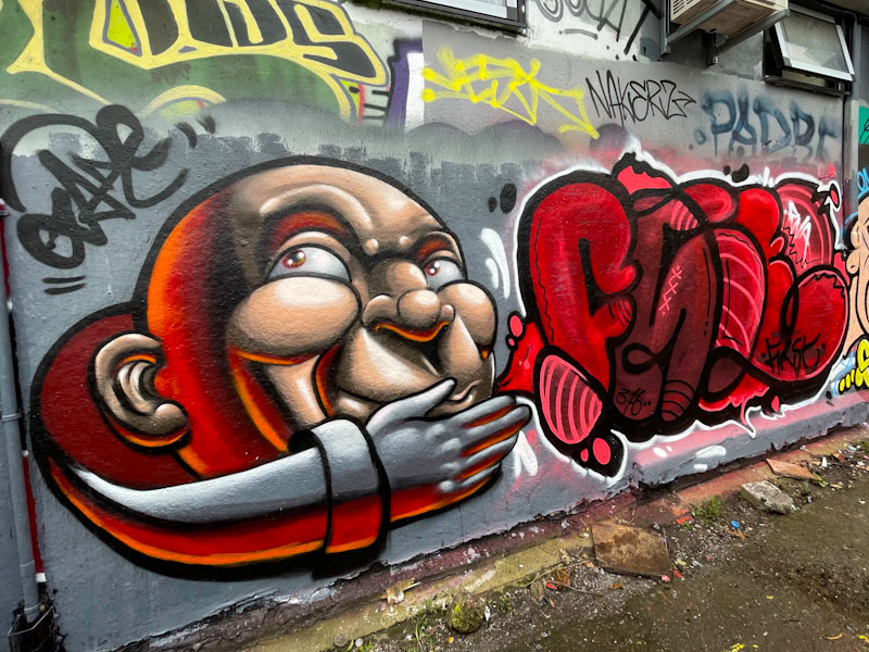
A brilliant pairing of Face 1st and Zake from the PWA crew. Zake smashes it with this gorgeous cartoon portrait full of texture and depth.
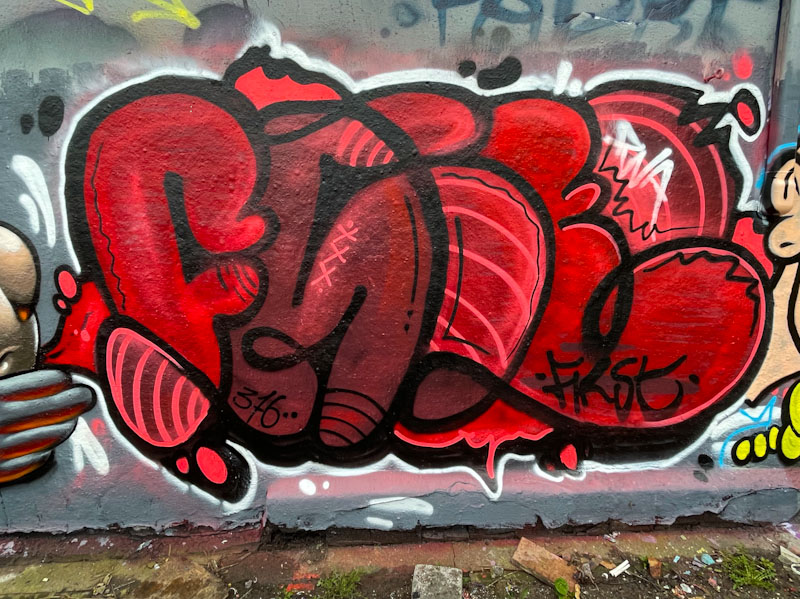
The writing from Face 1st is a little unusual but nonetheless captivating. Spelling out FACE and no smiling girls this time.
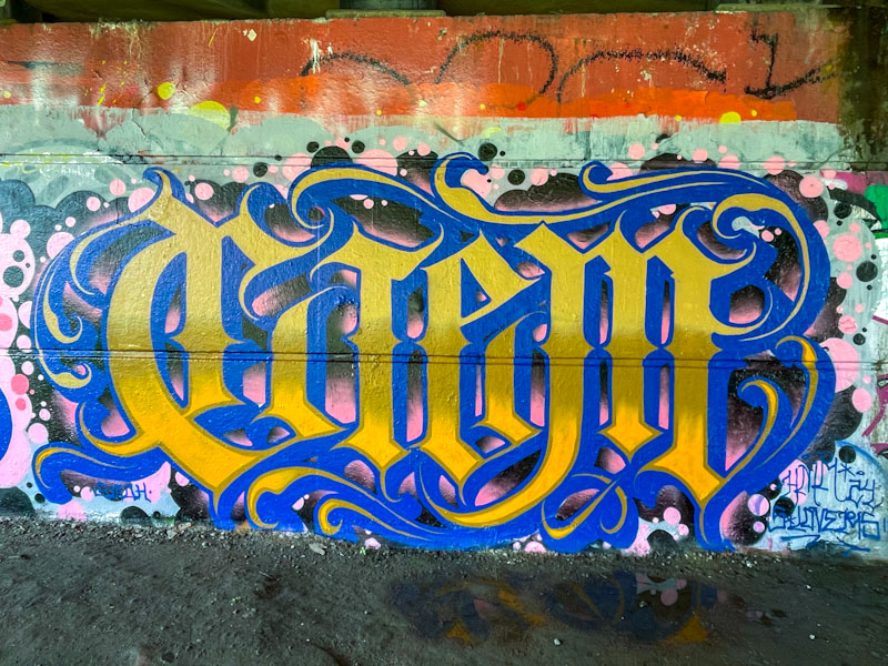
We are blessed in Bristol with having not one, but three calligraffiti artists, each bringing their own take on the style. The three are Stivs, Wxttsart and Todoaciem. There may be others, but if so, they are a little under my radar. This outstanding piece under Brunel Way was painted beneath Brunel Way, next to a piece painted by compatriot Pura Decadencia (to come).
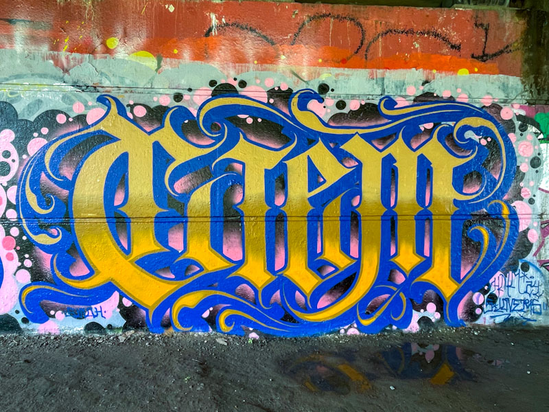
The letters spell CIEM, as you might expect, but what is really special here is the additional decorative scrolls on the edges of the script, creating a wonderful flourish. The colours blue and gold give it a regal look that works surprisingly well on the backdrop of black and pink spots. This is a top piece of calligraffiti from a confident and technically very skilled artist.


 Natural adventures