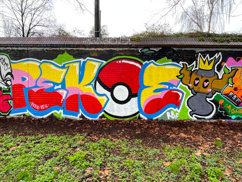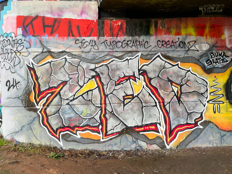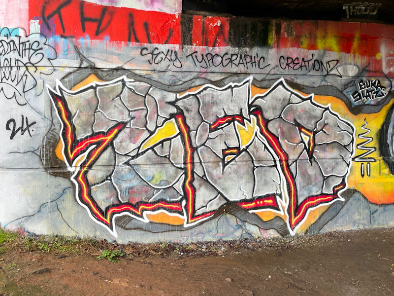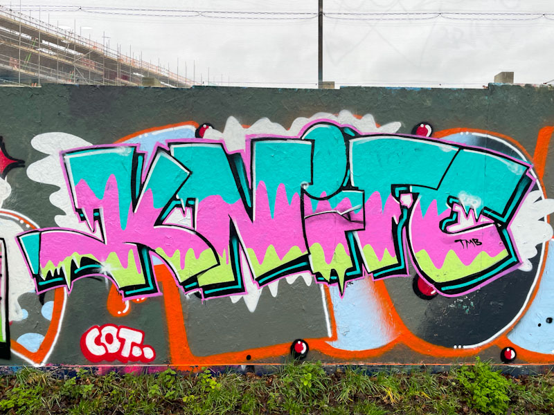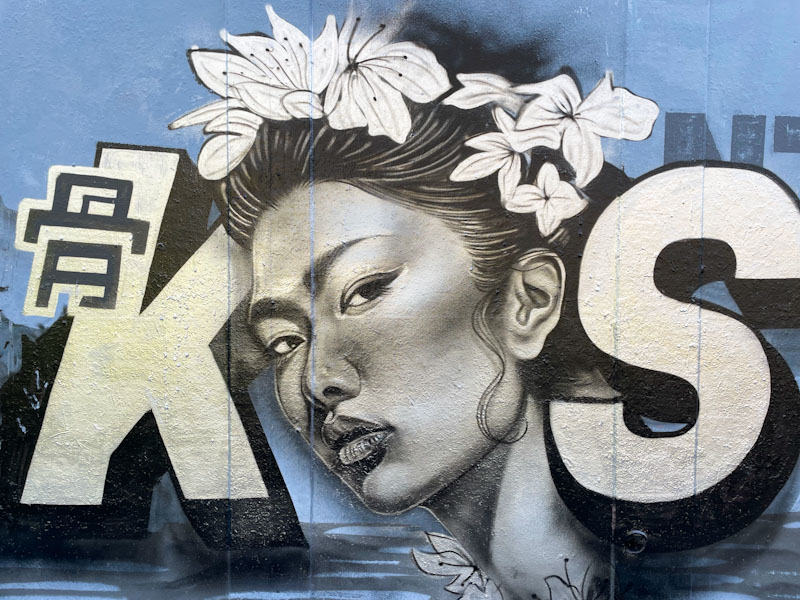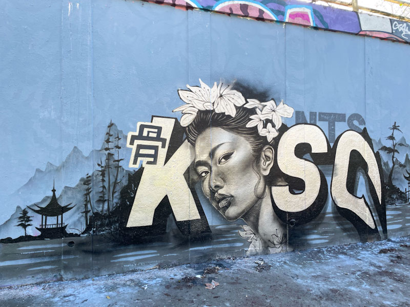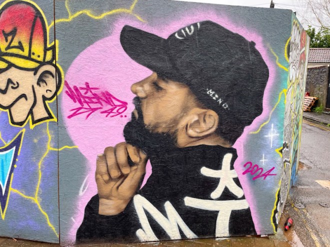
Hoardings are irresistible to street artists, graffiti writers and taggers alike. They provide a safe and clean canvas, temporary in nature, for spray paint creativity, and Mind 49 has grabbed the opportunity to decorate this hoarding in Church Road with both hands. Mind 49 is making a big impact on the street art scene in Bristol, and his portrait pieces in particular are turning heads all over the city. I am guessing from the frequency of his new work that he must have moved to the city, or in the neighbouring area.
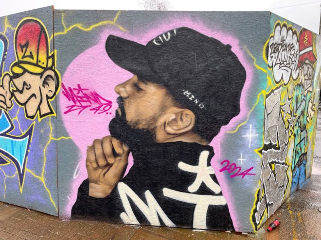
The portrait is really striking, and his style is fascinating. It is not photorealistic, but is representative. His can control though has a paint brush quality that is softer than the harsh crispness of photorealism. This is a really great piece, and he appears to improve each time he hits a wall. I am looking forward to seeing where he takes us in 2024.