.
Sandy grey stonework
catching shards of morning light
in Aquae Sulis.
.
by Scooj
.
Sandy grey stonework
catching shards of morning light
in Aquae Sulis.
.
by Scooj
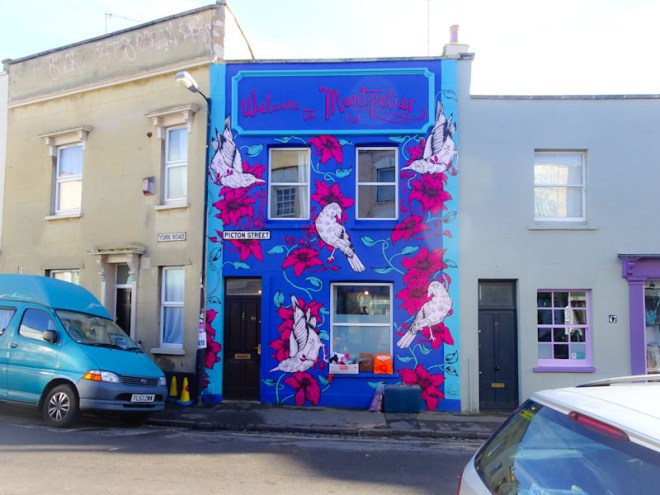
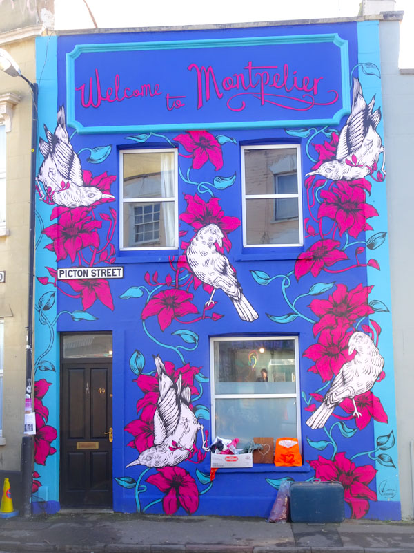
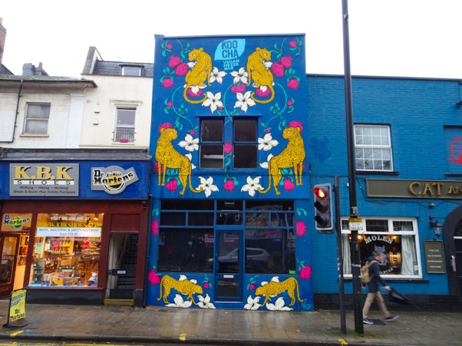
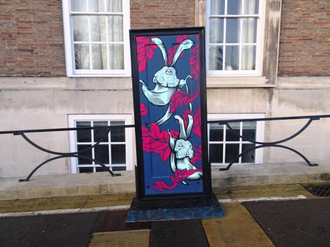
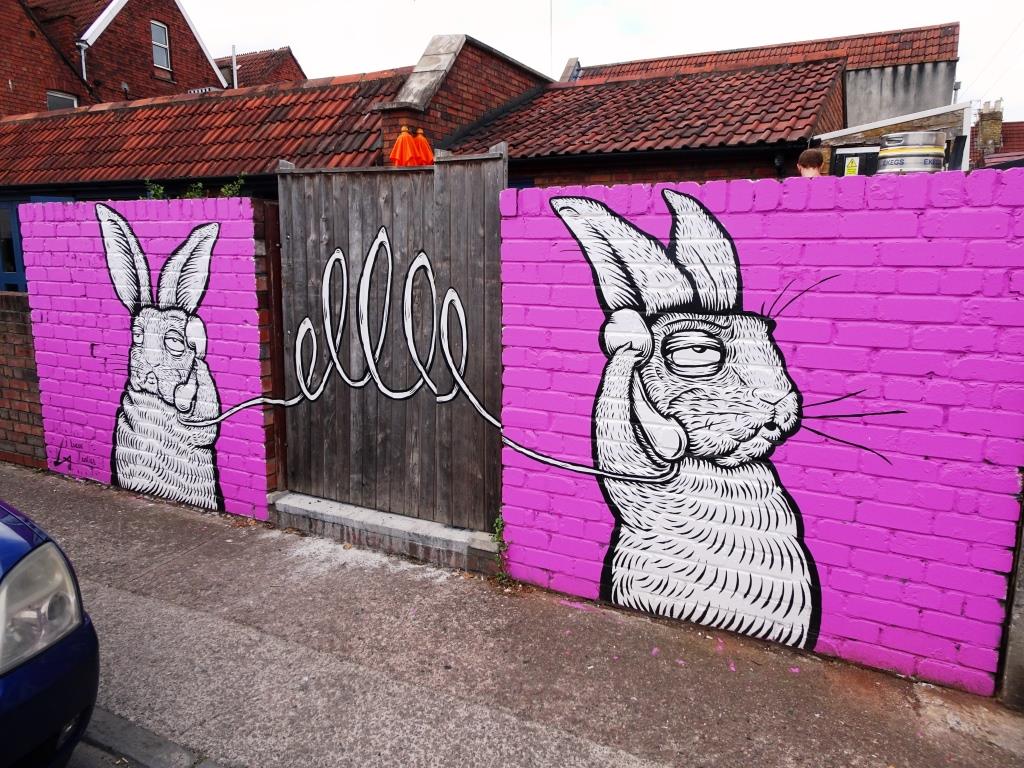
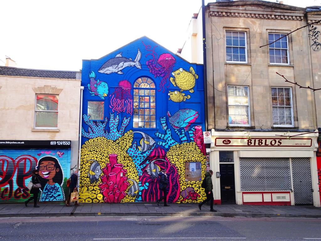
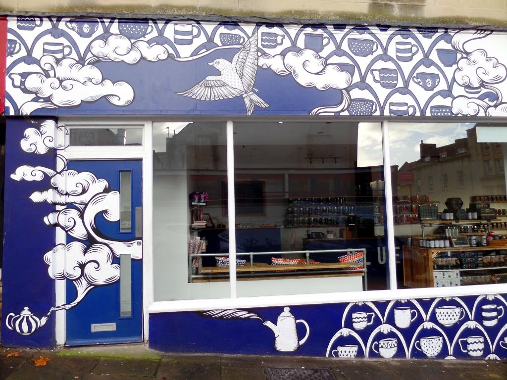
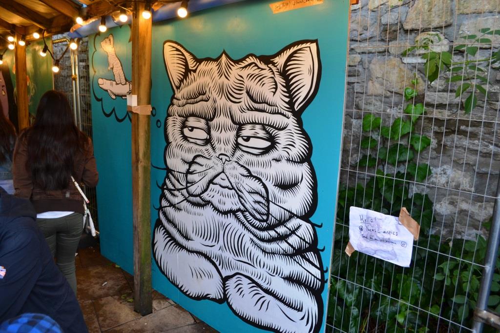
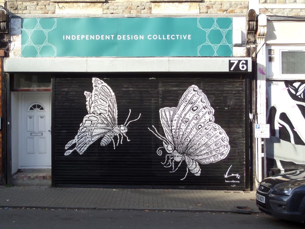
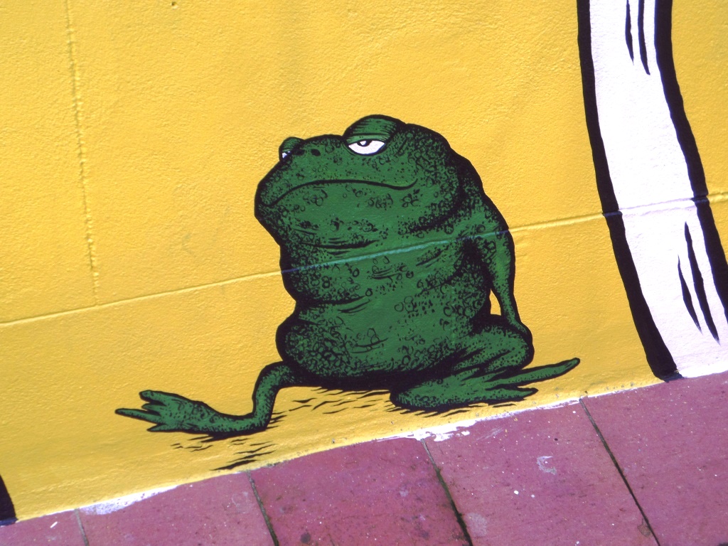
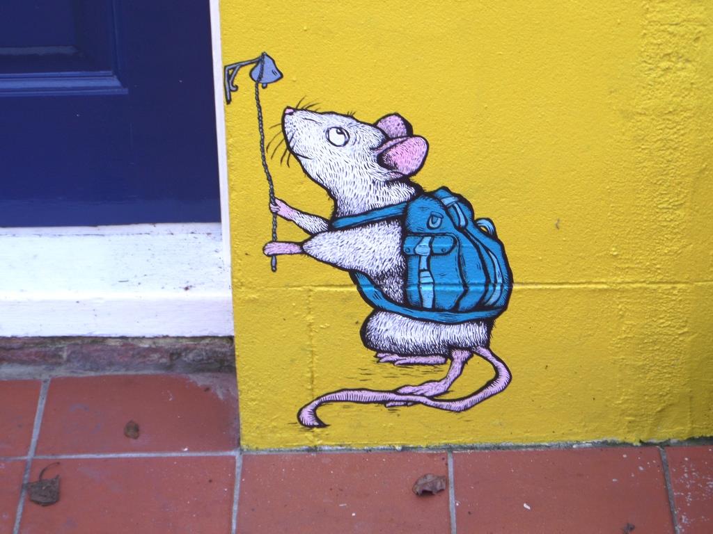
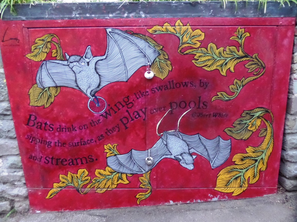
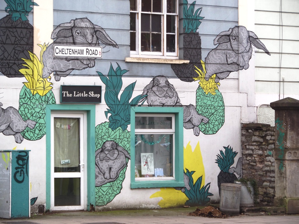
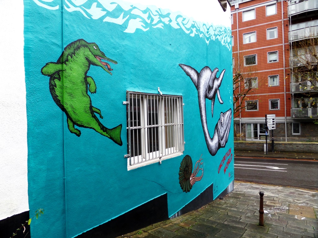
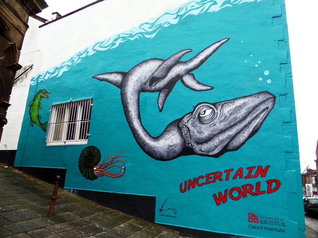
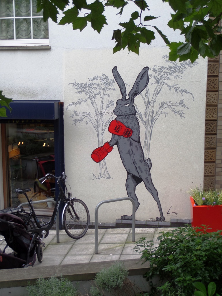
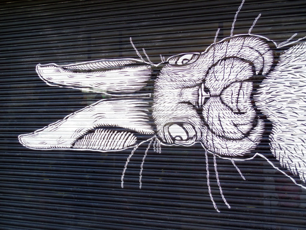
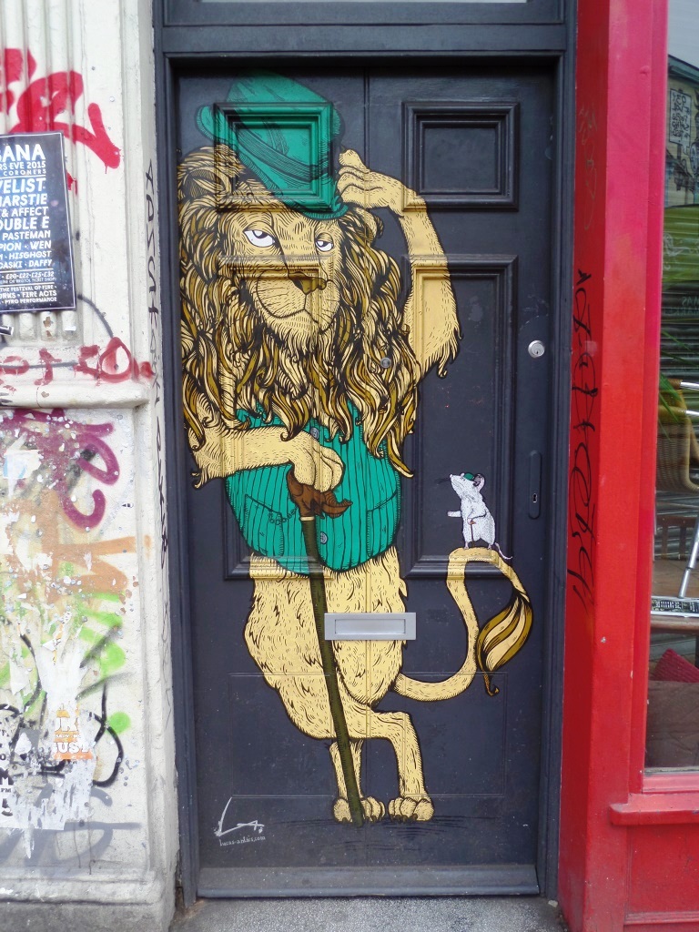
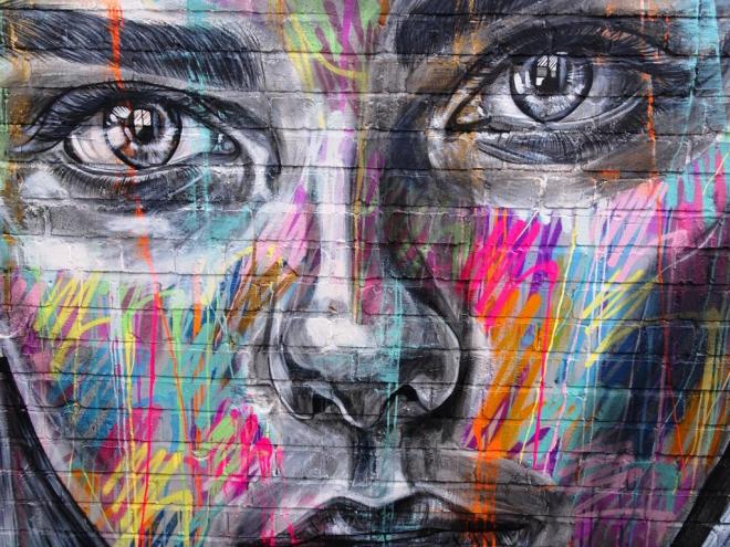
A gallery of murals from Bristol illustrator and artist Alex Lucas
All photographs taken by Scooj


Atmospheric shift
barometric pressure high
a fine week ahead.
by Scooj
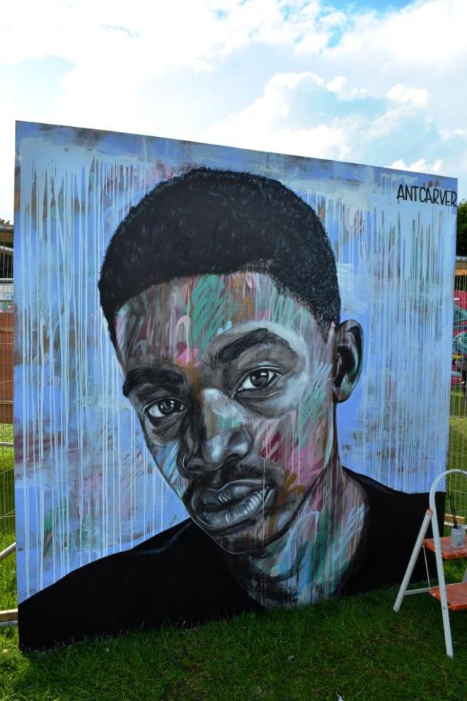
I always enjoy seeing the evolution of a piece of artwork, and Upfest affords the perfect opportunity to see artists at work and follow progress from cradle to grave. Of course this does depend on being in the right place at the right times, and I got lucky with this outstanding piece by Ant Carver.
The first stage of this work was to give the wall a splash of colour and texture…the first layer. A mask was then applied to create a draft of the eyes, nose and mouth in isolation from the rest of the work, a little bit like a stencil.
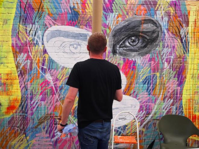
Once the draft of the eyes, nose and mouth had been added, Ant Carver got to work on the detail, using greyscale for these features. The skill of the piece is in blending all these layers to create a wonderful effect of the separateness and togetherness of greyscale and colour and the strength of detail in the features and vagueness with the rest of the face…very clever work.
I managed to get a couple of slightly poor pictures of his work at Upfest 2017, so it was nice to be able to get this series of slightly better pictures this time round. A memorable and unusual piece.
There is one artist in Bristol whose work manages to attain higher levels each and every time I see it. It is of course Voyder who I have raved about many times in this blog before. At Upfest 2018 he really pulled out all the stops and painted this outstanding piece. Is there no end to his talent?

This new wall for Upfest was in my view an unquestionable success and gave some bigger ‘permanent’ space for artists who can go big. The cars in the picture above give you a feeling for how big these pieces are.

Voyder is probably best known for writing his name in a variety of styles, but always utterly recognisable as his work, which reminds me I must do a gallery of his work when I have a bit of spare time.

It is difficult to get across how good this piece is, both technically and in its clever subject material. I would take a long shot and guess that this is a self-portrait composed of three main elements: his faceless upper torso; a brown brush stroke of paint across his face; his familiar signature. This makes for at least three very different textures to the piece, each of which would be able to exist alone.

The hands are beautifully worked and full of expression – I have not seen much of this kind of work from Voyder before although I know he has painted portraits before. The brown brush stroke is something he has been playing with for the last couple of years and appears in many of his pieces these days. I am told that the fill in the Voyder signature is a backdrop to a design screen. To cap the whole thing off nicely we have one of his trademark neon lines running through his name. A heavenly piece from this master of Bristol street art.
Unconscious bias is a curious beast, but it lurks in each of us in one form or another. One expression of it in me is the assumption that street artists are male unless they are not…if you see what I mean. I have made some terrible gender assumptions in the past with T-Rex, Skor85 to name just two, and so it was with Zabou. I have seen her work in London, but automatically thought she was a he. How glad I was to actually see Zabou at work during Upfest and to be able to write this post without falling in to the trap of gender assumption.

To their credit, the organisers of Upfest do not ask for the artist’s gender on the application forms for entry and so never quite know what the gender mix will be at the festival…this year it was about 35% female artists, which, in what we consider to be a male dominated arena, is very encouraging indeed.

This piece by Zabou, originally from France, but now operating out of London, is a stunning portrait beautifully executed, and it is really interesting to see from these pictures how the layers build up to give the final whole.

I love the little sprays of colour on the hand, fingers and face of the subject – it is these little details that bring works like this to life. I really love the portrait, and wish I had been able to find a little bit of time to speak to Zabou, but the festival is large and the days short. Maybe next time.
One of the privileges that wheatpasters have is that they can spend lots of time in the studio conceiving and preparing their work, and only a few minutes pasting it up. That is not to say it is in any inferior to any other kind of street art, it is just different and requires different skill sets. Perhaps the most challenging part is finding the exact right spot to paste a piece up, and in this instance, Face the Strange has nailed it with this large expanse of red brick wall.
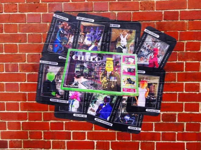
The piece itself is a clever reworking of Waddington’s Cluedo in which each of the characters have been given the Face the Strange treatment and have heads relating to their names. I really rather like this concept piece as did many other visitors to the festival who were gathered round it. This artist’s name says it all really.
Unremarkable
rain from first light to last light
unmemorable.
by Scooj
Tim Marsh is not an artist I know, but I feel I almost know him by proxy as he is a friend of Lewis Duncan, he of the brilliant No Grey Walls website featuring street art in Barcelona – and there’s the link, Tim Marsh who was born in Paris now lives in Barcelona. You can read a great interview between the two here.
This piece is a cool take on The Simpsons theme for this year’s festival and shows a rather furtive Bart in a hoodie smoking a cigarette. This is the Bart that he might become if ever he gets any older. The title of the piece perhaps gives us more of a clue, and introduces other famous people…Salvador Banksy.
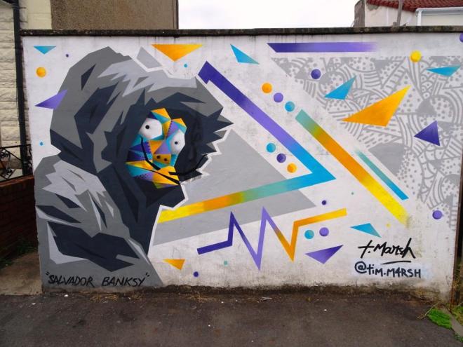
The piece has been nicely painted and the bits of tape in one of the pictures give you a clue to how he achieves his straight lines. This is a lovely piece on a new wall for Upfest and one that is well worth searching out…It is in Ruby Street, Bedminster.
This magnificent piece by Danny Rumbl is in a retro style that I really love, and it reminds me of the fine character works of Deamze and Sepr. The subtle blue-grey shades are extremely effective, and a great example of how sometimes ‘less is more’.

Danny Rumbl is an illustrator from the Netherlands who grew up with and was inspired by American cartoons of the 1960s, children’s books and nature all of which I think are reflected in this piece. What I like most about it though is the simple form, the crisp, clean lines and the solid fills. A highlight of the festival.


