
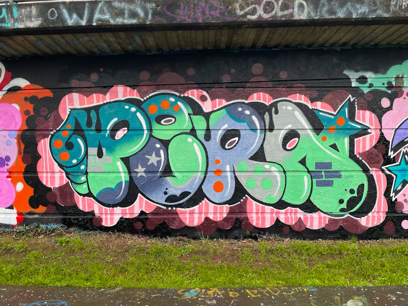
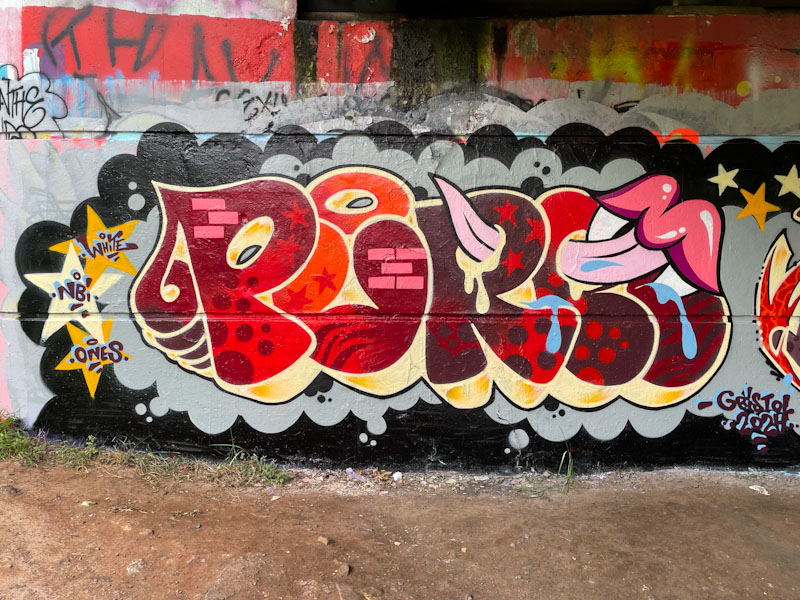
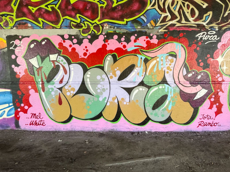
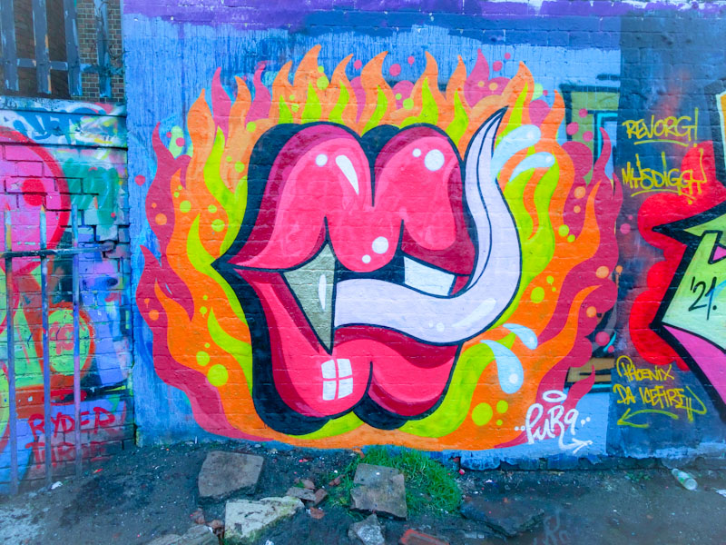
A gallery of fabulous graffiti writing and a selection of vampire teeth from Bristol/Spanish artist and tattooist, Pura Decadencia.
Instagram: puratattoos
All photographs by Scooj

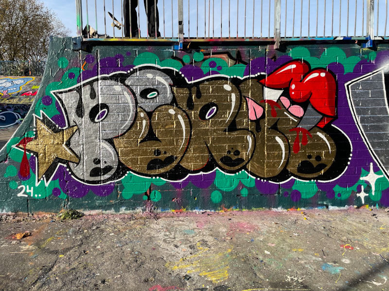

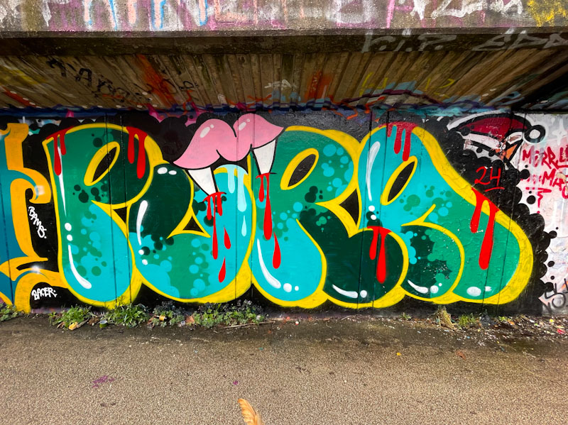

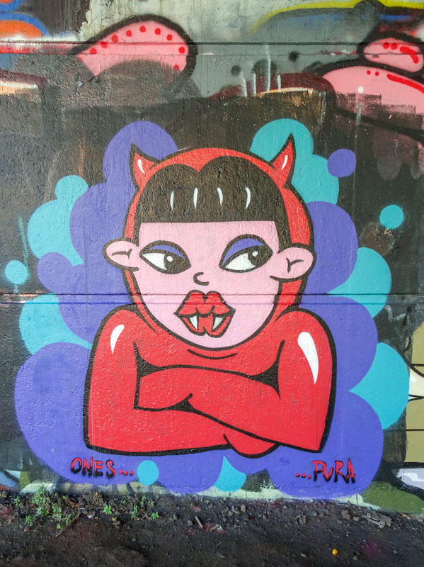


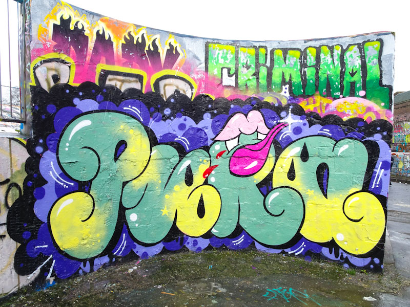
A gallery of fabulous graffiti writing and a selection of vampire teeth from Bristol/Spanish artist and tattooist, Pura Decadencia.
Instagram: puratattoos
All photographs by Scooj
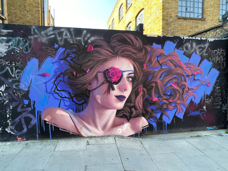
The highlight of my recent trip to Camden Town, was finding several pieces by Irony, including this one, that I had never seen ‘in the flesh’ before. He really is one of my favourite artists, and all of his work is of the highest quality. What I particularly like is that he seems to be equally comfortable painting high-end festival walls or spots like this one – he isn’t precious at all, and is a very modest gentleman.
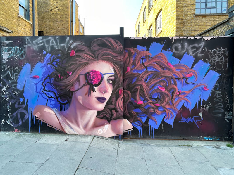
There is a hell of a lot going on in this wonderful detailed portrait piece, and symbolism that I don’t think I will get to the bottom of, although it is possible that he is ‘patching up’ the piece in a clever way. While writing this post, I have found out that this is a repair job on a piece that was originally painted in 2018, and so the plasters and the eye patch are probably literally covering up blemishes in the original.
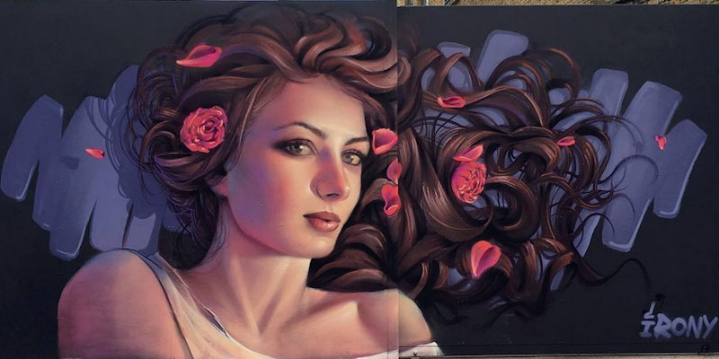
The facelift is quite stunning, and as you can see from this photograph taken by the artist of the original piece, the portrait has taken on a quite different persona. It is an amazing recognition of his talent and respect from others, that his work is still there seven years on in the first place.

As ever, outstanding work. You can see more of his pieces in this short gallery.
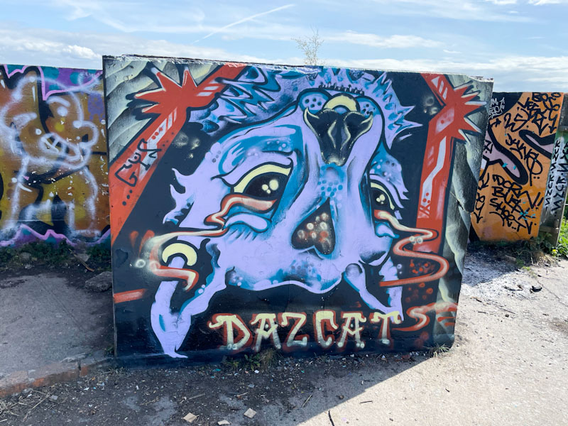
It would seem that Daz Cat is rather partial to the concrete blocks up at Purdown, and whyever not? The spot is a wonderful oasis away from the bustle of the streets and has some stunning views over the north and east of Bristol, the dog particularly likes it up there, perhaps it is the lure of the stinky goats.
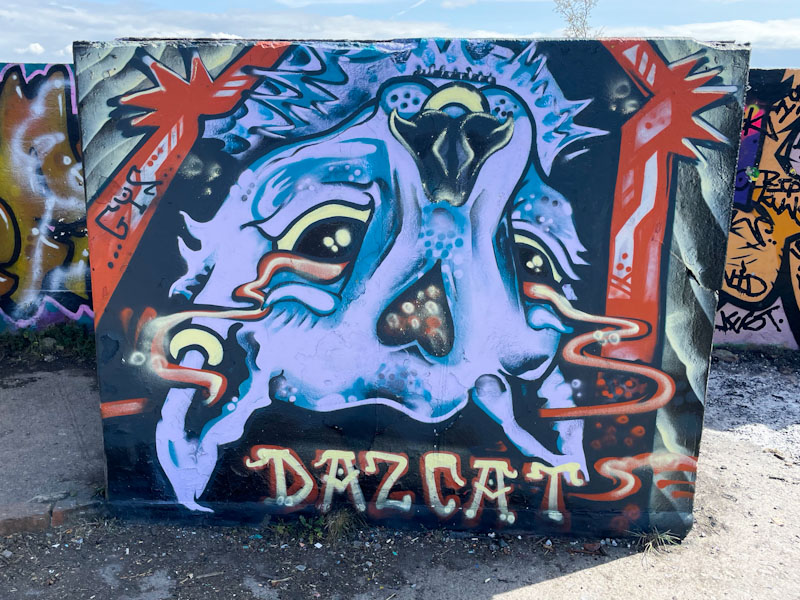
Daz Cat has switched things up a bit by painting this cat portrait upside down, which would completely goof me up, but I am not an artist, and maybe it is concepts like this that separate out the ways artists and non-artists see the world. The purple cat has a fine gold nose ring and a vapour trail from eyes to ears, which must be symbolic of something, and is an idea Daz Cat has used before. This is a fun piece from the cat supremo.

.
Three little piggies
curious to find out more
the dog sniffs the air…
.
by Scooj

Tucked away behind the iron fence of the swimming pool at Dean Lane is this fabulous collaboration combination piece from Werm and Zake. Werm, more than adequately providing the symmetrical letters, and Zake offering a couple of different cheeky characters peering over the top of them.

The horizontal band colour scheme, painted on an off-white background, works really well, and Zake has cleverly incorporated the band of colour into his characters. I’m not quite sure what it is about it, but this feels like a really classy piece to me, and I really like it.
I have seen quite a few pieces by Totosoapcity in Bristol before, but hadn’t known who the artist was, so haven’t posted them. This could mark the opening of a little floodgate for when I do some digging in my archives, which I like to do from time to time. I’m not sure that Totosoapcity is from Bristol, but must be reasonably local I would think, because we see visits every few months.

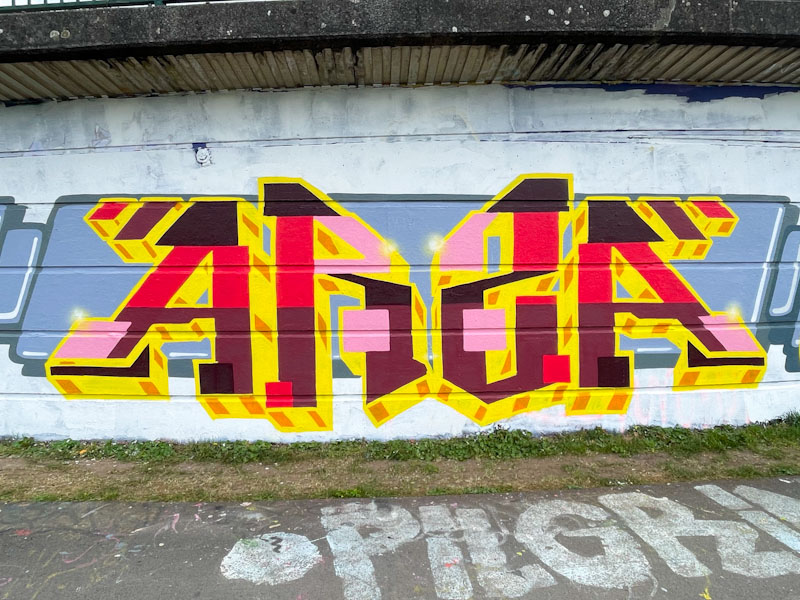
This piece is part of a large collaboration from a group of artists I am not too familiar with, but who have done a great job on this wall, selecting a themed colour approach to all their writing. I think the letters here spell ARS(Z)A, and have a pleasing symmetry to them. The red, pink, black, brown, yellow and orange colours are not my favourite combinations, but work reasonably well – not sure about the pink. They do, however, contrast perfectly with the themed grey banner background, which is consistent through the entire collaboration.
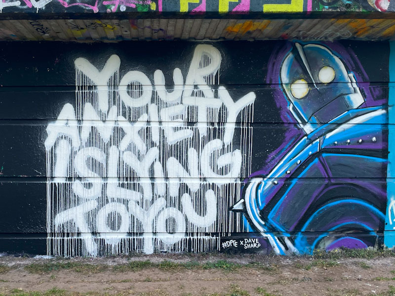
These two artists collaborated on almost this exact spot back in July 2022 – how time flies, I had it in my mind that it was last year. From what I can gather #DFTE and Dave Sharp are good friends, and this fine collaboration ‘anxious iron giants’ combines the distinctive writing of #DFTE with the artistic talents of Dave Sharp.
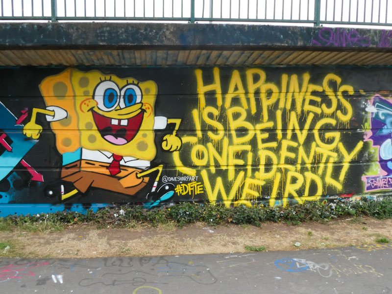
I would love to see more from #DFTE – the power of words is so beautifully presented with his unique style, going big on the drips, but he doesn’t seem to paint all that often. Dave Sharp, I don’t know much about, but he has captured the Iron Giant robot really well, perhaps tinged with a little anxiety… who knows. Their combination works really well, and as a bonus, here is their last one…
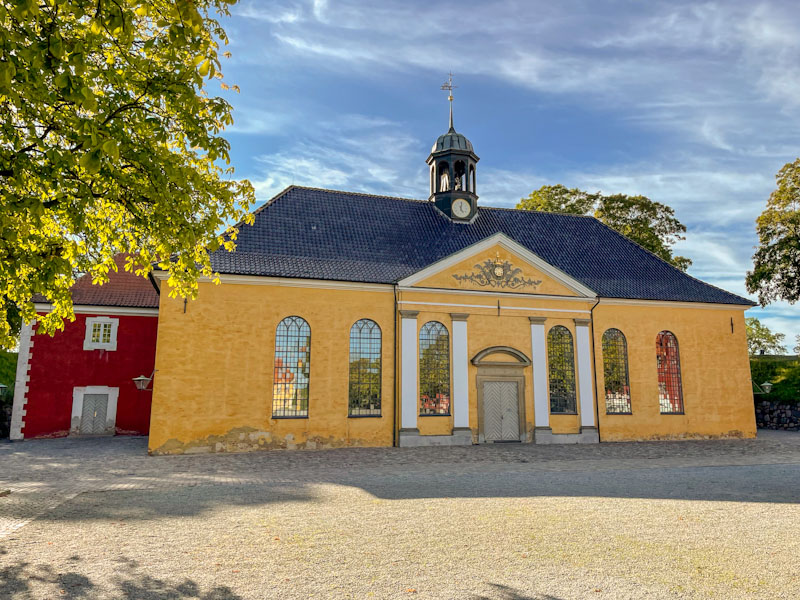
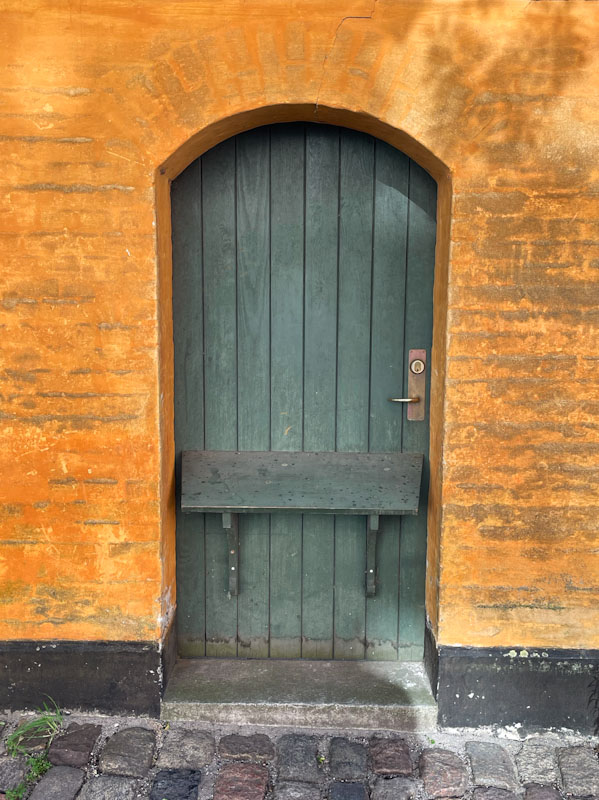
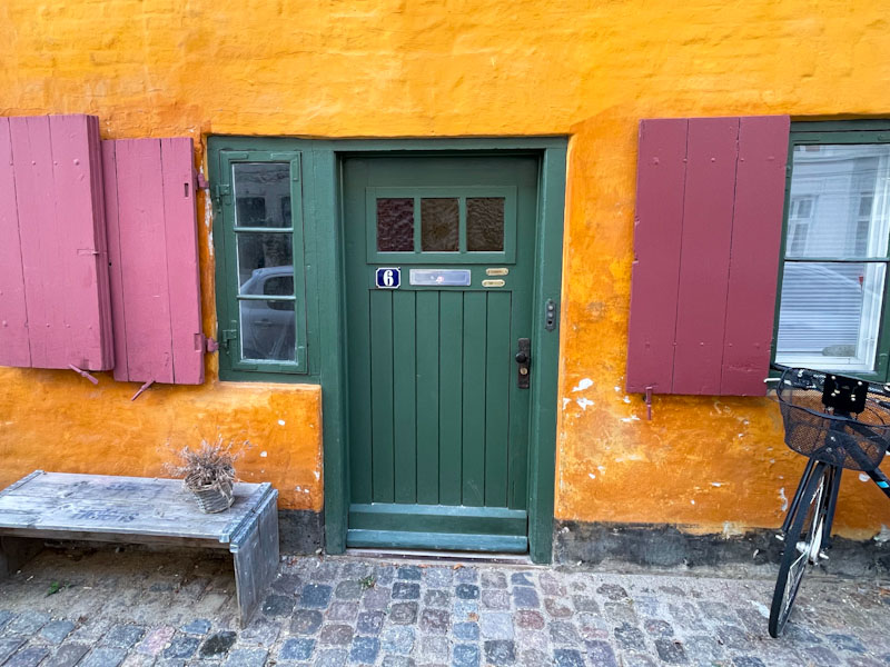
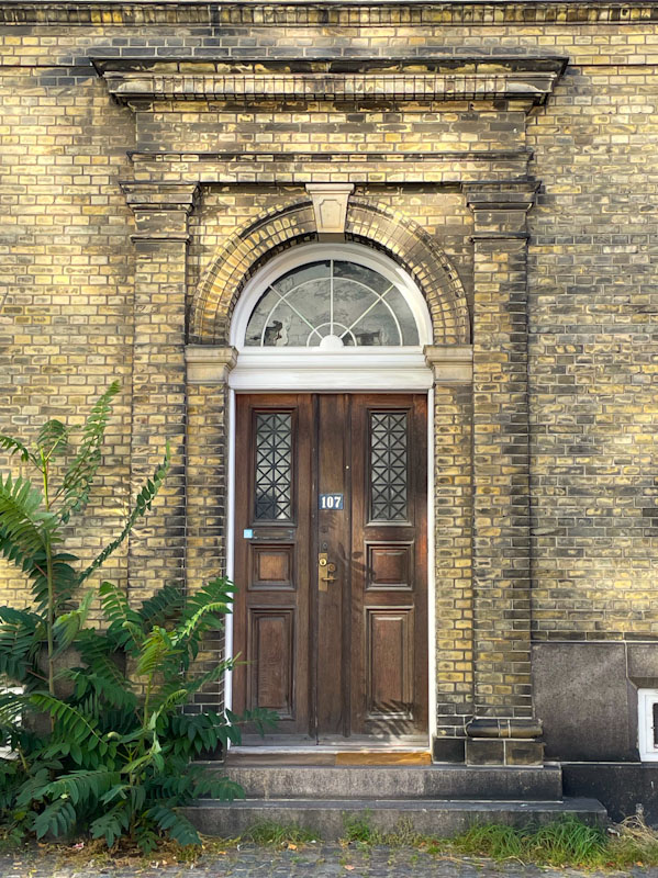
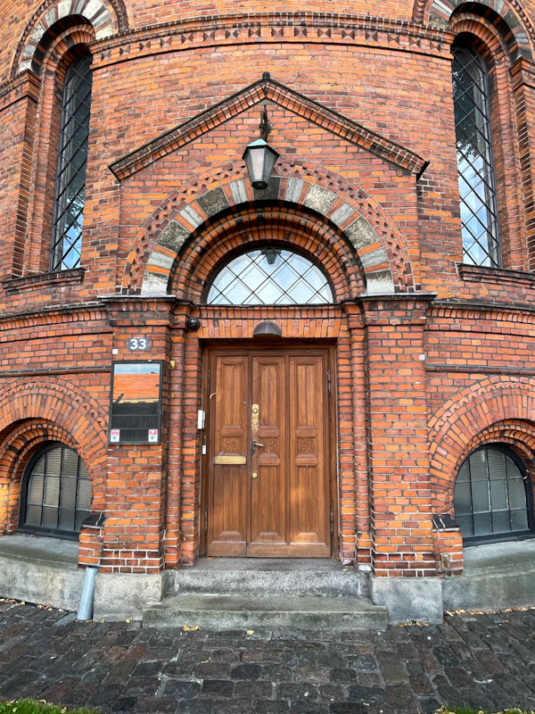
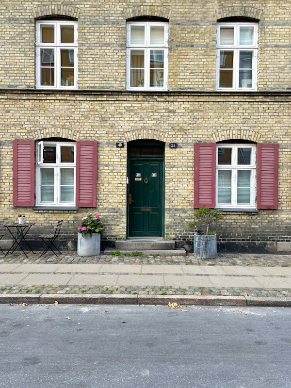
Doors 305 – Copenhagen, Denmark (part V), September 2024
Life is flashing by. April is over, and we are saying farewell to the first third of 2025. Unusually, we have had a pretty dry start to the year in England, especially March and April, and are experiencing summer temperatures this week, which is both delightful and worrying in equal measure.
I managed to spend an unseasonably warm few days in Copenhagen last September whilst on a city break with my mother. Perhaps ‘unseasonably warm’ or ‘biblical rainfall’ or ‘beast from the east’ are terms we will hear more and more frequently as we hurtle towards climate breakdown. I hope not, but it somehow feels like humanity has reached the age of stupid.
This week’s selection from Copenhagen are from the Kastelette citadel area to the northeast of the city and close to the most famous icon of all Denmark, the little mermaid statue, which is where I was heading for when I took these photographs. Here we go…


So there it is, this week’s Thursday Doors post has melted away as quickly as the year so far has. Still more to come from Copenhagen next time… and the time after that…
If you have made it this far, you probably like doors, and you really ought to take a look at the No Facilities blog by Dan Anton who has taken over the hosting of Thursday Doors from Norm 2.0 blog. Links to more doorscursions can be found in the comments section of Dan Anton’s Thursday Doors post.
![]()
Oh dear! Mr Crawls’ gull is looking a bit glum in this piece on the long hoarding at Greenbank. Painted on a favoured chrome background, the usually happy or cheeky gull looks like he is down in the dumps. It is clever that Mr Crawls can portray different emotions with tweaks to his ‘archetypal’ bird.

The stylised cartoon character has a downturned (mouth) bill and heavy-lidded eyes, dripping with sadness. The piece is really well presented and clean and tidy, and another in a wonderful series of character pieces by Mr Crawls.

This is an outstanding piece of graffiti writing from Minto, and is a great example of what is not there as being as important as what is there – if that makes any kind of sense. There is a lot of empty space alongside multiple illustrations and decorations throughout.
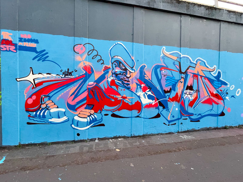
The letters spell out MINTO, and there are some regular motifs that the artist has used before, such as the character and a pair of sneakers at the base of the letter M. I’m not sure whether there is a coherent story or whether the piece is simply a collection of ideas and thoughts bundled up together. Either way, there is plenty to look at in this energetic piece.


