

.
Leafless sunflower
savaged by marauding slugs
determination
.
by Scooj
.
Leafless sunflower
savaged by marauding slugs
determination
.
by Scooj
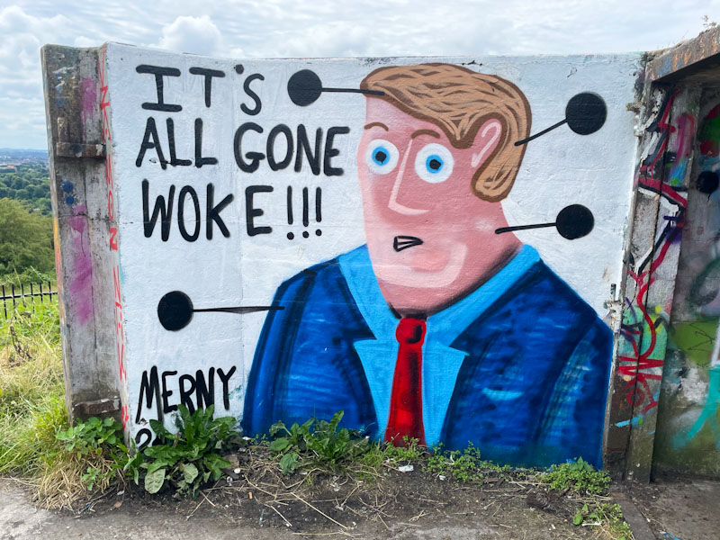
Ha ha! ‘It’s all gone woke’, so says this marvellous character by Merny. The phrase is one used by anybody who doesn’t like or disagrees with those elements of policy/regulation/rules/behaviour that they take issue with on account of it not complying with their own values. The peak example of the phrase was probably the quote from former Home Secretary Suella Braverman, who used the term ‘Guardian-reading, tofu-eating wokerati’ to describe Just Stop Oil protesters in 2022. I wonder how she would describe the pigs who are currently protesting against immigrants in the UK. Spot the tumbleweed.
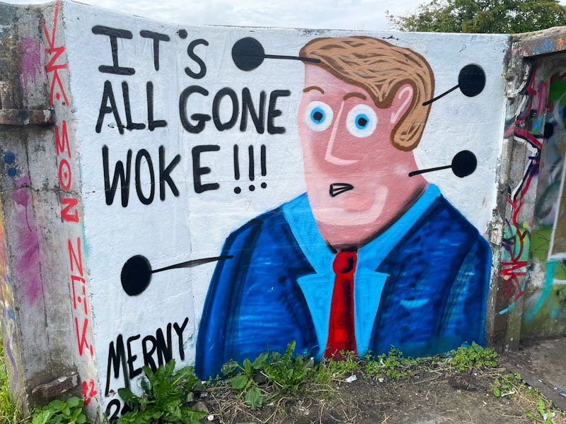
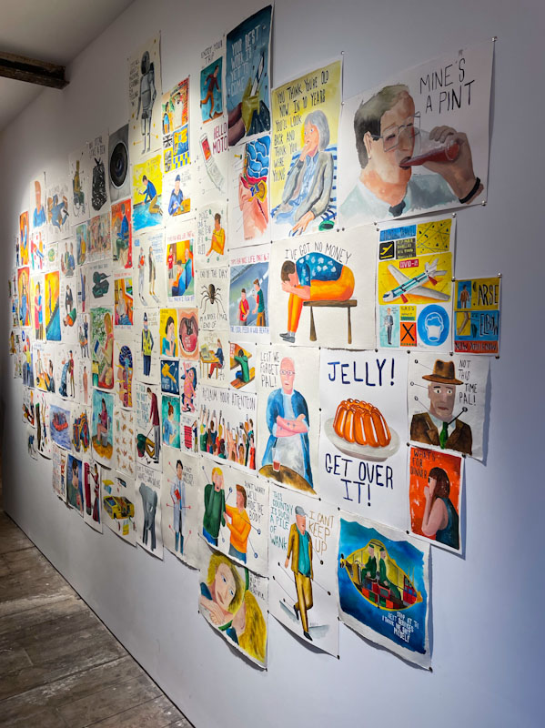
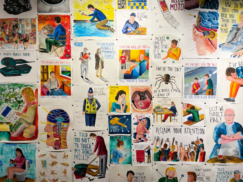
This is a lovely Merny piece, so ‘of its time’, simple and powerful, like so much of his work. The piece was painted around the time of his excellent exhibition, which I understand from speaking to him since, went better than expected, and he managed to sell quite a few original pieces, which is great to hear. I would have loved to have bought one or two of his originals, but alas they were marginally outside my price range. See some of them below:
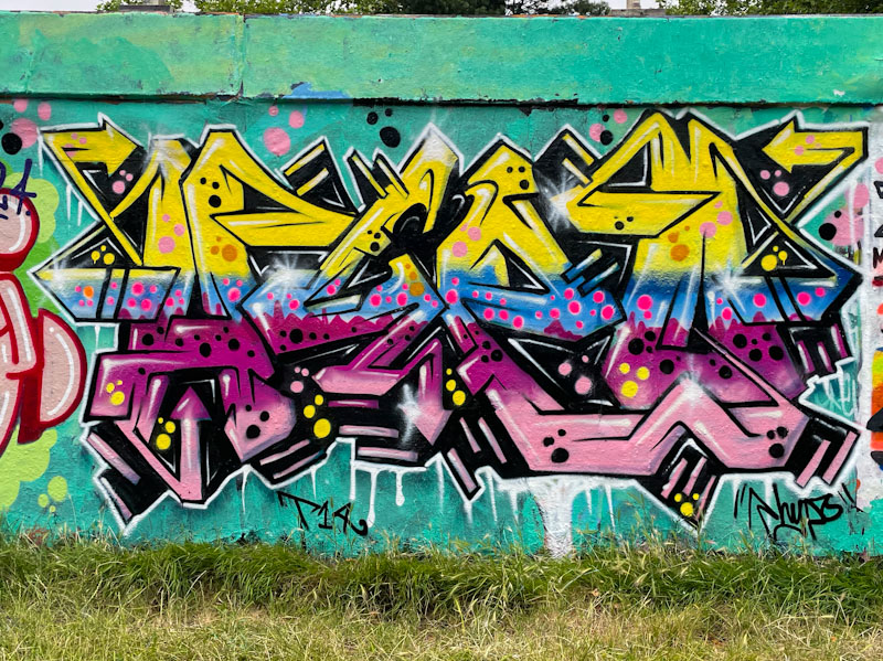
More colourful fireworks from Hypo. This piece reverts to his symmetrical style of lettering, where the ‘H’ and ‘O’ are broadly similar in shape and the ‘Y’ and ‘P’ generally reflect one another. This is a design that Hypo has played with for years and tends to work really well.
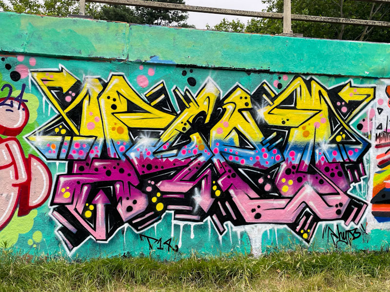
It is the fills though that grab the attention in this piece, with several horizontal layers of colour, I can count at least four, each of which is decorated with well-placed spots. There is a lot of energy piece, which is provided by the depth created and the sparkles at strategic points on the letters. Another great piece of graffiti writing for the collection.

If ever you want an example of the perfect triptych graffiti writing/character portrait piece then look no further than this magnificent piece by Dibz, Jody and Fade underneath Brunel Way bridge. As always, these three have smashed it, and I just don’t know how many more ceilings they can break with their work.


To the left, Dibz’ writing in black and pink is reflected on the right-hand side by Fade, where their writing is almost becoming indistinguishable except to the most experienced eyes. The key difference is that Fade’s letters tend to be ever so slightly softer than Dibz’. Both have created something special and finished it off with a splash of ‘liquid’ gold running behind the collaboration.

Sitting pretty between the graffiti writing is this outstanding skull painted by Jody. One of the great benefits of Jody joining these writers over the last couple of years is that we get to see so much more of his work on the streets, which I dare say we wouldn’t see so much if he was painting alone. When I see Jody’s work, I am still baffled how he manages to get such extraordinary detail and texture using a spray can. A trio at the top of their game.
Doors 273 – Doors of Manchester, UK, November 2023 (Part II)
Life is speeding up. It is already 1 August, the days are getting shorter, and so far 2024 has been a blur – it would be nice to be able to slow things down, at least for just a little while. It is probably my age, and a realisation that every moment is precious, but why would that make time go by faster? I am sure there must be studies on this kind of phenomenon, but I don’t have the time to seek them out and read them!
These doors were photographed last November while visiting Manchester with my daughter, who is currently travelling in Laos some 5,678 miles away from home, a stark contrast with Manchester, apart from the rain.
We are often our own worst critics, and I would say that there is only one ‘special door’ in this selection – I wonder if you can guess which one I think that is. Enjoy.


That’s all for this week. Happy August.
If you have made it this far, you probably like doors, and you really ought to take a look at the No Facilities blog by Dan Anton who has taken over the hosting of Thursday Doors from Norm 2.0 blog. Links to more doorscursions can be found in the comments section of Dan Anton’s Thursday Doors post.
by Scooj


The Purdown Anti Aircraft gun emplacement is a wartime relic which these days doubles up as a goat enclosure and graffiti spot, giving this monument a second life of sorts. Visiting this spot is always a bit of a lottery because turnover is usually pretty slow, and sometimes there is nothing new to look at, and other times (because visits tend to be infrequent) pieces can be quite badly tagged, or damaged by the goats!
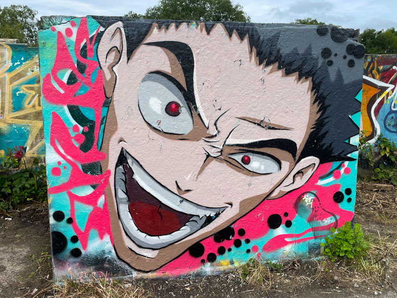
On my last trip, a couple of weeks ago, I his the jackpot though, with several new pieces all in pretty good condition, including this beauty by Peanutsdeli. I have to say that he is probably the last artist I would expect to find up here, so this manga-style cartoon portrait came as a very pleasant surprise indeed. The yelling face fits the rectangular slab perfectly, and I was even able to give the character a little bit of extra hair from the tree behind. More to come from this Purdown visit soon.

Following on from the previous post, this piece by Karmone was painted during the same paint jam. Karmone is an occasional visitor to Bristol, from his home in Wales, and through his connections with Bristol artists, is invited to paint jams from time to time. As I always say on Natural Adventures, it is a constant pleasure to be able to welcome visiting artists to share their talent on our walls, adding to the mix.
Karmone has, like the others, followed the convention of colours for the collaborative wall, and added a sprinkling of orange and grey to liven up the base of the piece with some interesting yin-yang spherical designs. His letters are exceptional, spelling out KARM, with tidy fills and mid lines. The arrangement of the letters and the 3D shadows cast give them a great deal of depth and dynamism. Some great work from Karmone.
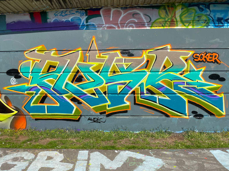
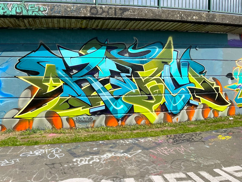
Rusk is an established graffiti writer in Bristol who tends to paint in fits and starts these days. He is currently going through a rather productive phase at the moment, which is great news indeed. This piece in Cumberland Basin was created during a paint jam organised by Smak and the Art of Sok, a couple of weeks back.
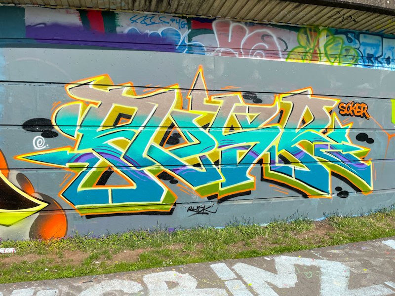
The general colours of the collaborative wall were light blues and yellows, and Rusk certainly stuck to the task with this tight piece. Rusk is known for his dedication and diligence and his work is always beautifully turned out. The highlight of this piece for me is the purple thread that runs horizontally through all of the letters. A fine example of on-point graffiti writing.
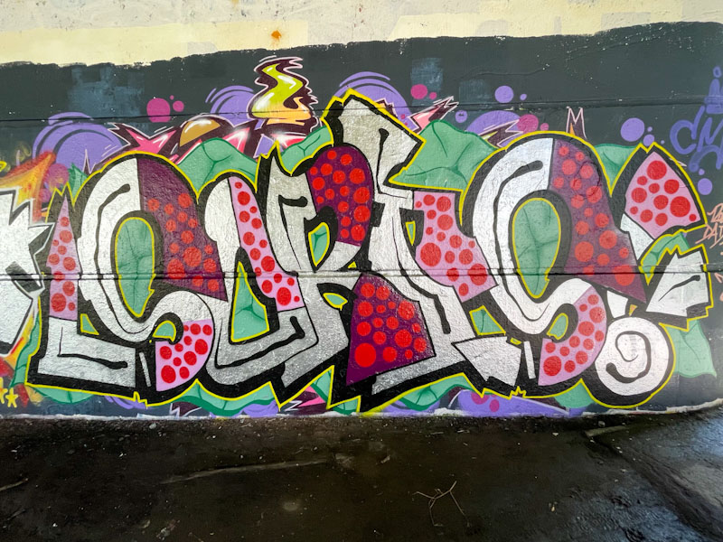
So, after a rush of high-end Upfest murals, I feel it is time for a switch back to some of the more grounded and authentic street pieces that are rolled out every day for those who choose to find them. This is a really nice piece of writing under Brunel Way, by Sorts.
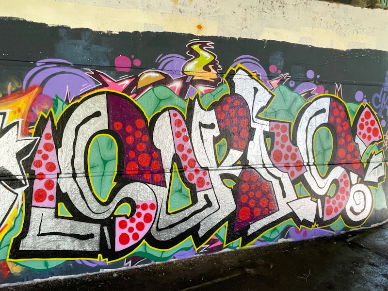
Sorts presents some nice irregular letters, with a chrome base which are augmented with some really nice pink and purple fill sections decorated with red spots. The whole thing is nicely balanced and works really well. The letters are set on a creative green background with ‘cracks’ painted into it. Great honest stuff from Sorts.
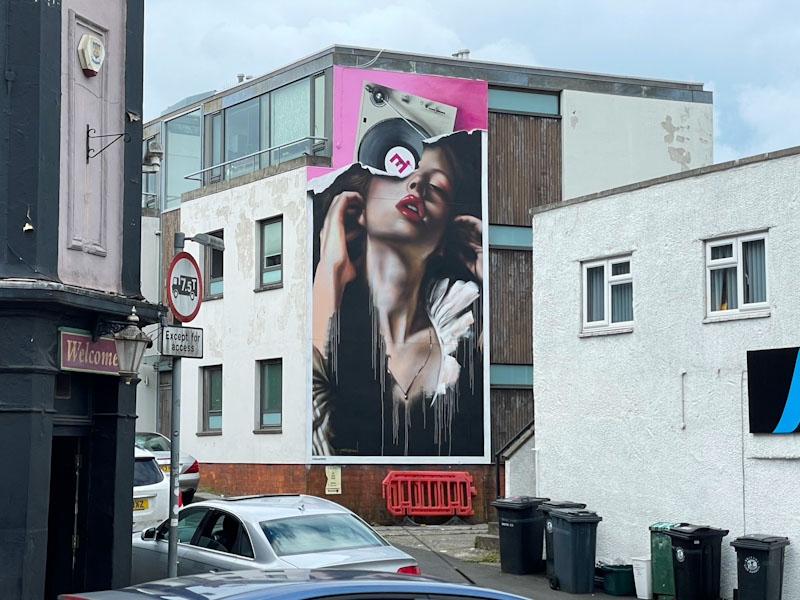
There are some pieces, especially during street art festivals, which simply have the ‘wow’ factor, where you stand before them in admiration, and in my view, this stunner by Epod3000 is one of those. Firstly, this wall is one of the most striking in Bedminster, and although not the easiest to photograph, it certainly has impact when it reveals itself to those walking along West Street.

The piece, called ‘Side.E’, a reference to the vinyl LP and deck at the top features a beautiful portrait of a woman (with lots of drips). The clever bit is that Epod has apinted the portrait in a way that makes it look like a poster that is peeling off from the wall – you know… the way advertising posters do after a while. It is a device used quite a lot in street art, and done well, like this, is wonderful.

Because of the wall opposite the piece, it is quite difficult to take a decent photograph from directly in front of it, without it looking a little distorted, but I have done my best here. I was lucky enough to see another of his pieces yesterday in Cheltenham, which I will post in due course. All great stuff from Epod.


