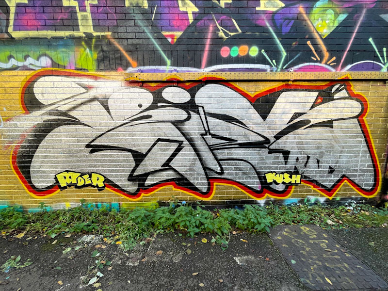
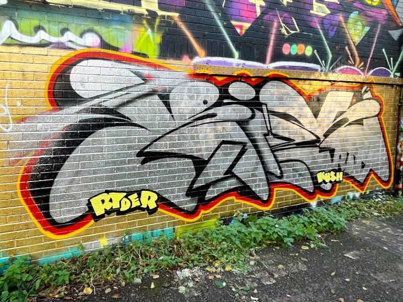
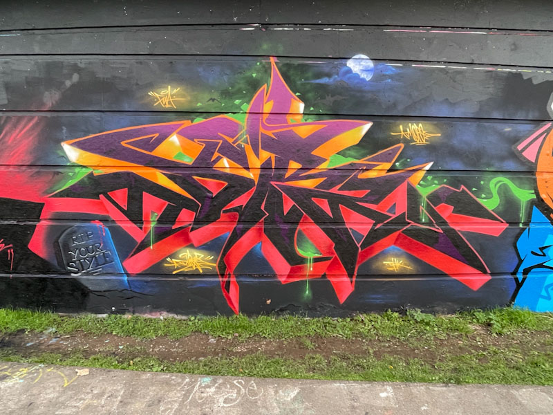
It is curious how I associate different artists with specific settings or spots. I say this, because I really didn’t expect to see a Mr Riks piece down here alongside the River Avon. This spot tends to be quite experimental, and a lot of emerging artists use it to practice their letters, forms and techniques. To find an established artist like Mr Riks painting here is, to my mind at least, quite unusual.
Mr Riks, River Avon, Bristol, November 2025
The letter form that Mr Riks writes with is so distinctive; smooth rounded edges, letters compressed without any see through gaps and a superb solid border are all things I would expect to see. This is a fabulous chrome piece with nice shout-outs to his mates, Ryder and Kush.
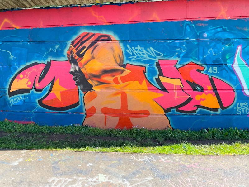
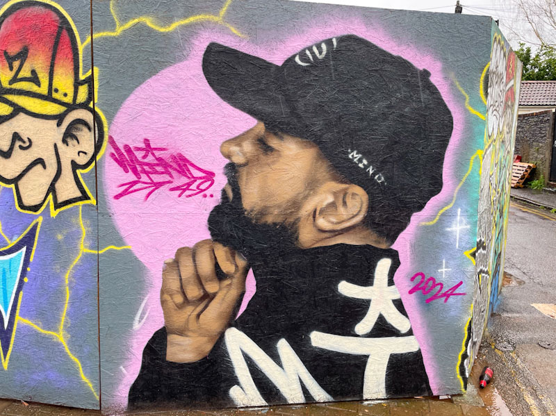
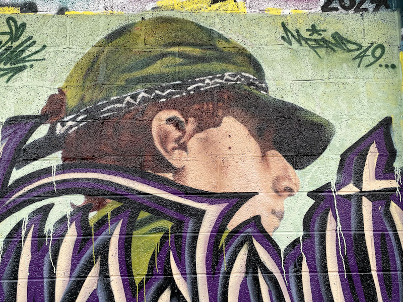
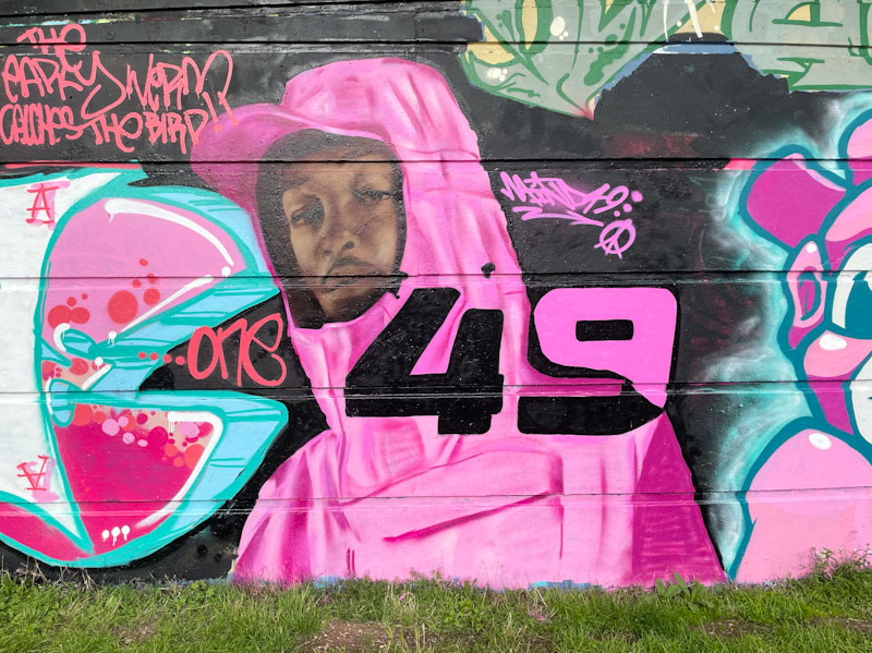
Mind 49, Lucky Lane, Bristol, September 2025Mind 49 and Wxttsart, Knowle West, Bristol, July 2025Mind 49, St Werburghs, Bristol, July 2025Mind 49, M32 Cycle path, Bristol, April 2025Mind 49, Cumberland Basin, Bristol, March 2025Mind 49, St George skate park, Bristol, January 2025Mind 49, Greenbank, Bristol, January 2025Mind 49, Muriel Alleyway, Bristol, July, 2024Mind 49, Muriel Alleyway, Bristol, August, 2024Mind 49, M32 roundabout, Bristol, June 2024Mind 49 and SPZero76, M32 roundabout, Bristol, June 2024Mind 49, Greenbank, Bristol, May 2024Mind 49, Cumberland Basin, Bristol, May 2024Mind 49, Lawrence Hill roundabout, Bristol, April 2024Mind 49 and Wxttsart, M32 Cycle path, Bristol, April 2024Mind 49, Sparke Evans Park, Bristol, March 2024Mind 49, Cumberland Basin, Bristol, March 2024Mind 49, Cumberland Basin, Bristol, March 2024Mind 49, Greenbank, Bristol, February 2024Mind 49, Church Road, Bristol, February 2024Mind 49, Picton Lane, Bristol, December 2023Wxttsart and Mind 49, M32 Cycle path, Bristol, January 2024Wxttsart and Mind 49, M32 Cycle path, Bristol, January 2024Mind49, M32 roundabout, Bristol, November 2023Mind 49, Greenbank, Bristol, August 2023Mind 49, Greenbank, Bristol, August 2023Mind 49, Cumberland Basin, Bristol, August 2023Mind 49, M32 roundabout, Bristol, June 2023Mind 49, M32 roundabout, Bristol, June 2023Mind 49, Cumberland Basin, Bristol, June 2023Mind Control, St Werburghs, Bristol, January 2023Mind Control, St Weburghs, Bristol, November 2021Mind Control, Princess Street, Burnham -on-Sea, September 2021Mind Control, Tobacco Factory, Bristol, July 2021, Upfest 21Mind Control, St Werburghs, Bristol, November 2020Mind Control, Purdown Battery, Bristol, July 2020Mind Control, St Werburghs, Bristol, September 2020Mind Control, Upfest, Bristol, July 2017
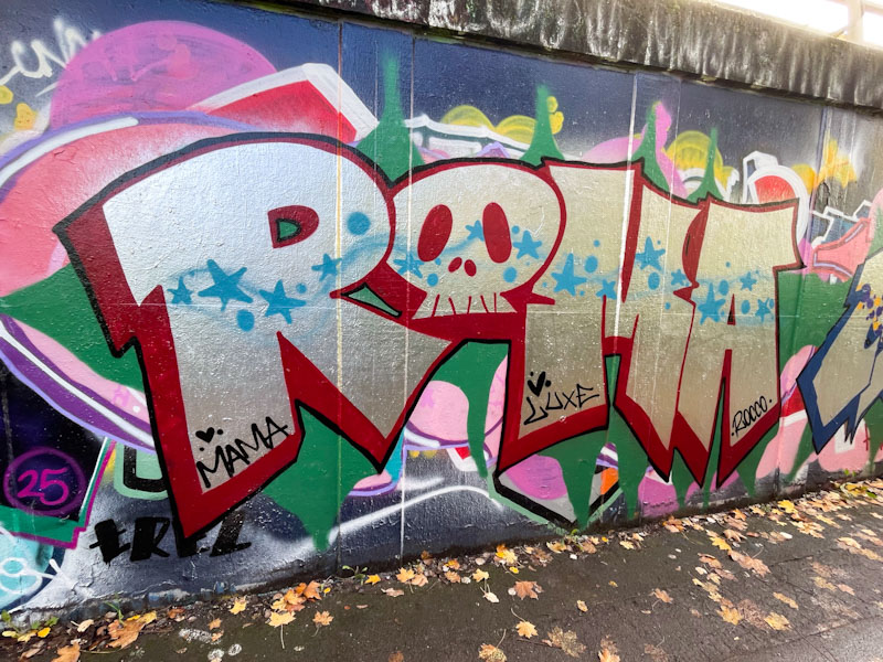
Although I have posted a couple of pieces by Roma before, I know little about the artist. There is something rather pleasing about the letter shapes, or perhaps it is simply the connection and love I have for the city of Rome.
Roma, M32 roundabout, Bristol, November 2025
This is a nicely presented chrome piece with a deep drop shadow in red and thin black border. The ‘o’ of ROMA is a little skull. The writing is nicely decorated with a small wave of blue stars and spots running horizontally through the letters. A rather nicely considered sand presented piece.
This is what a birthday celebration piece to self looks like… by Dibz for Dibz. The calibre of artists that turned out for this paint jam was pretty high, as you might expect, and the quality of the birthday boy’s piece reflects the quality of the others.
Dibz, Cumberland Basin, Bristol, October 2025
It is easy to get quite blazé about Dibz’ outstanding wildstyle graffiti pieces, because each one is utterly on-point, and it is what we expect, but this perfection betrays the talent, experience and hard work that Dibz puts in to achieve these incredible results. Alongside the outstanding writing, Dibz has added a little gravestone and cloud-covered moon to pick up on the Halloween theme running through the pieces in this paint jam. All so good.
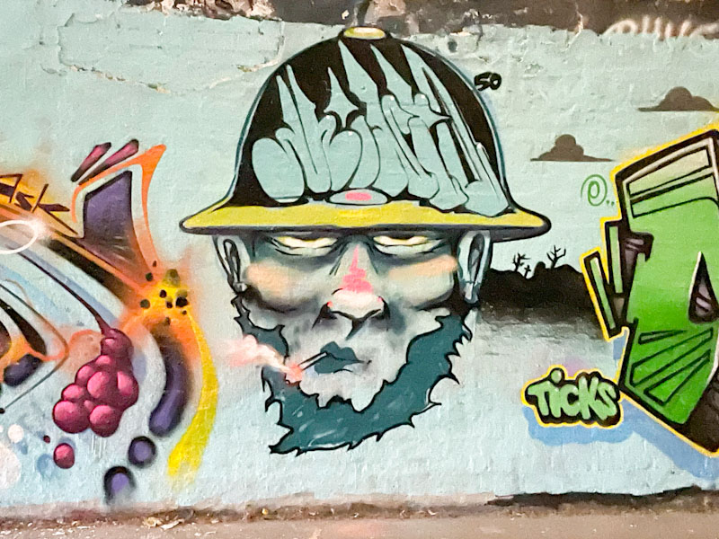
The turnout for Minto’s 50th birthday paint jam was outstanding, and a tribute to his obvious popularity. This is his own piece from the day and reasonably modest… I expect he had rather a lot of mingling to do.
Minto, St Werburghs, Bristol, November 2025
The small character piece is a portrait of a man wearing a hard-hat which contains the letters Minto. The bearded character is smoking and has a rather shifty look about him. There is some great depth in the features of the face, in particular the cheeks. A decent piece from the birthday boy.
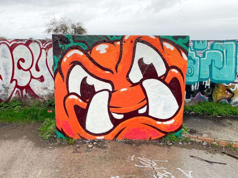
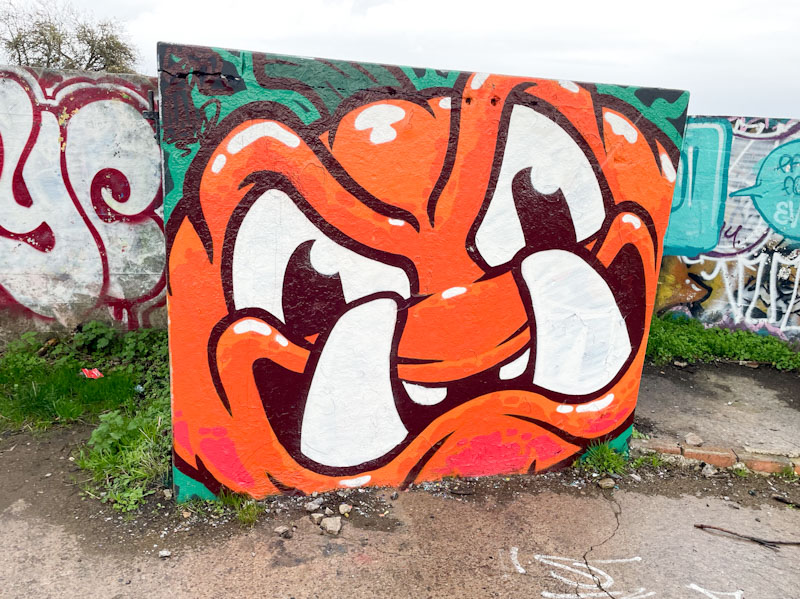
I am in a conference all day today, and only twigged late last night, so I am writing this yesterday in a bit of a rush. Halloween has been well-observed by several Bristol artists this year, and this beauty by Kool Hand was painted alongside a cartoon pumpkin by Werm.
Kool Hand, Purdown, Bristol, November 2025
Kool Hand has gone for an orangutan – pumpkin mash-up and absolutely delivered the goods. The toothy character is nicely painted with superb solid fills and confident thick black outlines. A perfect piece for the square concrete slab.
Doors 334 – Doors and the gardens of Anima, Marrakesh, Morocco, January 2025 (Part XIV)
On our way home from the High Atlas mountains, we called in at the Anima gardens, an extraordinary place where a stunning collection of plants meets the creative artistic imagination of multi-media artist André Heller. This garden was one of the great highlights of our trip to Marrakesh. An oasis (almost literally) of cool shade in the middle of the parched arid landscape which was full of surprises around every corner.
The imaginative sculptures in the garden seemed to be perfectly at home despite their bright colours and quirkiness. The place was a feast for the eyes and a haven for birds and insects too. This was genuinely one of the best gardens I have visited in the world, and utterly unexpected. A must if visiting Marrakesh.
It is another week in which doors play second-fiddle to their surroundings, but I hope you enjoy the ensemble:
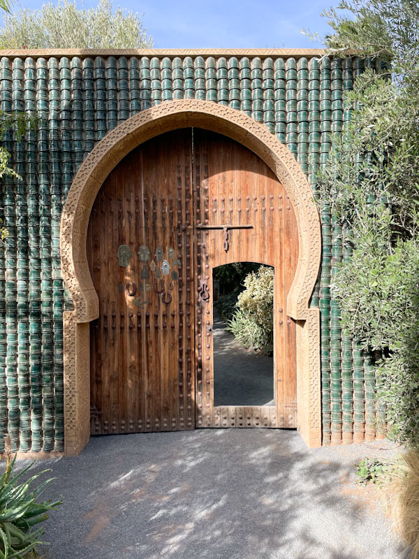
Entrance door to Anima, Marrakesh, Morocco, January 2025
Colourful service doors, Anima, Marrakesh, Morocco, January 2025
Eyes over a gateway, Anima, Marrakesh, Morocco, January 2025
Desert plants, Anima, Marrakesh, Morocco, January 2025
Desert plants, Anima, Marrakesh, Morocco, January 2025
Garden staff door, Anima, Marrakesh, Morocco, January 2025
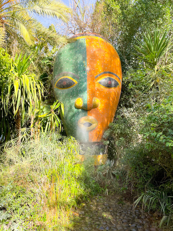
Face mask in the bushes, Anima, Marrakesh, Morocco, January 2025
Large sculpture spraying a fine mist, Anima, Marrakesh, Morocco, January 2025
Wooden sculpture, Anima, Marrakesh, Morocco, January 2025
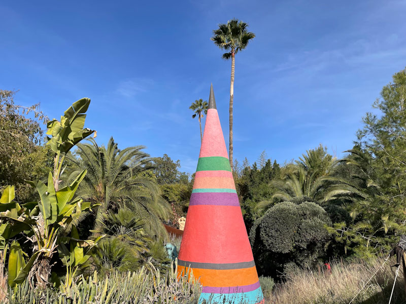
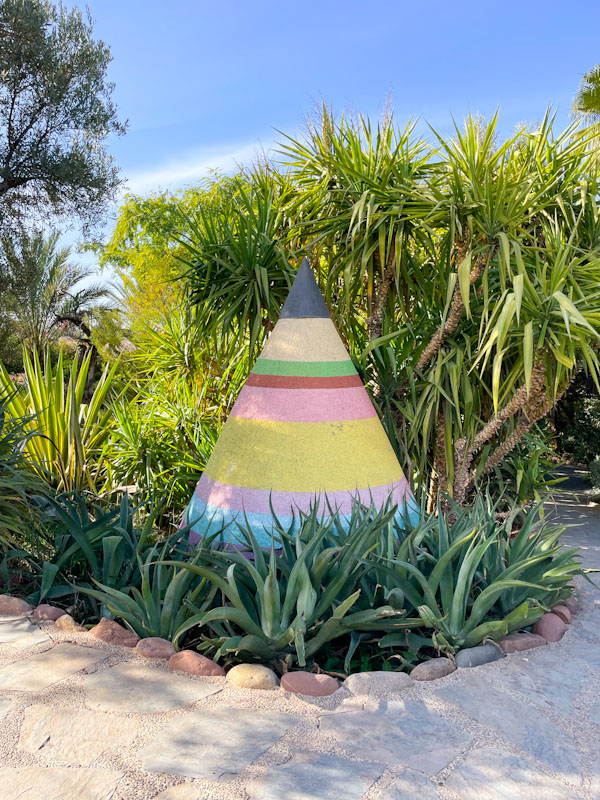
Colourful cone sculpture, Anima, Marrakesh, Morocco, January 2025
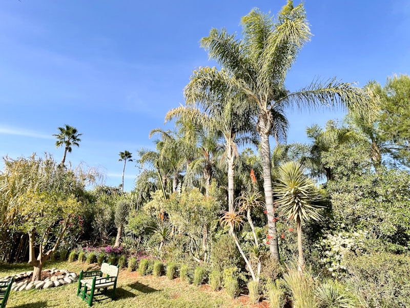
Palm trees in the garden, Anima, Marrakesh, Morocco, January 2025
Another cone sculpture, Anima, Marrakesh, Morocco, January 2025
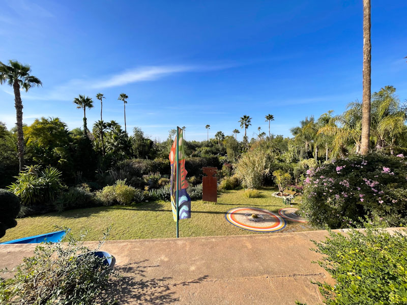
Open lawn in the garden at Anima, Marrakesh, Morocco, January 2025
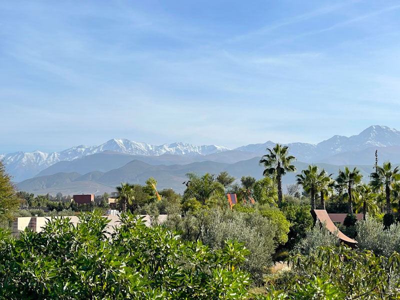
View of the High Atlas from the garden at Anima, Marrakesh, Morocco, January 2025
Classy cafe at Anima, Marrakesh, Morocco, January 2025
Fancy iron door, Anima, Marrakesh, Morocco, January 2025
Large iron sculpture of a ‘Yaz’, a Berber symbol which appears on the Berber flag, Anima, Marrakesh, Morocco, January 2025
It has been fun digging out these pictures of the Anima garden, and I have shared far more than I intended for the purposes of Thursday Doors (a bit of a show-and-tell I’m afraid). Back to the city next time. Have a great weekend.
If you have made it this far, you probably like doors, and you really ought to take a look at the No Facilities blog by Dan Anton who has taken over the hosting of Thursday Doors from Norm 2.0 blog. Links to more doorscursions can be found in the comments section of Dan Anton’s weekly Thursday Doors post.
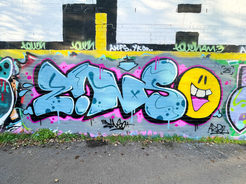
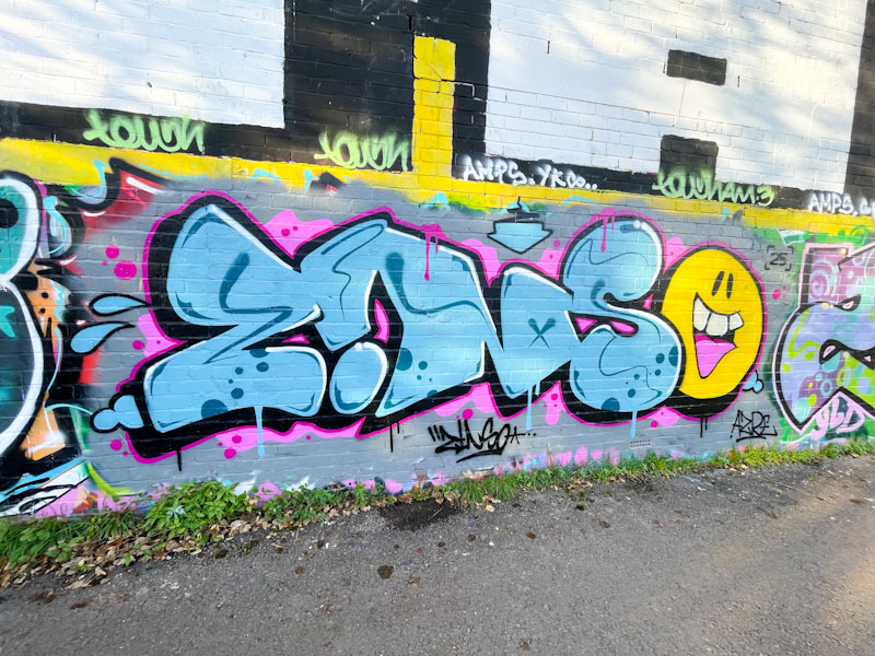
Since he made his return, Zinso has been smashing it, and alongside Asre, who he appears to have teamed up with, is making a sizeable impression. This is one of several pieces by the pair alongside the River Avon in St Philip’s Marsh.
Zinso, River Avon, Bristol, November 2025
The letters and smiley face combination piece is vibrant and uplifting, full of movement and joy. Zinso’s letters are nicely designed, I like the upside-down ‘i’, and filled with a mixture of blue squiggles and spots. The cartoon-style animated smiley in a contrasting yellow stands out, but is linked through being the ‘o’ of Zinso. The piece is so neat and tidy and beautifully presented.