
A gallery of short philosophical musings from the creative mind of Bristol’s #DFTE
all photographs by Scooj
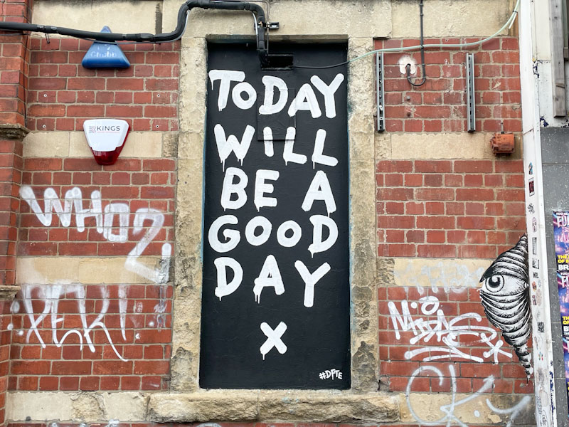

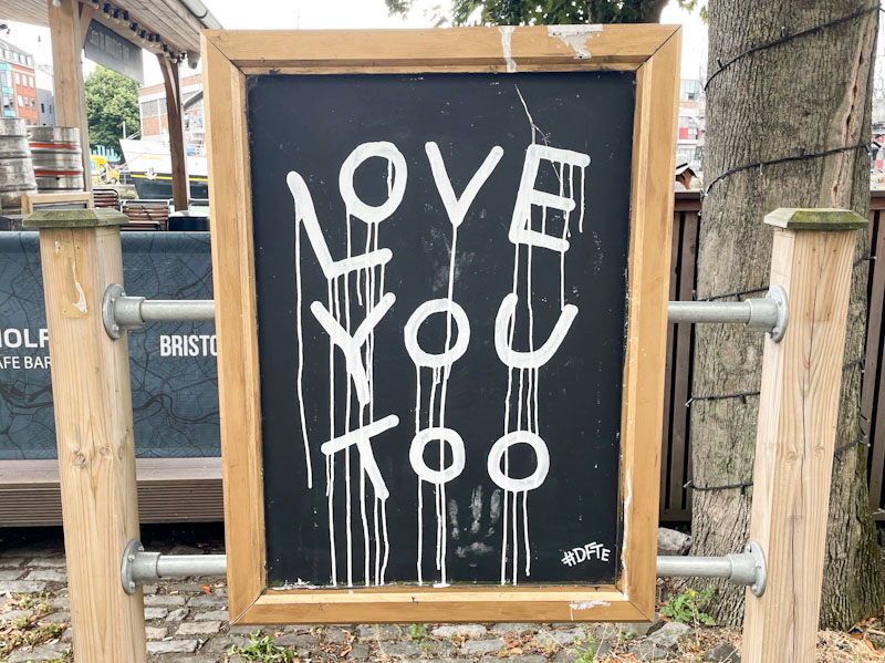
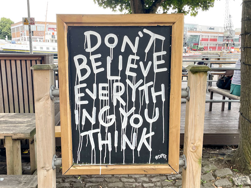
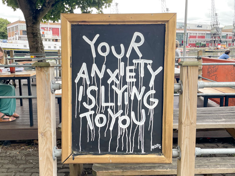
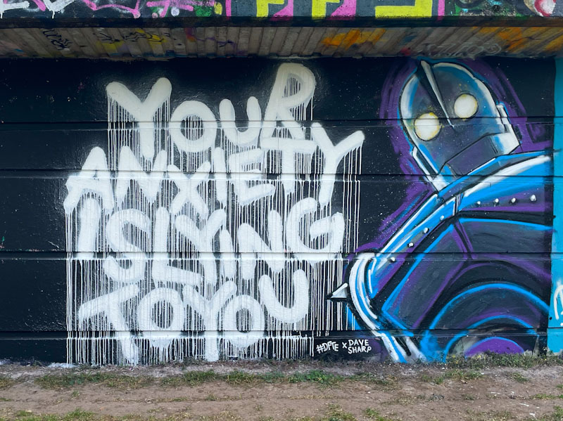


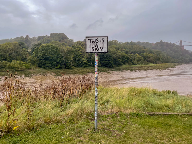
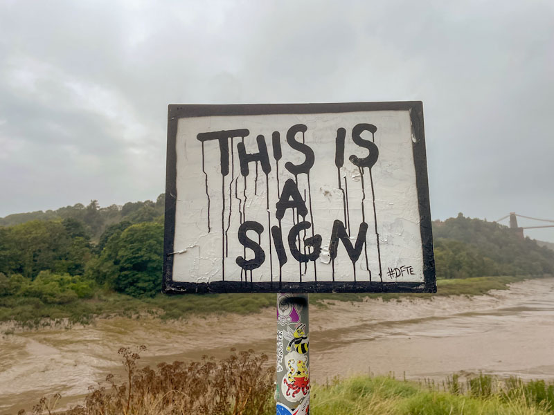


A gallery of short philosophical musings from the creative mind of Bristol’s #DFTE
all photographs by Scooj
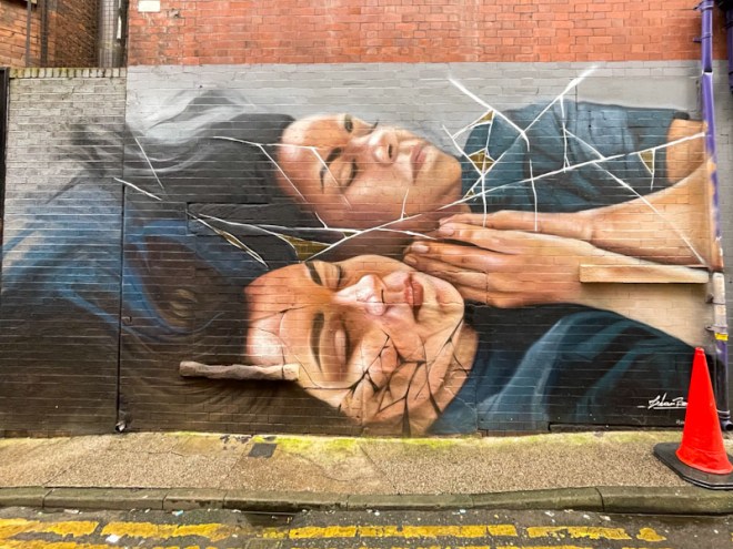
Natural Adventures is a blog with three or four strands, the most dominant of which is the street/graffiti art of Bristol. I am finding it increasingly difficult to feature art from other cities and countries, that I would like to share, but without compromising Bristol posts. I have been pondering this conundrum for a little while and decided that my posts from other places will more likely be galleries, which makes sense because I don’t know very much about the artists in other places, This way I get to share a whole load more pieces. Having said that there are some pieces that simply deserve their own post, and this awesome portrait piece by Liam Bononi is one of those.

One of my Favourite ever Upfest pieces is by Liam Bononi, and I have posted a different piece from a previous visit to Manchester where the artist is based. His incredible photorealistic portraits are disrupted by fractures and cracks, creating distortions, which I would guess are metaphors for disrupted and fractured minds behind the faces. The artwork is meticulous and beautifully presented. This piece was tucked away in a street with low foot fall, and you’d certainly have to go out of your way to find it. I only found it, because I was conducting a forensic tour of the streets of the Northern Quarter in Manchester. Another piece in my favourites folder (which incidentally doesn’t actually exist anywhere other than in my mind).
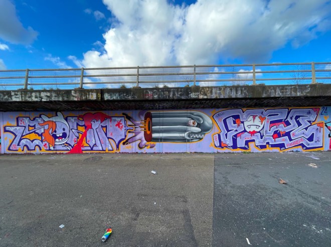
Although street art and graffiti can be and is painted at any time of day and on any day, there is definitely a strong pulse of activity on weekends. At times, it can be more difficult for me to get out at the weekend than during he week, which might seem counterintuitive, but there is no rhythm to the weekends, and there is always so much to do. This fabulous PWA collaboration was painted at a weekend, but I didn’t get to see it until the following week on my rounds.
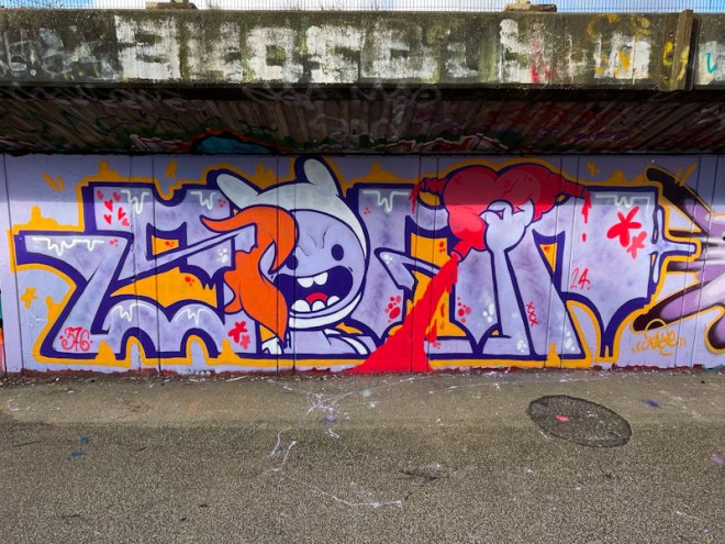
This one is a triptych with Soap on the left, Zake in the middle and Face 1st on the right, in the letters – character – letters format so commonly used in collaborations. Soap has painted a beauty, with big letters spelling out his name and a character from the cartoon series Adventure Time (I think) replacing the letter ‘O’. I m not too sure about the the bleeding heart, but I guess there is a story there, conscious or unconscious, somewhere.
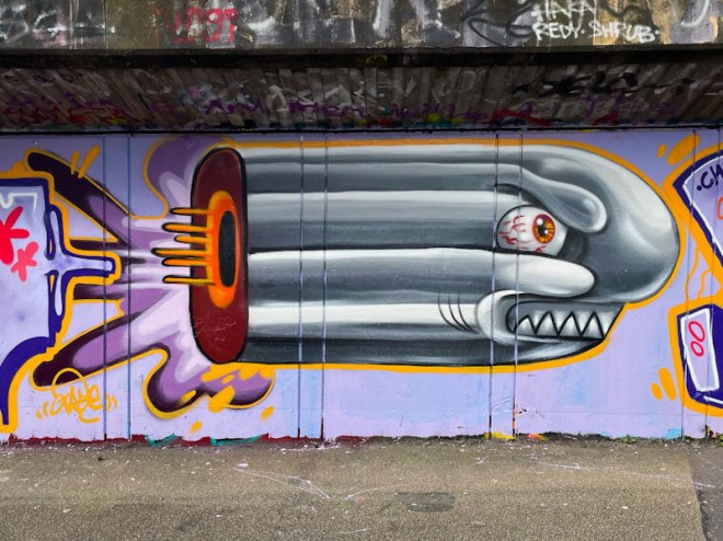
In the middle is something rather different from Zake. We are used to seeing cartoon-style portraits, full of depth, so this bullet comes as a bit of a surprise. I am guessing that it is the bullet that is causing such carnage running through the whole collaboration.
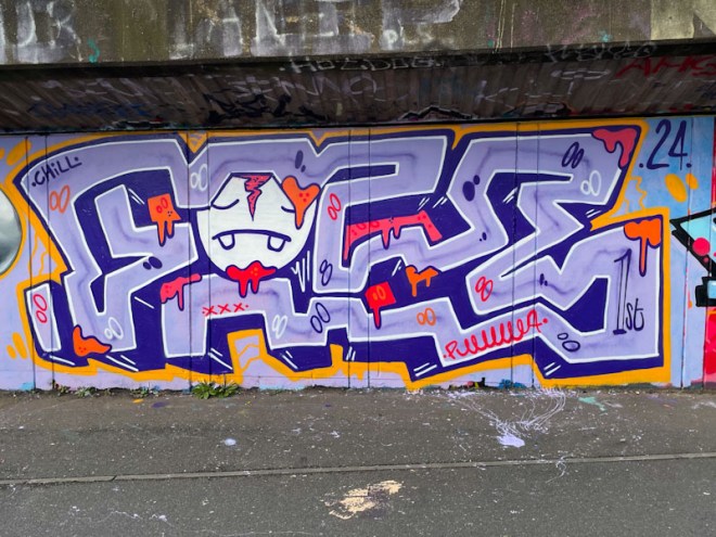
On the right, Face 1st has painted one of his blocky FACE pieces of graffiti writing, with very deep drop shadows and a rather distressed face peering through the ‘A’. There is an indication of trauma here too, continuing the collaboration theme. The crew are carrying on in 2024, where they left off in 2023, and that can only be good news.
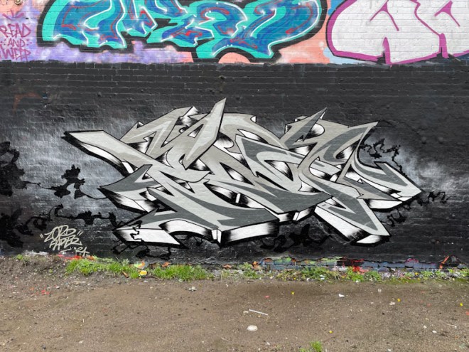
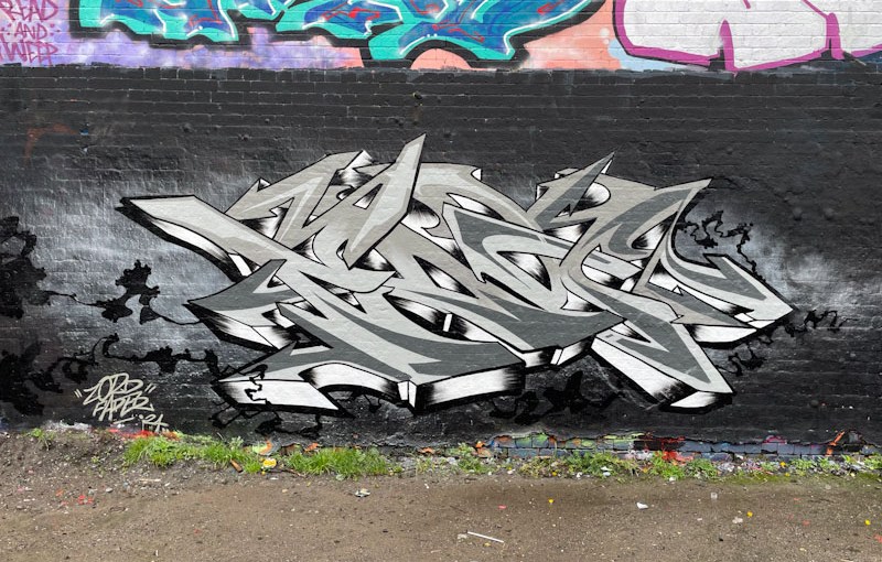
It is rare to find a Fade piece these days that is not immediately associated with a piece by Dibz and at times his work can be eclipsed by the overall collaborations they create, so it is great to see a fabulous standalone piece of graffiti writing from Fade, and this is a beauty.

Painted in greyscale on a black background, the impact of the letters has to be really strong, and it is. Spelling out FADE in letters that pop out from the wall, especially along the bottom edge. A nice touch is the little black ‘ink’ trail all around the outside of the piece. All in all, a fabulous and rather special piece of graffiti writing.
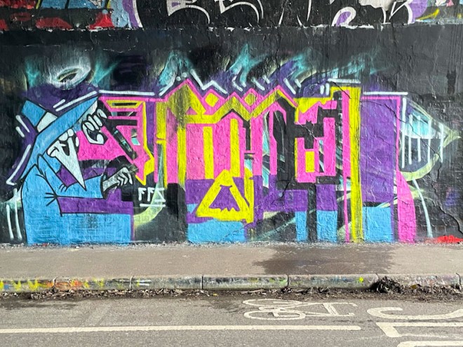
A little earlier in the year, Kid Krishna announced his return to the streets after a bit of a quiet period. Since January, he has been super-active and smashing it on walls all over the city, so much so that I am having to consider bunching a few of them together into a single post.

One of the things that Kid Krishna brings to his pieces is an incredible sense of colour, sometimes subtle and other times overt, but always carefully matched and incorporated. I have been puzzling over the character, and feel like I should know who it is, more than that, he was on some posters which I spotted in Nottingham, or something very similar. It will remain a mystery. This is a lovely fresh piece from Kid Krishna in the tunnel.
Doors 255 – Montefalco doors, Umbria, Italy (Part V – leftovers)
I am facilitating another workshop today, this time in London, and have written this post yesterday. This follows hot on the heals of a workshop in Nottingham on Tuesday, so I have limited capacity to write too much for this post.
Fortunately this should be quite a quick one, because it is the final leftovers from our day trip to Montefalco in Umbria last summer. I hope you enjoy them:

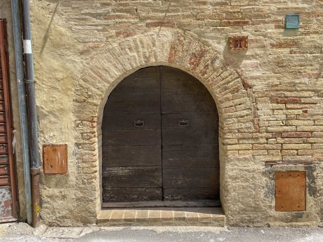


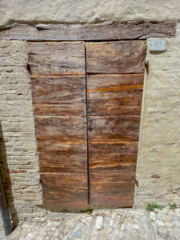
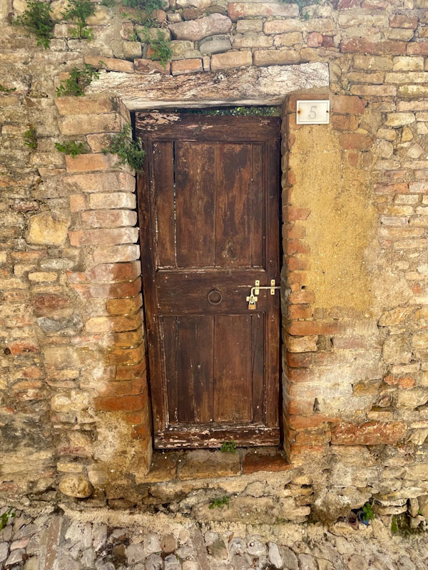
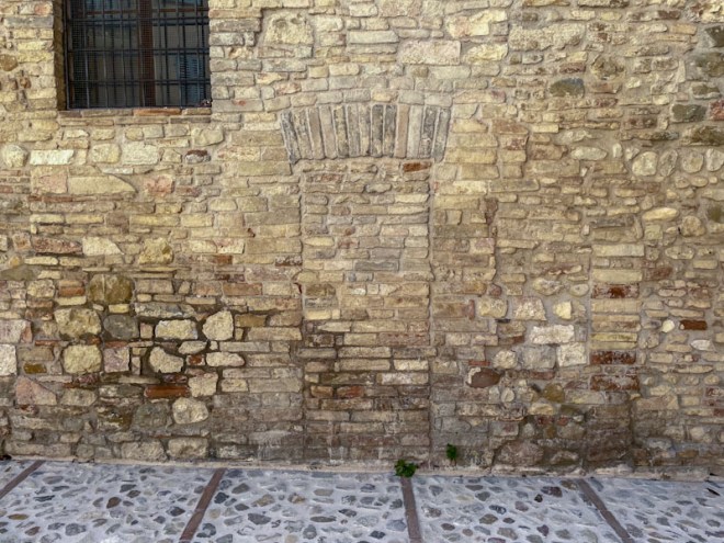


That’s it for this week. Something closer to home, i.e. UK-based next week. May I wish you a happy weekend.
If you have made it this far, you probably like doors, and you really ought to take a look at the No Facilities blog by Dan Anton who has taken over the hosting of Thursday Doors from Norm 2.0 blog. Links to more doorscursions can be found in the comments section of Dan Anton’s Thursday Doors post, and in his Sunday round up.
by Scooj

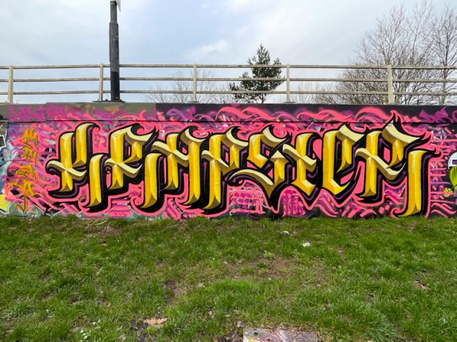
It was great to catch up with Stivs while he was painting this piece, and it gave me the opportunity to tell him how much I admired his incredible technical skills with creating these amazing calligraffiti letters. Stivs has made a deliberate choice to move back to writing words he used to write before writing Stivs, namely the word KRAP and variants of it. In this case he has written KRAPSTER.

The letters are not only beautifully crafted and proportioned, but they also incorporate four shades of yellow, one for each elevation, which together create the appearance of gold letters and a three-dimensional effect. The letters are set on a contrasting matrix of pink lines and squiggles, which rounds off the whole production nicely. Great piece by Stivs.
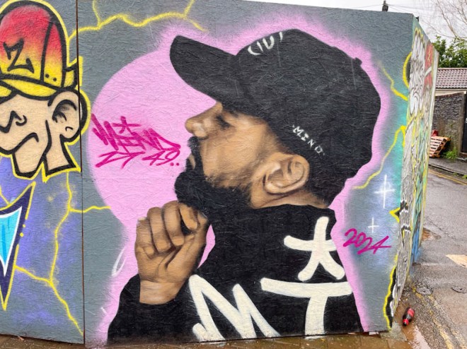
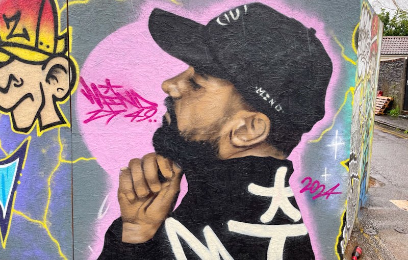
Hoardings are irresistible to street artists, graffiti writers and taggers alike. They provide a safe and clean canvas, temporary in nature, for spray paint creativity, and Mind 49 has grabbed the opportunity to decorate this hoarding in Church Road with both hands. Mind 49 is making a big impact on the street art scene in Bristol, and his portrait pieces in particular are turning heads all over the city. I am guessing from the frequency of his new work that he must have moved to the city, or in the neighbouring area.
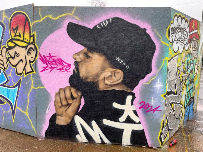
The portrait is really striking, and his style is fascinating. It is not photorealistic, but is representative. His can control though has a paint brush quality that is softer than the harsh crispness of photorealism. This is a really great piece, and he appears to improve each time he hits a wall. I am looking forward to seeing where he takes us in 2024.
.
A chance encounter
with a fellow traveller
great conversation
.
by Scooj
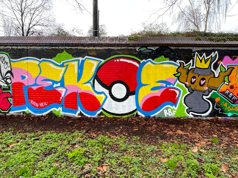
It is really good to see how Pekoe’s writing is improving at a terrific rate. I will admit that I was a little sceptical when she started turning her attention to letters, and wasn’t sure that she would be able to pull it off, and I was also worried that it might compromise her wonderful portraits. I needn’t have worried, her writing is great and she is still painting her portrait pieces.
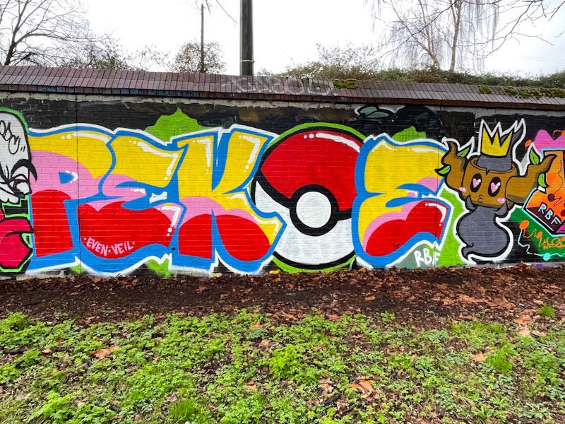
This piece, part of a birthday paint jam for Evey and Desi, picks up on the day’s theme which was Pokémon, and a ball features in her letters. Pekoe has included a character from the series/game/cards which I believe is Phantump, and she has included a graffiti crown for good measure. This is a lovely colourful piece which really gets into the spirit of the paint jam.





 Natural adventures