.
Thunder heavy rain
cascading over dry ground
overflowing drains
.
by Scooj
.
Thunder heavy rain
cascading over dry ground
overflowing drains
.
by Scooj

In recent weeks I have been enjoying a new walk route with the dog, up at a little nature reserve called Narroways which rises high above St Werburghs is nestled in between railway tracks and crosses over St Werburghs tunnel. There are a couple of railway bridges along the pathway, and this piece by Dazcat was on a wall alongside one of them.
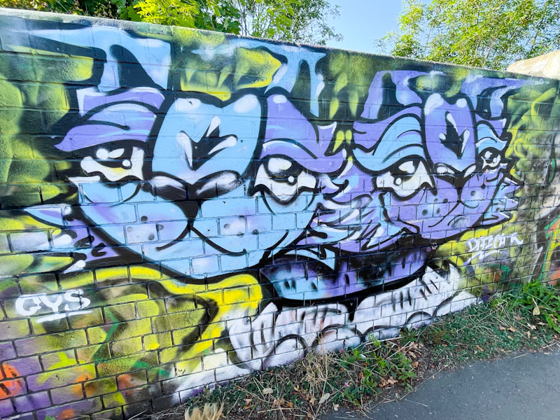
A cat with two heads, possibly Siamese twin cats, stare out from the wall at passers-by. As Daz Cat pieces go, I imagine he painted this quite quickly, and it has the simple charm of his earlier works, no complex story underpinning the portraits, just a couple of cats. A nice find.
.
May you rest in peace
mother, grand, great-grandmother
a proper lady
.
by Scooj
In memory of my mother-in-law who died peacefully yesterday. We were lucky enough to celebrate her 95th birthday with her a couple of weeks ago. We will miss her.
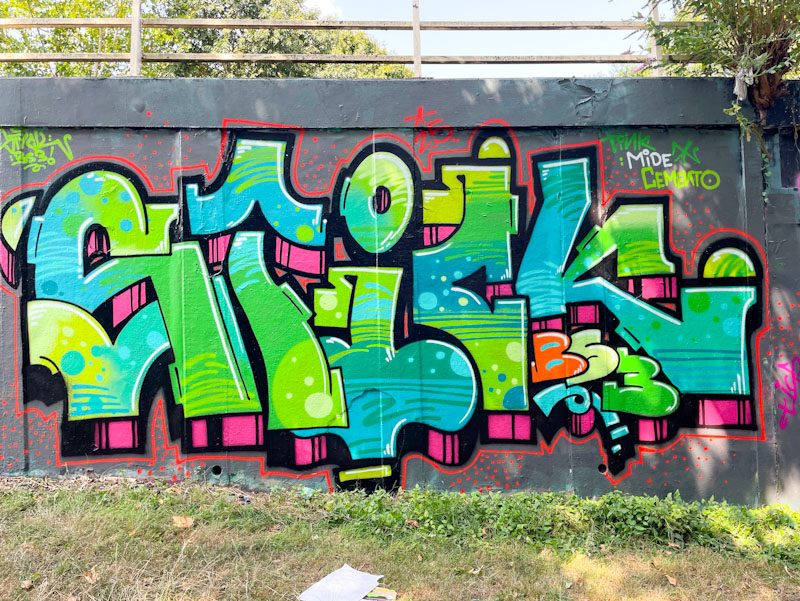
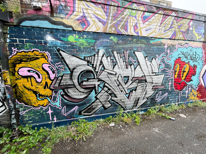
In recent weeks, Corupt has been painting loads of pieces, concentrating his efforts on the M32 roundabout, and this STICK piece is an absolute belter from the very highly regarded Hungarian graffiti writer.
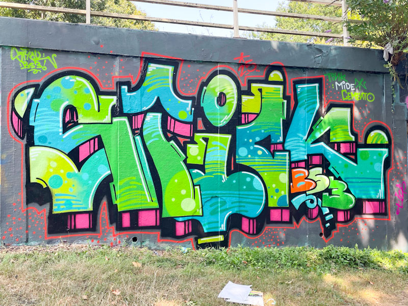
This beauty showcases Corupt’s class and skill in equal measure. The letters are superbly designed and the proportions work so well. It is the fills which I find most captivating, especially the translucent effect where the letter ‘T’ crosses over the letter ‘I’. BS3 is a postcode reference (which is actually in the Bedminster area of south Bristol). Rounding off the piece is Corupt’s trademark border, which has about an inch of separation from the letters and drop shadows, framing the writing uniquely.
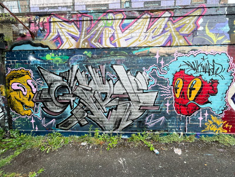
Awkward and Benjimagnetic have been having a bit of fun in Dean Lane recently, producing a couple of collaborations which are always worth photographing and reporting on.
Benjimagnetic’s GRO letters in the middle of this combination collaboration are book ended by two slightly creepy characters by Awkward. The ensemble works well as always with this pair. It is the eyes in Awkward’s characters that draw me to them, clever and impactful design.
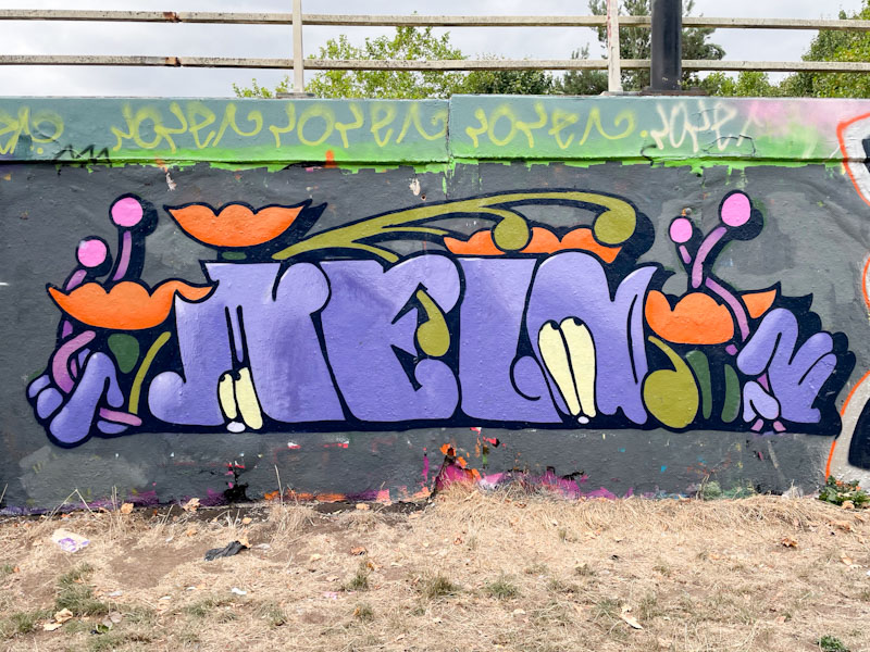
I had only met Esme Lower a couple of times before I met her again while she was painting this piece, and every time she has been ever so friendly and patient with my rambling conversation. She painted this wonderful, piece with a couple of friends on a rather nice sunny afternoon (remember those?), and she has done a really great job.
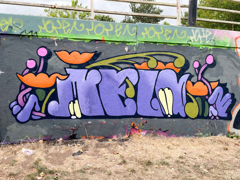
The piece spells out ‘MELO’ which is the middle section of a conflation of her first and second names. The characterful letters are beautifully decorated with flowers, and the whole piece has a hint of art nouveau style about it. This is a really neat and tidy piece, quite different from a lot of the writing we see in Bristol, which has a strong artistic flair running through it. More to come from Esme Lower.
.
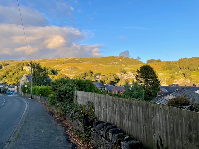
Vibrant market town
nestled in the Yorkshire Dales
breathe in the clean air
.
by Scooj
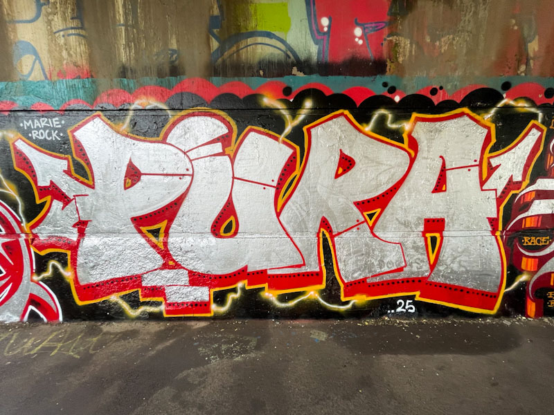
This is a pretty difficult damp wall to paint, but that didn’t stop Pura Decadencia and some friends from giving it a go a few weeks back, and because turnover here is very slow, her work is still there to enjoy.
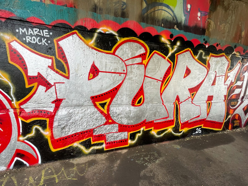
The chrome letters in this piece are accompanied by a red drop shadow and bordered with a thin yellow strip. Each of the letters is split with a red line and little ‘rivets’ either side, giving the look of steel plates hanging together, a device used by quite a lot of writers, and a really effective one. There is a white plasma bolt running through the letters, adding a little bit of extra interest, but not detracting from the big bold letters themselves. Nice work from Pura Decadencia.
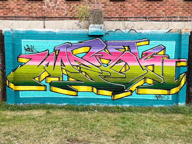
Pinning down the names of street artists can be really difficult sometimes. I call Mesk ‘Mesk’, because that is the word he most commonly writes, but his Instagram profile is @lazureness which leaves me with a bit of a dilemma. By which name do I refer to him in my blog posts. I have chosen to use Mesk.

This is a stunner in one of the wall segments at Peel Street Green, which are the perfect dimensions for writers to do their stuff. The letters here are beautifully laid out with an interesting and eye-catching array of colours blending in horizontal strips. These colours contrast neatly with the two-yellows and black lines used on the 3D drop shadow. The writing is set on a pair of blue rectangles, again contrasting with and complementing the letters. A vibrant and enjoyable piece from Mesk, or should that be lazureness?
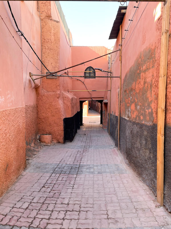
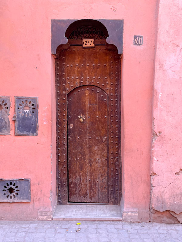
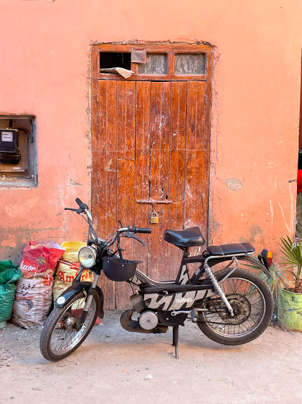
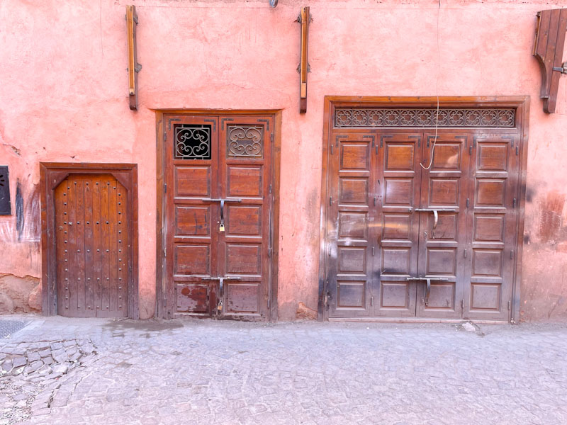
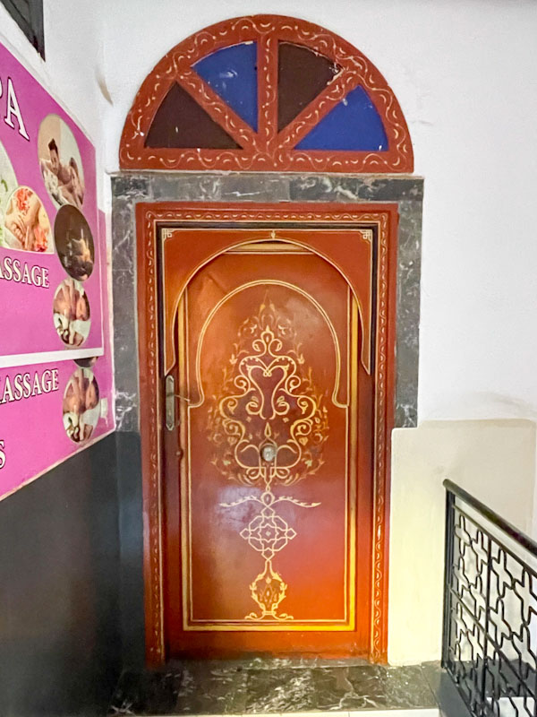
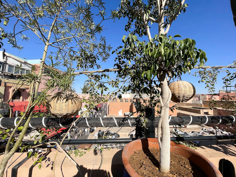
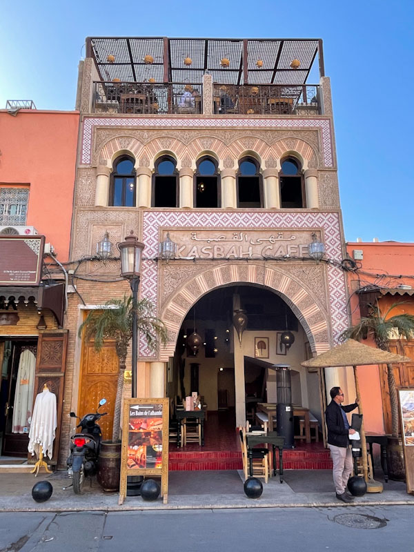
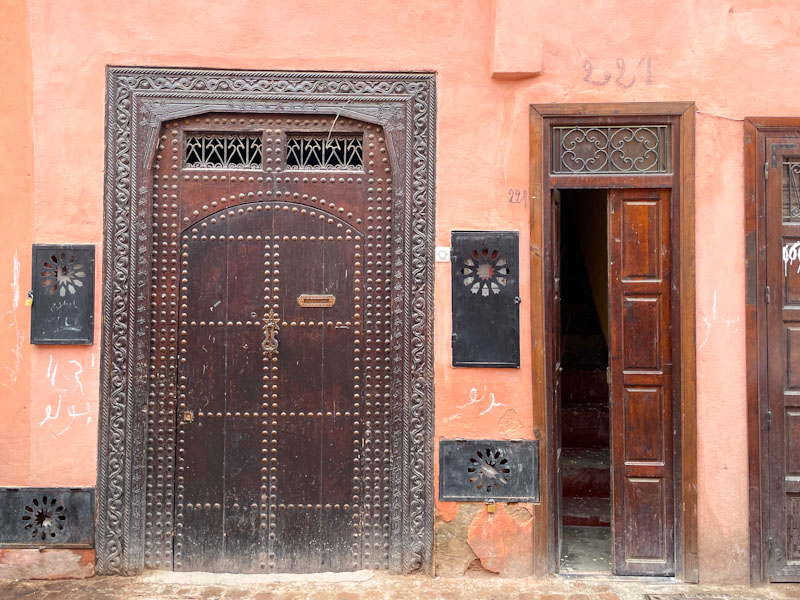
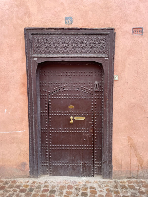
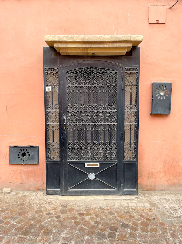
Doors 323 – Doors of Marrakesh, Morocco, January 2025 (Part IV)
For those of you who have been following this series of doors from Marrakesh, this week’s offering might feel a little bit ‘samey’, as they are more doors from the narrow lanes in the southern end of the Medina in Marrakesh. This whole area is enough to drive a door enthusiast into meltdown. It seems that each and every door is unique and very personal to the dwelling behind it, unlike in the suburbs of British (and other) towns and cities, where uniformity is more the norm.
Most of these doors were all photographed during an early morning walk on my own, which meant I didn’t need to tone down my enthusiasm to appease my wife and daughter, who get a little tired of my incessant fascination with doors. Keywords – Pinky-red walls, carvings, unique. I hope you enjoy them:

So that’s it for another week. If you miss this, it doesn’t really matter, because there is plenty more to come in the coming weeks. My only hope it that it doesn’t get too boring – although things do hot up a bit before too long.
If you have made it this far, you probably like doors, and you really ought to take a look at the No Facilities blog by Dan Anton who has taken over the hosting of Thursday Doors from Norm 2.0 blog. Links to more doorscursions can be found in the comments section of Dan Anton’s weekly Thursday Doors post.


