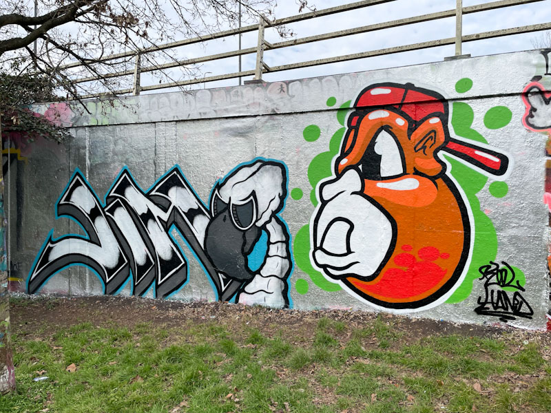
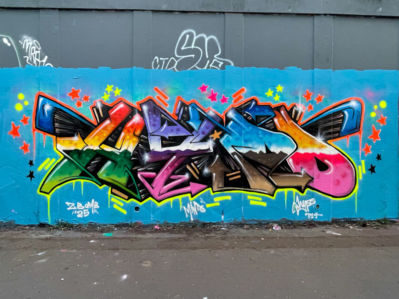
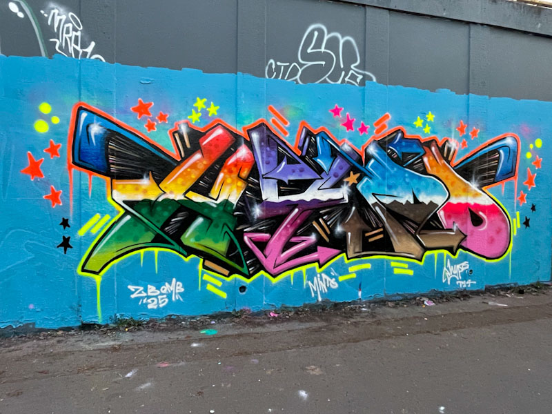
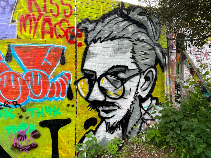
Mr Crawls and Kool Hand, M32 roundabout, Bristol, March 2025
Mr Crawls and Kool Hand have been painting together more regularly of late, and it is good to see. Their character styles, although quite different do complement one another rather well.
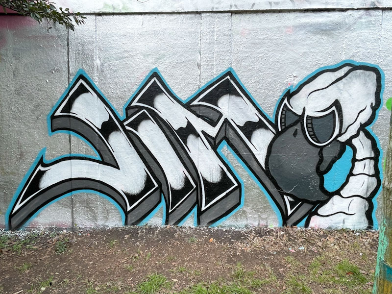
Mr Crawls, M32 roundabout, Bristol, March 2025
Mr Crawls has painted one of his ‘skeleton’ bird characters, which look slightly creepy if I am honest, but are very much part of his repertoire. He has shown another side to his talent here though, with some very nicely presented writing, spelling out JIM. I expect that this is a shout out to a friend/family member.
Kool Hand, M32 roundabout, Bristol, March 2025
Kool Hand presents his orangutan character, who over the years has developed and become ever so slightly more sophisticated. The solid fills haven’t changed much, but the clean lines have improved and the overall shape of the head has softened. Some nice white flashes add to the 3D appearance of the character. A rather nice collaboration.
Doors 309 – Copenhagen, Denmark (part IX), September 2024
The day has arrived, after a bit of a false start. This is the last in my series of doors from Copenhagen. Not only did I thoroughly enjoy my mini-break in the capital city of Denmark, but I have also enjoyed reliving it through posting this series of Thursday doors – a weird kind of vicarious experience, in which I had been the protagonist. Is that a thing?
These doors were the last I photographed during my trip, so they are not ‘odds and ends’, even though they are quite an eclectic selection.
In truth, I am also looking forward to posting doors from other towns and cities – I have so many in my archive and I am impatient to share them with you.
I hope that you enjoy this last hurrah from wonderful, wonderful Copenhagen.
Side door of Kristkirken (Christchurch?), Enghave Plads, Copenhagen, Denmark, September 2024
Nicely framed door and window, Tondergade, Copenhagen, Denmark, September 2024
Three doors and a big bird, Sundevedsgade, Copenhagen, Denmark, September 2024
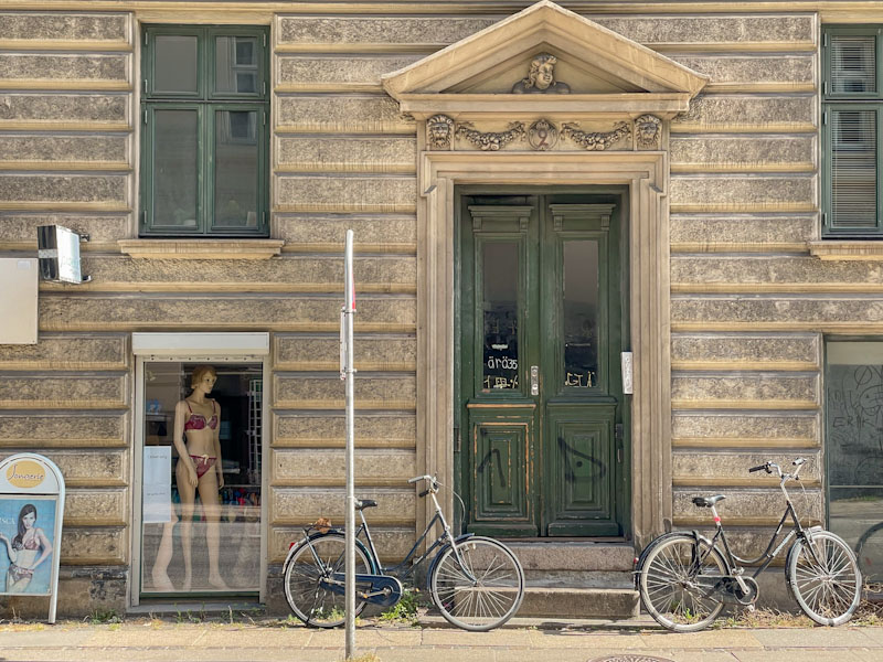
Green doors, bicycles and a sassy onlooker, Kingosgade, Copenhagen, Denmark, September 2024 (This is my favourite photograph in the whole series)
Double doors, bicycles and a fine surround, Sindshvilevej, Copenhagen, Denmark, September 2024
Doors of Hellig Kors Kirk, Kapelvej, Copenhagen, Denmark, September 2024
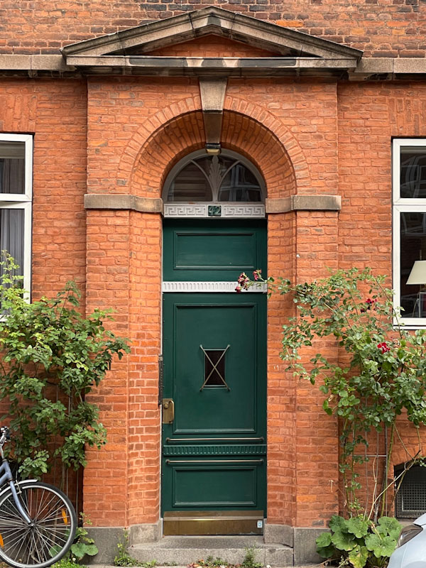
Unusual green door and beautiful bricks, Struenseegade, Copenhagen, Denmark, September 2024
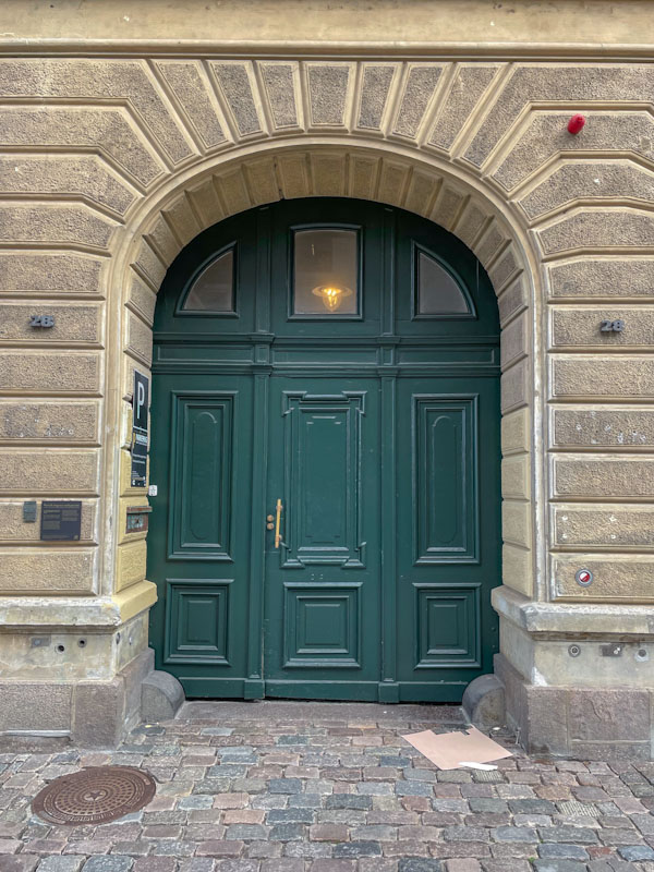
Grand green doors in Vendersgade, Copenhagen, Denmark, September 2024
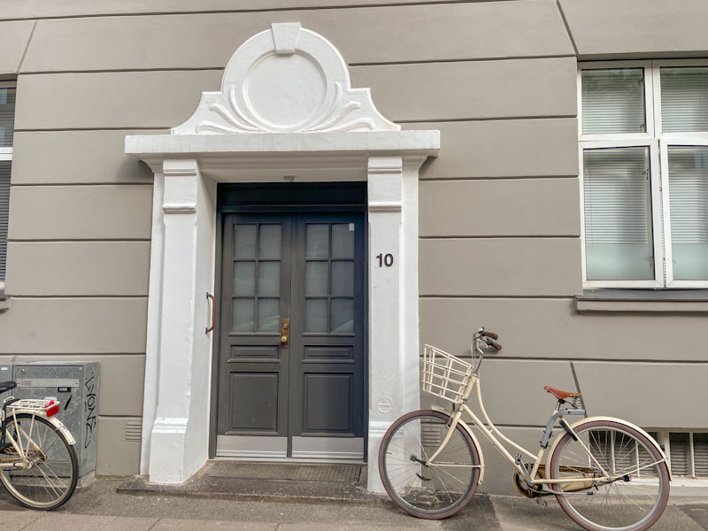
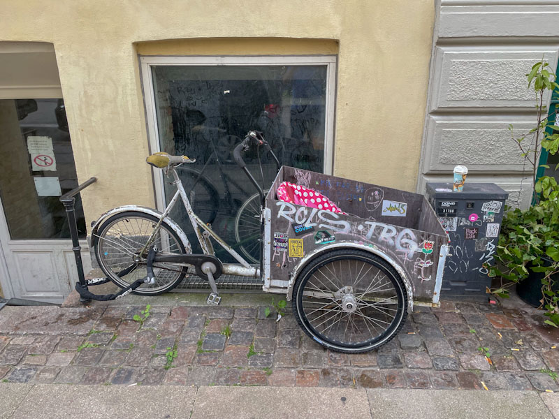
Just about a door as an excuse to show the common mode of transport in the city, Vendersgade, Copenhagen, Denmark, September 2024
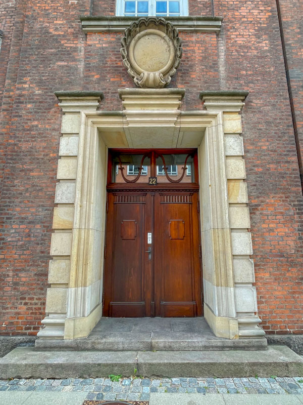
Austere corporate door, Vester Farimagsgade, Copenhagen, Denmark, September 2024
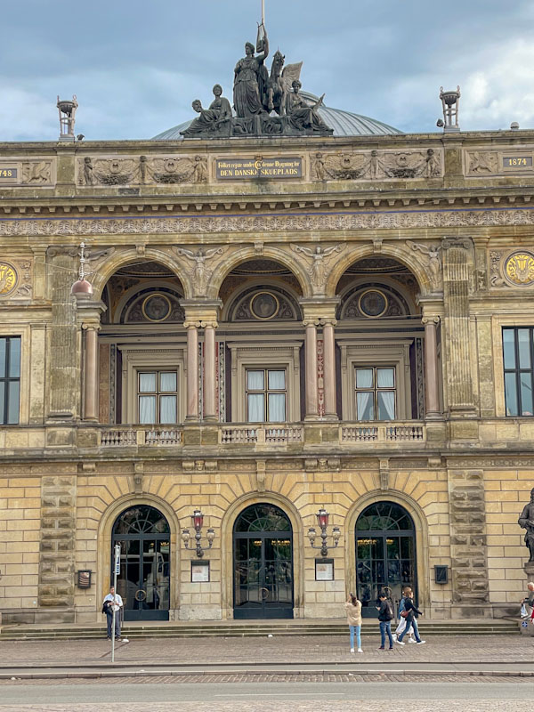
Doors of the Royal Danish Theatre, Copenhagen, Denmark, September 2024
So there we have it. I wave a fond farewell to a city that I would highly recommend to anyone. A clean, diverse, happy, historic, beautiful and somehow ‘good’ city.
Something a little different next time.
If you have made it this far, you probably like doors, and you really ought to take a look at the No Facilities blog by Dan Anton who has taken over the hosting of Thursday Doors from Norm 2.0 blog. Links to more doorscursions can be found in the comments section of Dan Anton’s Thursday Doors post.
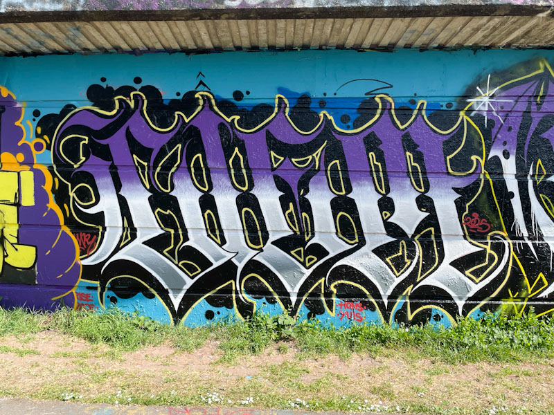
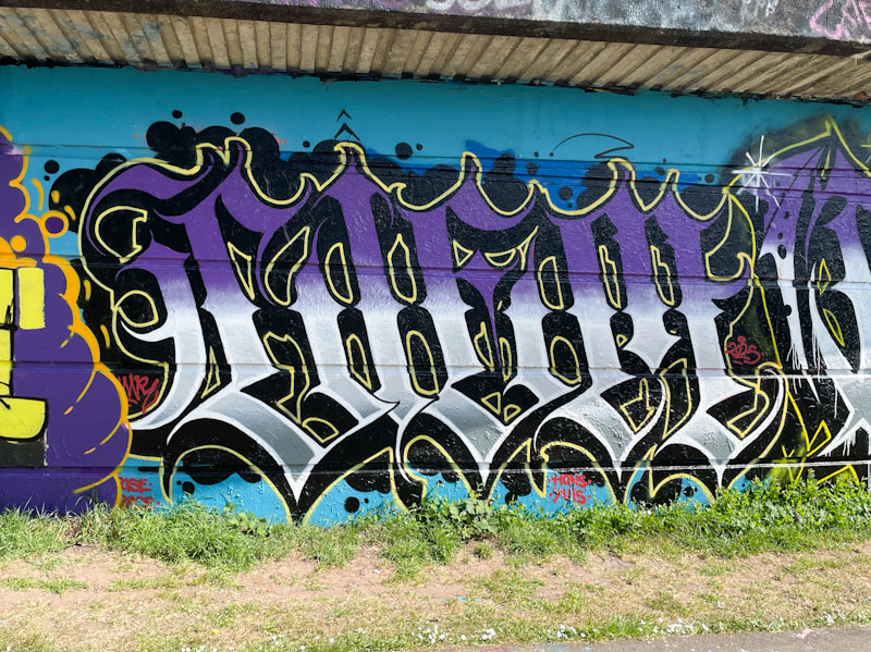
We’re back to this wall at the entrance to St Werburghs tunnel, where photography is difficult when a single piece occupies the space, because of the street furniture and also the light conditions, which are often quite challenging. This is a roundabout way of saying that I don’t think that these photographs do justice to the outstanding piece by Kid Krishna.
Kid Krishna, St Werburghs, Bristol, March 2025
The organic writing, spelling out CRIE, seems to be ‘bubbling’ or oozing out of the wall, and Kid Krishna has worked on this effect by accentuating the brickwork of the wall around the piece. The range of colours and starbursts fill the abstract piece with energy, providing a feast for the eye. Kid Krishna is on a roll!
It is a great thing that Hypo has made more time for his graffiti writing over the last year or two. His regular appearances, painting the letters HYPO are more than welcome, and he has upped his game considerably over that time.
Hypo, M32 roundabout, Bristol, March 2025
This is another piece in which he uses colour to the maximum, something he is really accomplished at, and he presents his letters with what looks like a water mark running horizontally through the letters. With subtle white highlights, his letters have a superb 3D effect, leaping out from the wall. This is a blinder of a piece.
I believe that Todoaciem has moved back to his native Spain, which would explain the absence of his outstanding calligraffiti on Bristol’s streets in recent months. I think he makes the journey back from time to time, probably to see his Bristol friends, and when he does he drops a piece, and this was a recent one from Cumberland Basin.
Todoaciem, Cumberland Basin, Bristol, May 2025
As ever, the writing is inch-perfect, spelling out CIEM, with incredible precision and discipline. The horizontal depressions in the wall make it a little easier to gain the uniformity of the letters, but that doesn’t take away from the skill needed to paint with this level of accuracy. Todoaciem’s fills transition beautifully in horizontal layers, and create a kind of metallic sheen for the piece. It is always great to find a piece by Todoaciem, especially as they are fairly infrequent these days.
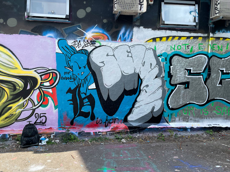
It was a genuine pleasure to catch up with Jee See just as he was finishing off this piece in Dean Lane. Jee See was the second street artist I made contact with, back in 2017, after meeting Decay in the Bearpit, and I have been enjoying his work ever since.
Jee See, Dean Lane, Bristol, May 2025
This is a SEISMIC/Mr Nobody combination piece, which includes the phrase “H is for…”, and according to what Jee See told me, H is for Heterosexual who Hates Homophobia, and for cisHet ally.
Jee See blends his trademark seismic writing with the cartoon face and the Gothic ‘H’, bringing all the elements together successfully in quite a small space. It was great to catch up with the artist, as he doesn’t get out to paint much these days – a serendipitous moment.
Jest Soubriquet is an artist with several ‘noms de plume’ such as Jest Likes and Likes Wan Tu or Likes 12, which makes things horribly difficult for my tagging his pieces, which is why I stick with the first name I came across… it just makes things simpler for me.
Jest Soubiquet, St Werburghs, Bristol, May 2025
This is another of his wonderful colourful patchwork portraits, and probably the best I have seen so far. The highly stylised portrait features a pouting woman whose face and hair are splashed with some delightful colours, and yet somehow appears to be completely normal – if that makes sense. I mean, nobody actually looks like that, but our brains compensate for the unusual colours and presents a normal portrait – clever things brains. Clever art from Jest Soubriquet.
Normally, when Haka paints one of his graffiti writing/character combination pieces, I recognise the character from a children’s picture book. This time Haka has stumped me – I am not familiar with any books containing a lizard, and can’t tell you too much more about it.
Some classic HAKA letters sandwich the lizard, although I note that only the right-hand side has been decorated with stars. I wonder if that is an omission, or whether it is the lizard that has emitted the stars from its claw. The lovely piece was difficult to photograph on such a sunny afternoon, something that has been a constant problem during our glorious spring.