
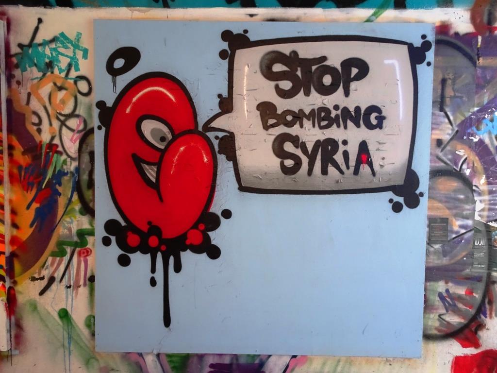
A collection of amazing abstract street art by Bristol artist Mr Klue (Klue Wone)
Instagram: @mr_klue
All photographs taken by Scooj


A collection of amazing abstract street art by Bristol artist Mr Klue (Klue Wone)
Instagram: @mr_klue
All photographs taken by Scooj
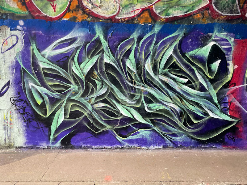
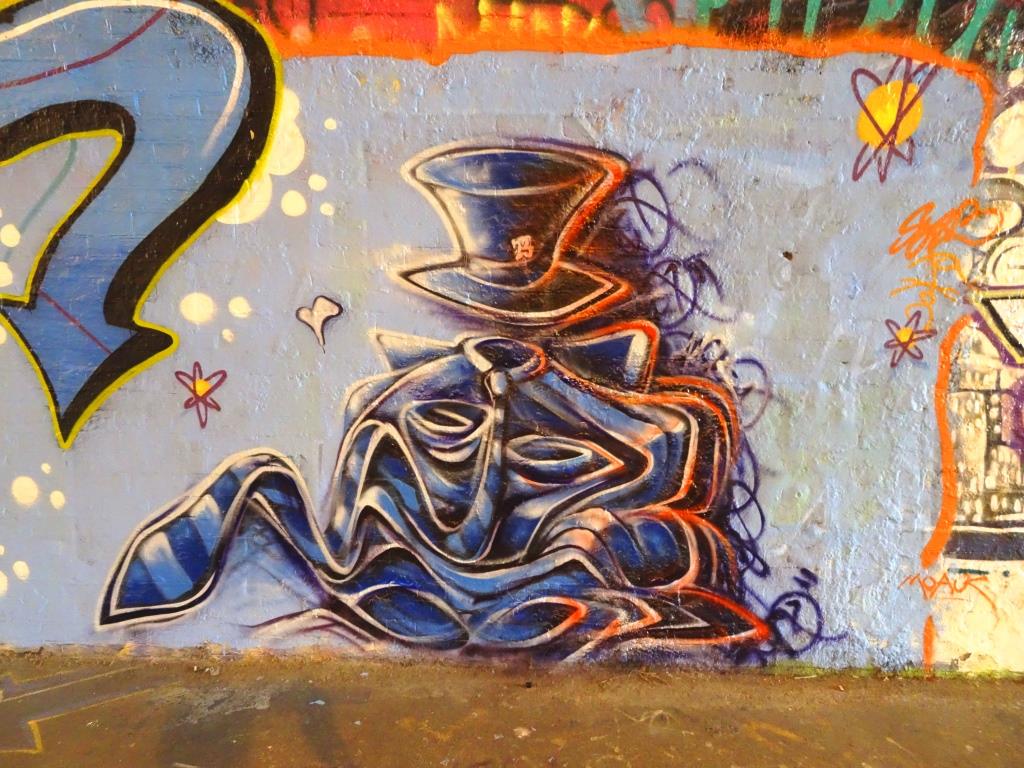
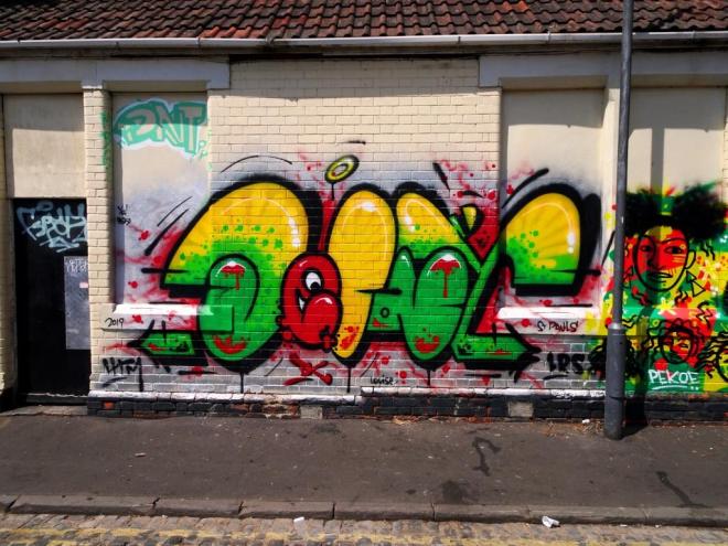
Mr Klue, as I have mentioned before has been on a bit of a binge lately, and has produced as many pieces in the last couple of months as he has for the rest of the year. This is something that should be celebrated, as his work is emblematic of the down to earth Bristol street art scene.
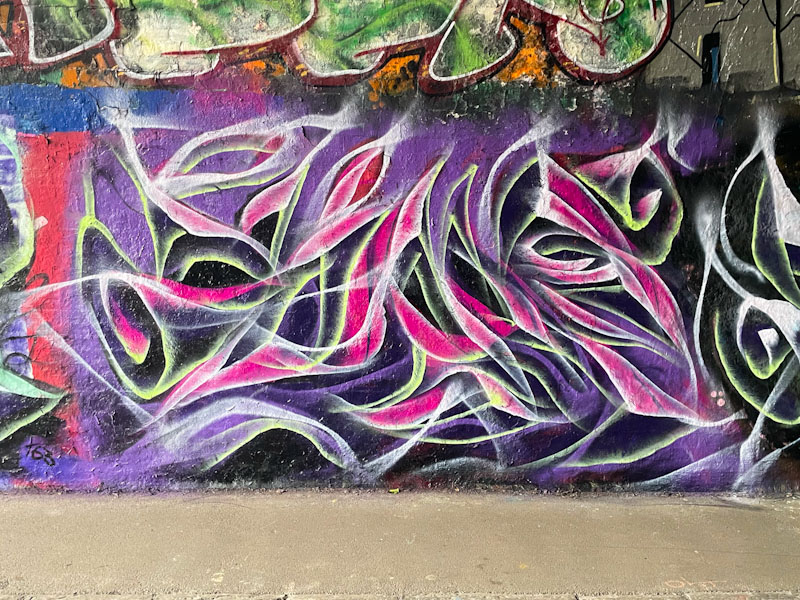
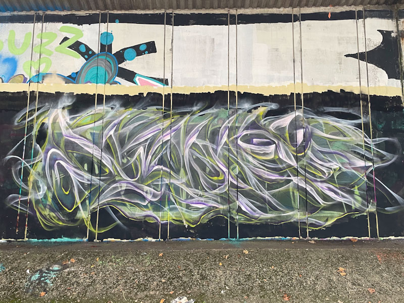
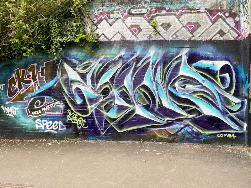
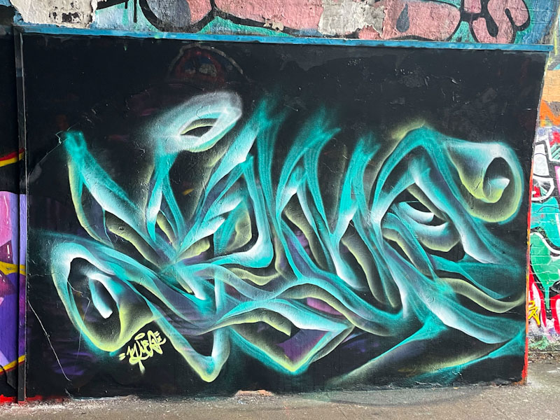
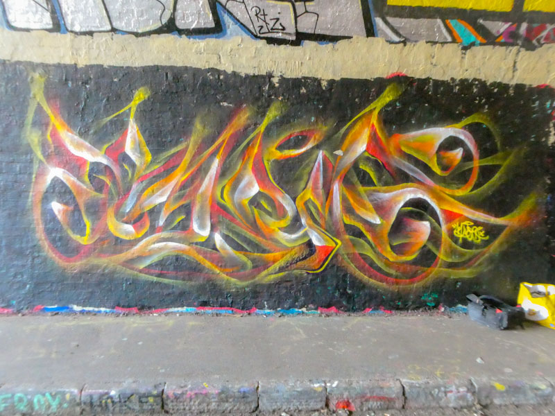
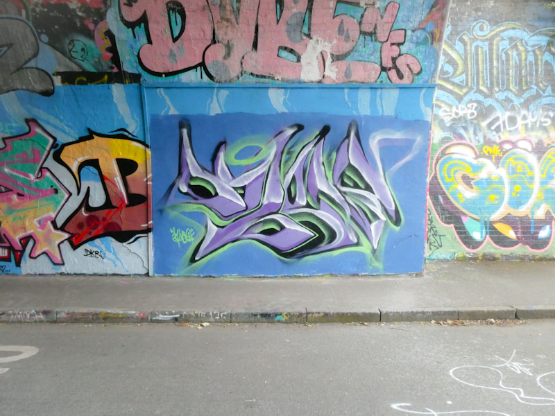
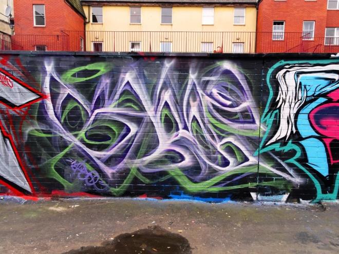
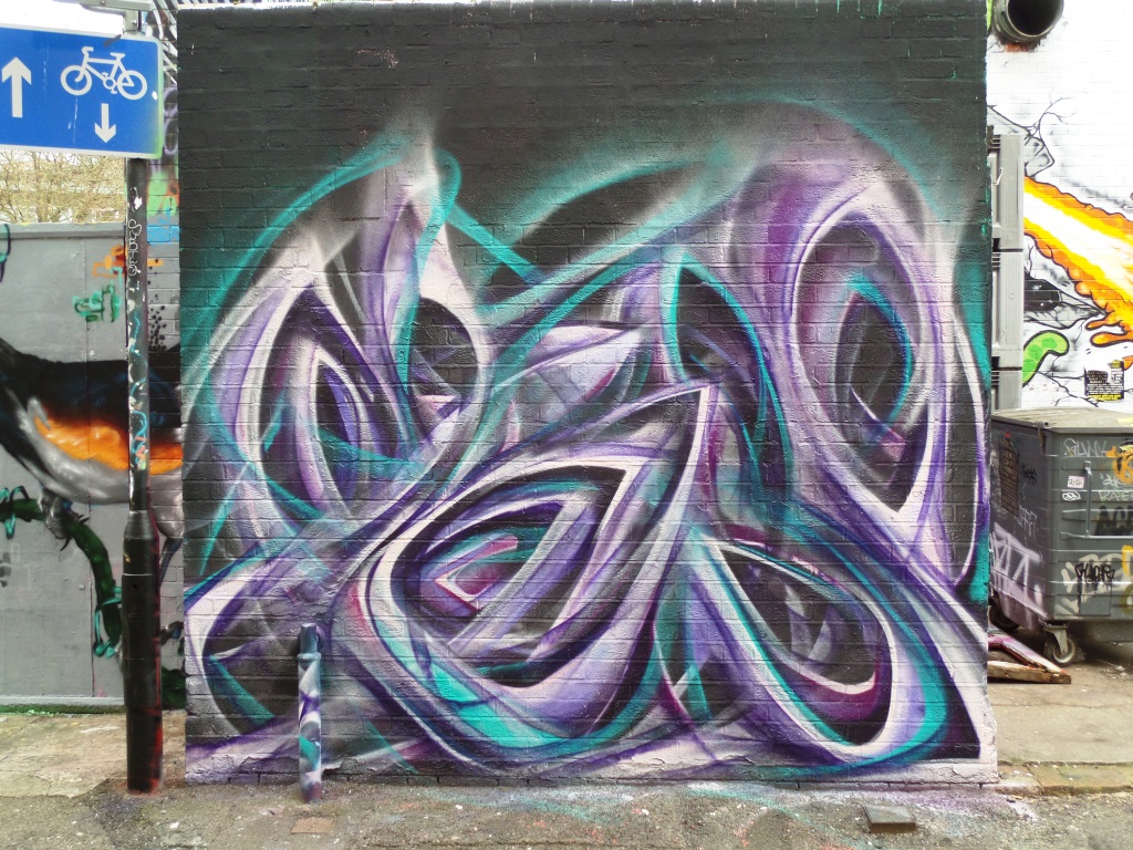
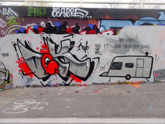
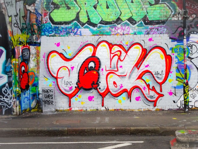
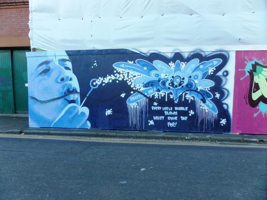
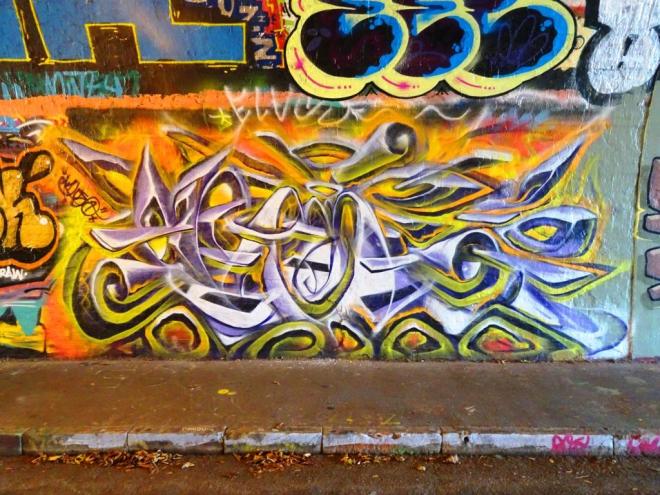
This piece in the tunnel at St Werburghs by Mr Klue has an ephemeral, wispy, smokey quality to it. I think that the letters spell out KLUE, and the whole thing is a little different from his normal offering in that it is less complex somehow.
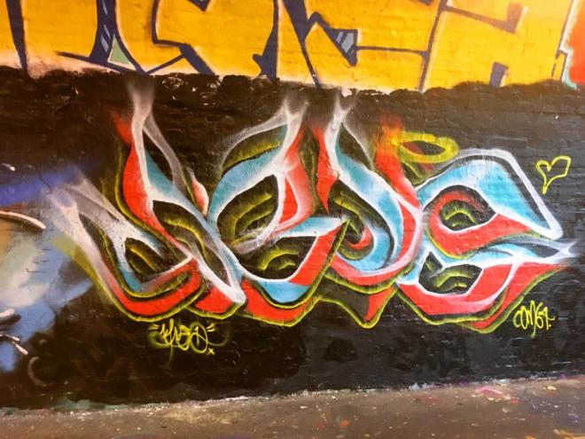
I guess that when writing letters, there is less freedom for the abstract artist…sure you can do swirls and twirls and disguise the letters, but they are still letters. With the free-form abstract work one usually sees from Mr Klue, there tends to be a little more richness, texture and content. Having said all that, I rather like this and the colour selection too works for me.
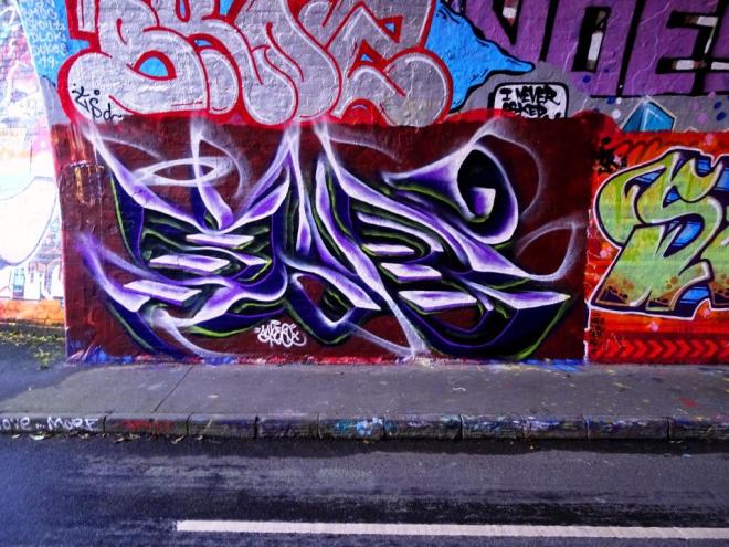
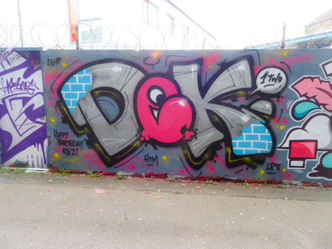
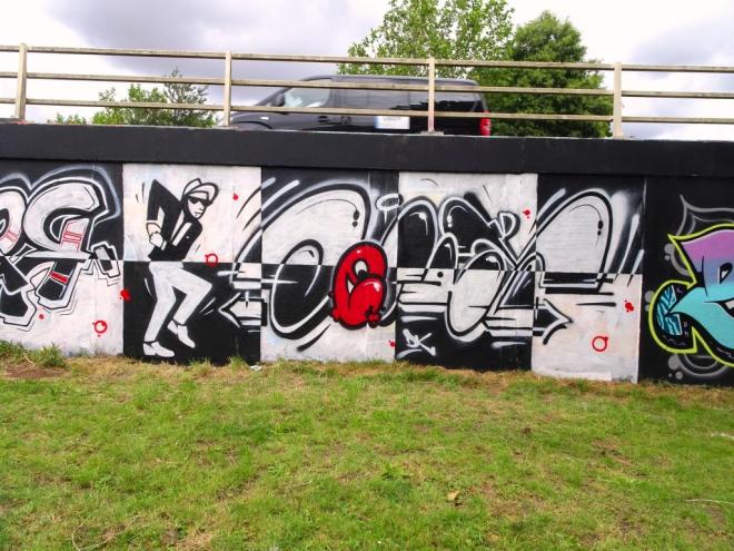
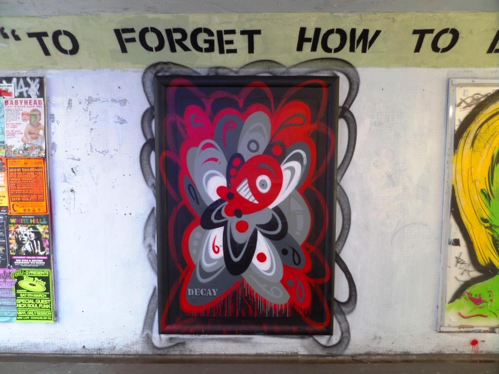
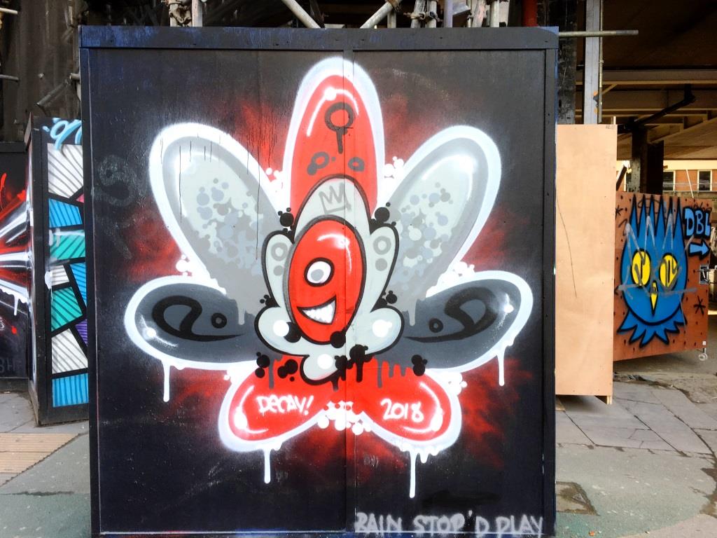
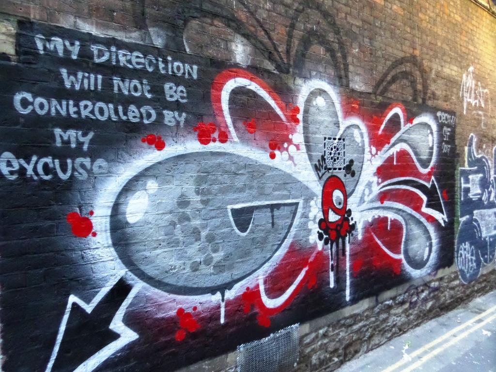
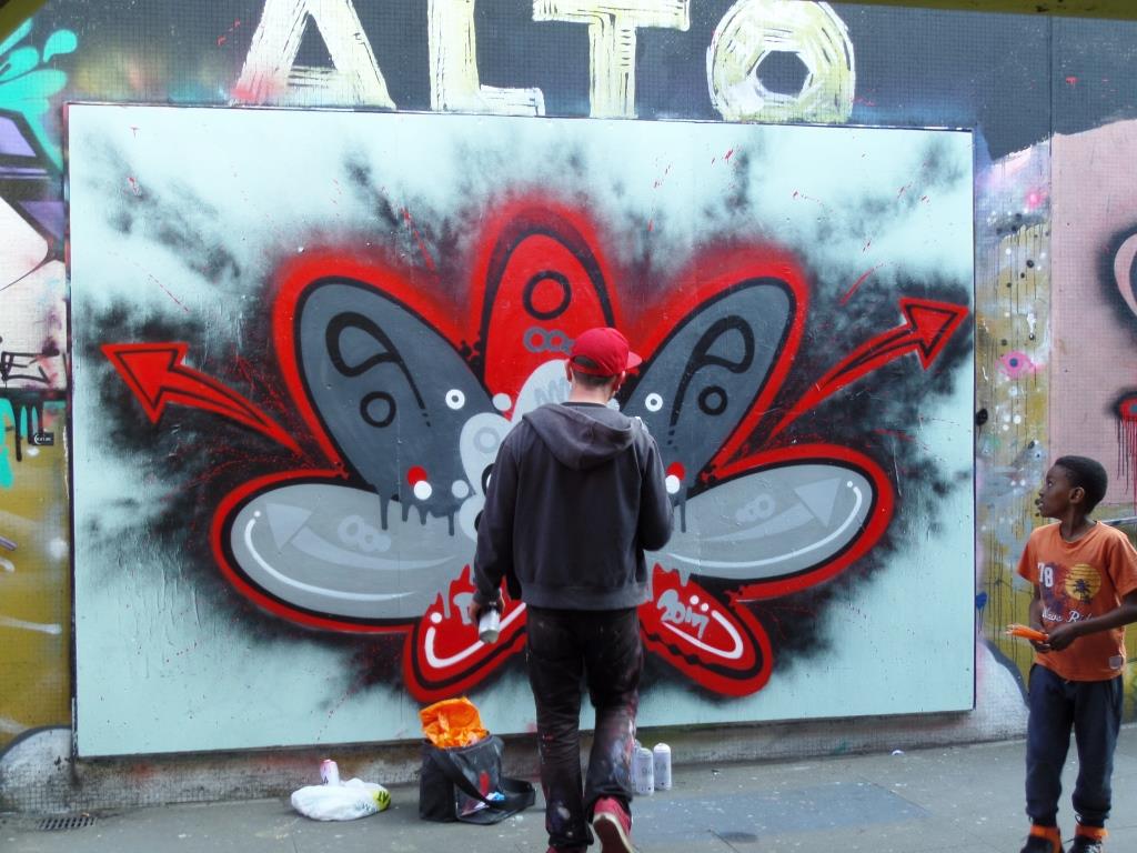
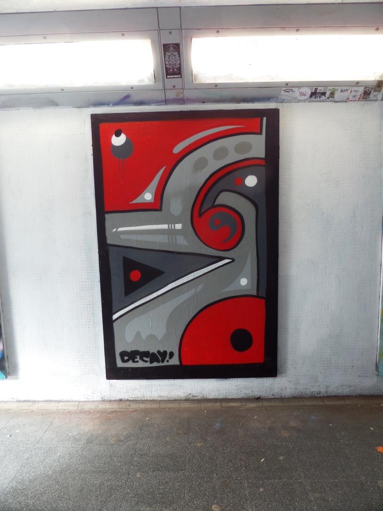
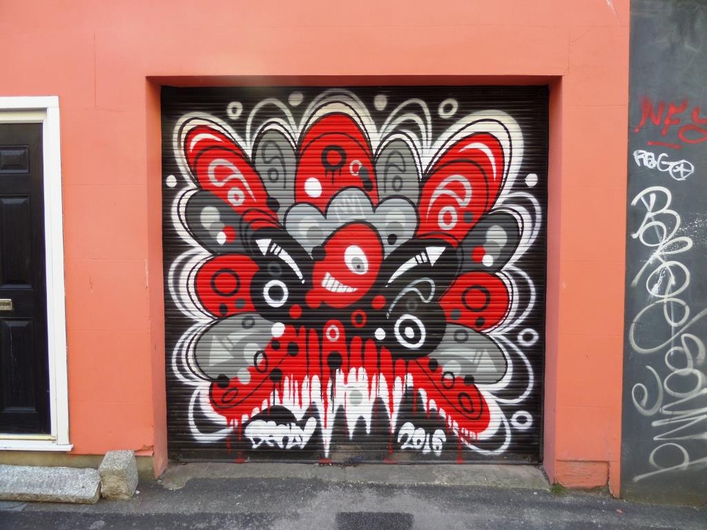
We are lucky in Bristol to have people like Decay who continue to spray down at The Bearpit in spite of a Council determined to clamp down on spraying. Most of the decent work down there is confined to the boards that were put in place by the People’s Republic of Stokes Croft (PRSC), and this is where most of the recent work is, like this one. All the other walls are regularly buffed (at some expense ) by the Council. The paint doesn’t even get to dry before the taggers move in. It is an insane cycle of self-destruction. I really think that the Council need to devise a better plan. The Bearpit has the opportunity to become the best legal wall in Britain if they just try to think outside the box.

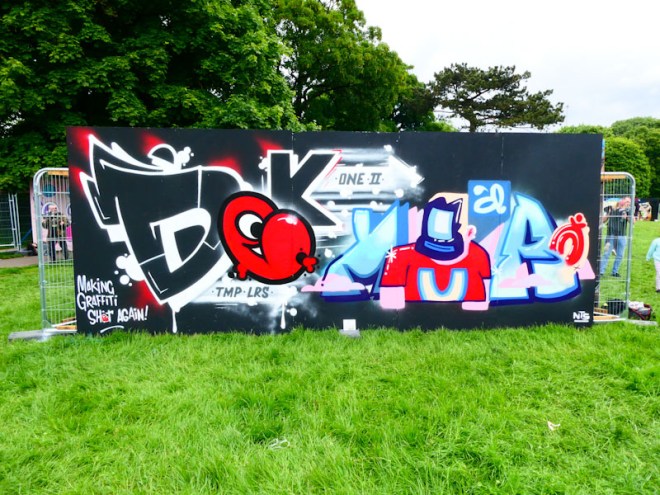
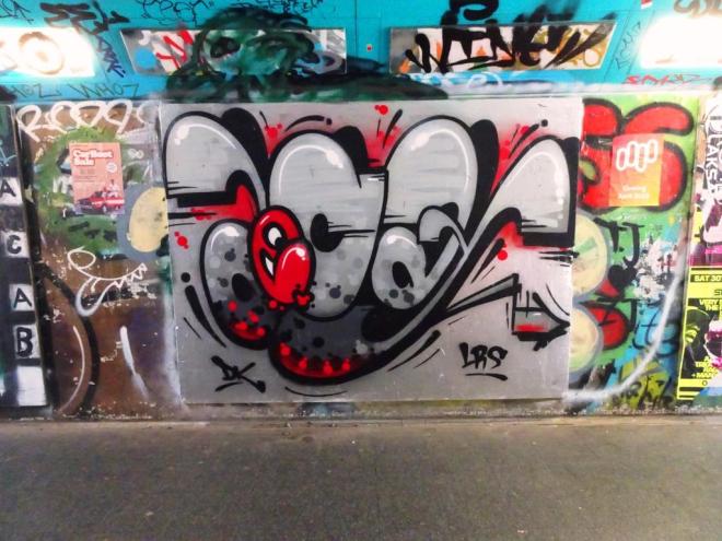
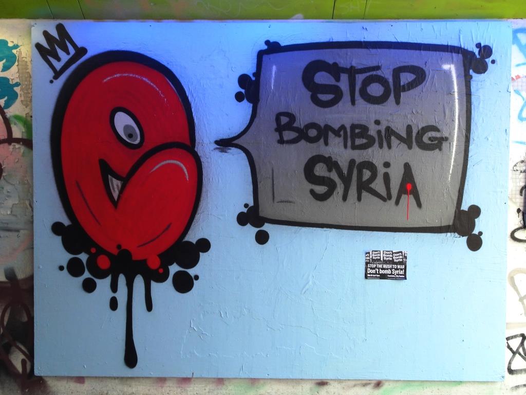
This Decay piece was a nice surprise for me as I rarely expect to find much down in The Bearpit these days. Great letters (DK) and for good measure two of his little character faces. Unfortunately there is a small poster slapped right in the middle – I guess it’s all part of the furniture.
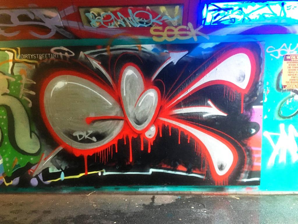
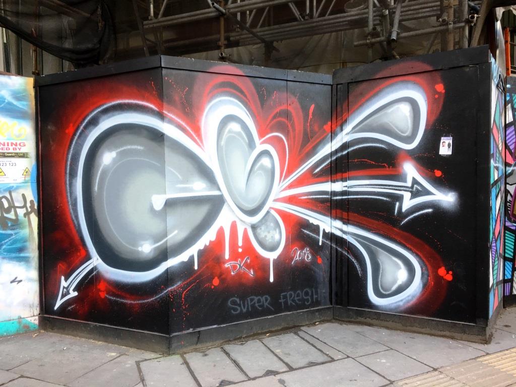
A collection of wonderful abstract street art by Bristol artist (formerly of Cheltenham), Decay (DK)
Instagram: @dk_tmp_lrs
All photographs taken by Scooj


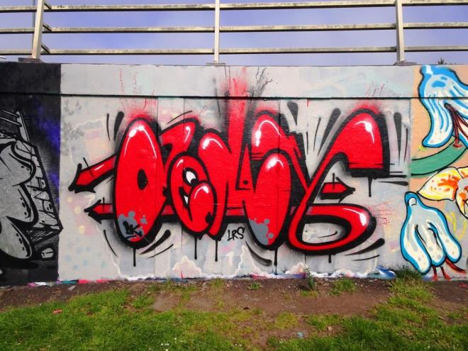


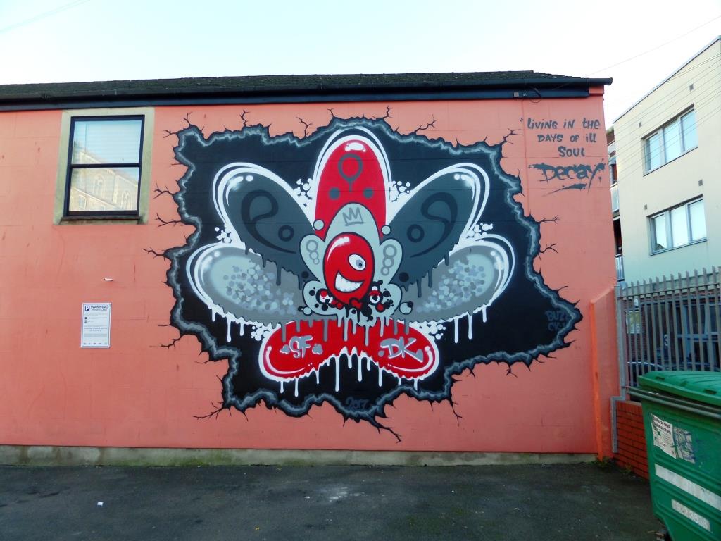


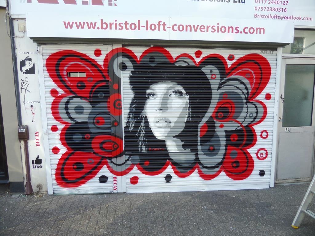


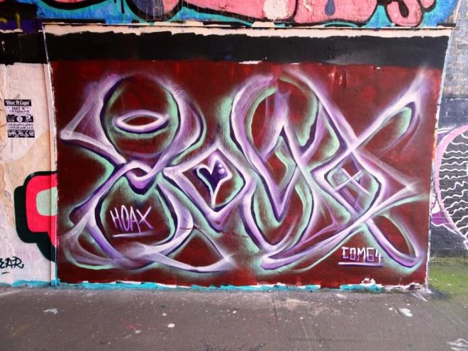
I have known about this wonderful piece by Decay for quite some time, but just haven’t had the time to get to this part of St Pauls until very recently. The abstract work was painted to mark the St Pauls carnival and Decay has exchanged his usual greys, blacks and reds for the Rastafarian colours of red, gold and green.
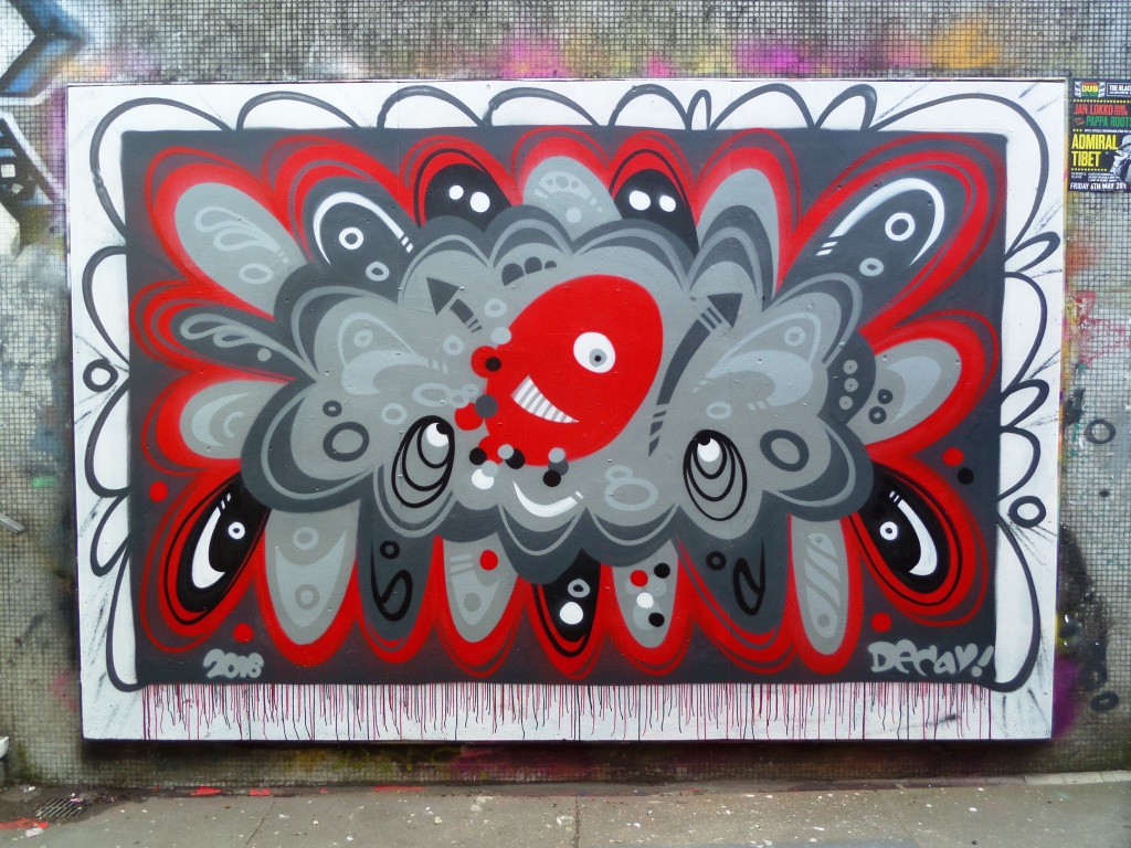
I feel like I have had slight withdrawal symptoms from having seen so little of Decay’s work since Upfest, so finding this was just what the doctor ordered. His abstract formation, or variations of it, are always pleasing to the eye and so distinctive that no signature is required. Nobody else does anything like this.
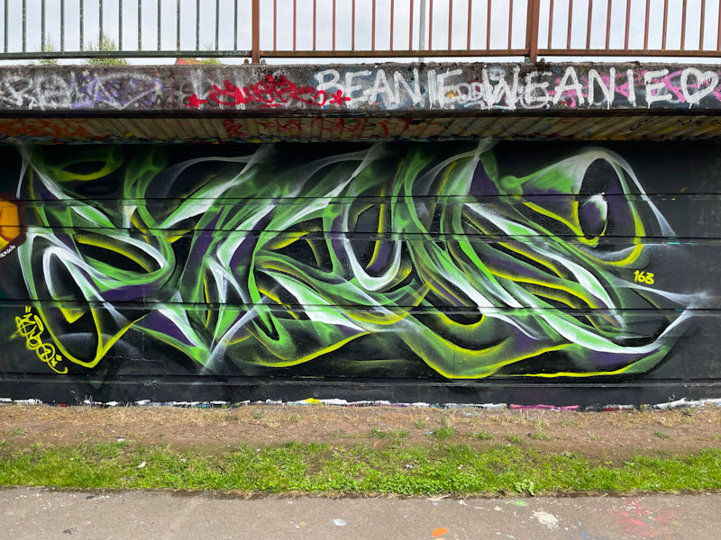
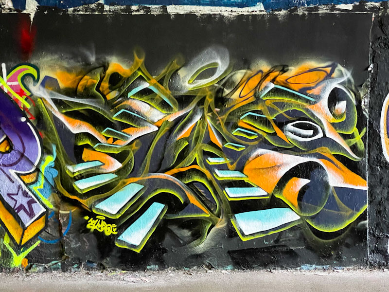
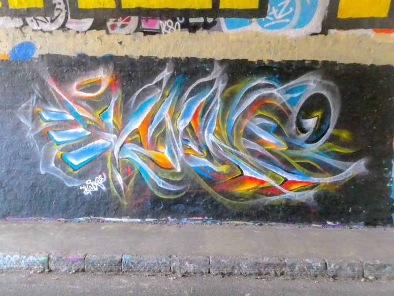
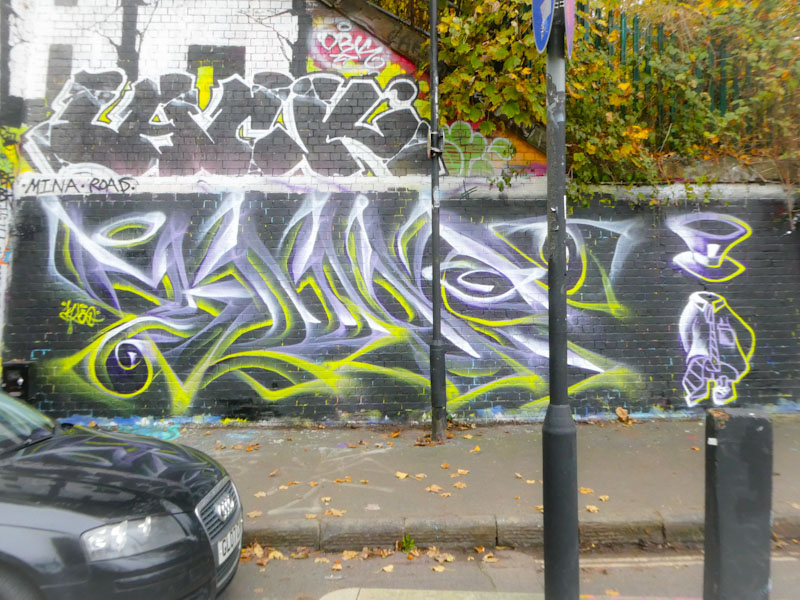
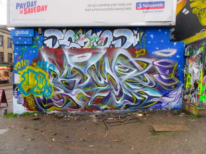
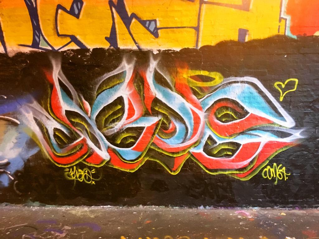
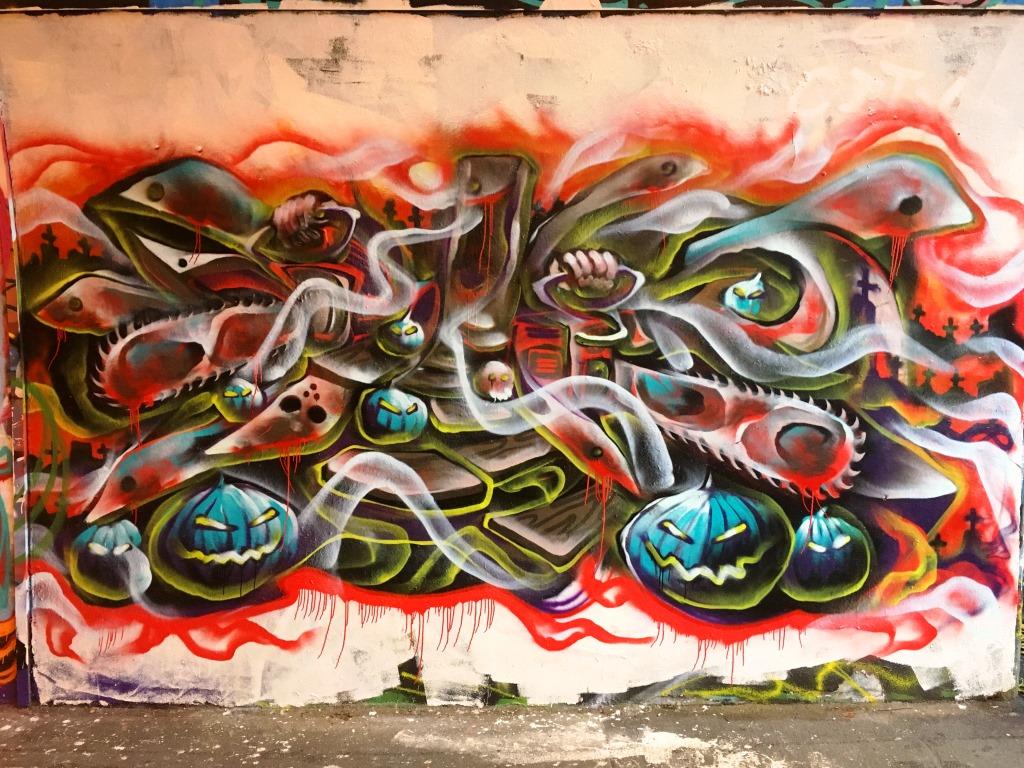
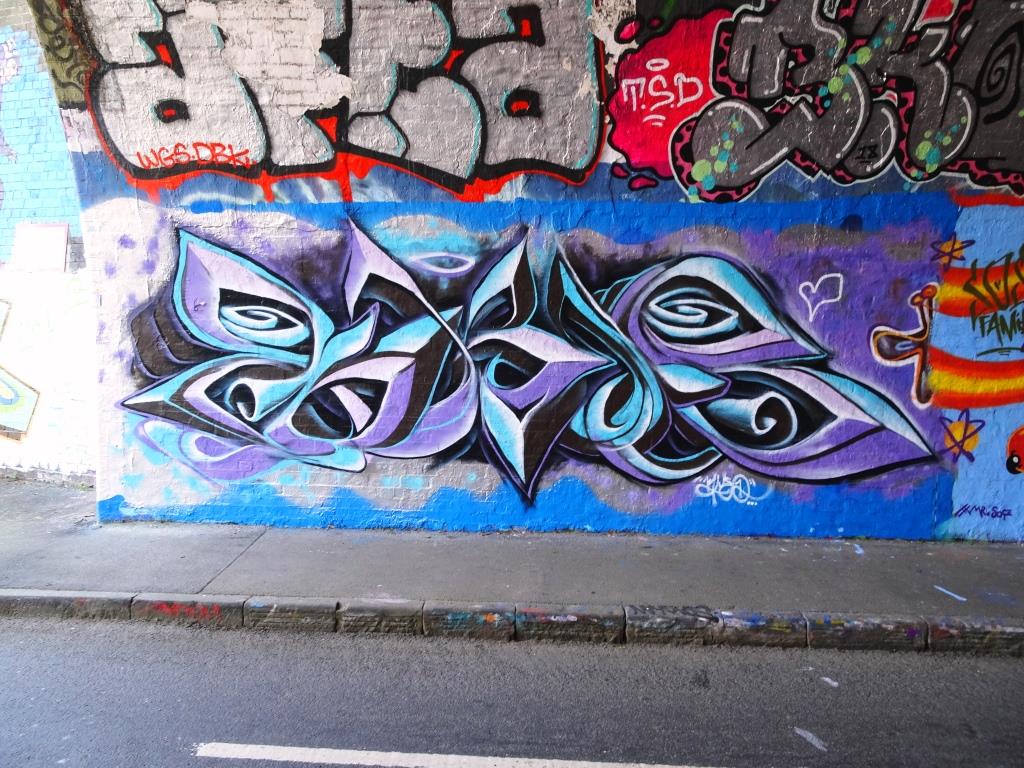
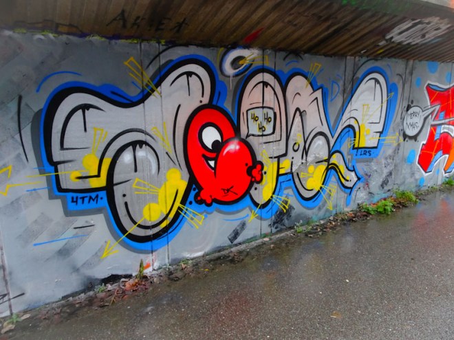
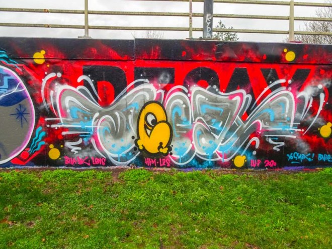
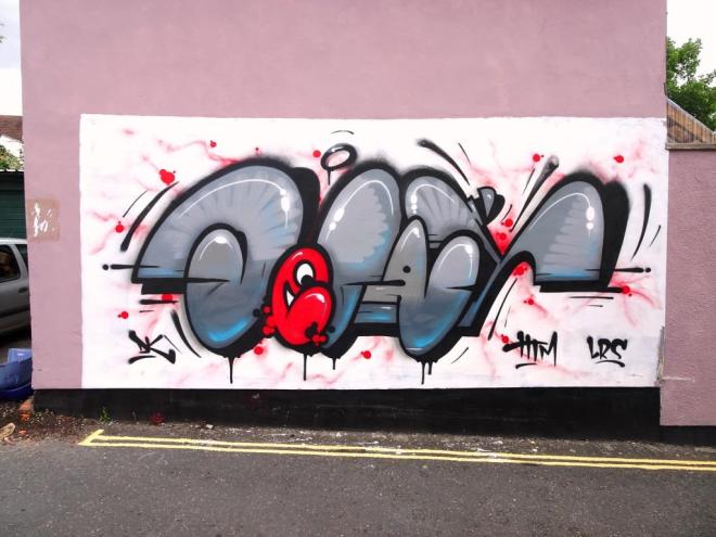
Well, well, well it would seem that Mr Klue has rediscovered his mojo, which is absolutely brilliant news for this king of abstract street art in Bristol and is also pretty good news for me too.

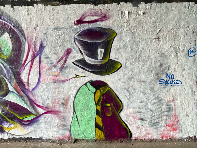
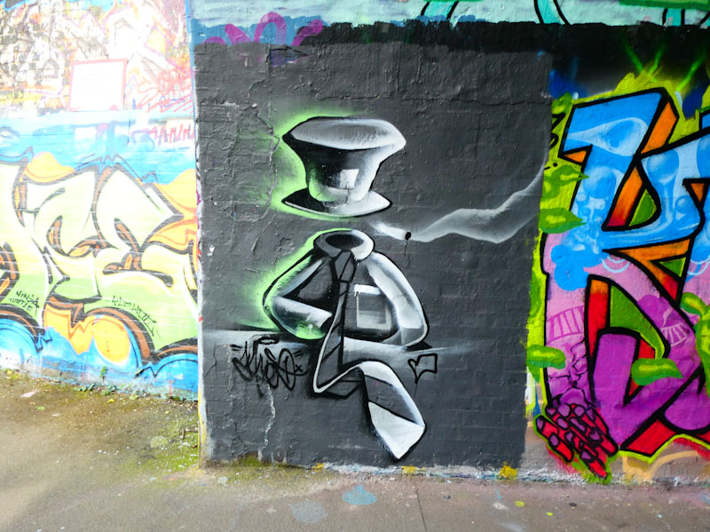
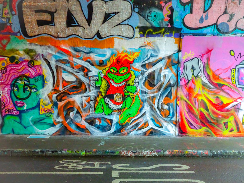
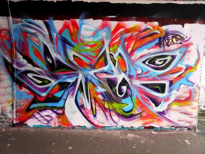
Over recent weeks Mr Klue has been turning out a whole load of excellent pieces, mostly in St Werburghs tunnel, and this one was form the very end of October. I mentioned before that there had been a great crop of Halloween pieces this year and this is one of them.
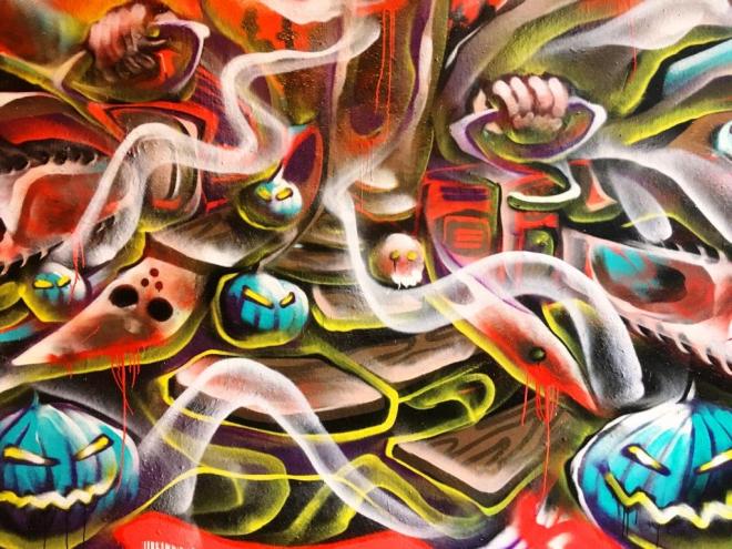
Much of Mr Klue’s work is peaceful and calming, but a quick glance of some of the detail in this one shows a fair amount of menace…the chainsaws are particularly horrific. I love this piece, and it really brings out another side to the talents of Mr Klue. One of my all-time favourite Halloween pieces.
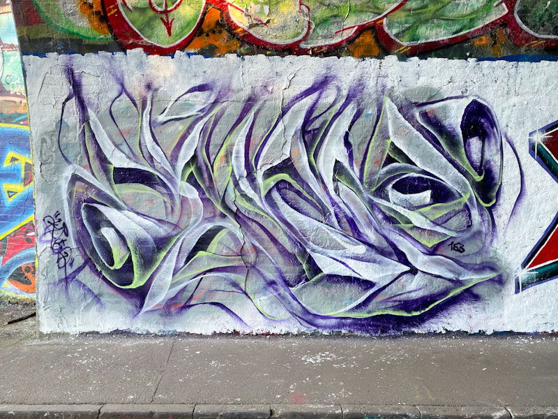
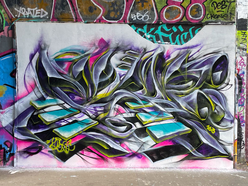
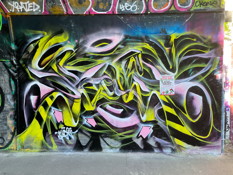
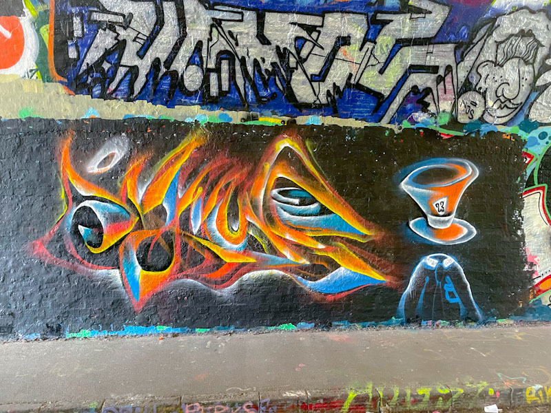
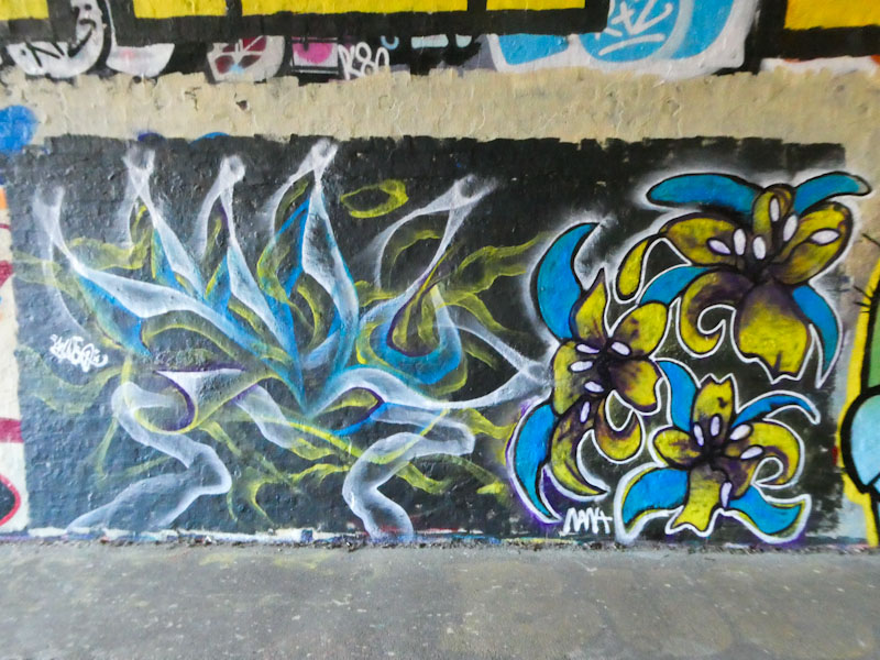
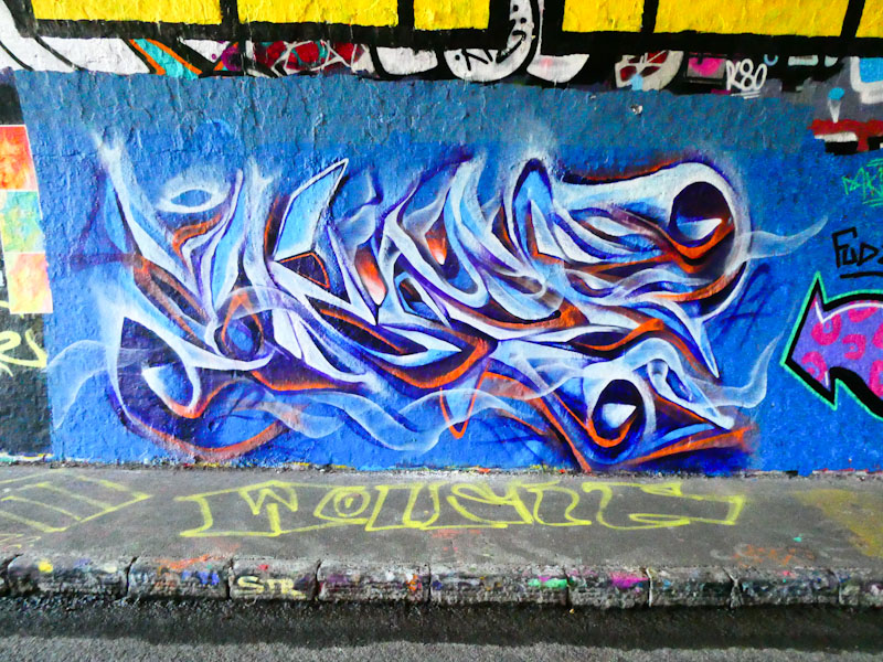
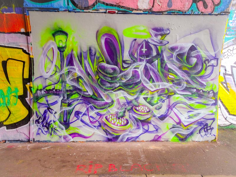
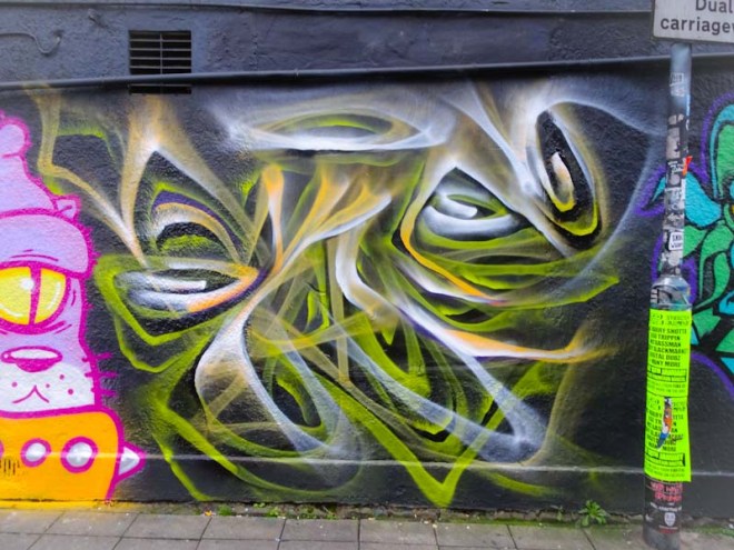
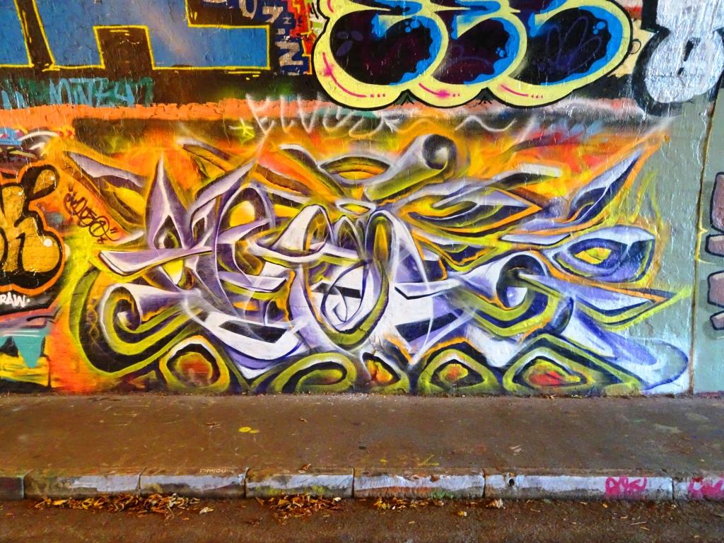
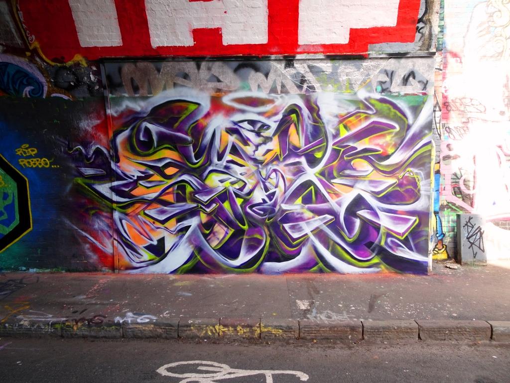
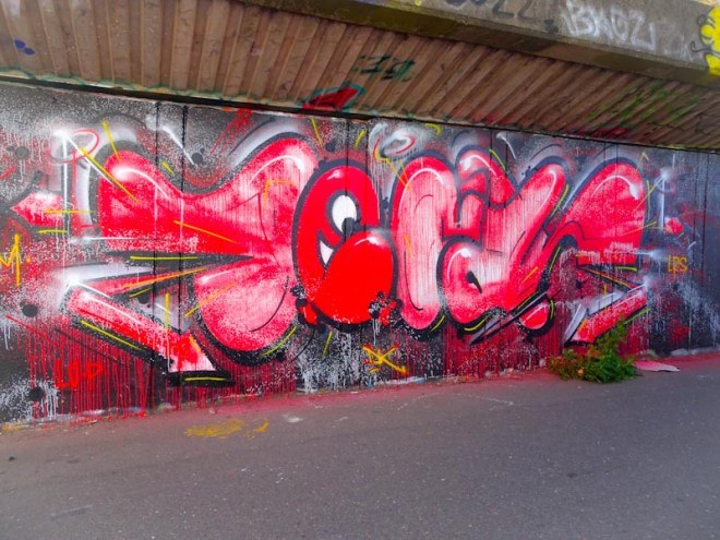
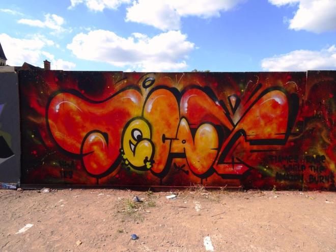
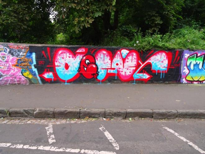
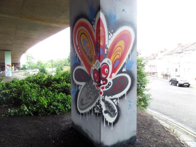
I have always had a massive soft spot for Mr Klue’s work – I love to examine it and unravel all the different abstract elements that combine to such great effect. As is always the case in this tunnel, the lighting has played havoc with the true colours of the piece, but the form is there for all to see.
After what feels like a bit of a lull in his work, it appears that he is becoming a little more active on the streets, which is a good thing. I first became aware of his work in the Stokes Croft area of Bristol, but it is telling that the decline in decent walls there and the Council’s stance on The Bearpit has driven artists like Mr Klue away (I am guessing). This is a fine piece indeed.
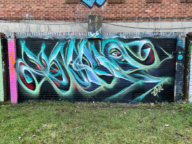
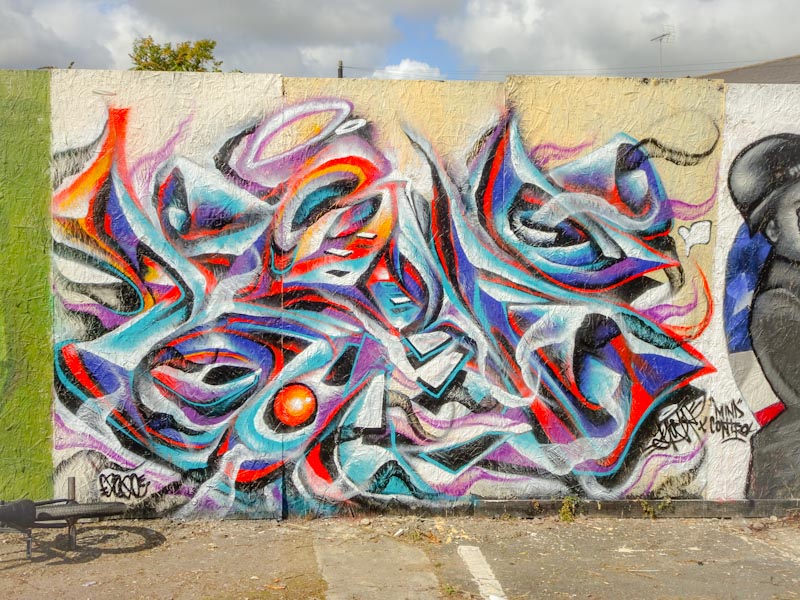
I haven’t seen anything from Run Z for a little while, so it was good to come across this great abstract piece in the little foot tunnel in New Stadium Road. This is a favourite haunt for Deamze, Soke and Voyder, but others come here too.
Run Z always brings something refreshing in his work as it is unlike most of the rest of the street art in the city. His patterns and exceptional colour choices set his work apart from the writers and character painters. He joins the small band of abstract artists whose work I love to see.
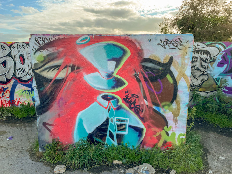
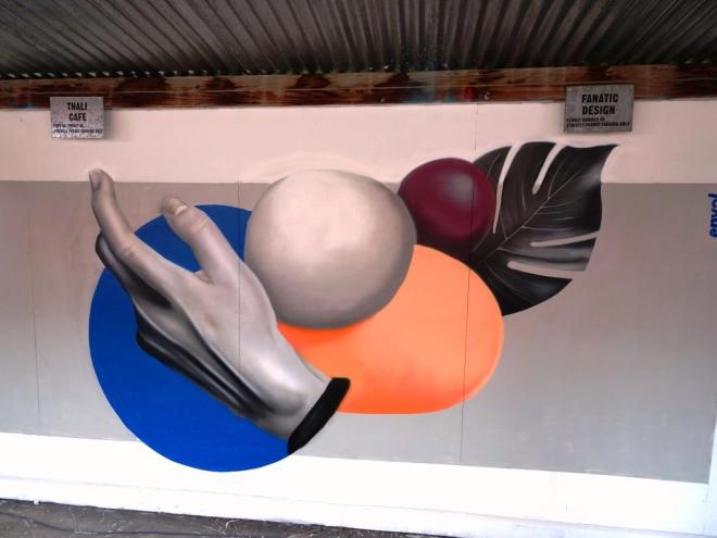
On the long car park wall of The Tobacco Factory one of the most eye-catching pieces is what I would describe as a still life study by the talented Envol. I first became aware of the artist at last year’s Upfest and his style is so very distinct.
There is something rather pleasing about this assemblage of recognisable things, the hand and the Swiss cheese plant leaf together with rather more abstract shapes. The painting draws the eye from one side to the other (in my case from left to right) before settling on the whole.
During the festival this area is a real squeeze, and it can be rather difficult stopping to take pictures without getting nudged in the back or caught up in the tide of human impatience sweeping towards the street food area. Last year’s piece is shown below.

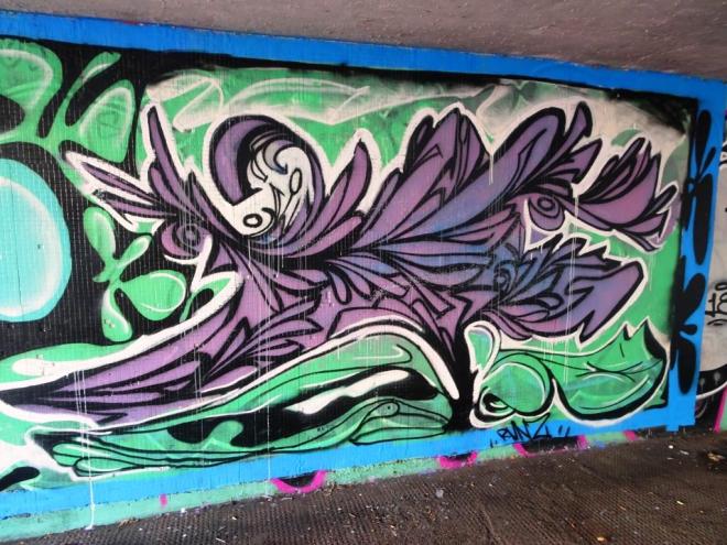
Alongside a rather magnificent Sled One piece i posted a little while back is this really unusual work from Ments. I haven’t seen much of his work for a while, so it was great to find this. In the past I have described his work as ‘organic’ in its form, but this piece represents quite a departure from his previous work.

There is a modernist feel to this piece, abstract surrealism almost and I rather like it. The writing spells out MENTS as it does in most of his work, but this time it is a little more legible. The colour selections are quite unusual but seem to work pretty well on this bright red background. More to come soon from Ments.


