In Bristol, there are dozens, literally, of writers bubbling under the surface. Many of these are not as well known as some of the more established graffiti writers, but every once in a while one of them breaks cover and rises up a level or two. This often coincides (unsurprisingly) with their appearance on Natural Adventures. Omie is one of those artists whose work I have noticed and admire.
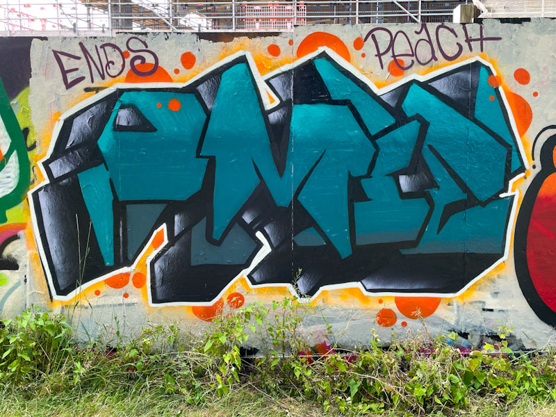
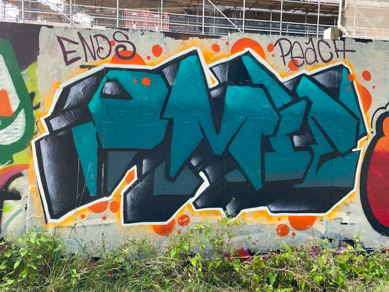
Omie, Greenbank, Bristol, July 2024
The refreshing thing about Omie’s work is that every piece is completely different from the last in style and composition, which keeps things very interesting. These heavy block letters spelling out OMIE in dark grey-green tones are given extra weight by a chunky 3D drop-shadow. Some orange decoration around the outside provides plenty of contrast to help the piece stand out. Nice work from Omie.
I have to confess that I really struggle with promotional pieces. In my purist mind I feel that straying into advertising (whether for mates or for commercial outfits) crosses the line between street art and the ‘edge’ that goes with it, and mainstream commercial activity. This is a personal view, and you may wonder why I post promotional pieces… well I suppose I do it for completeness and to showcase the full spectrum of whet we see in Bristol.
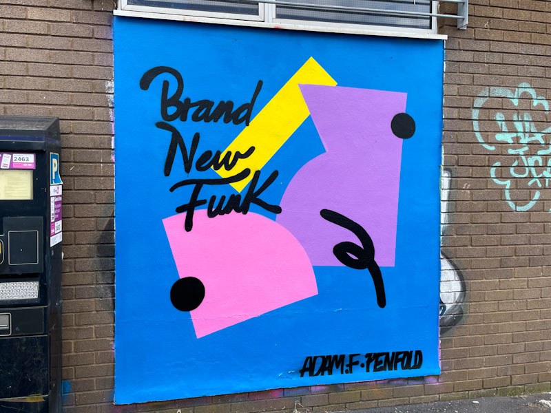
Mr Penfold, White Street, Bristol, June 2024
Mr Penfold uploaded a video of himself painting this piece, which reveals his techniques for getting his straight lines and curves into his designs. It is a great abstract design from the artist and is perfect for the spot that he chose to paint.
I love Conrico’s work. He has the most incredible capacity for telling stories through his art. Rarely is there a static portrait or lettering that does nothing more than look good. The other thing that I admire in his work is his spray style that looks more like brush strokes than spray – clever stuff indeed.
Conrico, M32 roundabout, Bristol, June 2024
This piece was painted during the paint jam to celebrate Wispa’s birthday (in absentia). I am guessing, but can’t be sure, that Conrico has painted a portrait of Wispa in honour of her birthday, which would make sense. He has included some writing, which I think might be Japanese, which I cannot read. A nice piece that is so typical of his unique style.
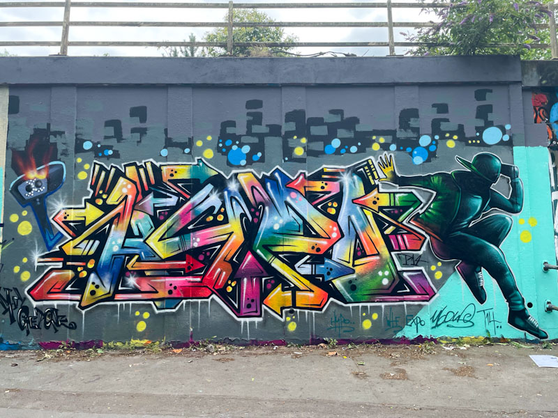
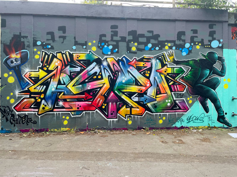
What a wonderful surprise it was to come across this outstanding collaboration from Hypo and Ulow. Regular readers will be familiar with Hypo, especially as he has been so productive over the last year or so, but Ulow’s appearances are rare these days, so this was a real treat.
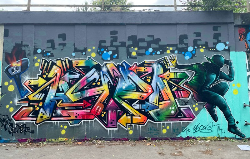
Hypo and Ulow, M32 roundabout, Bristol, June 2024
This collaboration is out of the top drawer. Hypo’s super-colourful writing is as good as I have seen from him and has a touch of Hemper in its presentation and depth… praise indeed. Ulow has an incredible talent for painting the perfect graffiti characters, and his dancer on the right hand side of the collaboration matches the energy of Hypo’s writing. This is a supremely good piece, and one of my favourite collaborations so far this year. Bravo!
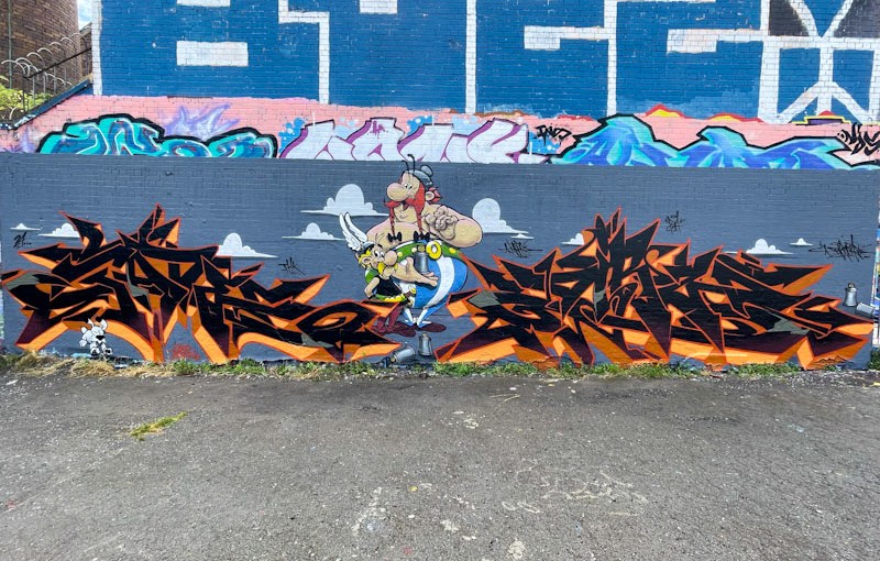
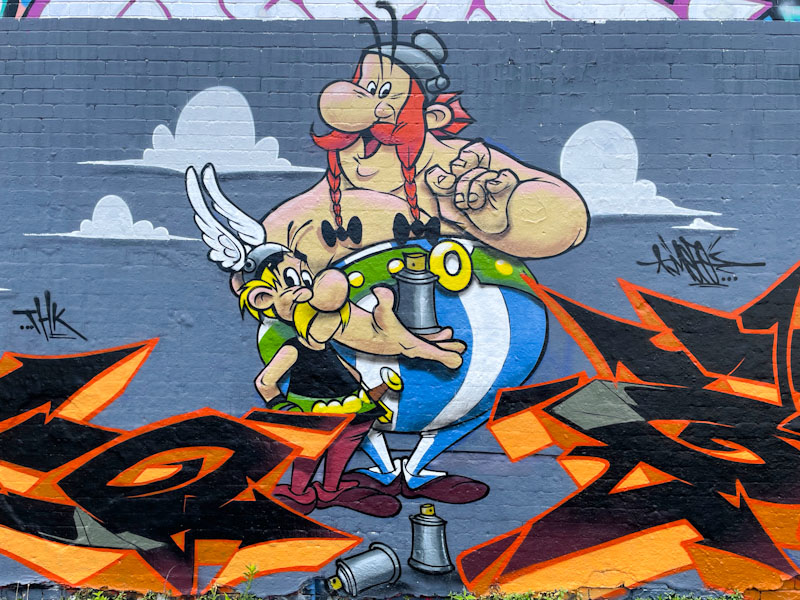
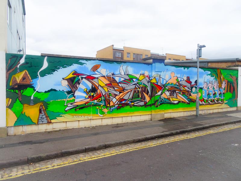
This is the second piece (the first was by Deamze) I have seen in Bristol featuring Asterix and Obelix from the children’s comic book series written by Goscinny and illustrated by Uderzo, both, regrettably no longer with us, but their legacy lives on through apprentices who have carried on the series of books. I am something of an expert on Asterix, I was brought up on the books, and in my youth they were the only thing I would read (much to my family’s dismay), so I judge this remarkable piece by Fade and Dibz through critical lens.
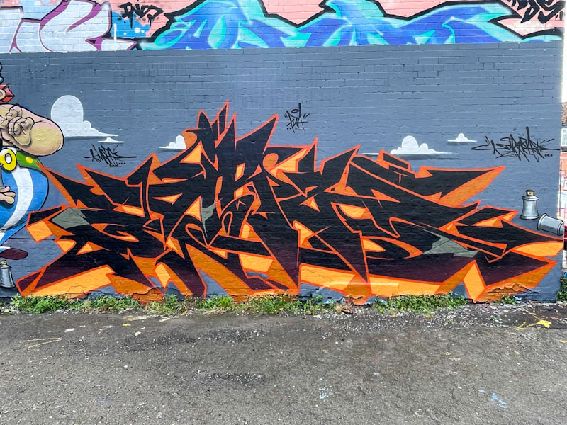
Fade, Dean Lane, Bristol, July 2024
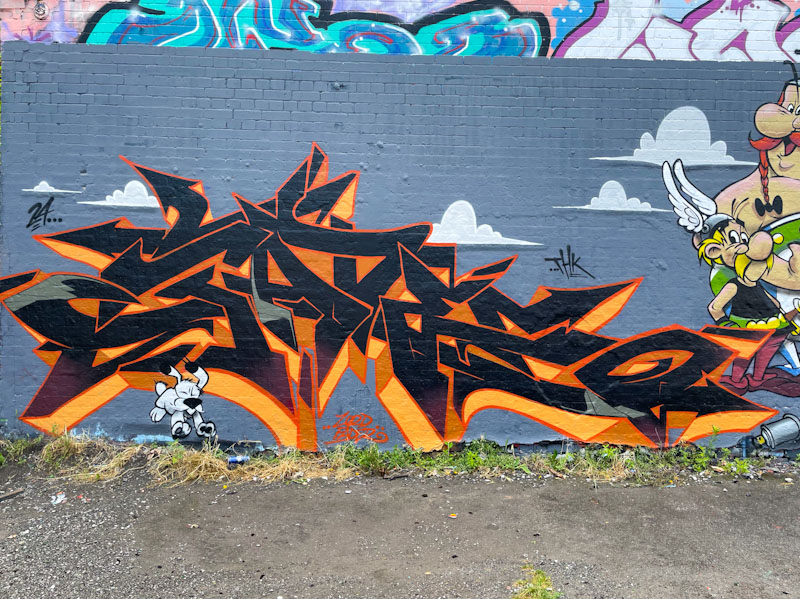
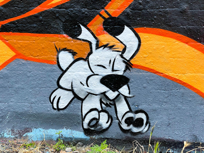
Starting with Fade, the strong and on-point letters in black with orange drop shadows, are nothing more than I would expect. For me, though the writing is eclipsed with the appearance of Dogmatix, Obelix’s dog, at the bottom left.
Fade and Dibz, Dean Lane, Bristol, July 2024
Dogmatix, obviously had a non-speaking part in the books, other than the odd growl or woof, and Fade’s rendition of the little character is perfect, picking up on his personality faithfully.
Fade and Dibz, Dean Lane, Bristol, July 2024
The centrepiece, probably painted by both Fade and Dibz features the heroes of the piece, Asterix and Obelix. The large sidekick, Obelix is 100% spot on, everything about his is brilliant. Getting on to Asterix though, my hypercritical eye isn’t quite happy with the warrior’s face, which feels slightly elongated… there is something not right about the proportions. I’ll let it go though, because they have tapped in to something that is deeply rooted in my childhood.
Dibz, Dean Lane, Bristol, July 2024
Dibz rounds off the production piece by mirroring Fade’s style and colours to provide balance to the whole collaboration. Remarkable stuff really and a red-letter day for me on finding it. Below is the Deamze piece from 2018 before he emigrated to Tasmania.
There are basically three kinds of ‘new’ artist in Bristol (or any other city I might suppose); those who are hitting walls for the first time having practiced or expanding beyond their art studios; those who are already established artists who move to Bristol or nearby and start painting; and those established artists who are simply visiting or passing through the city and drop a piece or two, because they can.
Dirtygypo, Cumberland Basin, Bristol, July 2024
It turns out that Dirtygypo has been writing in Bristol for at least a couple of years but has only just appeared on my radar. I guess I will have to rifle through my archives to see if I have earlier photographs of his work. Perhaps he has been hitting some of the more popular spots, or his pieces are lasting longer, whatever the reason, he has become more established recently. His work is exciting, colourful and busy, with irregular letters each filled and decorated differently. I am not sure what the letters spell, but I really rather like the frenetic appearance. Watch this space for more from Dirtygypo.
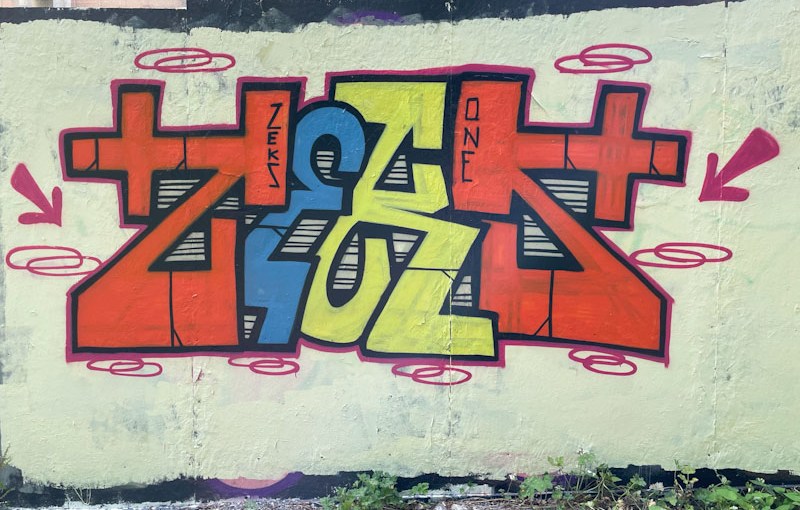
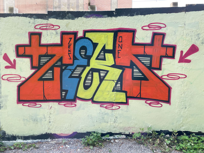
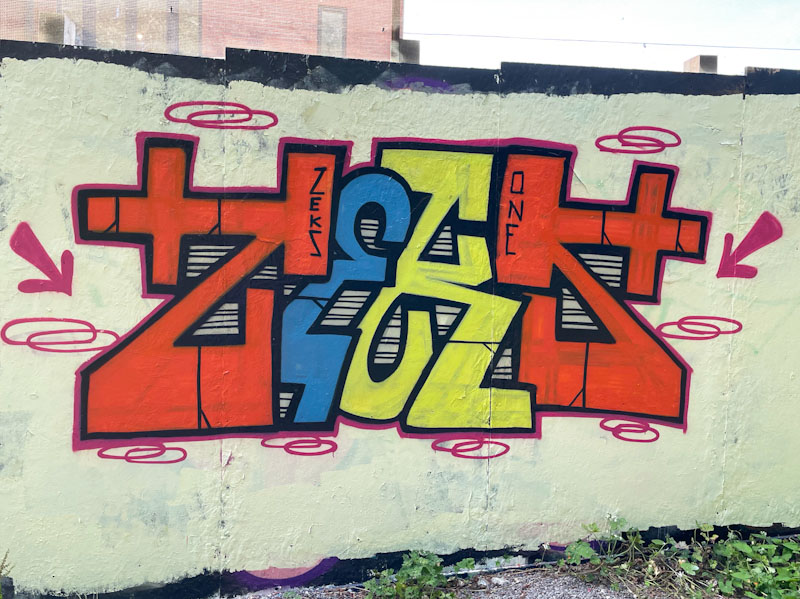
There is no doubt about it, I am really enjoying the fresh look of Zeks’ pieces combined with the fact that he is painting in Bristol a little more often these days, and long may that last. This is a straightforward piece of graffiti writing, with clearly defined letters and simple design – incorporating a little symmetry with the ‘Z’ and ‘S’.
Zeks, Greenbank, Bristol, July 2024
I can’t put my finger on it, but there is something quite unique about Zeks’ writing. There is a modesty and uncomplicatedness, an authenticity, which really attracts me. Simple solid fills are accompanied by a striped pattern filling the letter gaps. A couple of arrows and some rings accessorise the letters a little, but none of it would work very well without the cream background. This is a great composition.








 Natural adventures