

.
Drunken woken dance
from here to there in sunlight
then settled in shade
.
by Scooj
.
Drunken woken dance
from here to there in sunlight
then settled in shade
.
by Scooj
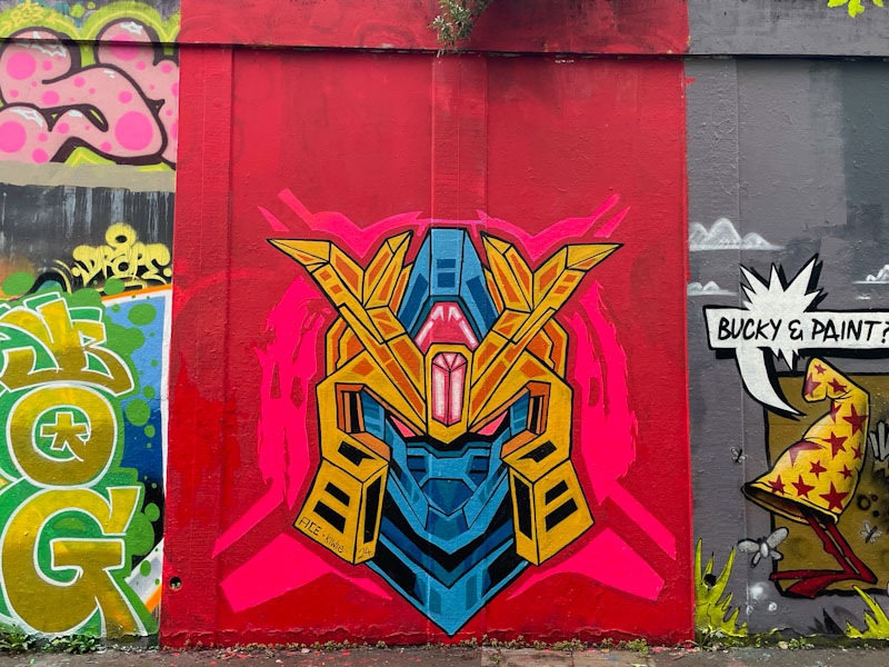
It looks like Acesartworld has found some inspiration from somewhere and some time to start decorating Bristol walls with his Transformer robot-style portrait pieces, of which this is the second of three recent works that I currently know about.
Acesartworld has certainly gone for it with the buffing the wall bit, taking his red splash all the way to the top of the wall, perhaps following the example of Kosc, just to his right. A squarer buff would have sufficed for the piece in question. When Acesartworld creates these masks, he uses a long straight piece of wood, similar to pieces of passim by Acer One, to achieve the geometry he is looking for. This is an interesting development from the artist, and I fully expect to see more of these as the summer unfolds.
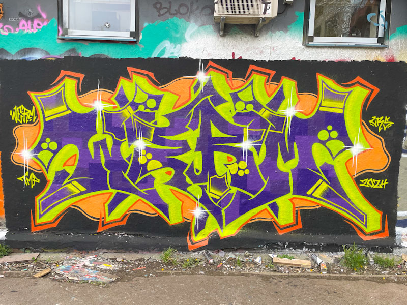
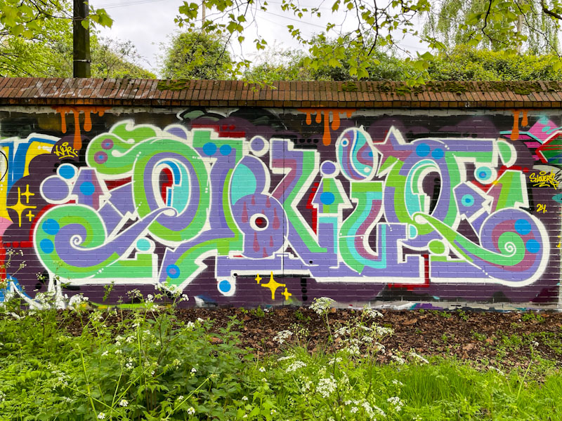
Werm is producing, in my view, some of his best writing work at the moment, having pulled back a little from his highly technical and complex pieces. There is something a little more accessible about his graffiti writing now, that hasn’t always been the case.
The colours in this piece spelling out WERM are certainly eye-catching and benefit from the buffed black wall, which enhances the impact of the writing. I suspect, consciously or otherwise, that the selection of purple and yellow for the letters might be related to the colour wheel, where they are complementary colours – they do work well together. I wonder if we’ll get to see Werm incorporating characters in his work, he would be more than capable of doing it and has done so once or twice in the past. I’ll ask him next time I see him.
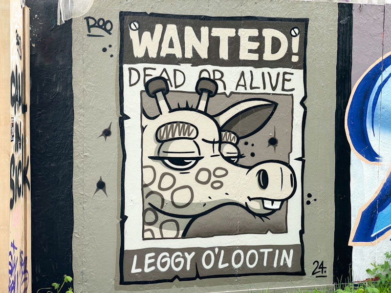
‘Wanted – dead or alive – Leggy O’Lootin’ so says the ‘poster’ by Roo. This sepia tinted piece is a clever and really rather touching portrait of a giraffe that has obviously been up to no good. The way Roo has painted him makes me feel rather sorry and sympathetic for him.

Roo has been active in Bristol so far this year, and long may it last. Her strong cartoon pieces are pretty much always respected and can remain intact for a very long time, which is testimony to the respect other artists have for her work. This piece is so original as well as being great fun.
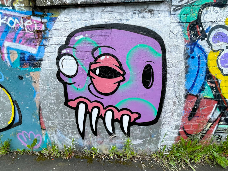
Another Mote monster to add to the ever-growing back-catalogue. Mote’s work tends to go through themed phases where he will produce a sting of monsters with a particular design idea, such as monster birds and monster fish and recently, monsters with one white eye and another heavily lidded eye.
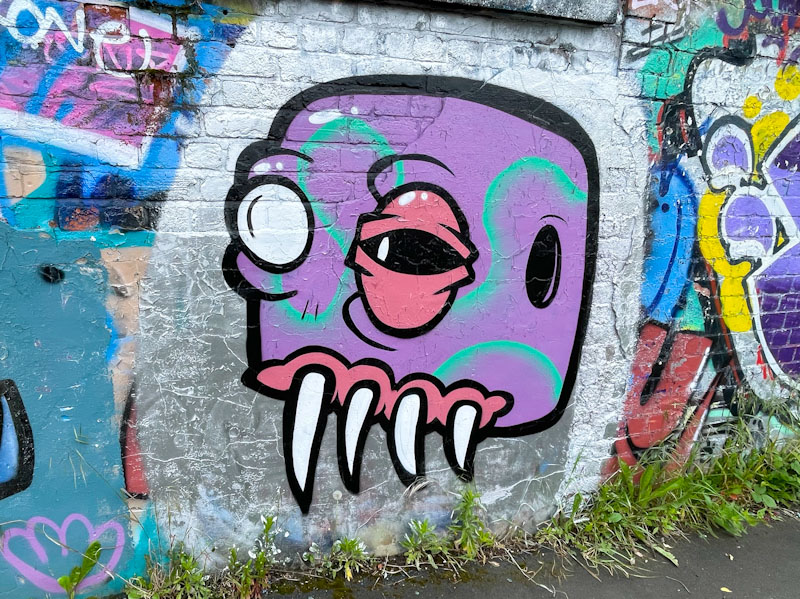
Because Mote themes his work in these ‘periods’, it can be possible to date his work to within say a six month time-frame. This monster is clean and tidy with a solid purple fill and pleasing ‘ribbon’ of green running through. And those teeth!
I would say that over the last two years or so, the intake of ‘new’ artists in Bristol has far outweighed any losses, and we have a ‘net gain’ of talent. This is great news, although it makes things a little troublesome for me, as there is so much more art to photograph and catalogue than ever before, and it is difficult to give artists the exposure they deserve.

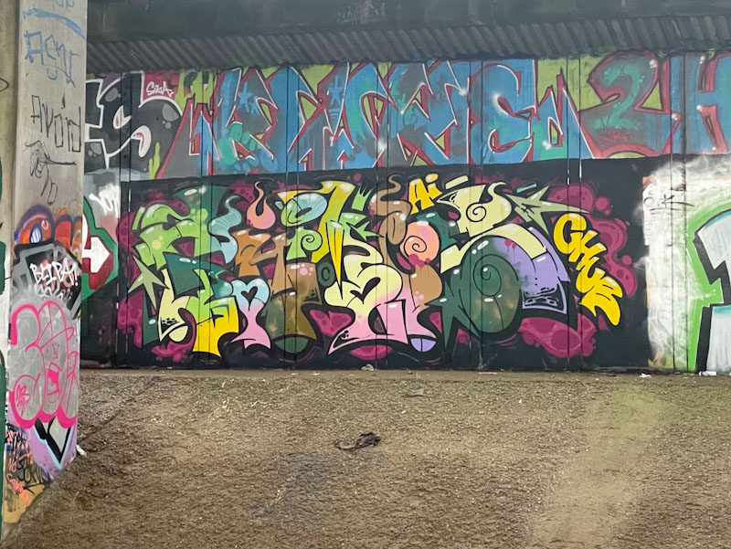
One of the newer artists to Bristol (at least on my radar) is Grimes, whose characteristically colourful and busy pieces have been brightening up spots all over the city. This piece underneath the M32 is typical of his work, full of letters and symbols, beautifully crafted and filled. I have loads of his pieces in my folders and will try to dig them out, as he has added something a little special to the Bristol mix.
.
September’s bounty
depends on pollination
put on a good show
.
by Scooj
What stands out for me in this lovely piece of graffiti writing by Claro_que_sssnoh is the subtle colour selection and slight softening of his letter style. The writing runs smoothly, where often his letters can have a slightly staccato feel running through curvy to straight lines in abrupt fashion.

I am not entirely clear what the writing spells as I would usually expect to see HONS. Claro_que_sssnoh has managed to do just enough of a background and ‘sparkles’ to differentiate his piece from the pre-existing pieces on the wall, and drips ad further interest. For me though, it is the colours that shine. Nice work.

Some artists are content to stick with what they know and play safe, others are constantly pushing the boundaries, and Laic217 has undergone something of an epiphany recently, taking his distinctive style into new and unexpected places, and as an observer, I am enjoying the trip.
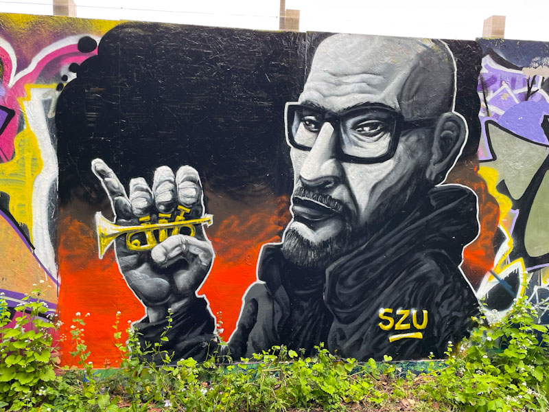
This outstanding portrait piece on the long hoarding at Greenbank features a man holding a miniature trumpet, all in greyscale except for the instrument. The piece is not signed, but there are some telltale signs that this is by Laic217, namely the unusual proportions of the character’s head, and more obviously the folds of material in his clothes, a speciality perfected by Laic217. This is a wonderful piece.

This is something a little different from Mr Draws, and I really rather like it. The colour scheme that he has selected works really well with the verdant spring growth at the base of the wall and the trees behind set on a stunning blue sky (something of a rarity this year).
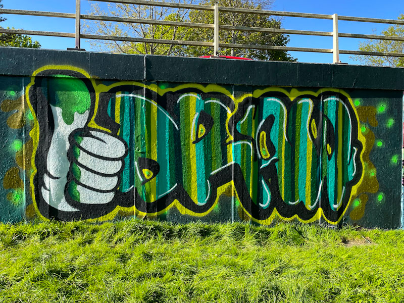
The character hand and letters combination looks really good and is nicely proportioned. This is so typically Mr Draws, and I can’t fully explain why, but his whole approach to graffiti writing is unconventional, which is great to see, as there is quite a lot of ‘Samey’ stuff out there. I love the hand, and I think that it is something he should bring into his work more often. A great piece from an artist I really like.


