A gallery of outstanding animal characters from London artist Roo.
Instargram: @roo_art
All photographs by Scooj
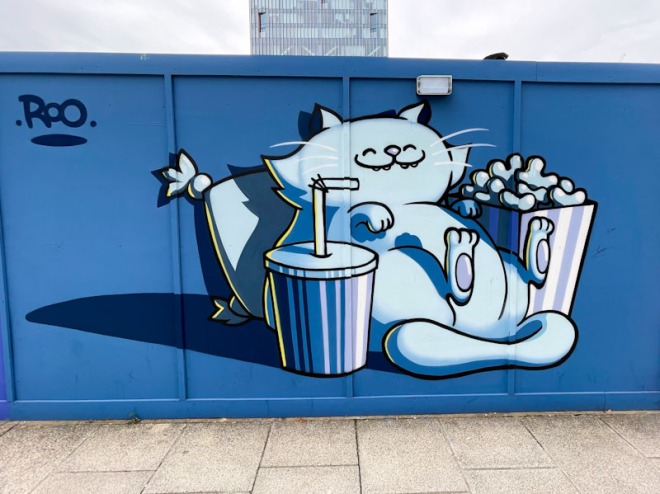
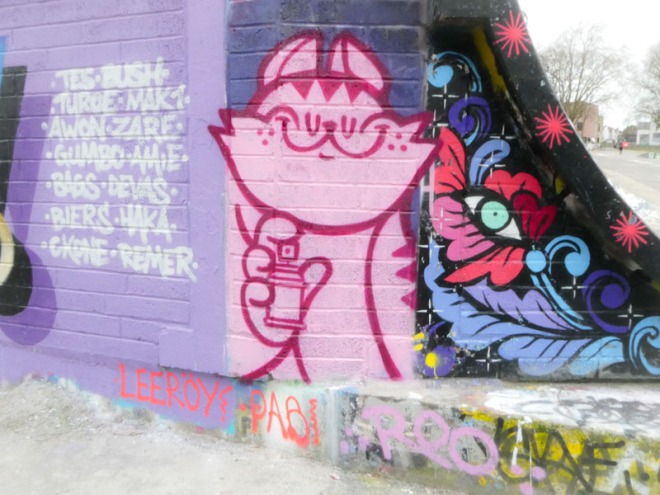
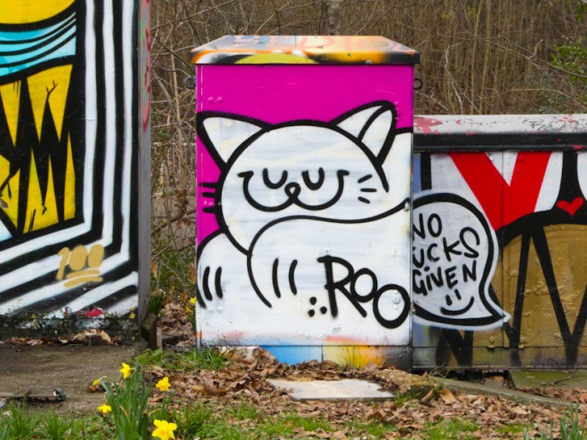
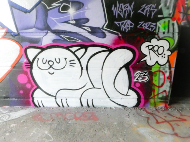
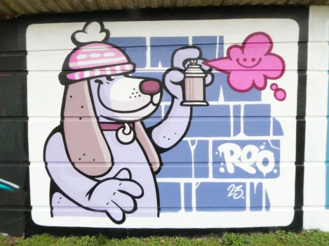
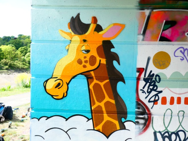
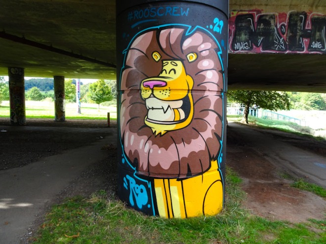
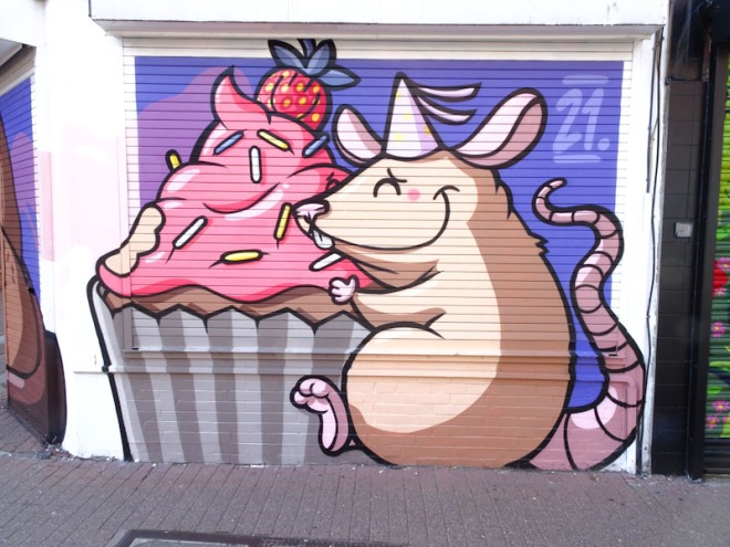
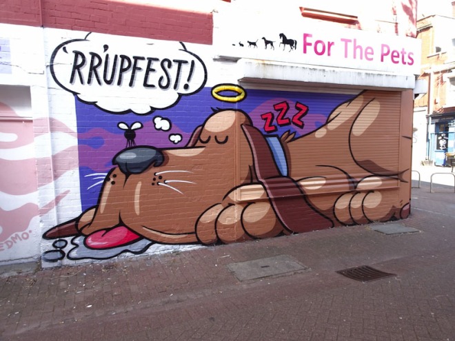
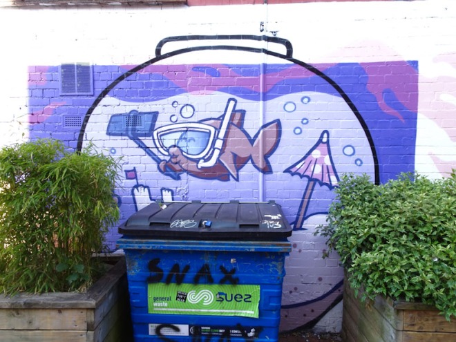
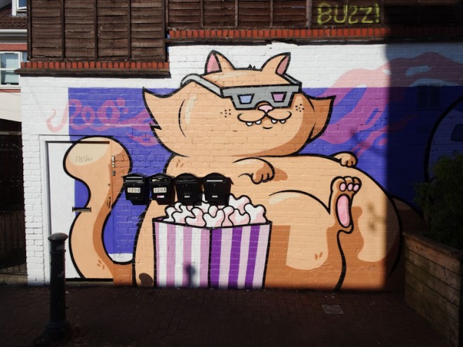
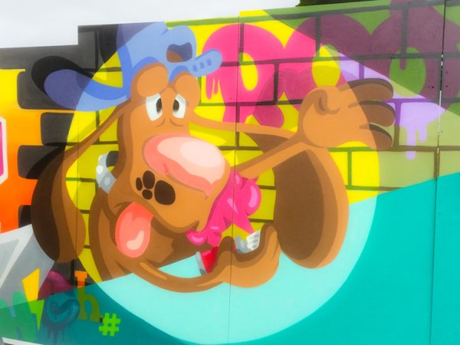
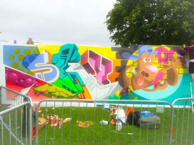
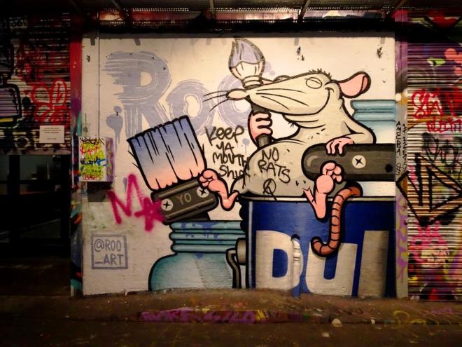
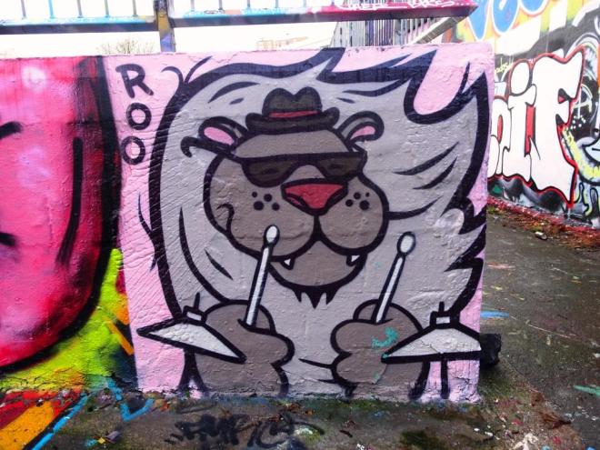
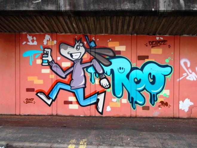
A gallery of outstanding animal characters from London artist Roo.
Instargram: @roo_art
All photographs by Scooj
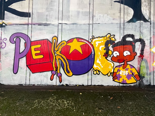
I am only an occasional visitor to the Frome Side spot, which sits underneath the M32, adjacent to the M32 Spot, and access is a little tricky, especially in the wet weather, but particularly for the dog. I tend to save up my visits for a time when I can go alone, which these days isn’t all that often. I actually combined this one with a big shop at the Eastville Tesco.
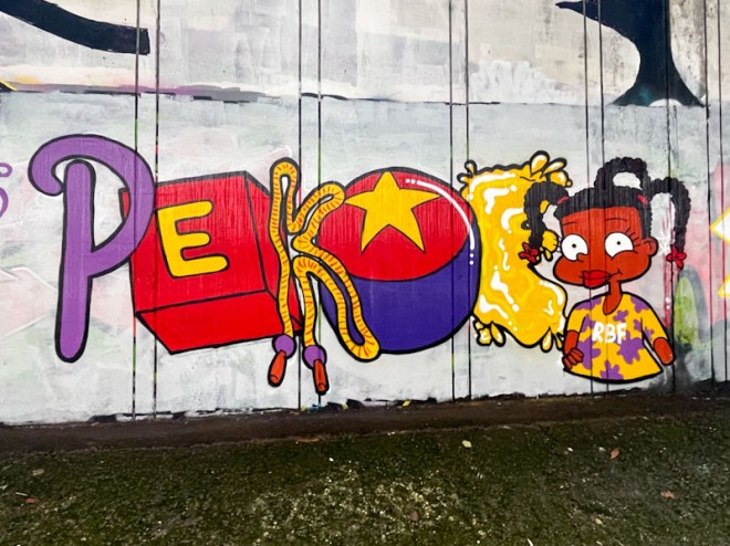
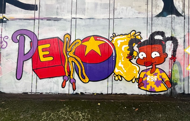
What a treat awaited, a full wall of RBF paint jam pieces to celebrate Bnie’s birthday with a Rugrats theme. Pekoe absolutely came up trumps with this piece. She has smashed it here, combining her writing with a brilliant portrait of a Rugrats character (Susie Carmichael), and painting each of the letters in the style of the cartoon series, including a letter brick, a ball and a skipping rope. What a brilliant piece from Pekoe, demonstrating her talents with both characters and writing.
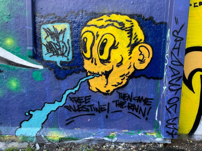
Awkward is an artist who pops up from time to time, pretty much always in the Dean Lane area. Most, if not all, of his work appears to contain a rather stressed looking character, the face only, often with a speech bubble with the word Awkward in it.
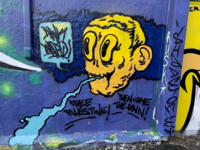
This piece comes with a further two messages, the first is ‘Free Palestine’ and the second might be an observation of the weather when he was painting, ‘Then came the rain’. Awkward seems to be well acquainted with a few of the established writers in Bristol, but just doesn’t seem to paint as often, which is a bit of a shame.
.
Winter’s arrival
on message and read the script
mild interrupted
.
by Scooj
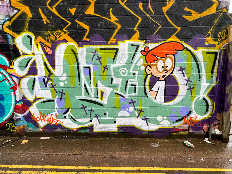
About a week ago I posted a piece by Biers which was not too dissimilar to this one. Similar colours and of course overall design of WD40, and incorporating a to cartoon character with ginger hair and glasses. The character from last week’s post was Dexter from Dexter’s Laboratory, but I am stumped by this character.
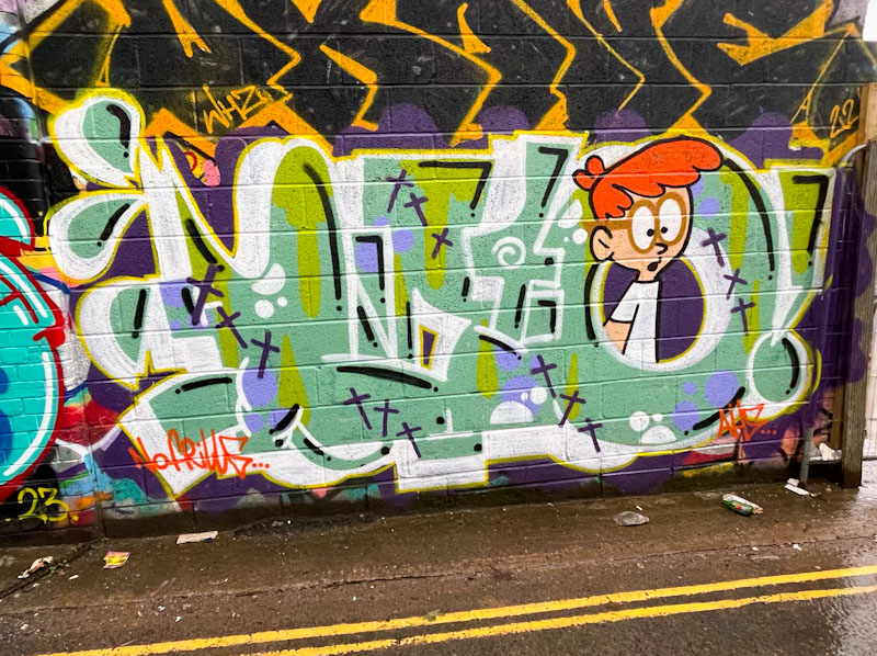
I was lucky enough to bump into Biers while he was painting this alongside Bags, but he hadn’t started the character, so I couldn’t ask him directly who it was. It is good to see that Biers is out and about again with his very ‘Bristol’ style of graffiti writing. I have mentioned this before, and I don’t know if this is a perception or a real thing, but I think that different cities and districts have ‘house’ styles, and Biers typifies the Bristol ‘house’ style.

Last week I posted a piece by Hypo that showed something of a development of his style into a more cryptic wildstyle approach. This piece on the other hand is the more familiar graffiti writing we expect to see from Hypo, and what a colour-burst it is too.
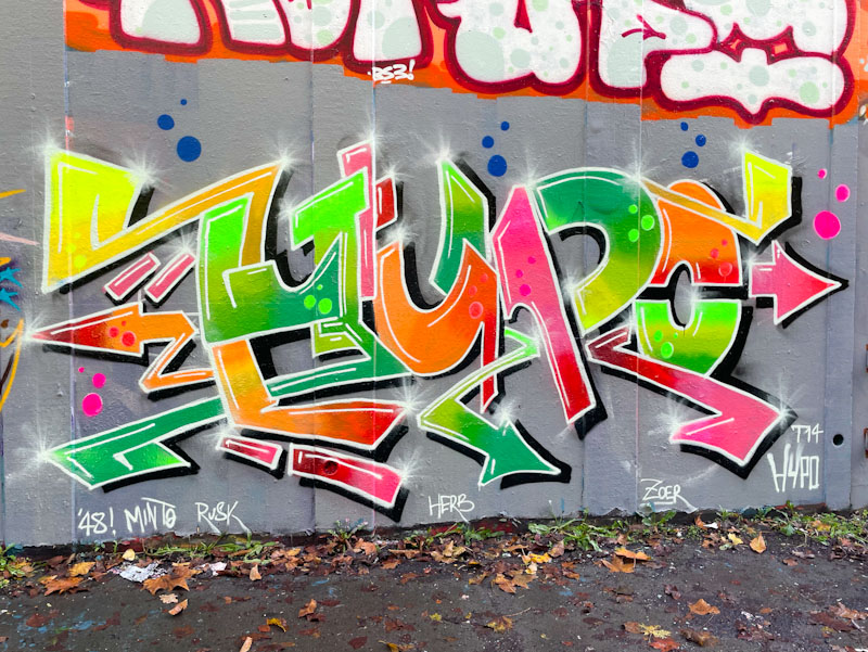
The letters are clear to read, and there is a real sense of joy and optimism about the piece. The colours come together as if they were sweets in a jar and the whole thing looks almost edible. I love the design, and the colour fades and decorations, I think though, and I know I am nit-picking, that the black shadow might have been a little tidier. Beautiful work from Hypo.
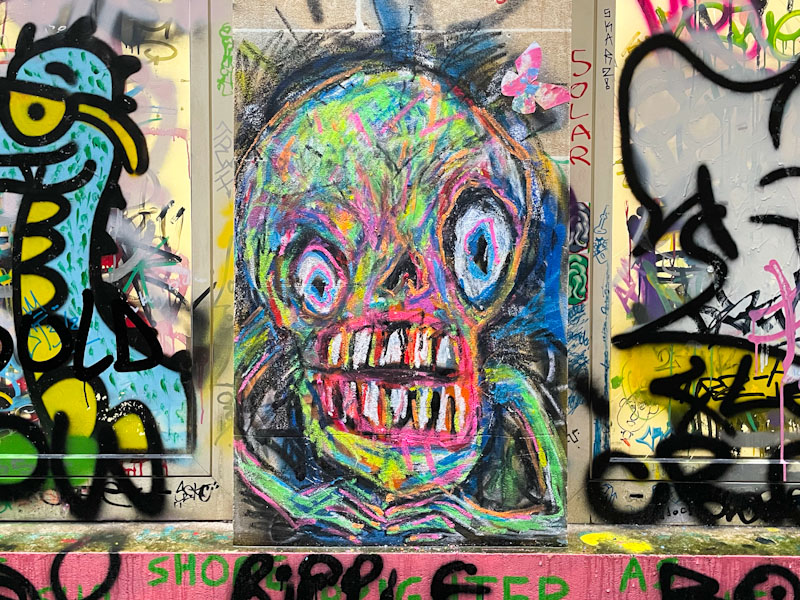
Tell me that this isn’t scary or alarming, and I’ll buy you a beer should we ever meet. I think that Alex Arnell may have paid Bristol a swift visit in October or November this year, because I have come across a few of his highly distinctive scribble pieces recently, and I know that he is not a local artist.
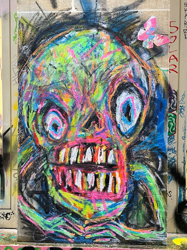
Although the piece is a child-like scribble, it is in fact far more sophisticated than that and the subject is highly unsettling. Lots of colour and layers combine to give us this angry/scary portrait – the stuff of nightmares. I am not sure what materials Alex Arnell uses for his work, but it would be interesting to see if he could scale it up and use spray paint to create the same effect. Interesting and distinctive.
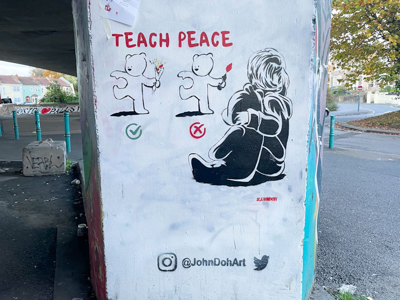
With his finger pretty much always on the pulse, it was only a matter of time before John D’oh would create a stencil commentary piece about the war in Gaza and here it is. In this column piece, John D’oh presents a touching and tender piece that also references Bristol and Banksy.
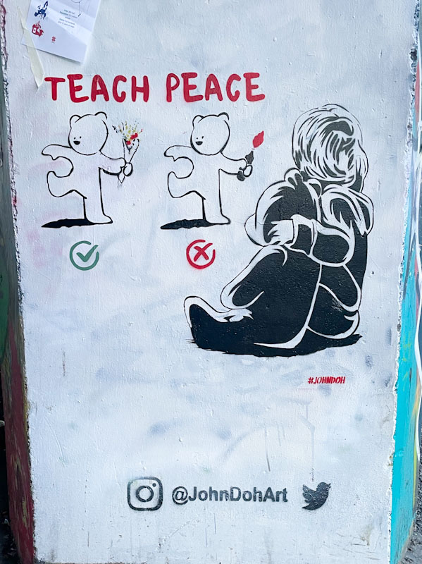
The message is clear, and one I think anyone in their right mind would agree with – ‘teach peace’. A young child and teddy look on at the right approach to conflict – the correct example throwing flowers and the incorrect version throwing Molotov cocktails. Along with most of us, this piece is asking for conflict to stop.
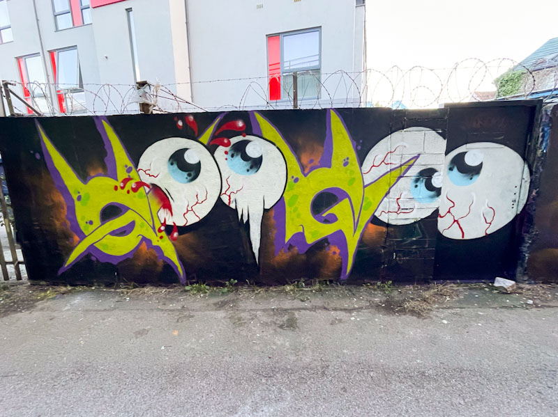
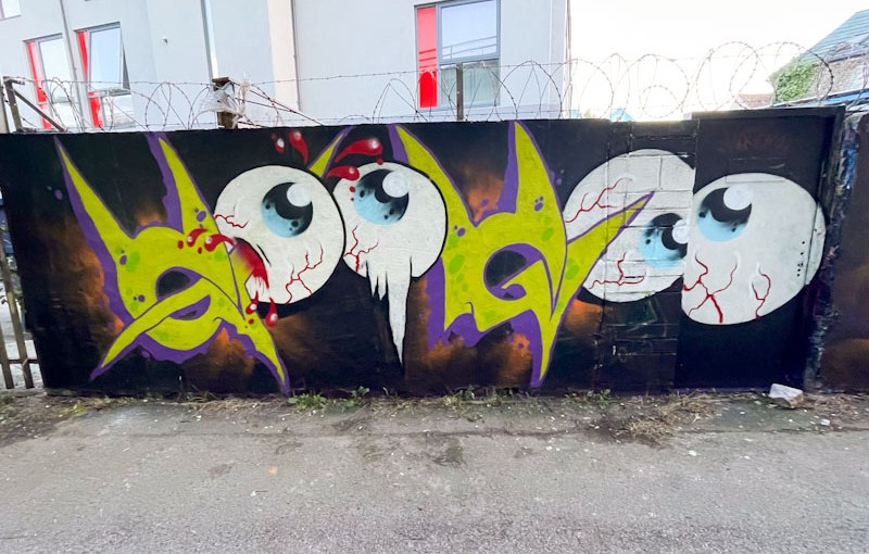
This is an unusual piece, which I think was probably a Halloween celebration, by an artist I have not encountered before, Jak MCS. No pun intended, but this is without doubt an eye catching piece, and I would have posted it sooner had I known who the artist was.
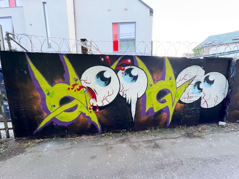
I would like to think that the writing says something, but the only thing I can come up with is voodoo, although it looks more like goo goo. Each of the elements of the piece, the eyes, the letters and the background are well done, but for me, there is something not quite right and it might be something as simple as the thinness of the yellow paint. Great to see yet another artist painting in Bristol.
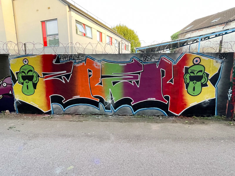
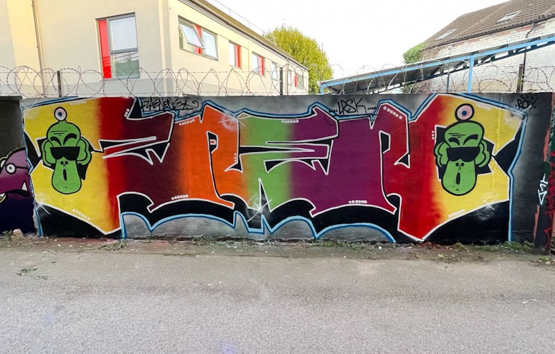
From time to time I get to see pieces that I really like and can’t quite explain what it is that sparks my interest. This is one of those pieces. I was mystified originally about the artist, and my first thought was WERM, but I discounted that very quickly on the grounds that the letters weren’t right, and it isn’t quite in his style – it was a plausible guess for about ten seconds. Then I had to do a little digging to establish that it is by Zaenone, an artist I know nothing about.

The colourful fills fade into one another in vertical strips in quite an unusual way and the letters are open, allowing the bleed of fill through the whole piece. A nice, strong white border contrasts with the fills and the black drop shadow. Two weird faces bookend the letters and create some additional interest. This is a fun and well balanced piece from Zaenone.