.
Railway trip to York
many more people than seats
thank goodness I booked
.
by Scooj
* a terrible haiku describing an uncomfortable scene.
.
Railway trip to York
many more people than seats
thank goodness I booked
.
by Scooj
* a terrible haiku describing an uncomfortable scene.
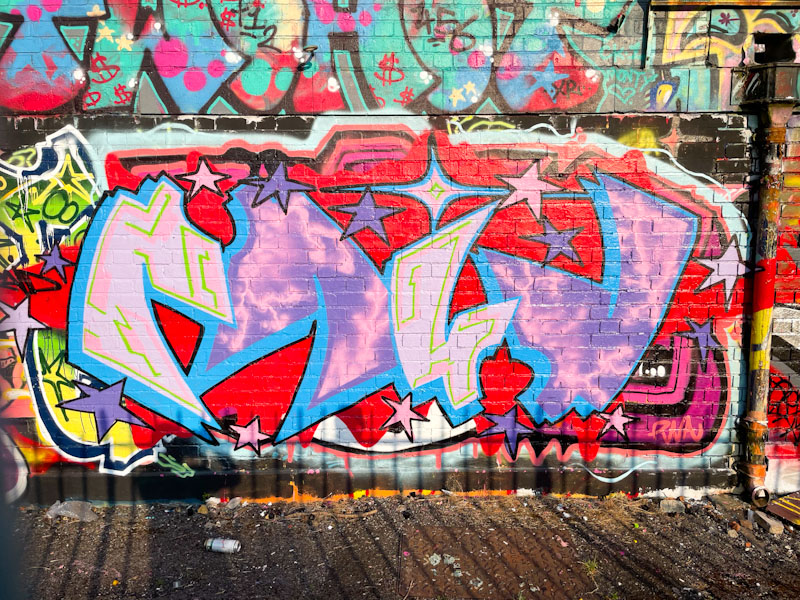
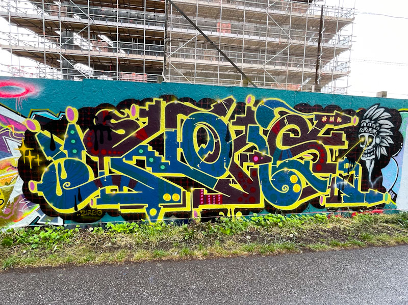
I am under a bit of pressure today, lots to do before heading off for York this afternoon for a conference tomorrow, so I’m afraid this is going to be a short one. I met Raid a week or two back while he was painting his new writing style on the M32 roundabout, a piece that was overpainted before I got to see it completed. He told me that he was really enjoying his new letter style and was drawn to the symmetrical elements in it.
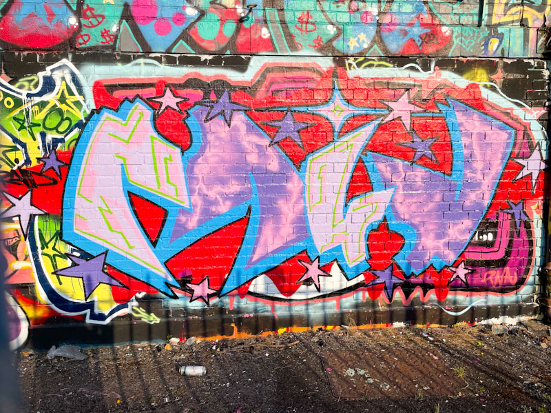
This one behind the railings at Dean Lane. The symmetry is a rotational one, where the R and the D are similar and the A and I are too. If you spin the piece around a central point, it would look the same upside down. I love to see artists experimenting and growing. Expect to see more from Raid this summer.
I simply can’t keep up, not with Mote and not with any other artists either. Whilst it might sound like a complaint, it is not really a bad thing because it signifies a thriving street art and graffiti writing culture in Bristol… as if we didn’t know that already.

Mote himself, has really been on full throttle lately and this piece on the M32 roundabout is part of his series of bird monsters, that he seems to be particularly keen on at the moment. In these bird pieces, Mote creates a delineation between the face and beak/bill and the rest of the bird, defined by different colour schemes. There is a lot to like about these giant ‘doodles’ and they have become very much a part of the furniture in the city.

I had a nice chat with Mr Draws over the weekend in this exact spot while he was buffing over this piece in preparation for a new one. At least he was going over his own work – how often does that happen?
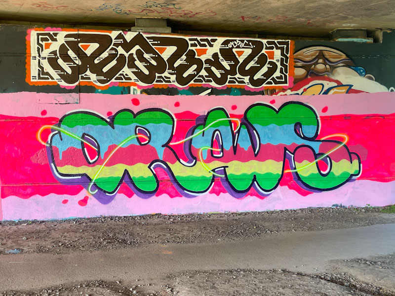
The bright colours in the letters and background have a hint of confection about them, almost good enough to eat. The whole thing calls out jelly to me, but I think that that might just be me. I know that Mr Draws wasn’t too happy with the neon pink colour, as it seemed to strip away the paint beneath. My advice is to steer clear from the neon colours, they are tricky and in the sunlight they decompose really quickly.

There is a very strong international component to the Bristol street/graffiti art scene in Bristol. We have artists from all over Europe, but in particular a host of Polish and Spanish artists, without whom the vast spectrum of artistic styles would be greatly impoverished. Claro_que_sssnoh belongs to the Spanish group of artists, although I’d like to think that he also belongs to Bristol.
This piece on the ever-shrinking Greenbank hoarding is painted in unusually dark colours, which I have to say I struggle with a little bit. I don’t think the colour selection here brings out the best in Claro_qhe_sssnoh’s work, and although as technically intricate as his other pieces, it doesn’t quite do it for me on this occasion. I do, however, like the addition of the skull wearing a fancy headdress on the right, with his laser stare.

It can be easy, when chasing down pieces, to forget some of the bedrock work that goes on day in day out from some of the unsung heroes of Bristol street art and graffiti writing. One such hero, who hasn’t made an appearance on Natural Adventures for some while, is Phour.

Phour has chosen some great letters to work with, and manages to present them with a consistent style and confidence. The whole piece looks great, with white letters on a blue background, giving the impression of being chrome – it is funny how your eyes can play tricks. The black 3D border provides depth and the letters are nicely bordered with a tidy light blue line. Phour has introduces some nice marbling cutting through some of the letters, to finish it all off with a bit of class. A great piece from Phour.

.
Riparian strip
Himalayan balsam chokes
sweeping all aside
.
by Scooj

Tucked away, hidden by a bush on the M32 roundabout, is this fun little character piece by Bean. Although each of Beans pieces that I have seen so far are different characters, there is something about his style that it quite distinctive. It might be the colour palette that he uses, which often includes lots of bright yellow, orange and red.
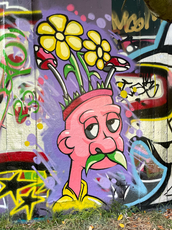
This cartoon character, with a green moustache is sporting a fine headdress of flowers and toadstools. The piece it really neat and tidy, and beautifully drafted, with great use of light and shade to create depth in the facial features. I am very much enjoying Beans’s work, which seems to crop up at reasonably regular intervals.
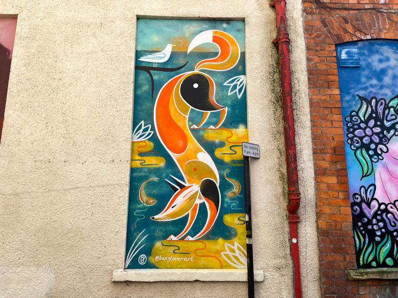
The Weston Wallz initiative has without question introduced a breath of fresh air in this breezy seafront town. Many of the buildings in the town, instead of being drab and rather weathered can boast some of the finest murals in the country, but it is not only the large walls, but some of the smaller ones too that have a direct uplifting impact on the locals, and Old Post Office Lane hosts a handful of wonderful pieces.
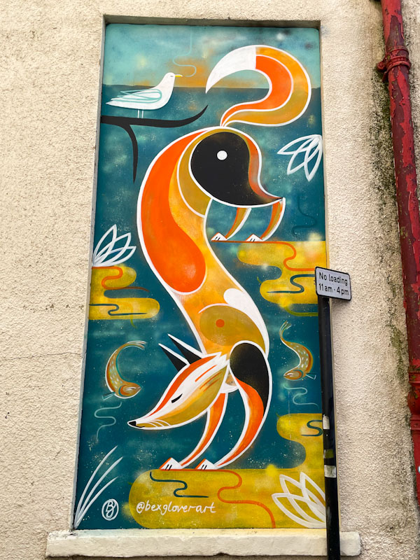
Bex Glover is no stranger to Bristolians, and to see one of her beautifully designed murals in Weston-super-Mare as part of Weston Wallz 2022 was a real treat. Her nature pieces create a sense of calm and beauty, and reminds of a natural world that we should cherish. The fox is a beauty, and I am rather fond of the two little fish that make an appearance too. A wonderful piece in a ‘ghost’ window.
.
My father is gone
and my surrogate fathers
today is for me
.
by Scooj


