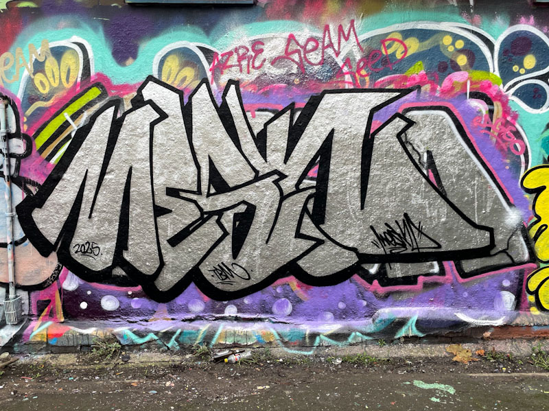
It is rather nice to be picking up a rather gentle drumbeat of pieces by Mesk. I have always been aware of his graffiti writing, but only really sought out his work since I met him in the spring.
Mesk, Dean Lane, Bristol, November 2025
This is a rather nicely presented chrome piece in the Deaner with the letters MESK clearly bordered with a strong black line. There is a bit of interference with the chrome piece below, which is a pity…a little bit of background decoration might have overcome that. That being said, this is a nice tidy piece.
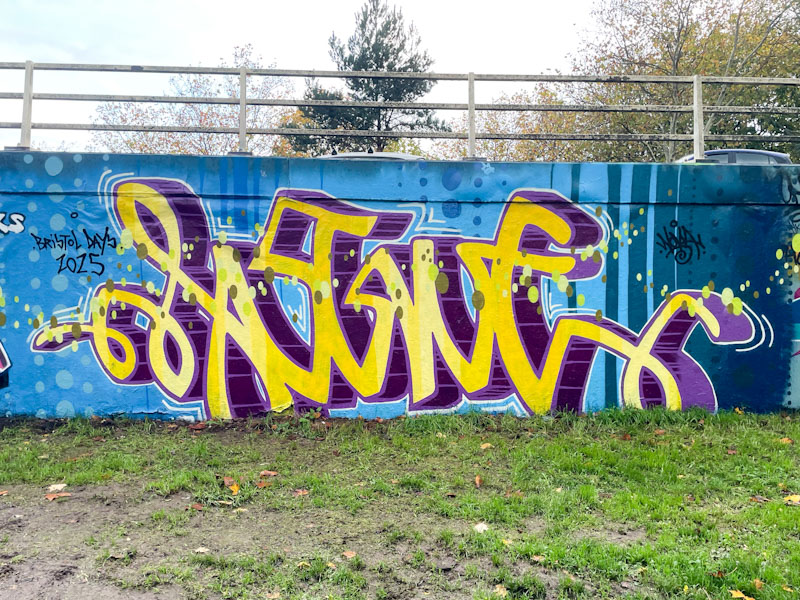
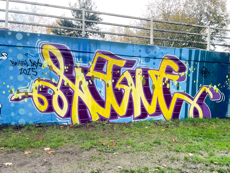
This year, Logoe’s visits to Bristol have been less frequent, and he hasn’t been blitzing the streets as much as he has done in the past, which, from my point of view, makes things a little more manageable. This is a nice piece painted recently on the M32 roundabout.
Logoe, M32 roundabout, Bristol, November 2025
This is a lovely piece of script writing in yellow, with a deep purple drop shadow. But the piece is more than just the writing; the whole wall contributes to the outcome, with a blue background incorporating vertical rows of spots transitioning into vertical lines on the far right-hand end and a liberal scattering of signature oval spots running horizontally through the letters. Altogether a pleasing piece of script graffiti writing from Logoe.
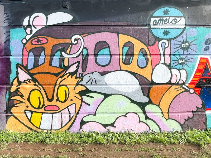
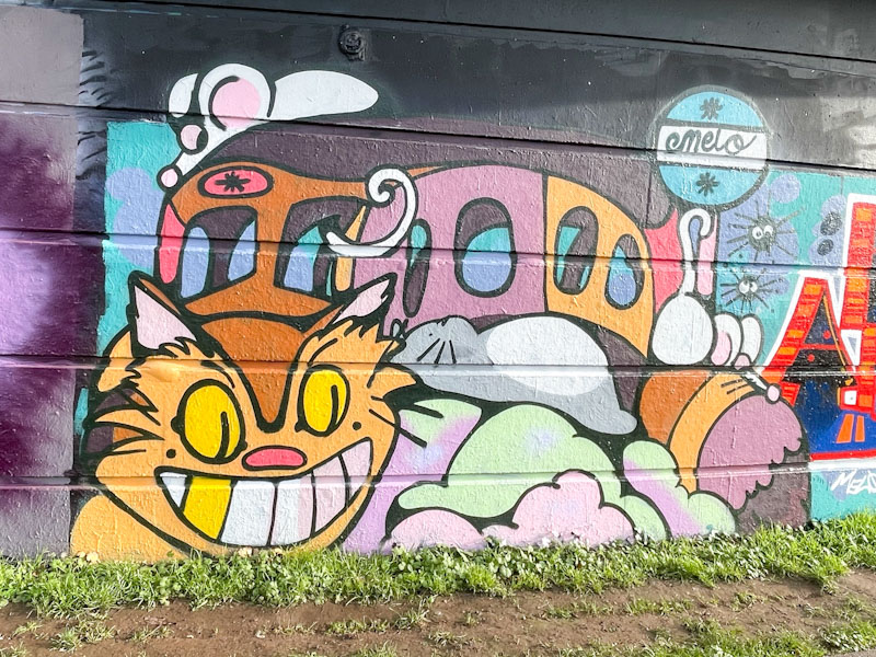
Esme Lower, Cumberland Basin, Bristol, November 2025
What a wonderful creation from Esme Lower. I was lucky with my timing on this one, and met Esme while she was painting this piece. She always seems to make time for a quick chat, and told me that this piece was inspired by a Studio Ghibli character called Catbus, from Totoro.
Esme Lower, Cumberland Basin, Bristol, November 2025
This is a beautifully imagined and painted piece with superb clarity and definition between elements. The fills are clean and solid and black outlines tidy. I love the little mouse sitting on the top of Catbus. Researching the character led me down an interesting path of Studio Ghibli artwork and films, which was most enjoyable. A lovely and accomplished piece by Esme Lower.
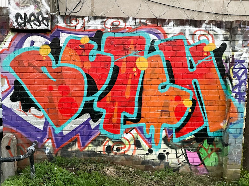
This is a rather small but pleasing piece by Butch at the end of the long wall at Peel Street Green. I have made no effort to hide the fact that I really like Butch’s writing, perhaps, because the letters are interesting, and the way he arranges them appeals to me.
Butch, Peel Street Green, Bristol, November 2025
The red letters are bordered with a light blue line, and the combination works surprisingly well. The way that the letters are irregularly presented, although with a consistent overlap, is part of Butch’s USP and to my eye really attractive. There are some subtle drips and spots in the fills to add interest and some yellow spots to finish. This piece somehow feels really representative of the Bristol graffiti scene.
The fun part of birthday paint jams is that it forces some of the participants out of their comfort zones by painting the letters of the birthday boy/girl rather than their own familiar letters. This is an exercise that appears to be easier for some than for others. Donz seems to have coped just fine with this delightful piece for Minto.
Donz, St Werburghs, Bristol, November 2025
The letters art typically colourful and upbeat. No need for a signature here. Donz’ work is usually quite flat, without drop shadows, which is no bad thing, it is part of his style and presentation. Everything here is neat and tidy, and he has set the letters on an interesting light blue wash with a kind of cityscape silhouette along the top.
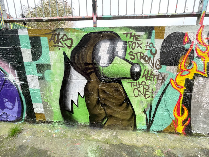
I really should post more pieces from the fabulous Mr Foksymoron. His cheeky character fox pieces are always fun and uplifting, and this one in Dean Lane is a beauty.
Foksymoron, Dean Lane, Bristol, November 2025
I love the Star Wars reference in this piece ‘The fox is strong with this one’ which in the film is, of course, ‘The force is strong with this one’. The Obi Wan Kenobi cloak is also perfect for this piece. Subtle enough to be missed by anyone unfamiliar with the film franchise. I very much like these interjections by Foksymoron, and might need to delve into my archives to post a few more.
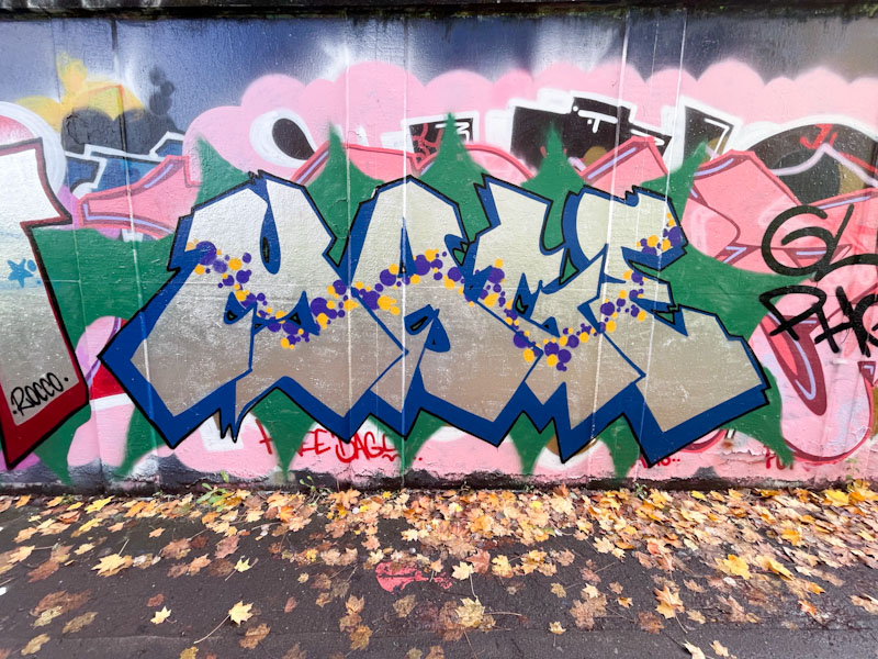
Mage used to write under a different name, and then went for something completely different. I’m not sure that he could have picked four more difficult letters to write, especially in their capitalised format… lots of lines, angles and complication. Maybe that was the challenge.
Mage, M32 roundabout, Bristol, November 2025
This is a well presented chrome piece with a nice deep blue drop shadow, set on a green splash. All neat and tidy, but what lifts this piece to a different level is the wonderful string of spots in yellow and purple, running through each of the letters, without which the piece would probably feel quite basic. A lovely idea well executed.
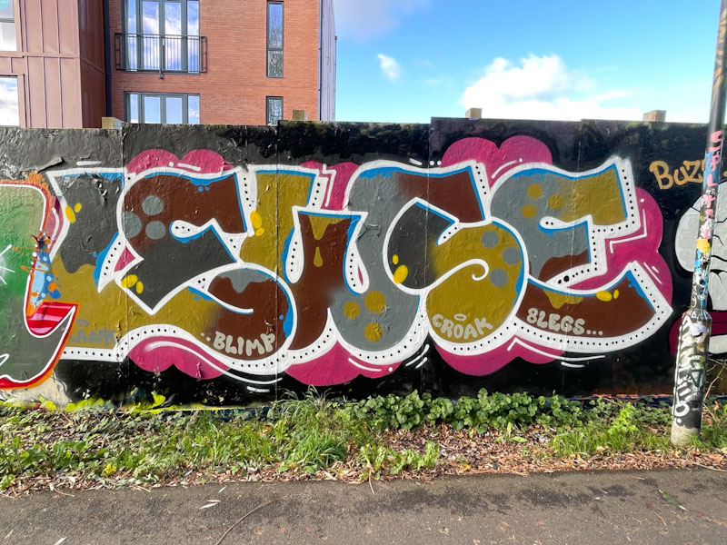
Lewse is an established graffiti writer in Bristol but is bafflingly underrepresented in Natural Adventures. I have dozens of Lewse pieces in my archives, but have only published a handful over the years. Reasons for this might be that I think that the artist likes to stay a little under the radar.
Lewse, Greenbank, Bristol, November 2025
There is a confidence and experience oozing from this work, as if Lewse has nothing to prove. Some great letter shapes are beautifully filled with earthy colours and the writing is beautifully complemented by a steady white 3D drop shadow with dots running through the midline. Classy.
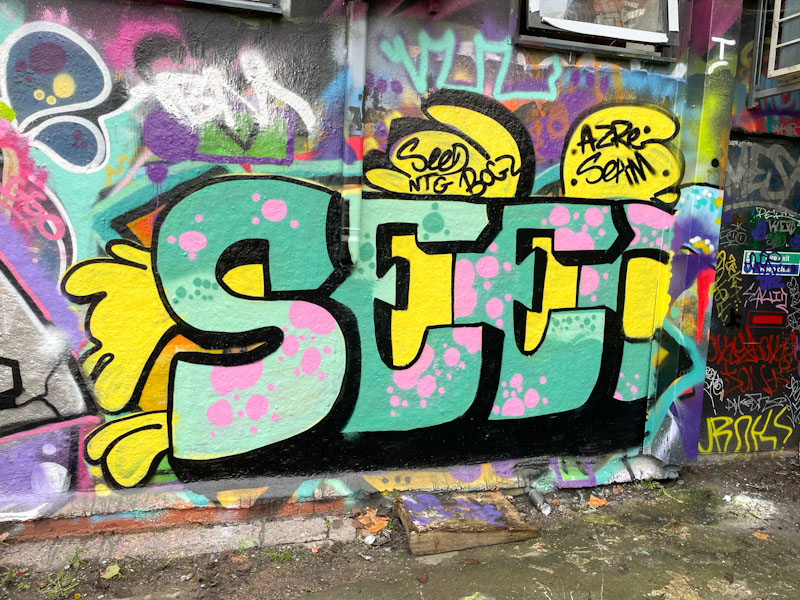
One of the rewarding aspects of photographing and recording street art in Bristol is watching on as new artists begin their journey and then develop their style and improve their technique. Some never quite make the grade, but others clearly have the determination and desire to progress, and some reach levels they might have never expected. I met Seed a couple of weeks back, and he told me he had only started graffiti writing a few weeks earlier. Since then, I have seen his work appearing all over the place. This is the first post of his work on Natural Adventures, but I very much anticipate it won’t be the last.
Seed, Dean Lane, Bristol, November 2025
What we see here is potentially a diamond in the rough. Seed has opted for large letters – I’m not quite sure the capital ‘Es’ are the easiest letters to start with, but I guess they present a challenge. The colour selection is good, and that yellow certainly attracts attention. The black 3D drop shadow is a little overpowering and needs refining, but the fills are OK, and the dotted decorations certainly improve the piece. Planning a wall is a really important part of graffiti writing, and Seed has left himself a bit short on the right-hand side, a mistake he is unlikely to repeat. Watch out from more from Seed over the coming weeks and months.