.
In the nick of time
the sun shows it’s tardy face
now summer begins
.
by Scooj
.
In the nick of time
the sun shows it’s tardy face
now summer begins
.
by Scooj
I have to credit Kaya at @loveforbristol (Insta) for disclosing the location of this street in Brislington. It is an alleyway I have been keen to find for quite a while, but simply didn’t know where to look. As it turns out, it is an area I visit reasonably often because my son has a friend nearby.
This piece by Merny (I still call him Morny) is one I have seen all over Instagram and at last I have now seen in the flesh.
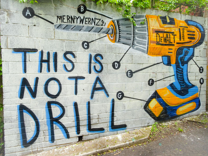
Merny is a hoot, and I think that this is a fabulously witty piece picking up on ‘announcement-speak’ ‘this is not a drill’ and deliberately misinterpreting the word drill. Who else in the street art world would paint a power drill on a wall. Another oblique reference (deliberate or otherwise) is to the René Magritte painting ‘Ceci n’est pas une pipe’ (this is not a pipe) painting. I love this piece so much, and I am really enjoying his little lettered (or numbered) labels he has started adding to his pieces, like notes for instructions. So good.
This large collaboration goes back a few weeks, and I have already posted the fourth element, the Daz Cat character, a little while ago. The remaining triptych is by Face 1st, Sage and Soap, and is really rather special.

To the left is the familiar work of Face 1st painted in a dazzling chrome. The letters FACE contain a feature used by Face 1st before, the introduction of a couple of swords. Quite what these swords symbolise I can’t say, but they appear to be driven into the smiling girl’s head, which is a little unsettling to say the least.

The middle section is, in my view, outstanding. The character by Sage just has something about it that really chimes for me. It is the perfect centrepiece to the triptych and really shows off Sage’s talent. The cartoon-style character somehow seems to fit the PWA ‘brand’ really nicely and reminds me of a very early PWA wall in St Paul’s (now gone)

On the right, as is so often the case in these PWA collaborations is a very nice piece of writing, also in chrome, from Soap. Lots off bones and gems in this veritable archeological/geological piece. The soap tag forms the centrepiece of tis complex piece.
Another wonderful PWA collaboration for us all to enjoy.
As I said in a recent post, barely a week goes by without posting a new piece by Pekoe, and as if to prove my point here is another one. This column piece is difficult to photograph and do it justice because of the way it is wrapped around the circular column.

This yellow-faced beauty carries all the hallmarks of a Pekoe portrait, with big hair decorated with stars and shapes, rosy cheeks with dotted outlines and tears. No need for the artist to sign the piece at all. Always great to find another Pekoe portrait.
Some days just turn out really well, and last Thursday I met Jelly for the first time at the viewpoint, Cumberland Basin… an already good day became a whole lot better. I was on leave last week, so my dog walks became rather longer than usual and much more relaxed. The upshot was that I was able to visit more spots and stay longer at each. Cumberland Basin was my last stop for the afternoon and when I turned up, there were two artists at work, Jelly and Fierfear (to follow) and to help with introductions, Paul H happened to be there too, sunning himself on the viewpoint bench. Paul had been helping Jelly with a spot to paint.

My first impression with Jelly’s work was that it had a hint of a Pekoe/Hazard blend about it, but perhaps that had more to do with the portrait approach rather than the actual style. I thought I might have seen Jelly’s work in London (her home town) before, but since she’s only been spray-painting for two and a half years (!!!), it is highly unlikely. Perhaps I have seen her work on Instagram.
The portrait is a stunner, a beautiful face with big blue hair with green highlights. Jelly’s signature long eyelashes add a touch of class and the flashes on the hoop earrings are beautifully done. The tag line ‘Because I’m wurf it’ I think is a nod to a Bristolian accent, although I might have been tempted to change ‘I’m’ to ‘oim’.

Of course, it wasn’t only the artwork that made this a red-letter day, but also meeting Jelly, who was very happy to stop for a chat and talk about her work. It is always great to welcome fellow Londoners to Bristol, and I hope that she enjoyed her day out enough to come and visit us again before too long, although I ought to add that it isn’t always such pleasant weather here.
Great piece, lovely lady, good day.
.
Vaccination two
personally reassured
still so far to go
.
by Scooj
I have to take my hat off to Claro for even attempting to paint this wall, but to do it so well is truly awesome. This bit of wall on the M32 cycle path is made of stone and is very textured, horrible and lumpy and bumpy, not that you’d know it from looking at this piece by Claro.

Claro’s style is so very distinct and quite unlike anyone else’s in Bristol. Spelling out HONS his writing combines curves with angular straight lines that at times looks quite uncomfortable if you know what I mean. The letters on their own might be a little boring, but with all the decorations and border colours, the whole thing ends up looking pretty good. More to come soon.
I fully expect that these foxes by Nebeldac will become a reasonably regular feature of Natural Adventures, although some of the ‘rougher’ ones might get swept up into a compilation.

This chrome fox appeared in Dean Lane a couple of weeks back and is really rather cool, making the most of a rare day of sunshine in what has been a very wet and miserable Ma. Nice to see the foxes appearing all over the place.
.
Days easy to fill
there is just so much to do
still so much undone
.
by Scooj
The slowness with which I have photographed and posted some pieces this year is an artefact of the lockdown as there are some parts of town that I simply don’t go to any more since I stopped going into the office. Anchor Road is one of those places. This piece by Paul Monsters was painted quite some time ago, but I only photographed it last weekend.

This container has had some memorable pieces on it, notably from Andrew Burns Colwill and SPZero76, so it is fitting to have an eye catching geometric design from Paul Monsters here too. Using his customary colour shades and shapes Paul has turned a drab surface into a vibrant living 3D piece of art for the citizens of Bristol to enjoy, and keeps up the fine tradition associated with this otherwise rather ugly storage unit. Excellent work.