Our dystopia
is less imaginary
than we might believe.
by Scooj
Our dystopia
is less imaginary
than we might believe.
by Scooj
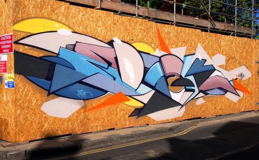
Mina Road, (pronounced my na) rather conveniently runs between the M32 roundabout in St Agnes and St Werburghs, and is a cut-through I use sometimes when I’m out grabbing shots of street/graffiti art. New hoardings are often a magnet for spray-can artists and this spanking new one has landed this splendid Epok piece.

Spelling our EPOK, this is a classic work from the artist, incorporating a complex selection of colours and that wonderful combination of curves and straight lines and angles that he excels at. A really great piece of writing, and how much nicer than the dull woodchip wall.
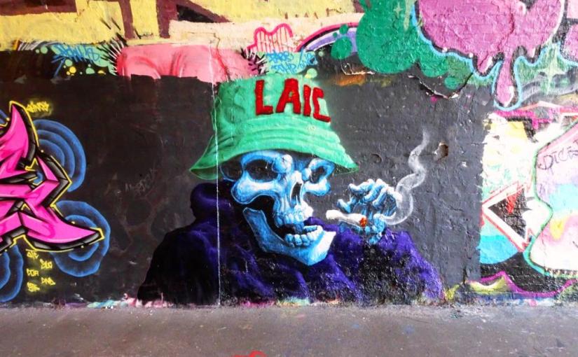
Another artist I will never tire of is Laic217 and this piece in St Werburghs tunnel is so typical of his great work. Another weed-smoking bucket-hatted skull, which he simply gets better and better at crafting.

I feel a real closeness with Laic217’s work because since I started doing this recording Bristol street art thing in 2015 I have watched his work closely and seen his style develop significantly, and although his subjects are often similar, the depth and complexity of his pieces constantly grows. Love this one.
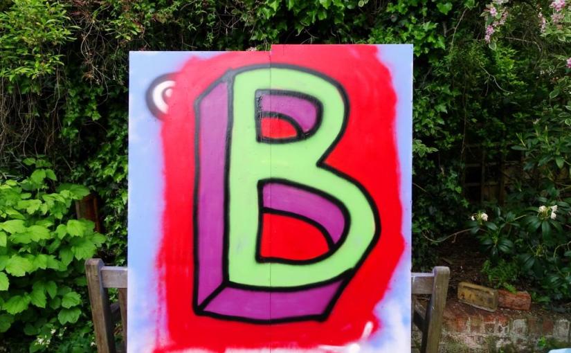
Learning to spray-paint
with my A, B, Cs. There is
plenty of headroom.
by Scooj
On North Street some hoardings have recently been erected around a tower block, which is either due to be renovated or demolished, I am not too sure which. Anyhow the hoardings look like they will be staying for a while, and Upfest are curating them, which means that they will probably remain in reasonably good condition and be reserved for selected artists.

This piece is by the fabulous Sepr and features a lady with a cat and some mischievous looking mice. The grayscale piece is punctuated with a little pink on the cat and the woman’s mouth… I have no idea what is going on with the pink but it looks good. I admire greatly Sepr’s clean retro style and never tire of the humorous scenes he creates.
Just to prove that he is not a one-trick-pony (which he absolutely isn’t) here is a non-rabbit piece by Nevergiveup in Dean Lane. This is a nicely thought out piece with great colours and elements in it and it is so very easy on the eye. The first thought I get is that it looks a bit brand-like and would work very nicely on a beer mat (do they still exist?).

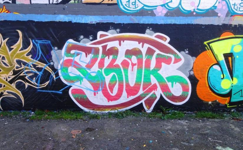
The letters ZBOK I think are a crew or something similar that Nevergiveup and some other Polish artists use. It translates as pervert or deviant… not an entirely unexpected word for an art form that is edgy and rebellious. I guess there is something a little paradoxical about such a nice design for the word zbok. Great piece by Nevergiveup, just a shame I didn’t get there when it was clean.
Son’s entrance announced
with a customary burp
will it ever end?
by Scooj
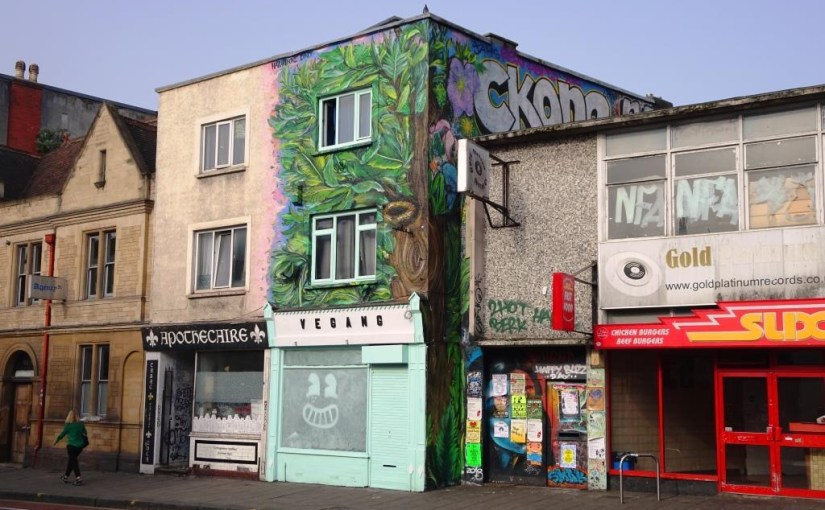
The Matchbox Gallery is a small shop in Stokes Croft that is run by DNT and hosts occasional exhibitions, although I’ve never quite made it into the shop to see one. If you plotted DNT’s street art on a map, the Matchbox Gallery would be at the centre and concentric circles or art density would radiate outwards from it. This collaboration above the Matchbox Gallery with Hazard would be the pin on the map.

The two artists have created what I would call a true collaboration where their work is woven together and a shared style dominates. The mural depicts a tree and foliage which is emblazoned above the shopfront and a littlwe on the side too. I rather like the face in the window of the shop too. I believe there are plans afoot to move the Matchbox Gallery, but am not certain. Great mural for this part of Stokes Croft.
This is the second No Frills collaboration in Dean Lane in a month or so from Slim Pickings and Biers, which is nicely set on a black background with a Day-Glo green/yellow ‘cloud’.

On the left is the Biers piece that features a cartoon scientist, whose test tube is bubbling over with the luminous green/yellow stuff. After a little Googling I found out that the scientist is Professor Utonium from the Powerpuff Girls – a cartoon series that completely passed me by. I’m not sure what the writing in this one says, he seems to write something different each time now, which is great.
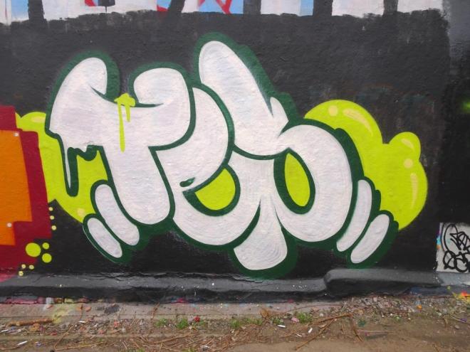
Slim Pickings on the other hand remains utterly consistent with his design and the letters TES. I guess that for him he seeks to perfect something he is familiar with, and although the design remains the same, the colour selections and one or two little inclusions vary it and continue to hold interest. Another great collabortaion from these two.
Miserable me
soaked feet courtesy of a
wobbly paving stone.
by Scooj


 Natural adventures