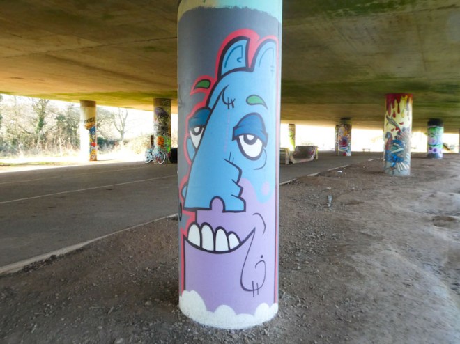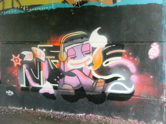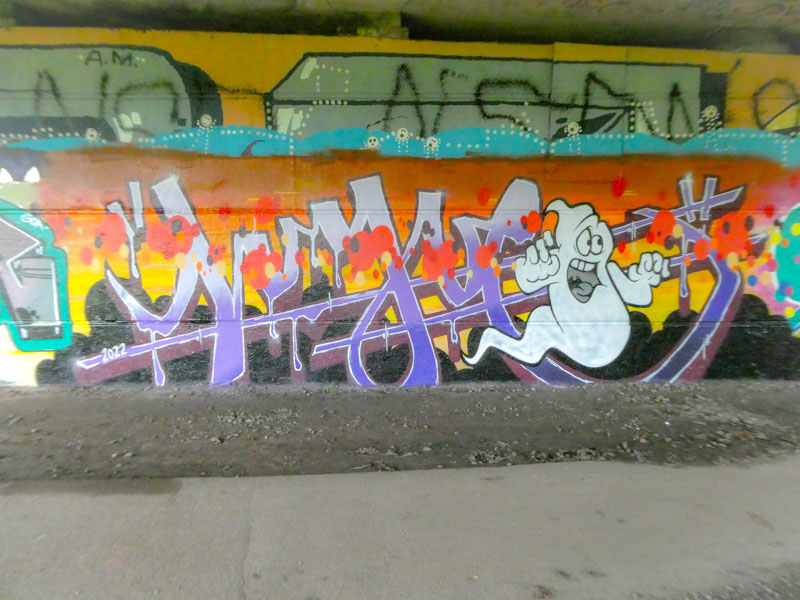
Klashwhensober is utterly relentless. I reckon that I only post about one in five of his pieces, and I currently have a lot of catching up to do. This recent piece under Brunel Way is something a little different and special from the artist, and demonstrates his versatility.

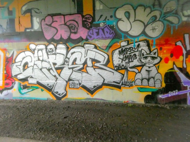
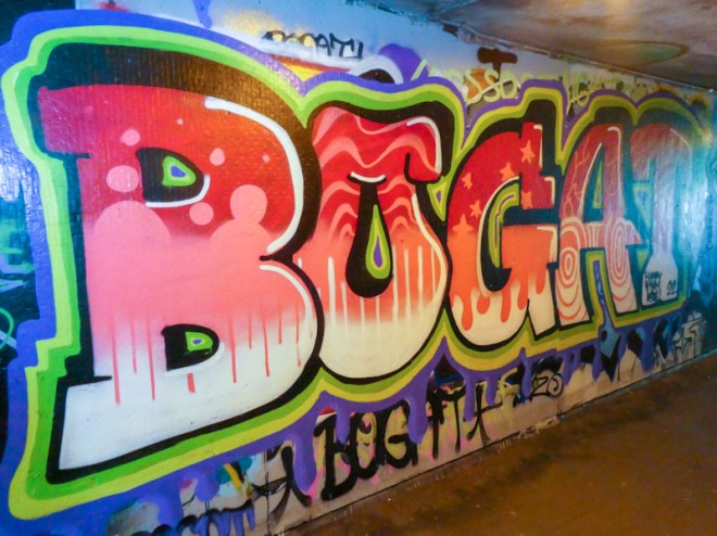
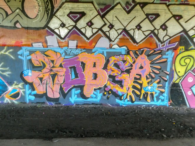
Set on a grey background and ‘stitched together’ with a blue line running up and down and across the piece, Klashwhensober’s letters ‘SOBER’ each have their own character and design. I particularly like the E and R at the right hand end. The colours work pretty well together and the 3D drop shadow does a great job in lifting the letters away from the background. An unusual offering from Klashwhensober, but one that works really well. I’d welcome more like this from him.