
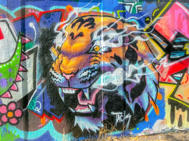
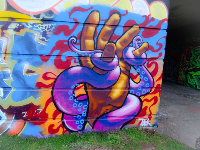
A gallery of fabulous character pieces by Tack Jucker
Instagram: @tack.jucker
all photographs by Scooj


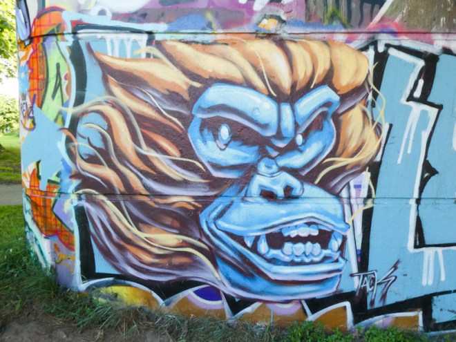


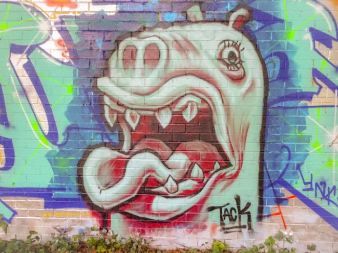

A gallery of fabulous character pieces by Tack Jucker
Instagram: @tack.jucker
all photographs by Scooj

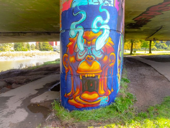
I really should know, by now, not to visit Sparke Evans Park or the River Avon on a sunny day. It makes photography nigh on impossible. This was my second attempt at photographing this piece, after the sun had moved a little, and the foliage that was casting a shadow was out of the way. Still, the light was reflecting off the piece a little too much for my liking.
There isn’t too much I can say about Chill that I haven’t said before. The tattooist inspired designs in black and white are pretty unique in Bristol, and I haven’t seen anything quite like them anywhere else either. I like the way Chill incorporates flowers into his pieces, marrying up urban culture with a love for nature. Another fine piece from Chill.

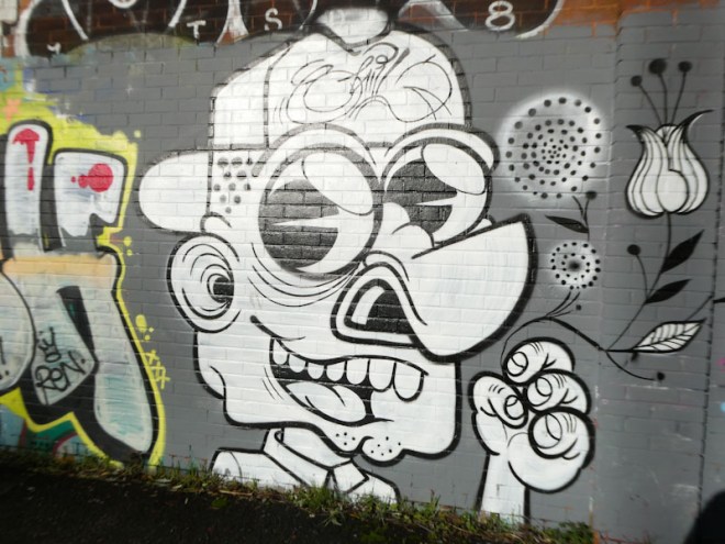
A little bit off the beaten track, and in a street that doesn’t have much of a graffiti culture, is this rather nice Taboo piece featuring Snagglepuss, a Hannah Barbera creation. On my arrival, the warehouse was just opening up, and I think the proprietors considered me a little odd photographing the graffiti outside their premises, but they let me get on with it.

The writing is characteristically unruly, with each letter taking on no particular consistency or form, but the whole being unmistakably Taboo. I am confused by the orange line, which, to my eye, disrupts the flow, and I think it might have been added by someone else, although with Taboo, you never really know. Nice to see this piece on my travels around the city.

In my mind’s eye, I had published loads of pieces by Bogat. It turns out that this is only the fifth, so there must be a fair few lurking in my archive. I wonder if a way to flush out some of these ‘lost’ pieces is to have an amnesty, whereby I just publish a bunch of pieces by multiple artists, in one post, from a particular month, as a kind of ‘lost souls’ gallery, and write less about each individual piece. Something to think about.

This particular piece is an absolute cracker from Bogat, and very probably his best so far (of those that I have seen). It was painted a part of a paint jam in this rather grubby underpass, but I think all the artists pulled out the stops with their work – perhaps there was a bit of a competitive element to it all. I could also interpret this piece as a bit of a homage to Laic27, because many of the elements of his work are replicated here.

Something that can be always relied upon is that any piece, large or small, by Sled One will always ooze class. This recent work at the entrance to the tunnel is proof enough of that. I particularly like this piece because it came as a complete surprise.

When I first saw this, I thought that there might be a suggestion of Sepr involvement, because the character would fit the Sepr style, but the eyebrows give it away as a Sled One character. The chef skeleton is full of character movement, holding his hand in a gesture of culinary perfection, perfect. Another thing I love about Sled One’s work is that he slaps classy ‘ASK’ mega tags (After Skool Klub) all over the city, often without signature. Another notable piece from Sled One.

It is getting very difficult to keep on top of the street art scene in Bristol at the moment. The sheer number of artists and the frequency with which they are painting, means that many pieces never see the light of day on the pages of Natural Adventures. An artist who doesn’t appear as much as he should is 3F Fino, and I have a great many of his pieces lurking in my archive.
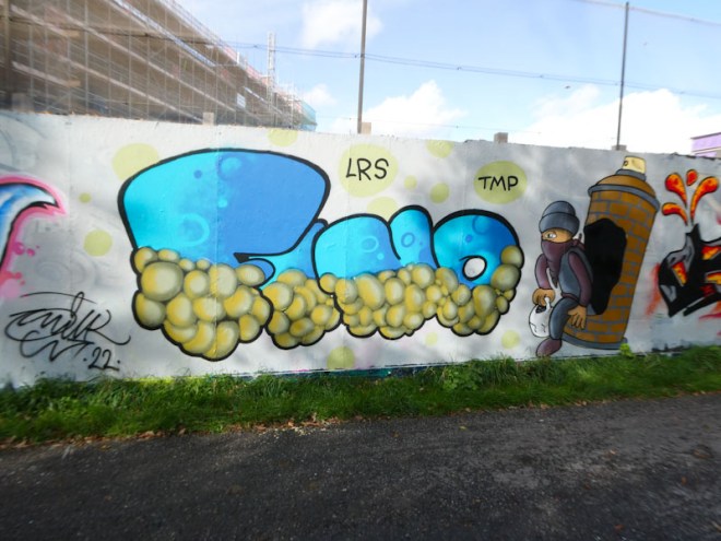
I have managed to include this recent one from Greenbank, painted alongside LRS crew friends. The letters FINO are half decorated in a bubble style, that 3F Fino has used before at L Dub, if my memory serves me right. The design as very effective and unusual. Alongside the letters, the artist has painted a masked character jumping out of the side of a spray can with a brick wall motif, used a lot by street artists. All good work from 3F Fino.
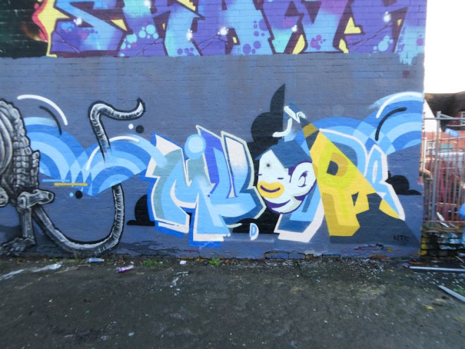
Watching Mudra develop over the past couple of years has been one of the great pleasures in recording the street art scene in Bristol. From his early colourful portraits to his sophisticated style of writing, he has upped his game time and again and continues to improve with every piece.
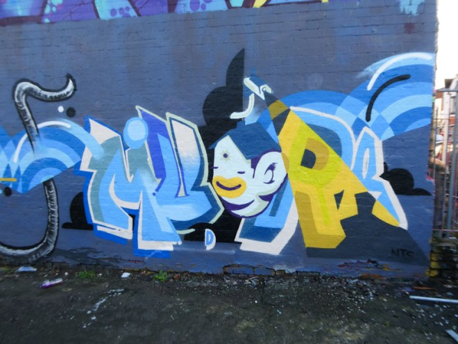
The writing, in a magnificent palette of blue and yellow, spells out Mudra with a spectrum of styles and sizes for the letters, but somehow all very recognisably Mudra’s work. The monkey/house character in the middle of the piece is a bonus, and serves to add interest, without which the piece wouldn’t look complete. I love the yellow wedge too, a lovely effect.
I was lucky enough to pass by this little wall when Nugmoose was painting it alongside a friend who has painted a few frogs in the area, but currently doesn’t yet have a ‘street name’. Nugmoose is an interesting artist who seems to take a sideways view of our world.

Nugmoose accompanies his trademark alien writing with a character, of sorts, but it doesn’t seem to matter ho much I look at it, I just can’t make out what it is. It looks organic, so I wonder f it is an alien. I will have to ask him the next time I see him. What you can be sure of with Nugmoose is that his work will always be super-imaginative.

I believe that maybe Minto lived in Bristol, although I might have that wrong. One thing for sure though is that he has friends here and regularly visits the city, usually dropping a fin piece of graffiti writing.
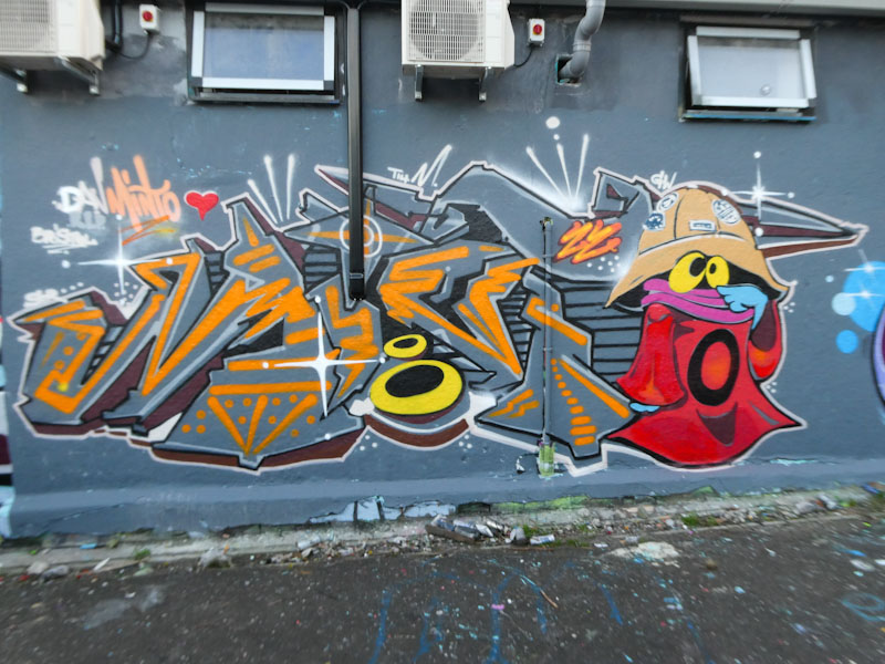
This is one such piece, and Minto has combined his writing with a character. It is driving me mad, but I recognise the character but can’t identify him, and even Google has let me down on this occasion. Minto’s work is as meticulous as ever, and he is always welcome to paint in Bristol.
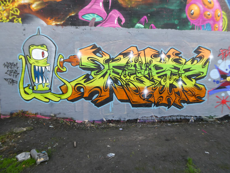
It is incredible to think how far and fast Werm has come from when I first met him back in 2020, when he was writing under the name Eman. He has definitely switched from character pieces to focussing on his writing, so it was great to see this piece where he has combined both.

The character is, I think, an alien from the Simpsons – I know I have seen it before… I have just Googled it, and I am correct, and it is called Kang or Kodos. The letters, spelling out Werm, are intricate and beautifully filled with superb horizontal fill transitions. This is Werm raising his game once again. Great stuff.


