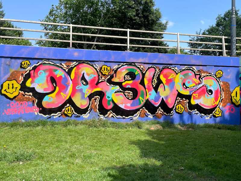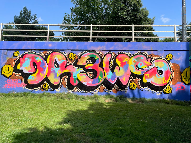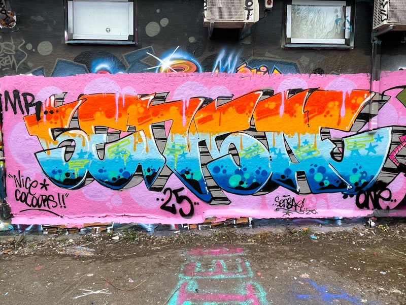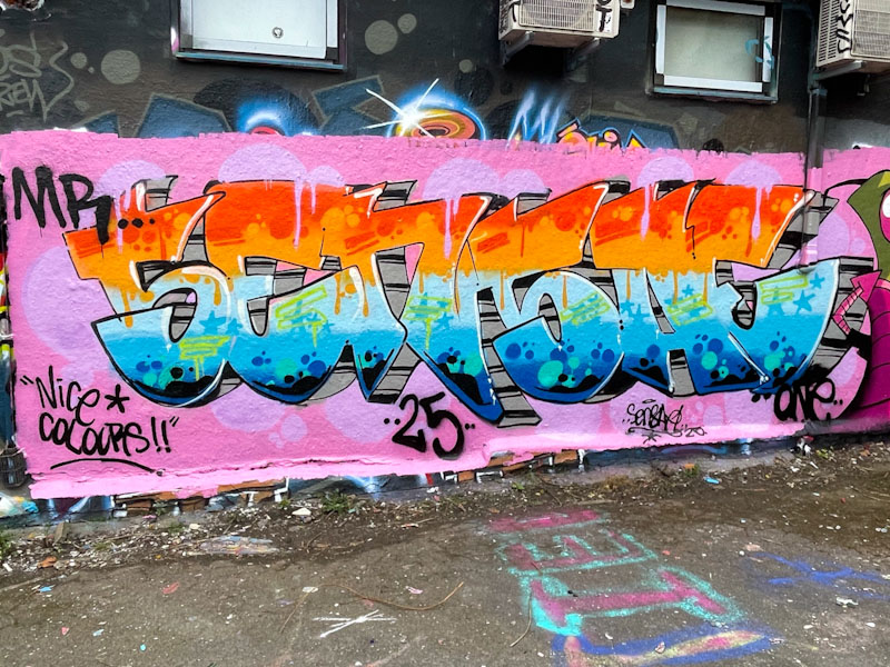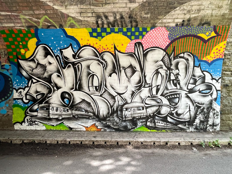
The tunnel, under the railway, at Boiling Wells Lane is usually pretty useless for graffiti, more commonly used for throw ups and tagging than serious artworks, but some new pieces from Hemper and friends have rather upgraded this spot, and I wonder if it will encourage others to paint there a little more.

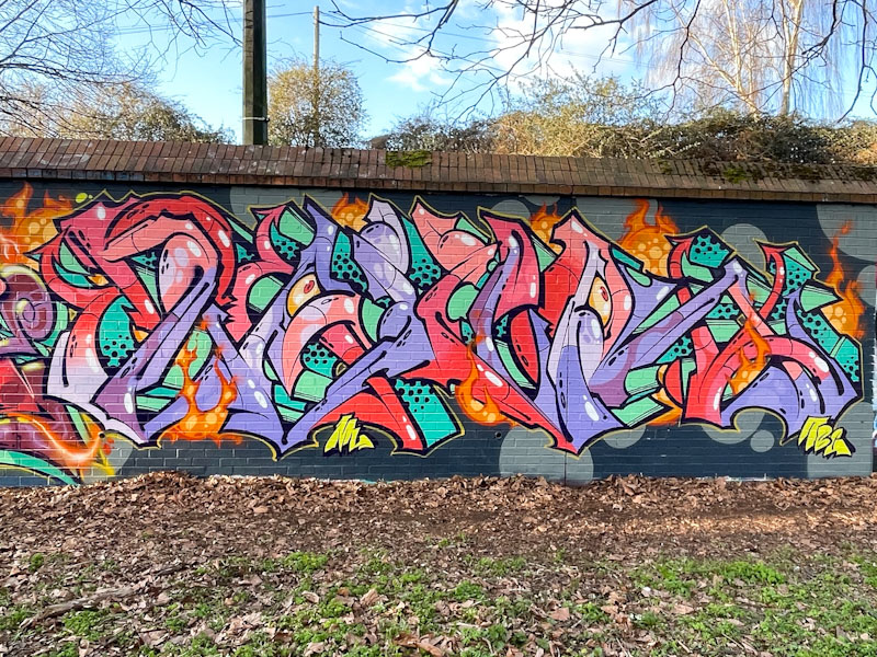
Hemper has arisen from his mini-slumber for the last month or so and started producing these slimline ‘Hems’ pieces of which this is an absolute cracker. The black and white letters, portraying local scenes of trains and caravans, and full of mischievous characters, contrast superbly with the quilt-like patchwork of colourful patterns surrounding the piece. This is masterful work from one of the very best writers in the country.