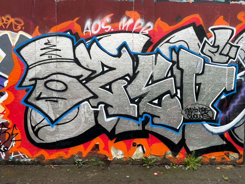
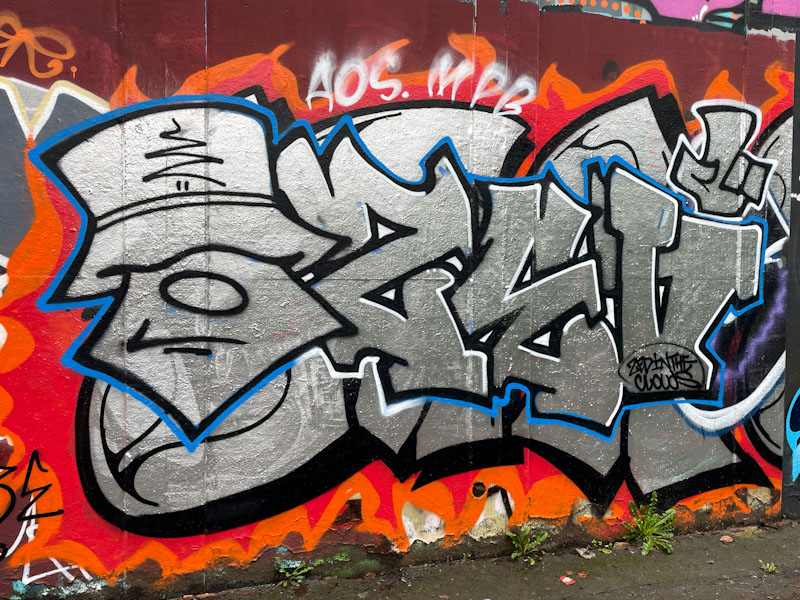
Zed in the Clouds, M32 roundabout, Bristol, March 2026
It would seem that every time I feature a piece by Zed in the Clouds, I find myself repeating that he is somewhat underrepresented on the pages of Natural Adventures.
Zed in the Clouds, M32 roundabout, Bristol, March 2026
This one was perhaps just too ‘noisy’ I had to include it. The chrome combination piece with a character on the left, and the letters ZED, contrast perfectly with the orange and red ‘flame’ background, which looking at it might have been from a former occupant of this wall. I think that the Zed in the Clouds piece is bounded by the blue outline, and includes the hand on the right.
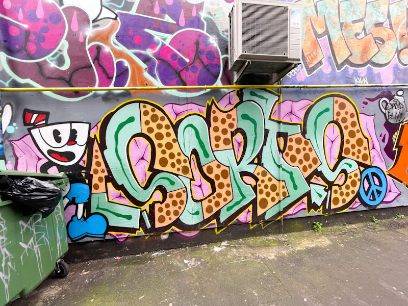
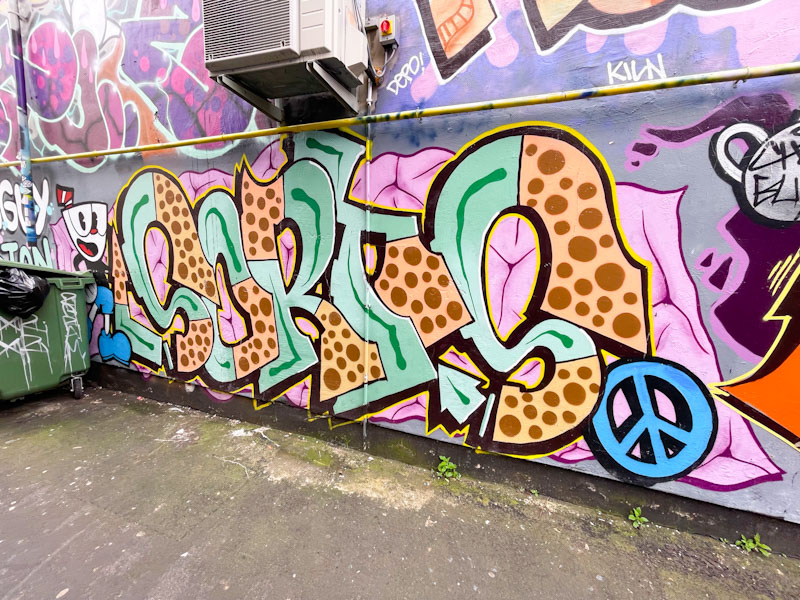
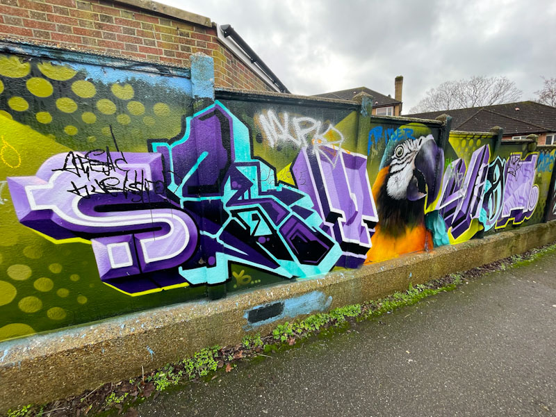
It has been a long time since I last visited St Mark’s Avenue, and it has been a long time since I last discovered a piece of graffiti writing by Sorts. So two long awaited events occurred a week or two back when I made a spontaneous decision to step into Easton.
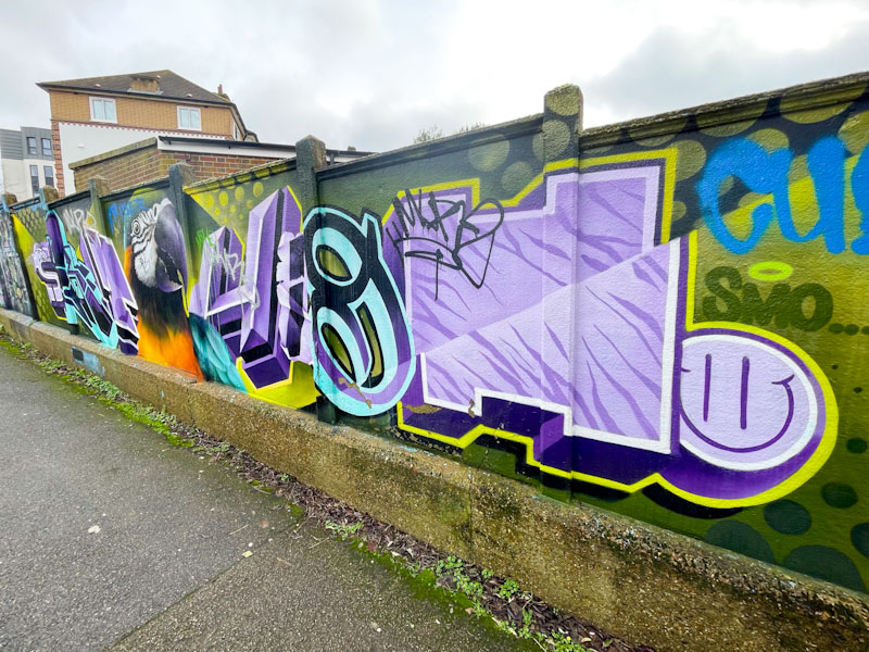
Sorts, St Mark’s Avenue, Bristol, March 2026
There were a few pieces in St Mark’s Avenue that I hadn’t seen before, starting with this beauty from Sorts. By the look of it, this combination piece, with a cheeky character on the left, is reasonably recent, or at the very least it looks fresh, and there aren’t any rain and dust splatters along the bottom fringe, which you tend to see on older pieces. The letters are nicely presented and filled in quarters with contrasting colours and patterns. It would be great to see more from Sorts.
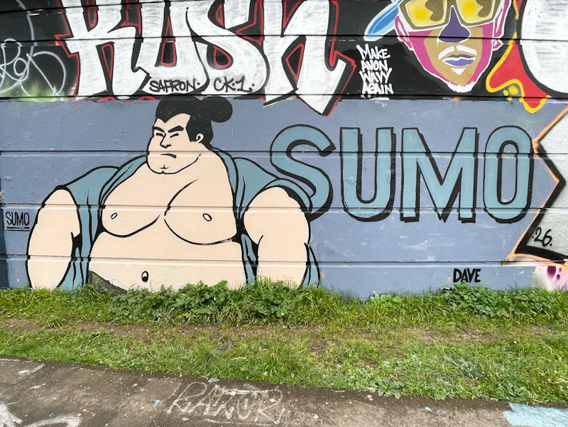
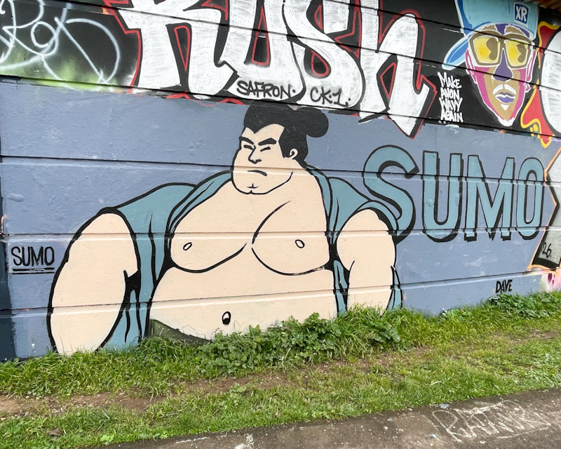
I can’t recall ever seeing anything by Sumo before, but since I found this piece, I have come across two more in different Bristol spots. If Sumo is new to Bristol, then I am very excited about it, because if this is anything to go by, we are going to be in for a bit of a treat.
Sumo, Cumberland Basin, Bristol, March 2026
It looks like Sumo’s work is rather self-explanatory. The combination piece has a rather large Sumo Wrestler character alongside some rather smaller letters in a simple clean font saying SUMO. The piece is arresting and very different, and a fine addition to the enormous variety of styles we see in Bristol. Watch this space for more soon.
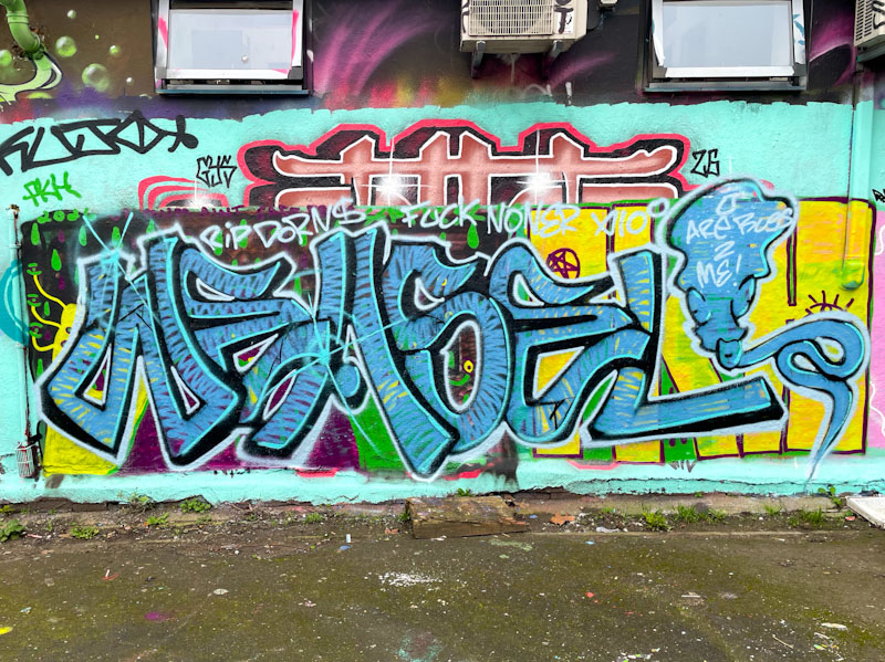
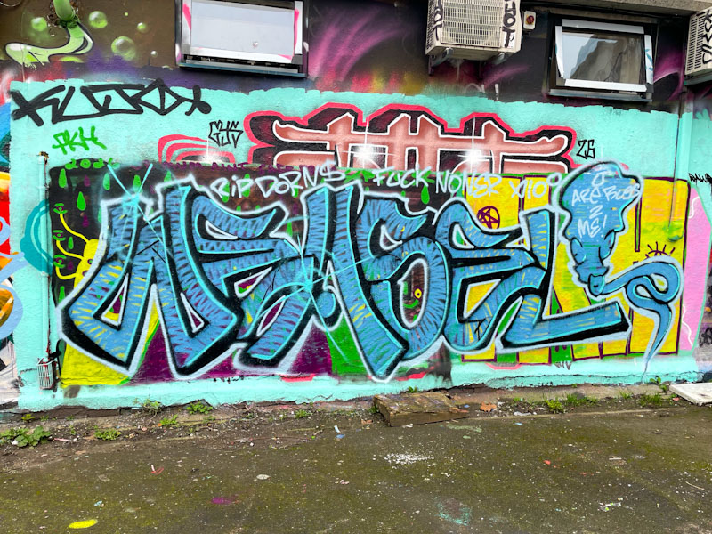
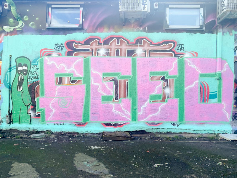
The lifecycle of a wall is often fascinating, and under this piece by Weas(el) is a little bit of recent history that can be made out, because artists have painted over one another without buffing the wall. The sequence, over about 10 days or so was a beauty by Werm, then a piece from Seed, followed by another piece that I never saw and finally this one from Weas – I’ll show the others at the end of this post.
Weas, Dean Lane, Bristol, March 2026
Weas’ work can be found literally all over Bristol – one of his tags has even made it onto a utility box very near my house. Although his ‘mega-tags’ are fun, he actually is, in my view, a much better artist when he turns his attention to his graffiti writing. His letter fills always give the impression that he is a man in a hurry, or that he likes his paint to go a long way. His letter style is quite easy on the eye, and of course combines the writing with the mega-tag I mentioned earlier. Weas certainly likes to make his mark.
Werm, Dean Lane, Bristol, February 2026Seed, Dean Lane, Bristol, February 2026Weas, Dean Lane, Bristol, March 2026
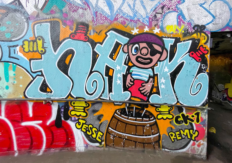
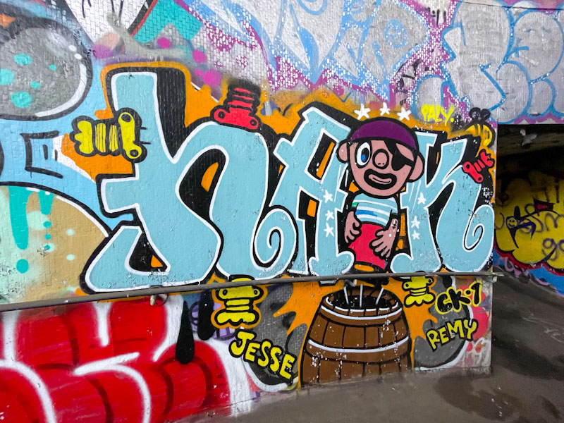
In my wanderings in search of Bristol street art and graffiti, I tend to visit the ‘honey pots’ most often, and then radiate outwards to the spots where turnover is lower, or where wall space is limited to one or two pieces only. This means that I tend to miss quite a few pieces from these less visited places. I was pleased therefore to stumble across this Haka piece in a tunnel under the M32 recently.
Haka, M32 roundabout J2, Bristol, March 2026
I think that Haka painted this some time ago, but it still looks in fair condition. Haka’s combination pieces usually feature children’s picture book characters. The pirate in the piece, standing on a barrel is unknown to me, and a quick Google search didn’t help. A fun piece for the kids.
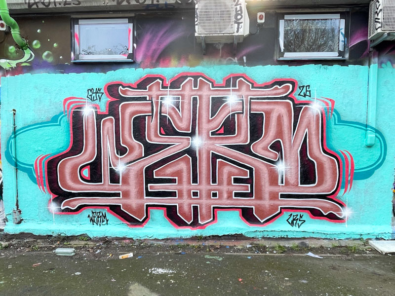
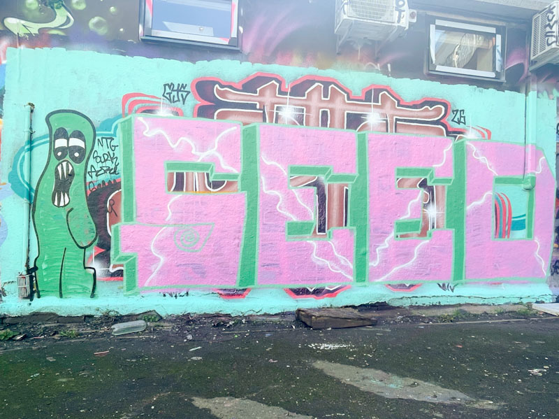
I enjoy observing new artists who try to break out onto the scene, and after all, all graffiti/street artists have to start somewhere. As they progress, they will make mistakes, both in their art, and equally importantly regarding etiquette. Even I fall foul of this from time to time – there are codes and principles, even if there are ‘no rules’. On this occasion, Seed painted his large letters recently, over a beauty by Werm. Generally speaking you shouldn’t paint over something that you are not equal to or better than, and Seed isn’t yet at Werm’s level. The logical consequence is that you end up with only high-end pieces on all walls, and that is where taggers and bombers come in, freeing up walls to be painted again.
Seed, Dean Lane, Bristol, February 2026
Seed is learning gradually, and improves from piece to piece, but his work is still rather crude. His letters here are large and square, and his 3D drop shadow missing on the bottom of them. He is experimenting with some plasma lines to break up the large swathes of pink. He has also included a little cartoon-style character, completing the combination piece. Keep practicing and perhaps stick to practice walls for the time being.
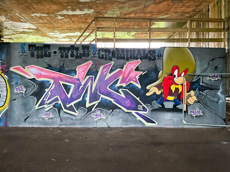
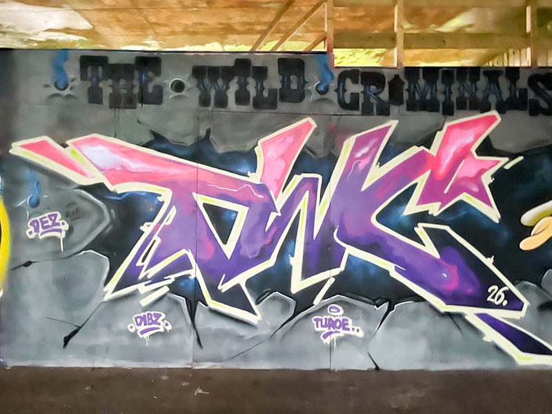
Turoe and Dibz, Brunel Way, Bristol, February 2026
This is a rather nice combination collaboration from Turoe and Dibz, and I think that Fade was there too, but possibly in a filming capacity. The depths of a wet and rather horrible winter seem to be dimming, and many artists are waking from their slumbers.
Turoe, Brunel Way, Bristol, February 2026
It turns out that this hoarding, which is actually the side of a large skate ramp, is becoming a bit of a honey-pot for high-end pieces. Although I can’t be absolutely sure, I think Turoe painted the TWC (The Wild Criminals) letters breaking out from the grey ‘wall’. Some great colours and textures in the fill, the hole and the wall.
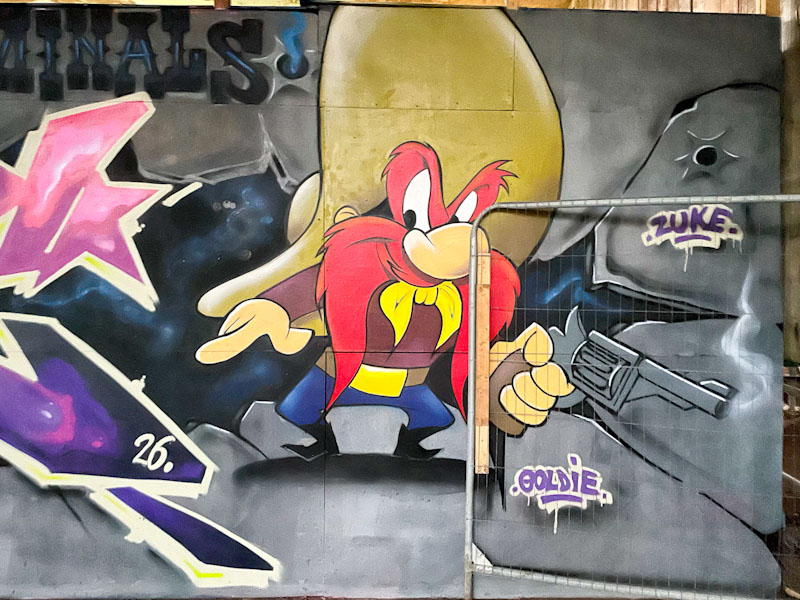
Dibz, Brunel Way, Bristol, February 2026
I think that the Yosemite Sam character is the work of Dibz, which is unfortunately behind a bit of temporary railing, which I should have moved really for the photograph, but it is a real bit of street furniture that gets in the way from time to time, and adds authenticity to the record. The character is superbly painted, and so true to the cartoon character. Warner Bros and Looney Tunes would be proud.
This Surbiton Station wall was a lucky spot to find and has kept my posts ticking over during a rather lean spell on the streets of Bristol. This particular piece is a rather old, but nonetheless stunning combination piece by SkyHigh.
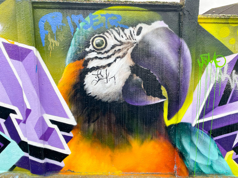
SkyHigh, Surbiton Station, London, February 2026
His letters, painted with the characteristic multi style blocks, are broken up with a superb parrot, confirming that SkyHigh is equally happy painting letters and wildlife portraits. A quick look at his gallery will show you that he paints these combinations quite regularly.
SkyHigh, Surbiton Station, London, February 2026
The blue and gold macaw is absolutely amazing, and I am in awe of SkyHigh’s skill with his spray cans to be able to create something so beautiful and so accurate. It is about time that he and Roo paid another visit to Bristol.
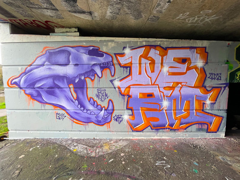
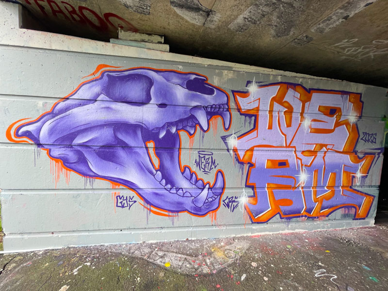
I was so pleased to find this piece by Werm, who like many other artists has struggled to paint this winter, I assume, because of the rain. Werm painted this spot some years ago with a skull piece, and I think that this is a throwback piece to the original painted in February 2023.
Werm, Cumberland Basin, Bristol, February 2026
I guess you could call this a combination piece, although the skull and letters are discrete. On the left, the skull (from the cat family I guess) is beautifully observed, with some great shading to bring out the form and depth. The proportions work really well – skulls can be very difficult to paint. The writing on the right spells out WERM stacked, two letters on top of the other two. Overall, this is a fine work from Werm and almost like a study to practice his craft.
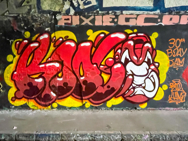
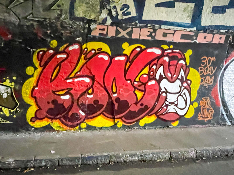
This was a piece from a little while ago by Kool Hand, celebrating his own birthday with some friends in the tunnel. For some reason, my iPhone was playing up that day, and my photographs a little blurry – some kind of auto-setting might have kicked in because of the low light levels.
Kool Hand, St Werburghs, Bristol, October 2025
The combination piece has the letters KOOL accompanied by a trademark orangutan head, and the whole thing is very nicely presented. Kool Hand is an artist whose work just keeps on developing gradually but consistently. A very nice birthday present to self.