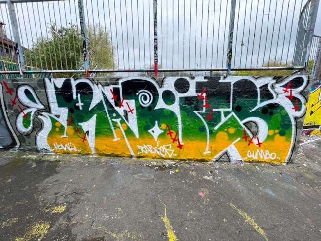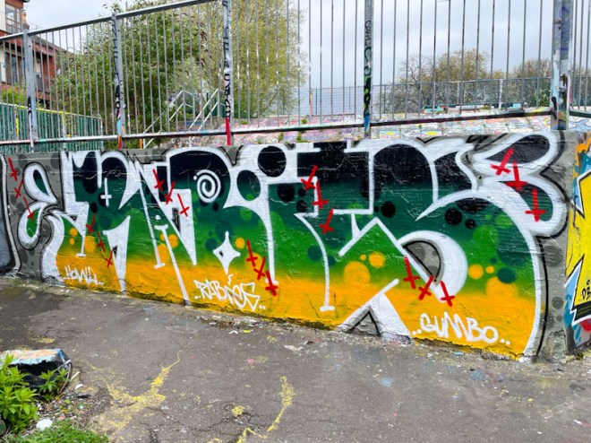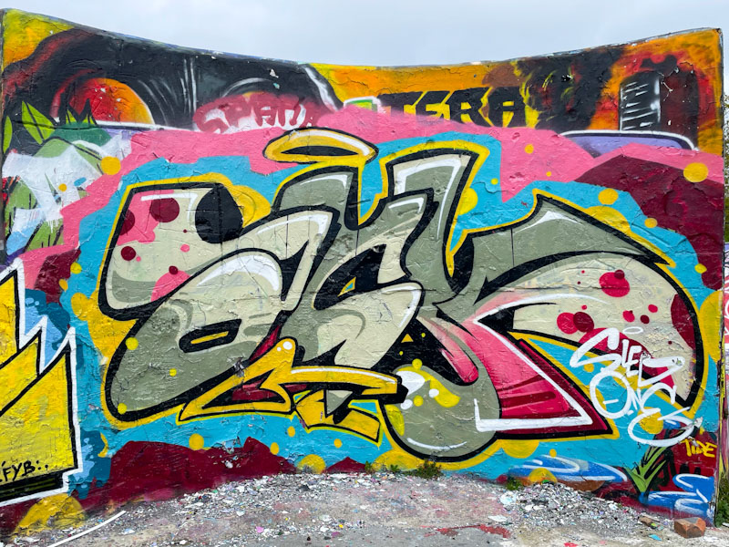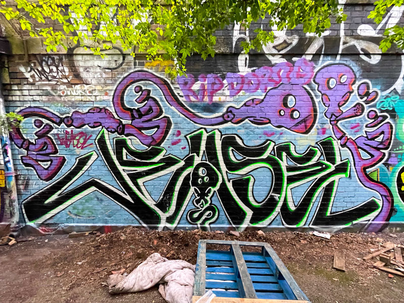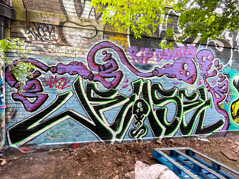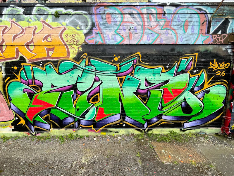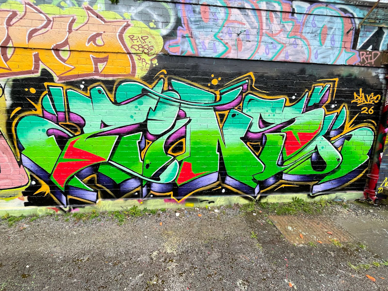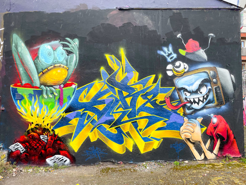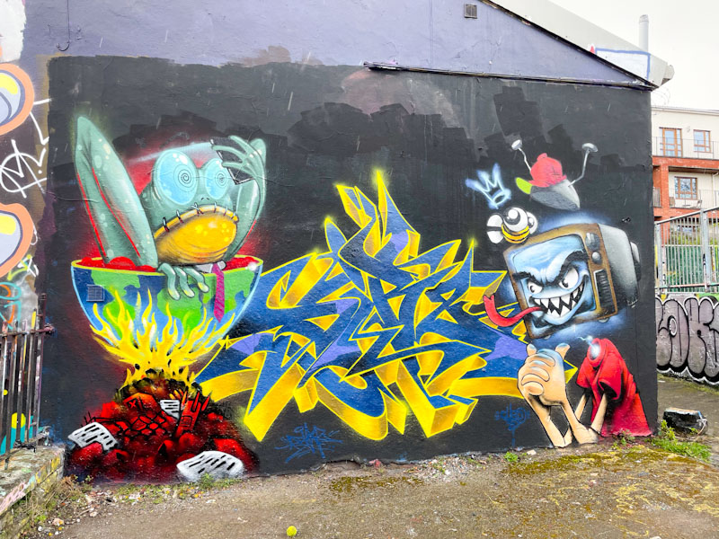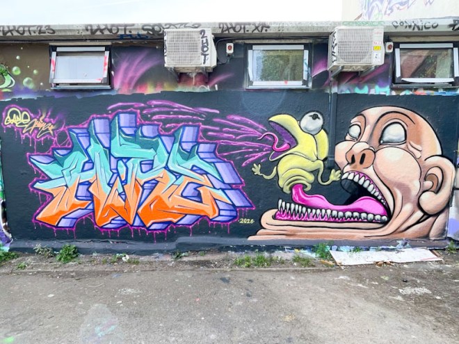
This is a rather fun collaboration between Hire and Zake in Dean Lane. I can’t remember if these two have collaborated before, they probably have, but this is still a bit of a treat from the writer and the character artist.
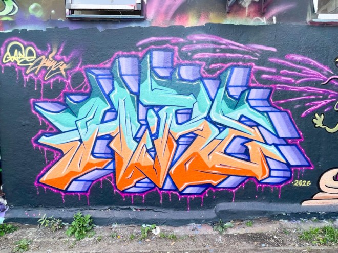
On the left, Hire has written his letters in a rather compact block, which is quite unusual, as he typically spreads his letters out a fair bit. The fills of orange and light blue have been nicely done and work surprisingly well together. A deep drop shadow is bordered with a drippy pink line with light highlights woven in.
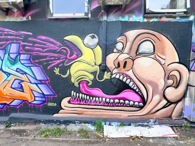
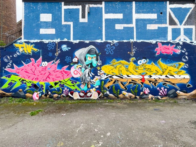
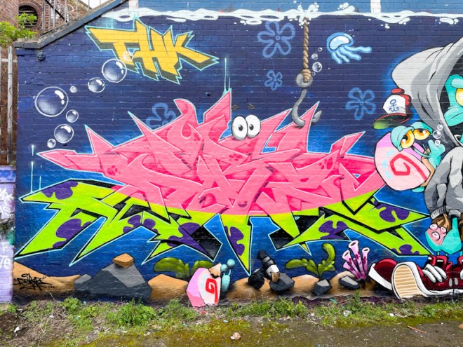
I’m not too sure what to say about Zake’s character piece, as it is all a little bit strange. A bald man with a huge mouth and multiple teeth has a little finger puppet attached to the end of his long tongue. The puppet character, which looks like some kind of lizard monster is spraying pink ‘vomit’ over Hire’s piece, thus creating his drippy pink outline. A great read-across between the two pieces in this collaboration.