
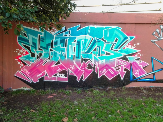
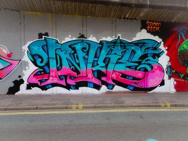
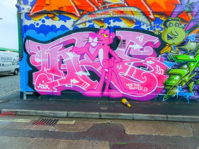
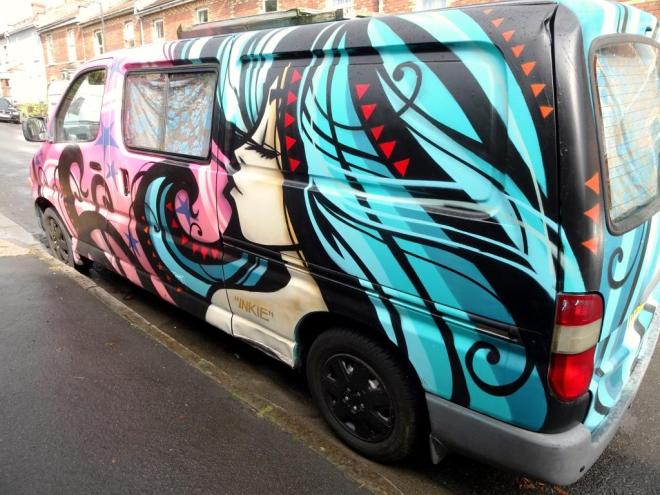
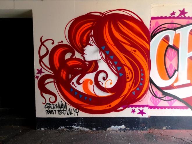
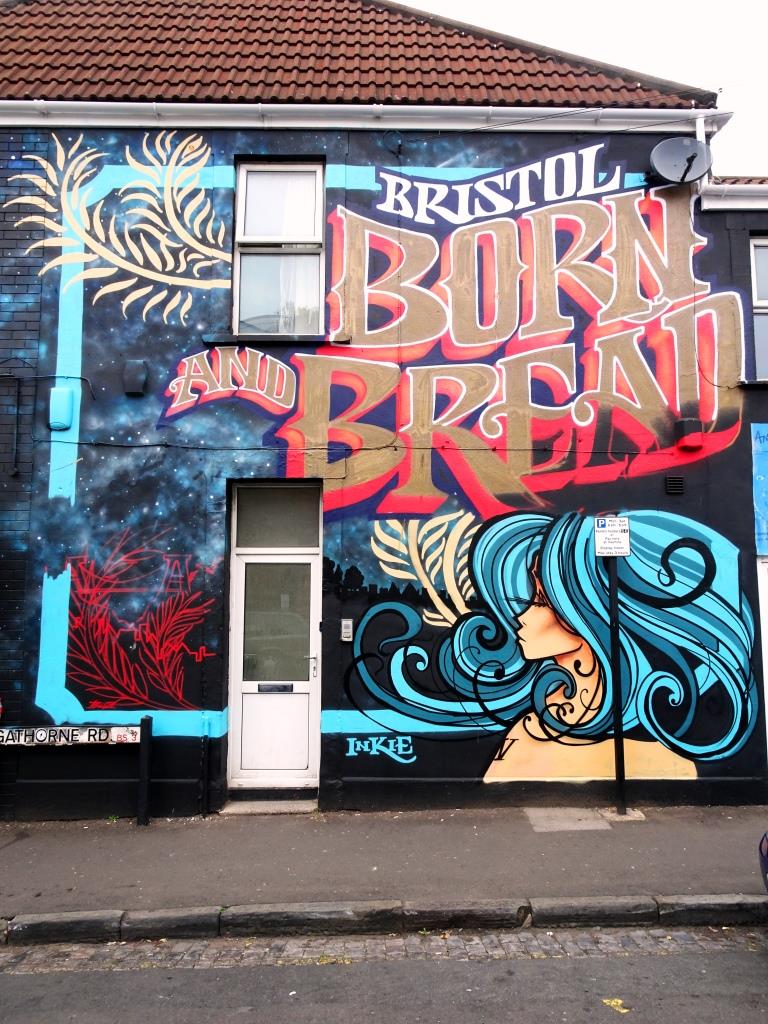
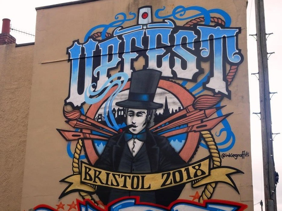
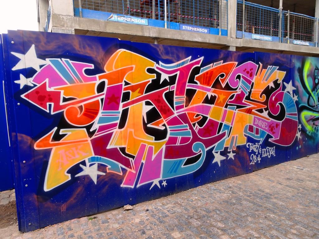
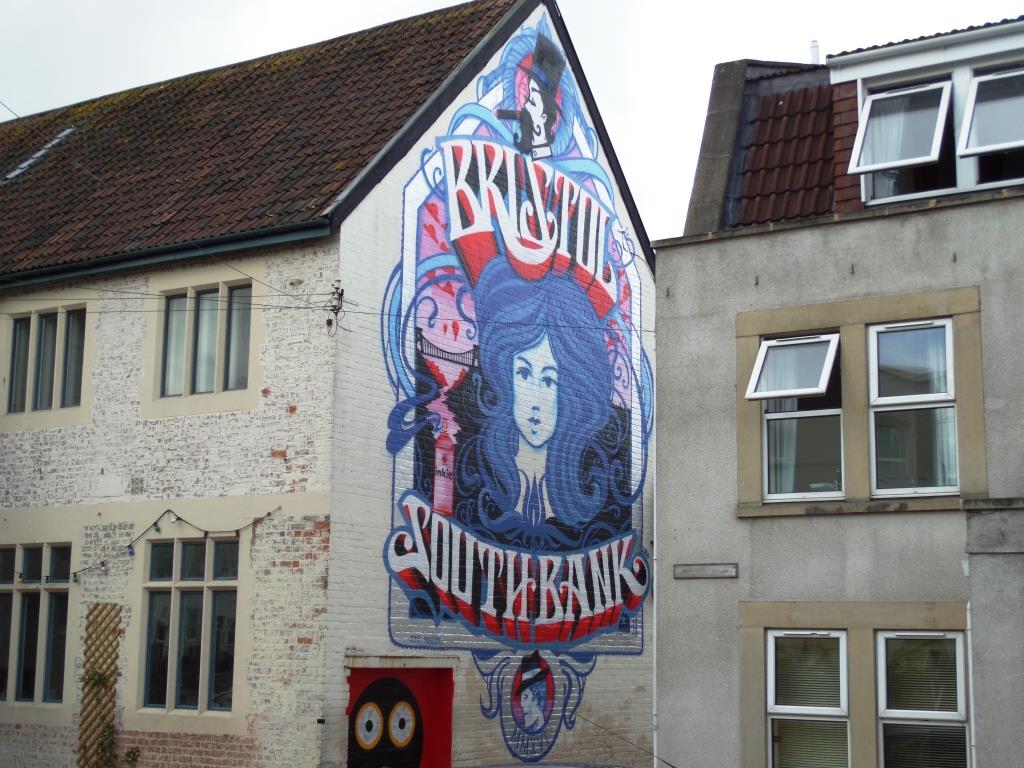
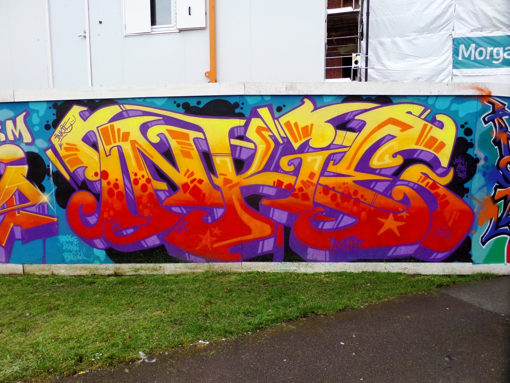
A gallery of awesome street art and graffiti writing from Bristol’s legendary Inkie.
All photographs taken by Scooj.
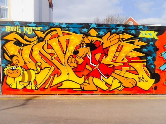


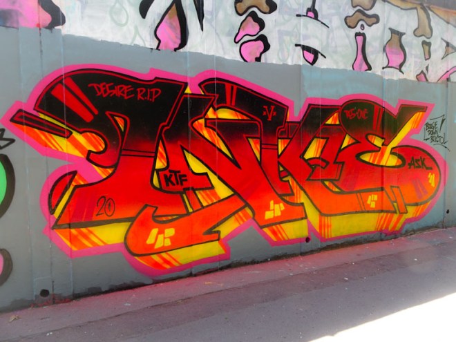


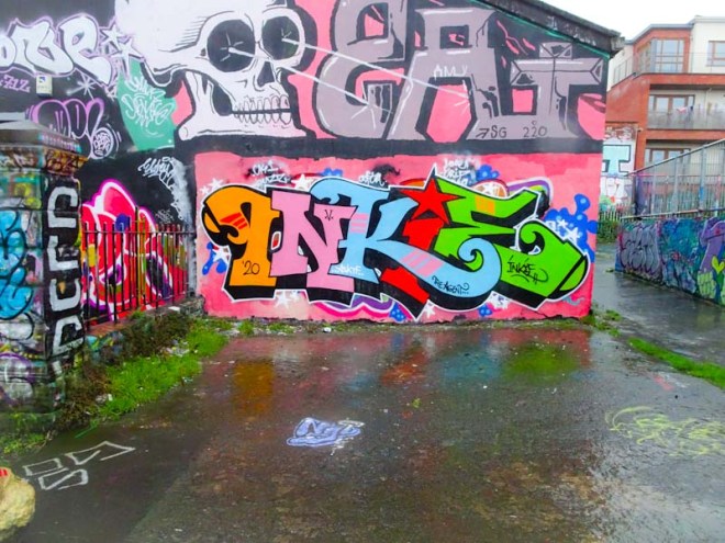


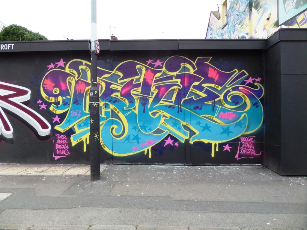


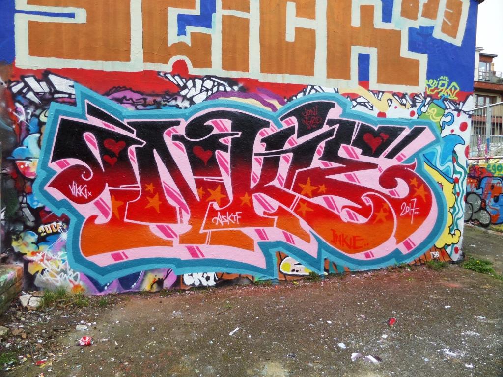
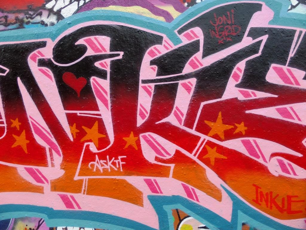
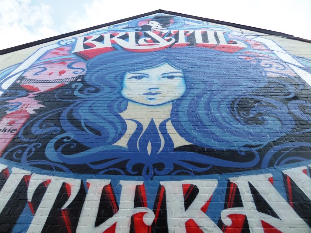


A gallery of awesome street art and graffiti writing from Bristol’s legendary Inkie.
All photographs taken by Scooj.
I have walked past this pioece by Mr Penfold a handful of times, but not until recently did I have my camera with me, which is a pity really because it has been rather spoiled with a tag. It is in a little alley just off Nelson Street and close to St John the Baptist church.

His work always contains these abstract designs in bright colours, often incorporating animal print patterning. The colours in this piece are typical of his work, which can often be seen brightening up shop fronts and public spaces. Something about his work reminds me very much of the 1980s, it might be the brashness of the placing together of contrasting patterns and colours. Always instantly recognisable, and usually upbeat work.
It is obvious from this collaboration combined with Instagram posts from each of these artists that they not only paint well together, but they are really good friends too. Jointly, Hazard and Tasha Bee are at the vanguard of female street art in Bristol, although if I am honest an artist’s gender to me is not as relevant as the quality of their work, both score highly on the latter measure.

The Hazard piece on the left is a copy of the one she painted in Stokes Croft a couple of weeks earlier and has that amazing blue and red shadow thing going on.
It is so good to have her in Bristol for a while because we get to see her work first hand, rather than via social media – I need to photograph her most recent piece this lunchtime (by the time you read this it was a couple of days ago).
The Tasha Bee piece on the right is in such a different style – flat rather than 3D and highly designed, fitting the ‘Tasha Bee brand’ if that makes any sense at all. I love the work of both of these artists, and although I have met Tasha Bee several times, I would love to meet Hazard too and see her at work. Wonderful collaboration.
Rezwonk likes this doorway, and is enjoying getting to grips with his letters – R E Z W O N K – which he has been using recently, with particular great effect in his collaboration with Subtle a few weeks back. This work looks particularly time-consuming, but is worth it. This kind of work reminds me a little of the work of LA, a New York graffiti artist, in his collaboration with Stik.
I have seen more of this work by Rezwonk scattered about the place and will post it in due course. I think he should use it in collaboration with one or two more artists in Bristol as I think this particular approach really lends itself to it.
Door 31
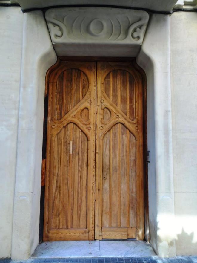
Back to Barcelona again (a rich source of doorage) and a little look at a couple of the enormous appartment doors that can be found in the more affluent commercial areas of the city. This door was sandwiched between two rather exclusive shops, and was typical of the rather imposing entrances in the area. I particularly liked it because of its Tolkeinesque design – elves live here.
However, this door is not the main event of this post. Much of the attraction I have for doors is imagining what lies on the other side – does the door provide any insight or is it a barrier to discovery?
One of these large doors happened to be open when my daughter and I strolled past, and oh my! what an incredible lobby area lay on the other side. I was utterly overwhelmed by the decoration and detail to this entry way.
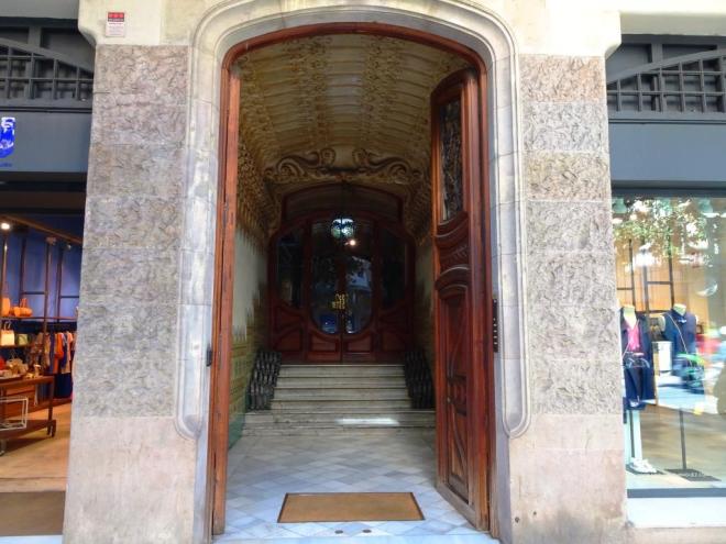
So we stepped closer to get a better look…

From the ceiling to the floor, this lobby oozes class. Stunning ornate plasterwork on the ceiling draws you in past the beautiful tiled walls and marble steps. and on either side of the steps metalwork rails (which appear to have no purpose other than decoration) lead you a second interior set of doors.

The beautiful inner set of doors are worthy of a Thursday doors post in their own right, and the crazy lampshade seems to be utterly at home in this visual feast. Now I don’t know if this is typical of Barcelona appartments, but I think it is amazing that so much effort has gone into something that will be seen by so few people. This is a city that seems to be proud of putting on displays, and for the visitor it is awe inspiring.
by Scooj
More doors at: Thursday Doors – Norm 2.0
Door 29
I usually like to present one door at a time in my Thursday doors posts to allow for a thorough examination of the door, without the distractions of others. However, sometimes it is appropriate to look at several at once – besides which, how else will I be able to clear out my archive of doors?
On a recent trip to Barcelona with my daughter, I noticed that in the old city many of the doors to apartments above shops were extraordinarily thin and tall. Some were so slender that you wonder how larger people might manage. Were they designed this way to maximise the space for the shop front? or was there some other reason for this architectural design? Answers on a postcard…
Here are a few of the many doors we saw:


This door was open, and what I saw inside was not at all what I expected. This is not a place for those afraid of confined spaces. Immediately behind the door, there was a stone spiral stairtcase, tighter than any I have ever seen before. By the look of it on the doorbell, there are eight apartments through this door. The mind boggles at the logistics of meeting people travelling in opposite directions, and looking at this through the lens of the British pre-occupation of health and safety – isn’t this something of a horrific fire escape risk? Interesting as it is, I fret every time I look at this picture.
by Scooj
More doors at: Thursday Doors – Norm 2.0
The boards at North Street Green are mostly set out in pairs and in portrait orientation. This means that when writing about them, one has to take them in pairs. Sometimes the pairing is wholly complementary, almost like a collaboration. In other cases the pairings are in marked contrast, and this is one of those. On the left is a feline (tiger?) face by Bristol’s J. West and on the right is a simple portrait of a girl and overwritten with colourful squiggles by Everything’s Oh-Kay.
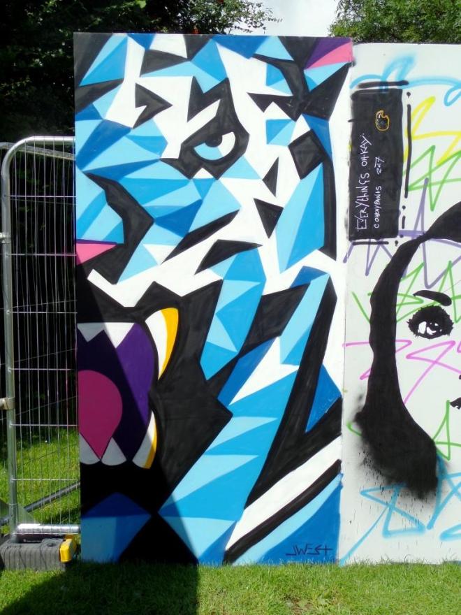
J.West is no stranger to this blog, and I most recently featured his street savvy panda complete with ghetto blaster from The Bearpit. This blue cat, composed of geometric shapes and contrasting colours is probably the best of his work I have seen to date. I really like it.
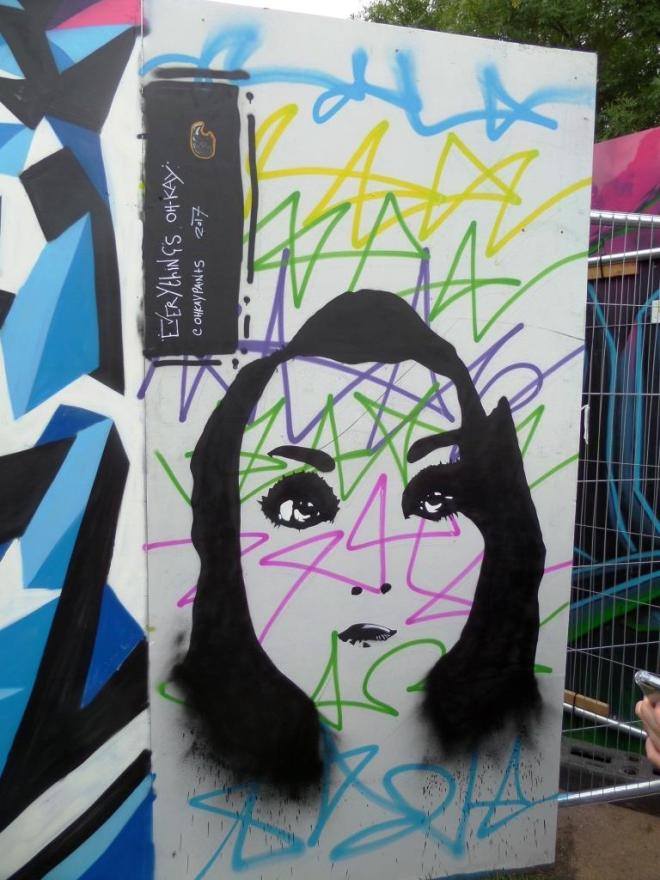
I have not seen any of Everything’s Oh-Kay’s work before, and my first impression is that it feels very graphic designery. In fact, a great many street artists are designers and illustrators by day, taking to the walls to liberate their asrtistic talents away from a commission or customer brief. I am a little on the fence with this particular piece, and would like to see more.
On my walks to Leonard Lane in the city centre, the walks I really enjoy, I usually come face to face with this hairdresser’s shop as I get spat out of the lane and into Small Street. Every time I go there I forget to take a picture, but not this time.

The shop front is by Bristol designer Mr Penfold, who does quite a few design commissions in and around the city. Every now and again he also does a street art piece, but that seems to be a bit of a rarity these days. This is typical of his modern, fresh design work and certainly brings some colour to this rather unexceptional frontage.
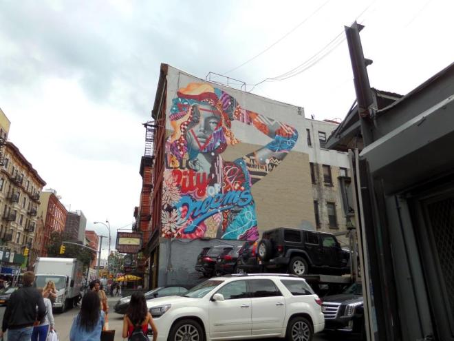
This is another stunner from Tristan Eaton entitled Big City of Dreams which rises high above a car park, you know, one of those funny little ones in New York that must charge the most extortionate fees, and stack cars in a way we are not accustomed to seeing in the UK.
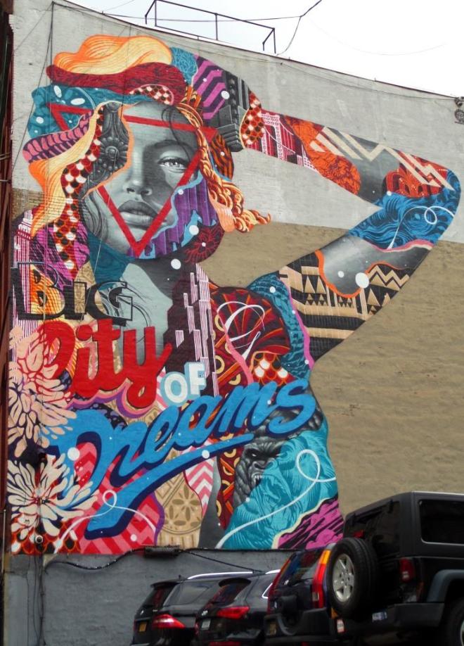
Tristan Eaton reminds me of an amalgamation of different styles that has elements of PichiAvo and Louis Masai about it, which is of course a great compliment. I think that his work is exceptional and love the piece I posted before of his Audrey Hepburn in SoHo.
Another picture long-lost in my archives and by an artist I have not come across before or since. This striking skull down in The Bearpit is by Wires, whose Instagram profile reads – ‘designer | artist | illustrator | flash painter | skateboarder | Bristol’. I don’t think he takes to the walls too often, which is a pity, as his style is rather unique and interesting.
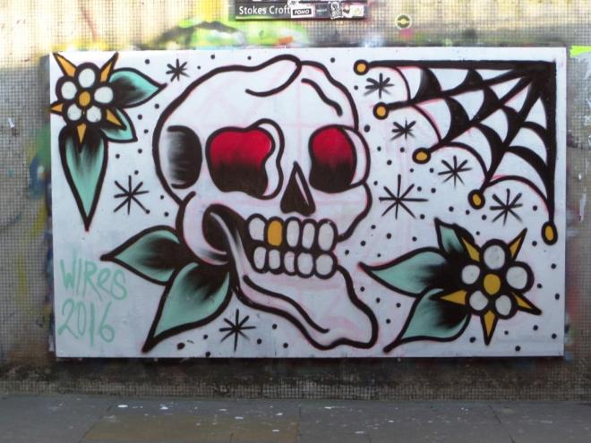
The piece has a Tattoo design quality about it, even the colours are reminiscent of the shades of the inks used. It would be great to see more of his work in Bristol, but I think I’ll have to keep my eyes peeled.


