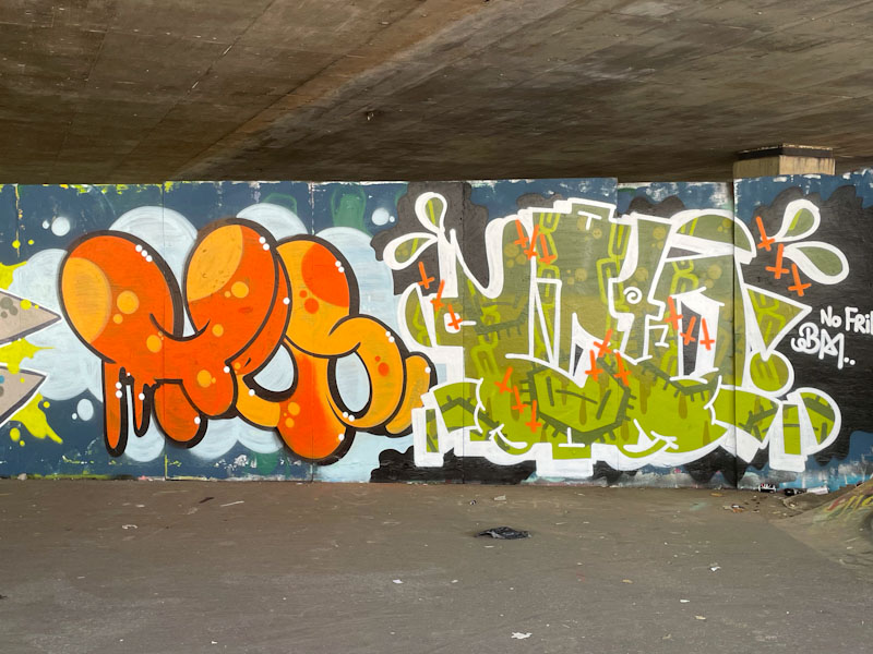
It takes talent to paint on the sides of containers or on shutters, because of the uneven surface, but so many artists seem to master the problem with consummate ease, including Logoe with this piece under the M32. This container has been here for years, but I have absolutely no idea why or what it is for, it is has provided a canvass for so many artists.
Logoe, M32 Spot, Bristol, March 2023
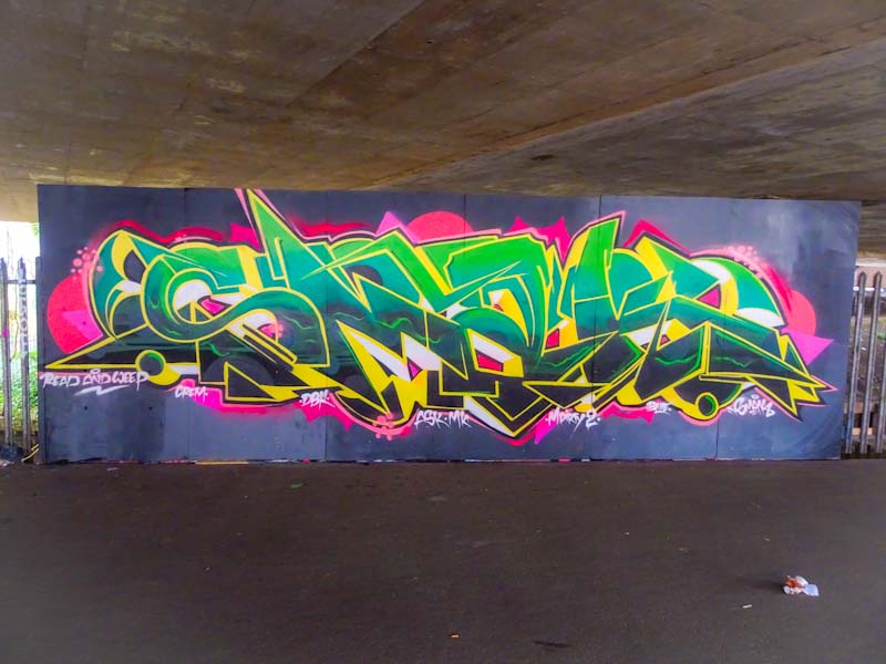
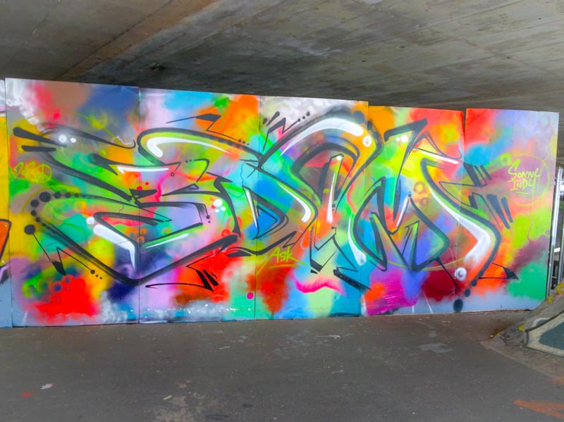
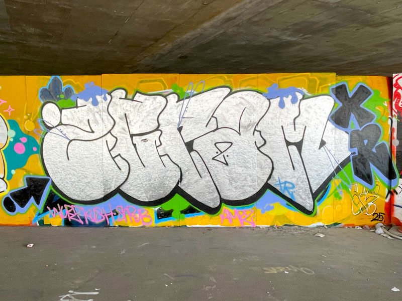
This is another in the series of pieces by Logoe from his most recent blitz, and what a fine piece it is too. Unusually there are no oval dots running horizontally through the piece, and so you get to see the raw script writing without any distractions. All good from Logoe.
We’re going back a long way with this piece, photographed at the top end of Stapleton Road in May 2018. I don’t know who the artist is, and I expect that is why I never posted it at the time.
Unknown artist, M32 Spot, Bristol, May 2018
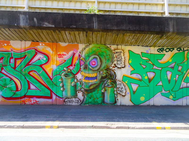
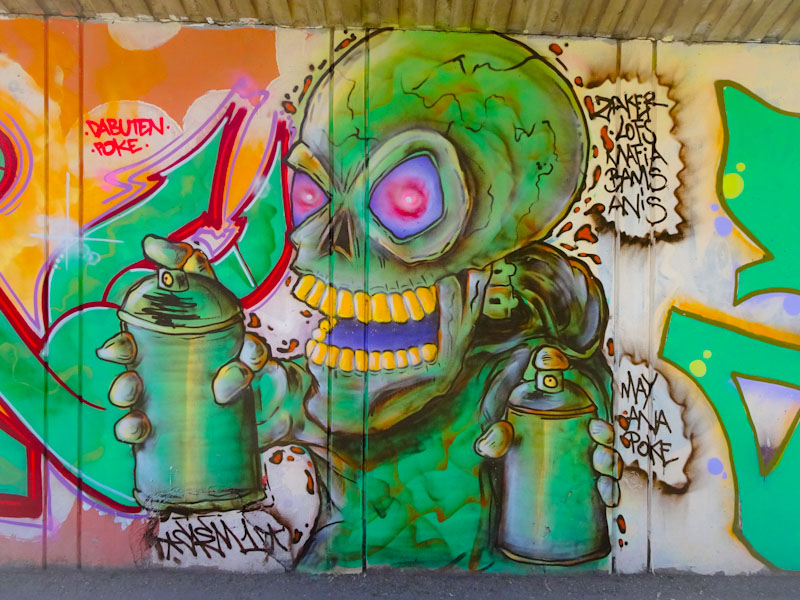
It looks like it might have been by Dabuten Tronko, but I think the tag is from the piece to the left. The familiar theme of a skeleton using spray cans is often associated with Laic217, but this is certainly not one of his. I guess it will remain a mystery who the artist is, but it was too good to leave in my archive once I have revisited it recently.
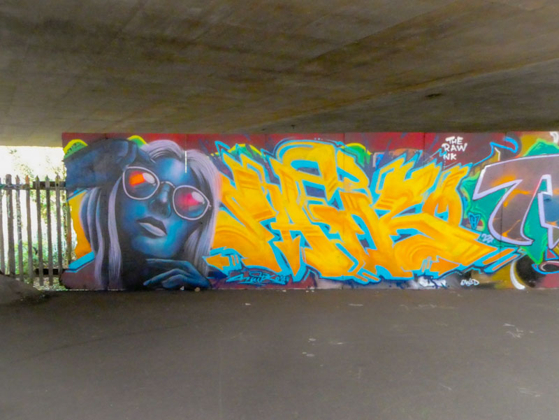
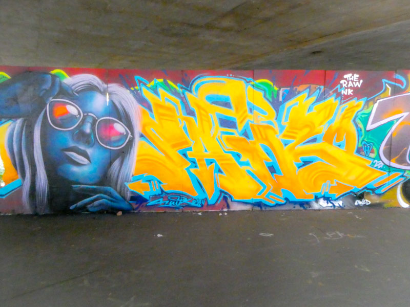
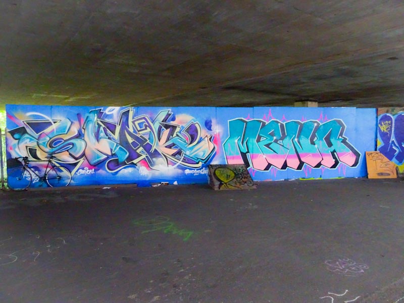
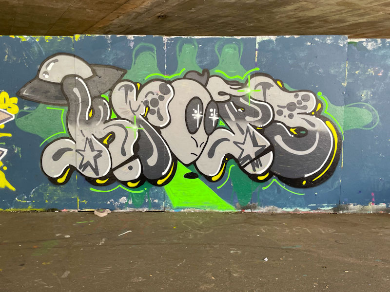
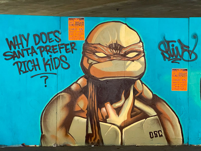
I took these pictures a short while ago, but held back on publishing a post because I couldn’t work out who the artist was. It took me a long time to work it out, but I got there in the end. I’m not sure I have seen his work before in Bristol, but it is clear that Saik0134 is a hugely talented artist, and is welcome back anytime.
Saik0134, M32 Spot, Bristol, February 2023
Painted on one of my favourite walls in Bristol, this portrait/writing combo stands out from the crowd. The bright lettering and striking portrait are real attention-grabbers. Even though the piece is not painted on a buffed wall, it doesn’t seem to matter too much, with the piece occupying nearly all the space. The letters spelling SAIK are nicely done in yellow and orange with light blue drop shadow, but for me it is the portrait that is the trump card.
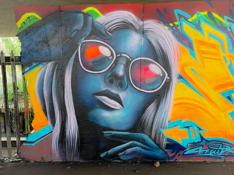
Saik0134, M32 Spot, Bristol, February 2023
The eye is drawn immediately to the woman’s glasses, reflecting the light, a clever street art technique, and she is beautifully painted in shades of blue and grey. This is a fabulous portrait piece, and I would love to see more from the artist in Bristol, or anyone else for that matter. This artist is not to be confused with another who used to paint in Bristol called Saik One.
Looking at a single wall and how it changes over time.
3. Long hoarding at the top end of the M32 Spot
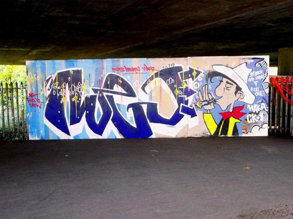
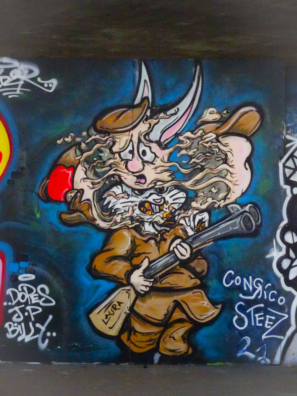
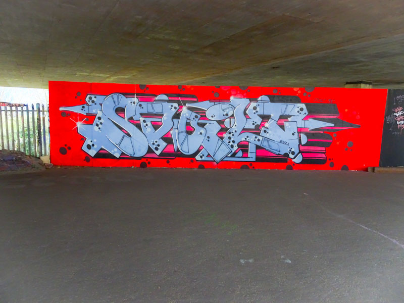
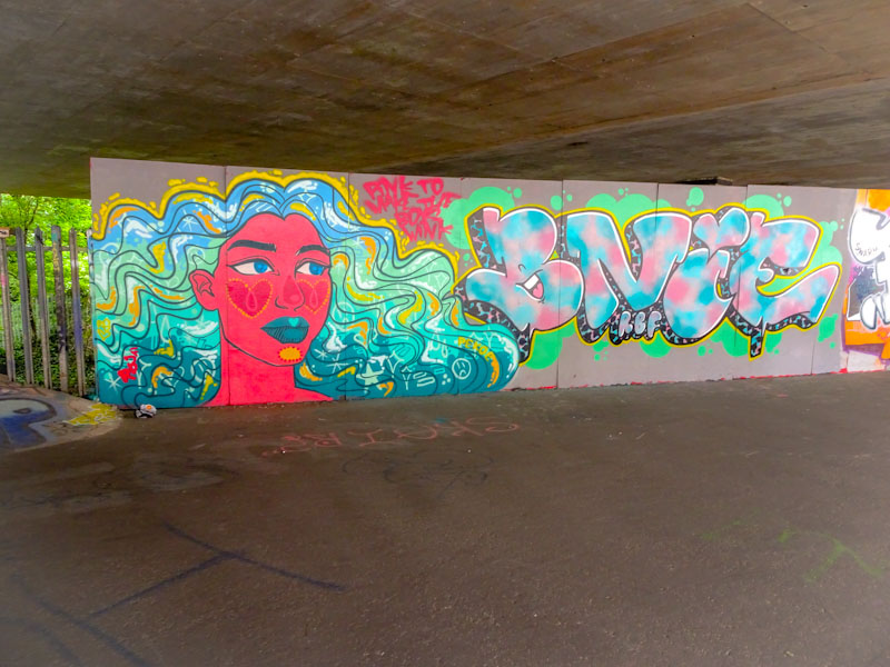
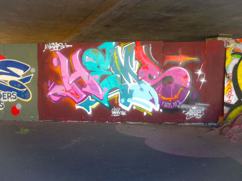
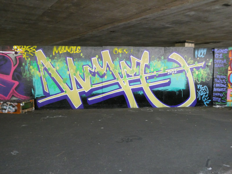
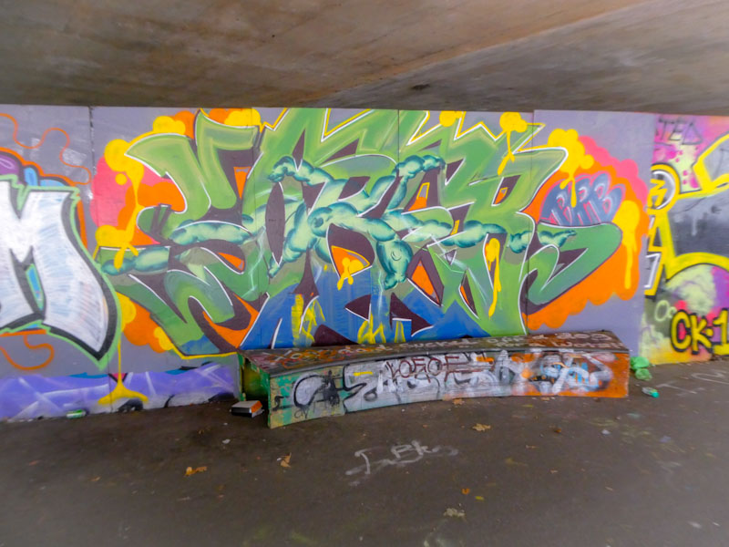
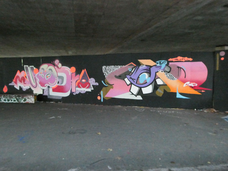
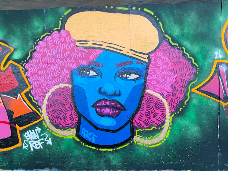
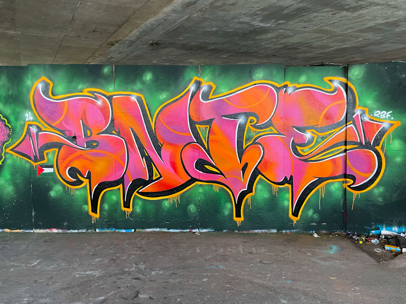
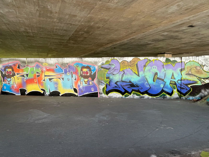
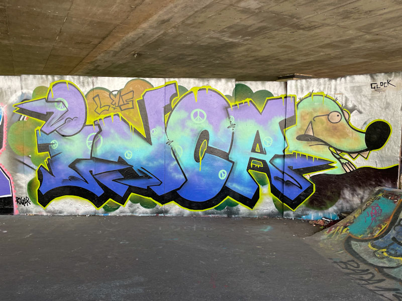
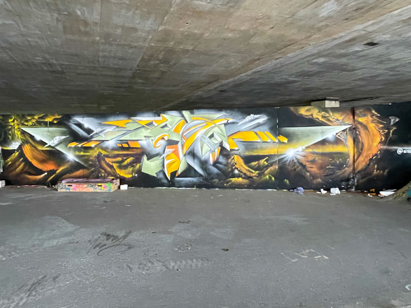
Logoe and Haka, M32 Spot, Bristol, November 2019 Logoe and Haka, M32 Spot, Bristol, January 2020 Smak, M32 Spot, Bristol, February 2020 Soap and Face 1st, M32 Spot, Bristol, June 2020 Ryder, M32 Spot, Bristol, September 2020 Ryder, M32 Spot, Bristol, September 2020 3Dom, M32 Spot, Bristol, September 2020 Smak and Mena, M32 Spot, Bristol, October 2020 Smak and Mena, M32 Spot, Bristol, October 2020 T-Rex, M32 Spot, Bristol, January 2021 Ryder, M32 Spot, Bristol, February 2021 Conrico, M32 Spot, Bristol, February 2021 Dott Rotten, M32 Spot, Bristol, April 2021 Pekoe and Bnie, M32 Spot, Bristol, June 2021 Hemper, M32 Spot, Bristol, August 2021, Upfest 21 Logoe, M32 Spot, Bristol, December 2021 Minto, M32 Spot, Bristol, February 2022 Ryder, M32 Spot, Bristol, February 2022 Logoe, M32 Spot, Bristol, October 2022 Cuomo, M32 Spot, Bristol, October 2022 Klashwhensober, M32 Spot, Bristol, November 2022 Mudra and Saor, M32 Spot, Bristol, November 2022 Dopes, Jaksta and Neddy Ned Ned, M32 Spot, Bristol, January 2023 Saik0134, M32 Spot, Bristol, February 2023 Werm, Pekoe and Fade, M32 Spot, Bristol, May 2023 Noise, M32 Spot, Bristol, September 2023 Bnie and Wispa, M32 Spot, Bristol, October 2023
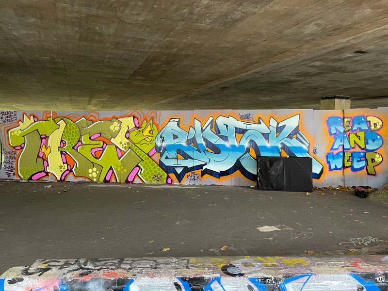
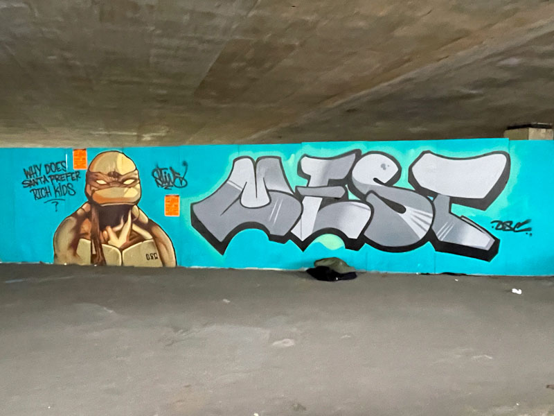
T-Rex and Rusk, M32 Spot, Bristol, November 2023 Rusk, M32 Spot, Bristol, November 2023 T-Rex, M32 Spot, Bristol, November 2023 Evey, Pekoe and Bnie, M32 Spot, Bristol, March 2024 Evey, M32 Spot, Bristol, March 2024 Pekoe, M32 Spot, Bristol, March 2024 Bnie, M32 Spot, Bristol, March 2024 Zaenone and The Mole, M32 Spot, Bristol, May 2024 Zaenone, M32 Spot, Bristol, May 2024 The Mole, M32 Spot, Bristol, May 2024 Slim Pickings (Tes) and Biers, M32 Spot, Bristol, August 2024 Krops, M32 Spot, Bristol, August 2024 Logoe and Nova, M32 Spot, Bristol, September 2024 Nova, M32 Spot, Bristol, September 2024 Logoe, M32 Spot, Bristol, September 2024 ESKA, M32 Spot, Bristol, October 2024 Logoe, M32 Spot, Bristol, December 2024 Stivs and Mest, M32 Spot, Bristol, January 2025 Stivs, M32 Spot, Bristol, January 2025 Mest, M32 Spot, Bristol, January 2025 Desi and Mr Two Gram, M32 Spot, Bristol, June 2025 Desi, M32 Spot, Bristol, June 2025 Mr Two Gram, M32 Spot, Bristol, June 2025
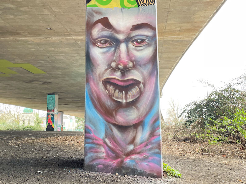
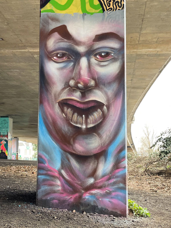
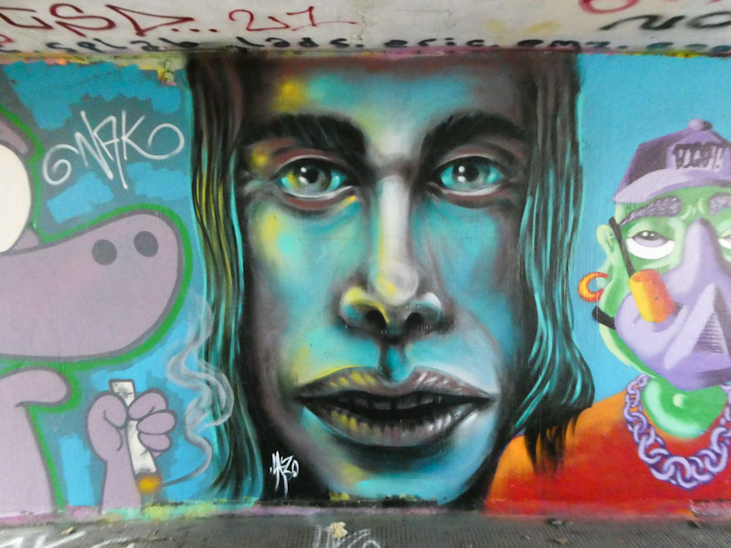
This is only the second piece by Lazo that I have seen, and I was fortunate enough to meet him when he was painting this column. As with his first piece, there is something very captivating about this portrait, and the style is quite different to that which we might expect to see in Bristol.
Lazo, M32 Spot, Bristol, February 2023
Lazo’s long face is perfect for column artwork and looks amazing, especially if you crop out the yellow paint at the top of the piece. I particularly like the depth and tone he achieves with his ‘brushstrokes’. The eyes too have something rather special about them. I am looking forward to seeing more from Lazo this year.
A little while ago, I was taking a Japanese friend on a tour of street art and graffiti spots around Bristol. She is writing an article on street art for a Tokyo journal and was getting a feel for the Bristol scene. Over the course of the day we were lucky enough to meet several artists, including Object… who was blitzing the columns under the M32 with his distinct expressive fingers and hands.
Object…, M32 Spot, Bristol, February 2023
In this first piece, Object… has managed to work his fingers around existing pieces, making very good use of the Boris Johnson head, originally painted by John D’oh, creating something of a grotesque figure (not too difficult in the case of BJ).
Object…, M32 Spot, Bristol, February 2023
It was an education watching Object… paint these pieces (more to follow in another post), which he did with rollers and brushes. He would create the rough shape of the fingers with the roller in white, and then add outlines and some definition, resulting in these extraordinary gnarly digits. Of course, it was really great to catch up with the artist, as always.
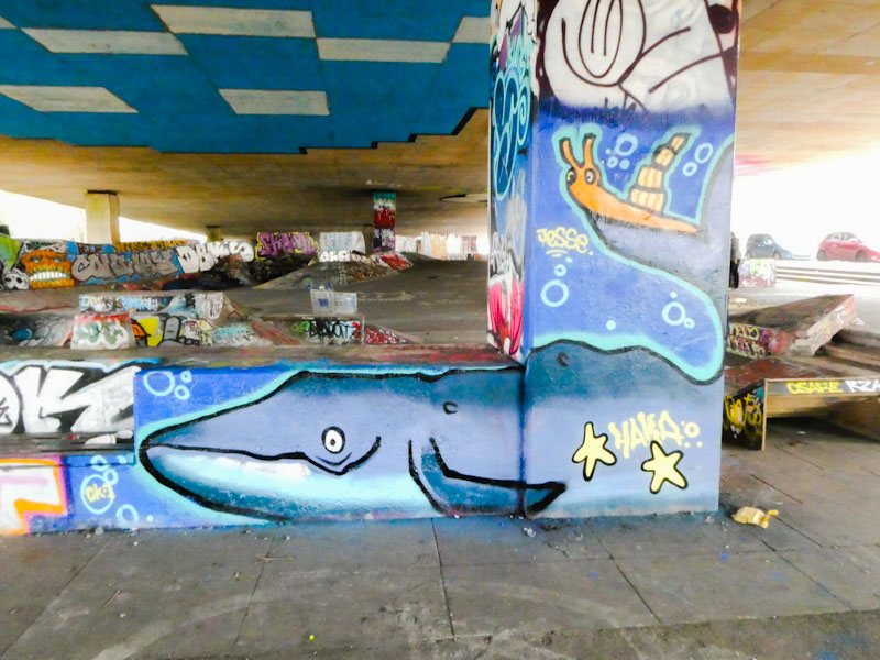
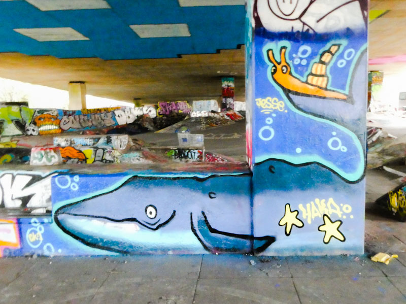
How absolutely brilliant is this? I used to read the Snail and Whale to my kids when they were little, along with several other Julia Donaldson classics. Having a close association with the sea for much of my childhood and my working life, I particularly enjoyed reading this picture book to them.
Haka, M32 Spot, Bristol, February 2023
Haka has absolutely nailed the style of the illustrator, Axel Scheffler, in several pieces around the city, but this somehow feels even more authentic than some of the others. I am absolutely loving this ‘period’ in Haka’s street art journey, and expect it to continue for a few years yet. Bravo!
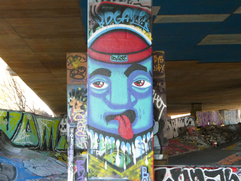
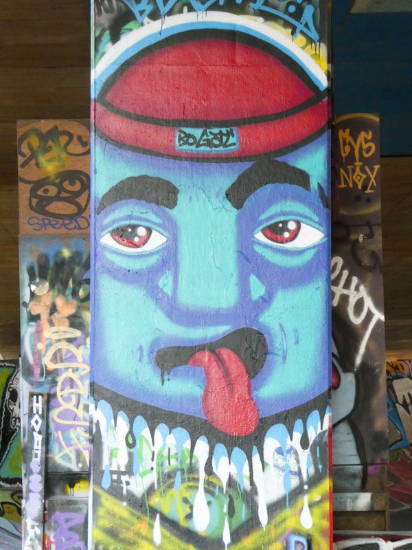
The whole of the M32 spot has become really untidy lately, and the flyposters have been very busy covering every surface with irritating posters. I never thought I’d say it, but I reckon the whole place could do with a bloody good buffing, tidy up and starting over again. Bogat has managed to find some space on this column to paint one of his trademark faces.
Bogat, M32 Spot, Bristol, February 2023
Although relatively simple in design, Bogat’s work is captivating and packs a punch, and he has a look and feel that is quite unique in Bristol. I particularly like the red cap, which reminds me of my own personal super-hero Jacques Cousteau, who was rarely seen without one. A nice column piece from Bogat.
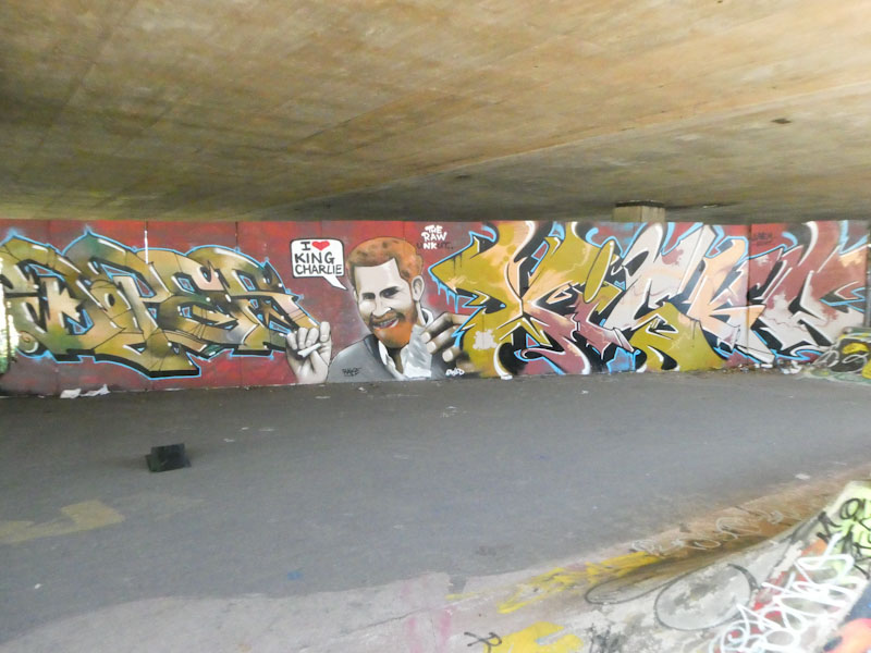
Dopes, Jaksta and Neddy Ned Ned, M32 Spot, Bristol, January 2023
Well lookee here, on one of my favourite walls we have a fabulous three-way collaboration from Dopes, Jaksta and Neddy Ned Ned. The whole thing is painted in Autumnal colours (although a winter collaboration), and provides more than a little contemporary commentary.
Dopes, M32 Spot, Bristol, January 2023
To the left is a fine piece of writing from Dopes, offering his beautifully proportioned letters in a metallic style with plenty of shading fades and highlights, neatly finished off with a tidy blue border and some arrows thrown in for good measure.
Jaksta, M32 Spot, Bristol, January 2023
The most eye-catching element of the triptych is the portrait of Prince Harry, painted by Jaksta. This mischievous send-up of the Prince directly relates to the revelations in his autobiography ‘Spare’ and is a play on the word Charlie (cocaine) and Charles (his father the King). The portrait is nicely worked, but very different from the style I would normally associate with Jaksta.
Neddy Ned Ned, M32 Spot, Bristol, January 2023
I have never (knowingly) come across Neddy Ned Ned before, although his work does look slightly familiar. It is always great to have visitors to the city, especially when they are clearly as talented as Neddy Ned Ned is. There is a nice flow and confidence to the shapes of the letters, and there is a bit of a fill-fest going on too. Altogether, this is a banging collaboration.
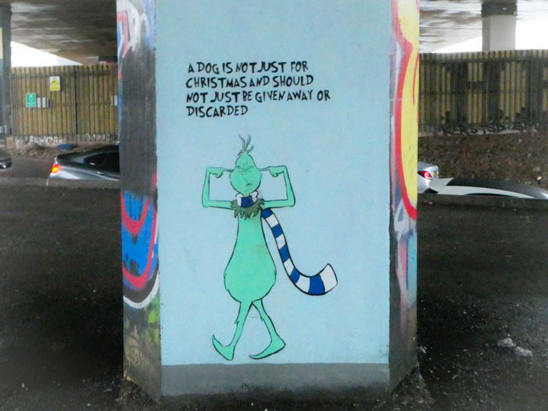
A quick message today from the Grinch, via the skill of John D’oh, for all you dog lovers out there – ‘a dog is not just for Christmas and should not just be given away or discarded’.
John D’oh, M32 Spot, Bristol, December 2022
A beautiful stencil piece featuring the Dr, Seuss character.