.
Red soil scoured bank side
vegetation heads seawards
inexorable
.
by Scooj

.
Red soil scoured bank side
vegetation heads seawards
inexorable
.
by Scooj

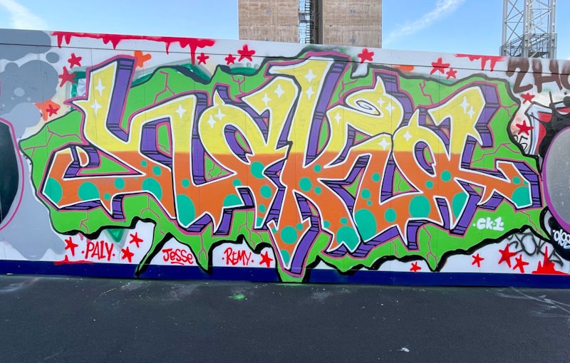
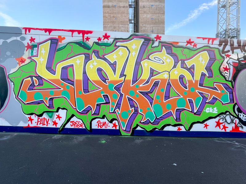
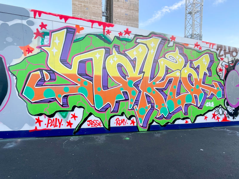
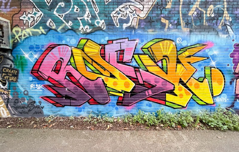
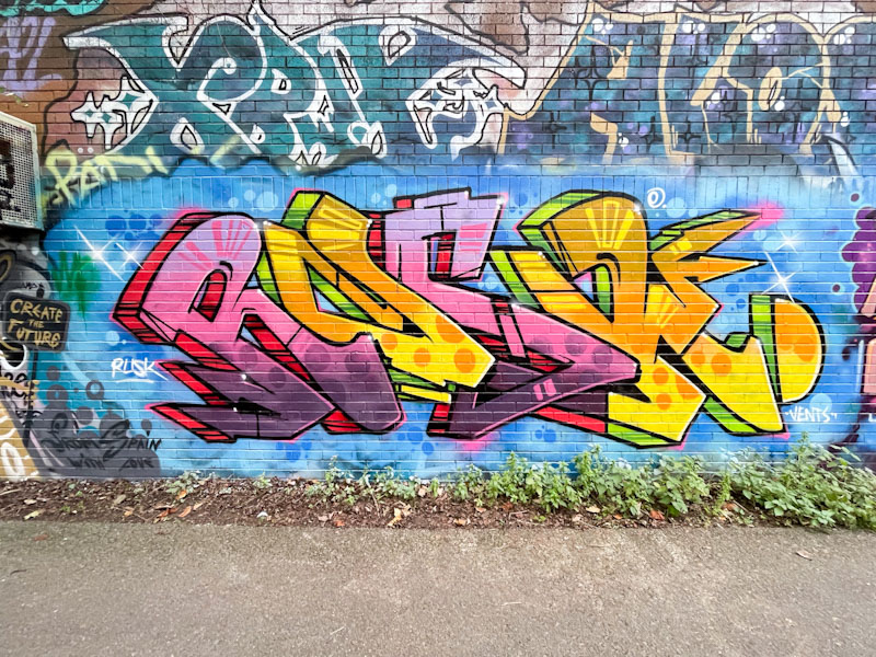
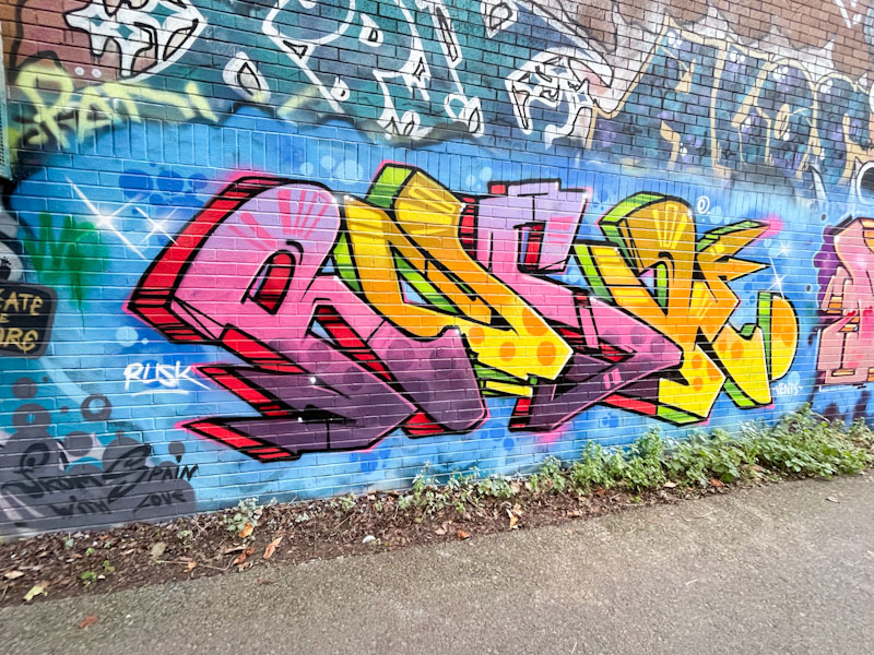
I enjoy my dog walks alongside the River Avon through Sparke Evans Park, and beside the light industrial estate, all the way to Temple Meads station. The walks combine my love of nature and of street art, and the dog enjoys the smells, and running around the park. These walks are especially rewarding when I come across a piece like this one by Rusk.

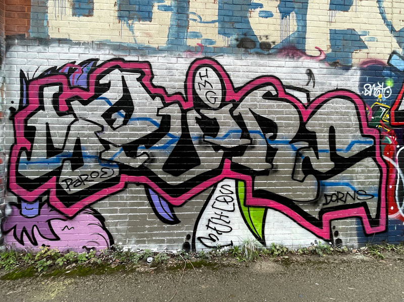
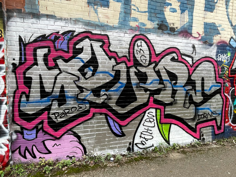
This is a fabulous piece of graffiti writing by Rusk, and stands out as such on this long wall. The colourful letters are tidily presented in a blue background. Although it is not as polished as some of his pieces, the whole thing oozes class. I believe it might have been to celebrate Vents’ birthday (hence the shout-out) but I am not sure. An unexpected and pleasant surprise.

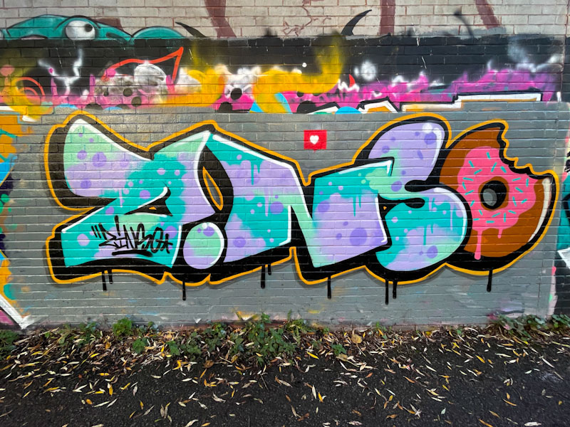
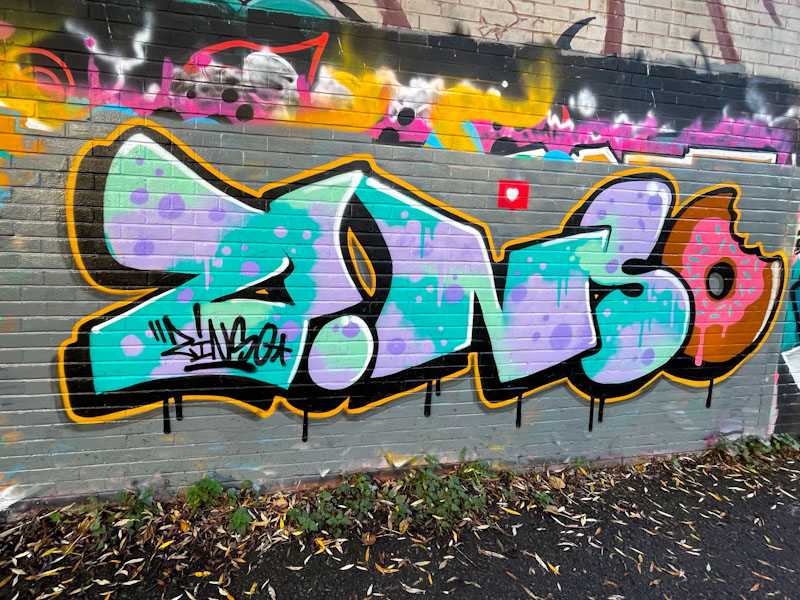
Haha! I love this tidy piece of graffiti writing from Zinso alongside the banks of the River Avon. Every element of this nicely thought out piece works well and from my perspective, the best thing to do is respect it and enjoy it.

It was a sensible move to buff the wall first, because a cool piece like this could be lost if simply dropped onto existing graffiti. The letter fills are made up of a lovely blend of blues, greens and purples, including spots and drips. The doughnut at the end is simply perfect and adds a touch of humour to the piece. A black drop shadow and orange border round the piece off nicely. I also like the inverted ‘i’ and the little heart above the writing. Very nice work from Zinso.

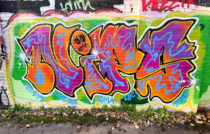
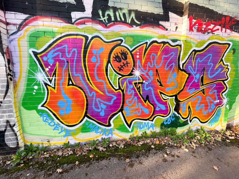
I have always liked Nips’ pieces and as a rule her work is getting better and better. This is a gorgeous and uplifting piece of graffiti writing alongside the river, which certainly catches the eye. Impossible to walk past without a quick glance at the very least.

Nips is known for her imaginative and well executed fills, and this piece is no exception the fill colours are so well blended, and the wibbly blue midline is inspired. The little character replacing the tittle (dot on the i) looks to be a nod to Halloween. This is a truly enjoyable piece.

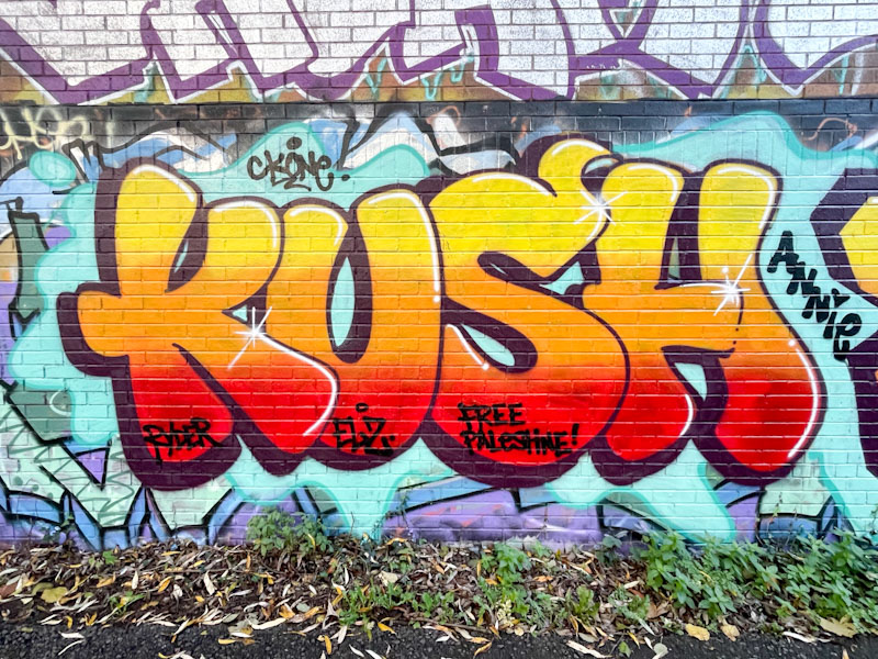
Some artists are underrepresented on Natural Adventures, and I strive to work out why this might be. Sometimes it is simply that I don’t like or rate their work (sad but true). Sometimes it is because I don’t really know too much about them, and sometimes it is because I sense that they might rather like the anonymity or simply to keep a low profile. But here’s the thing, painting huge letters or characters on public walls is hardly keeping a low profile, and remaining anonymous or under the radar is a rather high expectation, I would say.

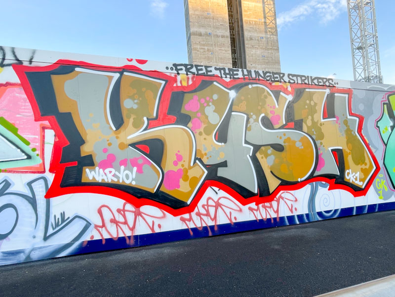
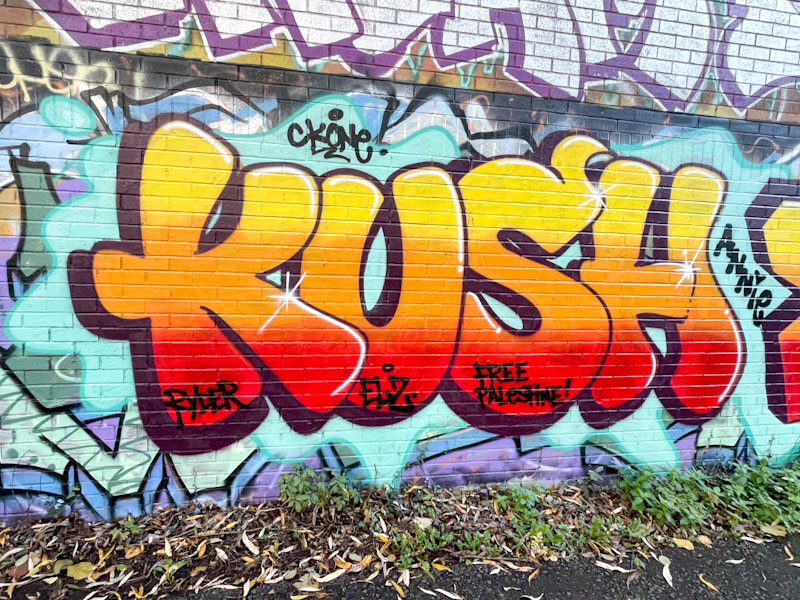
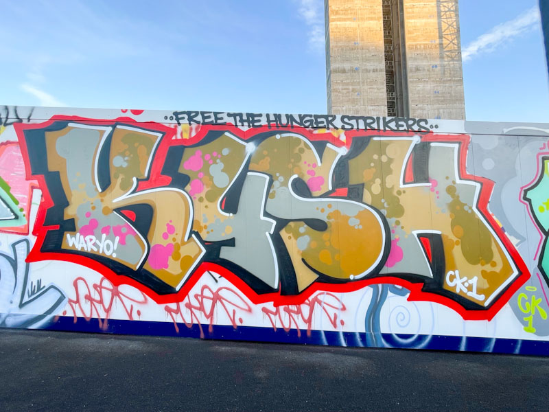
Kush is an established artist whose work has been dotted about the place for a long while. Having said that, I know nothing about him at all. I am guessing he has been around for some time because he has a tribute shout out to CKOne. The letters are nicely rounded, with a three-layer fill and some tidy white highlight lines to give the piece some perspective and depth. Nice work from one of the quieter graffiti writers in Bristol.

It is absolutely no surprise that Zinso and Asre have teamed up and tend to paint together quite a lot these days. Both have a similar tidy style and both like to use bright and vibrant colour palettes in their work.

This is a beauty from Zinso painted in the tried and tested pink and blue combination of colours. The letters, fills and borders are tight as a nut, and the cartoon-style writing definitely stands out from the crowd. The piece looks really fresh, as if it had been painted moments before the photograph, which, of course, it might have been. I now have more than enough of his work for a gallery – join the queue.

I think that this might be the third piece of graffiti writing by Avem808 that I have posted on Natural Adventures, and I am really liking what I see from the artist. There is an intricacy blended with fluidity about this piece that plays with the eyes.

I am not entirely sure what the letters spell. I’d like to believe it says AVEM, but I think that there is more to it than that. It is a wonderful tribute piece to a departed friend, Frank, and painted with heart and soul. The colours fit into that ‘fruit salad’ palette (a popular sweet of my childhood, and partner to Black Jacks) and make for an upbeat and joyful piece. There is lots of detail, and it is one of those pieces that deserves a long viewing time.

Since his return to painting in Bristol, Asre has focused on his writing, but it is his cheeky character pieces that first caught the eye a few years ago, and this is a fine example of one of those. I am a little sad that he chose to paint over a long-standing Haka piece, but that is the nature of street/graffiti art, constant churn and renewal.

The character is nicely framed and fits the space perfectly. Asre’s stylised cartoon characters are easily distinguishable thanks to the crosses in the eyes and the zigzag line in the mouth delineating the teeth. I am guessing that this was painted as a bit of an ‘extra’ while painting some writing nearby. Nice one.


It is curious how I associate different artists with specific settings or spots. I say this, because I really didn’t expect to see a Mr Riks piece down here alongside the River Avon. This spot tends to be quite experimental, and a lot of emerging artists use it to practice their letters, forms and techniques. To find an established artist like Mr Riks painting here is, to my mind at least, quite unusual.

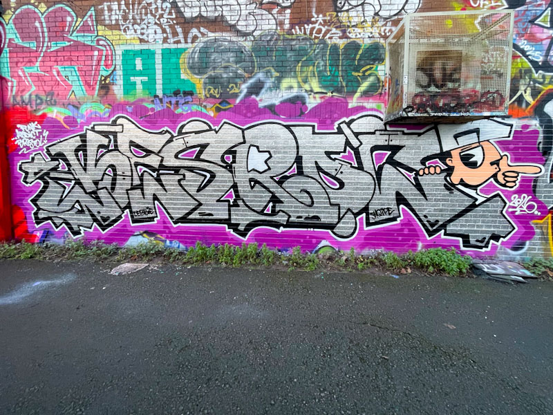
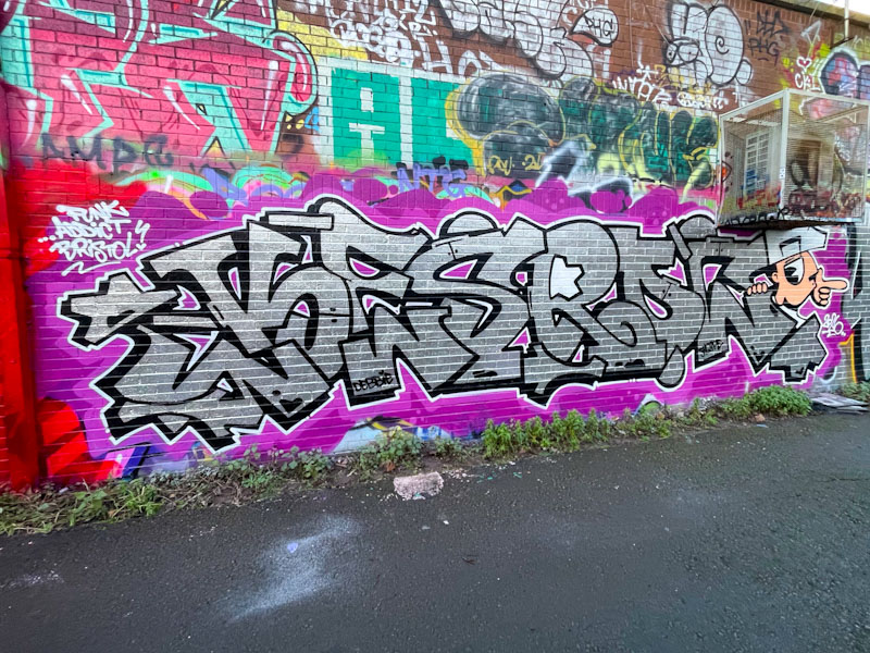
The letter form that Mr Riks writes with is so distinctive; smooth rounded edges, letters compressed without any see through gaps and a superb solid border are all things I would expect to see. This is a fabulous chrome piece with nice shout-outs to his mates, Ryder and Kush.

Since he made his return, Zinso has been smashing it, and alongside Asre, who he appears to have teamed up with, is making a sizeable impression. This is one of several pieces by the pair alongside the River Avon in St Philip’s Marsh.

The letters and smiley face combination piece is vibrant and uplifting, full of movement and joy. Zinso’s letters are nicely designed, I like the upside-down ‘i’, and filled with a mixture of blue squiggles and spots. The cartoon-style animated smiley in a contrasting yellow stands out, but is linked through being the ‘o’ of Zinso. The piece is so neat and tidy and beautifully presented.