When I last met Mr Draws under Brunel Way about a month ago, he told me that he was keen to paint more pieces with an environmental or protest theme. Well with Prime Minister who seems to be hell bent on waging war against nature and the ‘green blob’ as hard right populists tend to do, Mr Draws’ efforts have never been more timely.
Mr Draws, St Werburghs, Bristol, July 2023
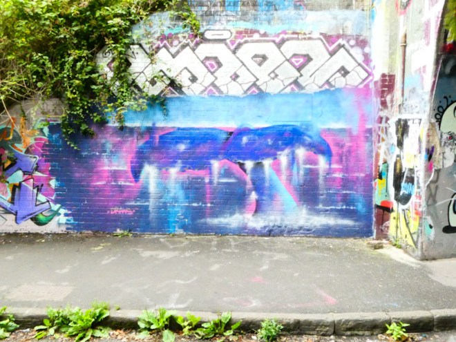
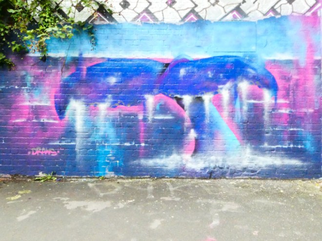
This is a beautiful piece of the fluke from a whale breaking the surface before descending into the depths, helps to remind us about what is important on this Earth we call home. The atmospheric piece appears to capture the movement and grace of the whale, a sight we are familiar with through viewing wildlife films, but which we rarely glimpse first hand. Bravo Mr Draws, please keep up these genuine efforts to make the world a better place.
Chill, Zake, Face 1st and Soap, St Werburghs, Bristol, July 2023
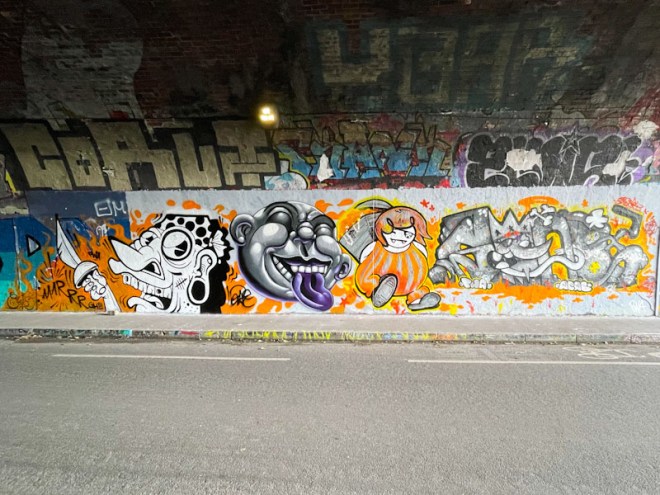
I am writing this last night in the full expectation that I will be heading off to the Cheltenham Paint Festival this morning, which means that in a short while, Natural Adventures will be awash with fabulous pieces from Cheltenham by artists from nearby and far, far away. On to this fine collaboration from the PWA crew, Chill, Zake, Face 1st and Soap.
Chill, St Werburghs, Bristol, July 2023
There is a bit of a pirate theme going on (perhaps linked to PWA – Pirate Wall Art), and Chill kicks things off perfectly with this wonderful cartoon character wearing a bandana and brandishing a cutlass and crying out ‘AAARRRGH!!!’ The scar on the cheek and terrible teeth finish the character off brilliantly. A superb piece.
Zake, St Werburghs, Bristol, July 2023
Next up, Zake goes a little bit off-topic both in terms of a pirate theme and indeed the colour scheme too. His piece is fantastic and a bit of a return to the kind of faces he was painting a year or two ago. Tons of depth is achieved with clever use of shading, which is a speciality of the artist.
Face 1st, St Werburghs, Bristol, July 2023
Face 1st duly returns us to the pirate theme with his character, complete with skull and crossbones eye patch, makes off with a treasure chest full of gold and jewellery. It is a brilliant piece full of mischief and movement and so utterly Fac 1st.
Soap, St Werburghs, Bristol, July 2023
Finally, Soap sticks with his graffiti writing, and continues the pirate theme and colour scheme. The letters spell out SOAP, and the Ice King ‘O’ is wearing an eye patch. The letter fills and dynamism of the piece are perfectly presented and add a distinctive element to the quartet of styles. A truly magnificent collaboration, so full of fun and mischief.
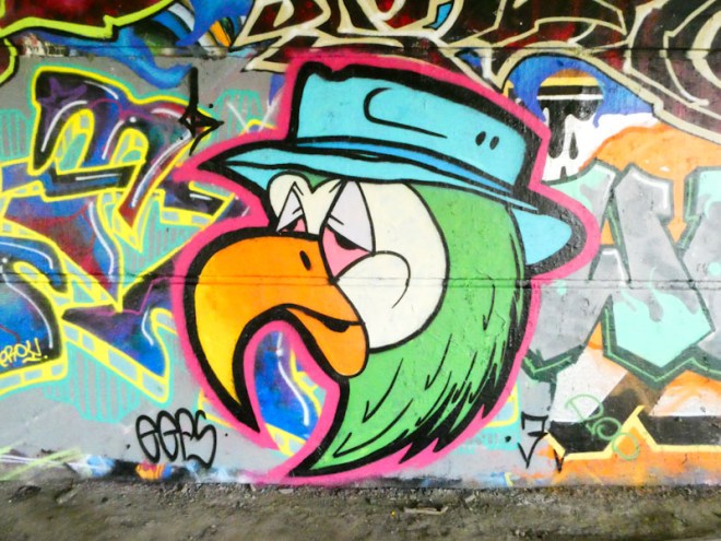
This is the second piece I have published by Mr Crawls, and as I said in the last post, he tends to paint the same ‘mega tag’ each time he paints. The cartoon-style bird, looking slightly worse for wear, is difficult to identify and in my own mind I have it down as a gull of some kind, but it might simply be a generic bird. This one is actually a parrot.
Mr Crawls, St Werburghs, Bristol, May 2023
In this version, the Parrot is once again wearing a bucket/tourist hat, but a slightly different style. It is with the hat design that Mr Crawls has most scope for varying the piece and making it distinct from other versions. There re several more gulls in my archive, but I think I will need to collect them together into a single post, in the same way that I have done for Asre, Bogat and Klashwhensober.
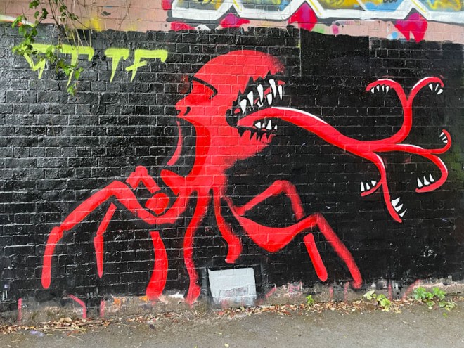
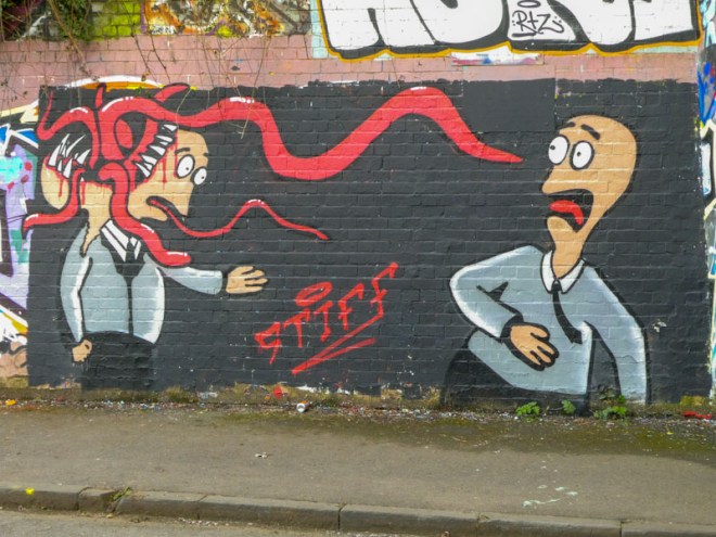
I managed to snap this piece by Stiff just before heading off on my holiday, which I was pleased about, because, for whatever reason, his work never seems to last very long. His work tends to be on the alien theme and in this piece a red monster is sticking its toothy tongue (?) out of a very toothy mouth.
Stiff, St Werburghs, Bristol, June 2023
Stiff pretty much always paints on a black background, which tends to bring a focus on the monster/alien. Red on black works very well, and this is a striking piece. There appears to be a square speech bubble at the base of the piece, but it contains nothing – I am not too sure what that is all about. It is always great to find one of Stiff’s sporadic pieces.
Ha ha! Face 1st always cheers me up, and doubly so with this lovely piece at the farm end of the tunnel in St Werburghs. The spot is one that is often favoured by Mr Klue (who has gone a little quiet again), but Face 1st has more than done it justice.
Face 1st, St Werburghs, Bristol, June 2023
The running girl is blowing a huge bubble with some yellow bubblegum in which another girl’s face appears as if a reflection. The greyscale piece is packed with energy, movement and fun – a pleasure to find.
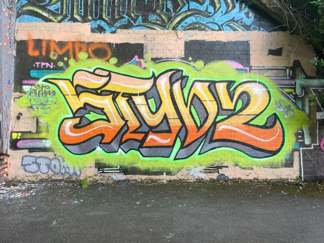
I have missed several recent Stivs pieces (wrong place, wrong time), so it was good to find and photograph this one . The artist has returned to his calligraffiti, having spent some weeks painting portrait pieces, although this one is a little more stylised and mainstream than his typical calligraffiti style.
Stivs, St Werburghs, Bristol, June 2023
The strange orange and green colour combination works surprisingly well, but why wouldn’t it? I guess they are colours often seen together in nature. Instead of writing STIVS, he is playing with us and has written STYVZ. This is a nice quick one from Stivs.
I am enjoying the regular flow of MILK from Wxttsart, and this yellow and black number from a paint jam in the tunnel a little while back is another great example of his writing that is definitely crossing-over into calligraffiti.
Wxttsart, St Werburghs, Bristol, May 2023
His two-tone grey letters have a mid-line running through them and a yellow 3D shadow dropping off to the left, providing some depth to the writing. Adding a little bit of interest are some lightening strikes at the base of the letters and a few highlight spots, without which the piece might appear to be a little flat. Some nice work from Wxttsart.
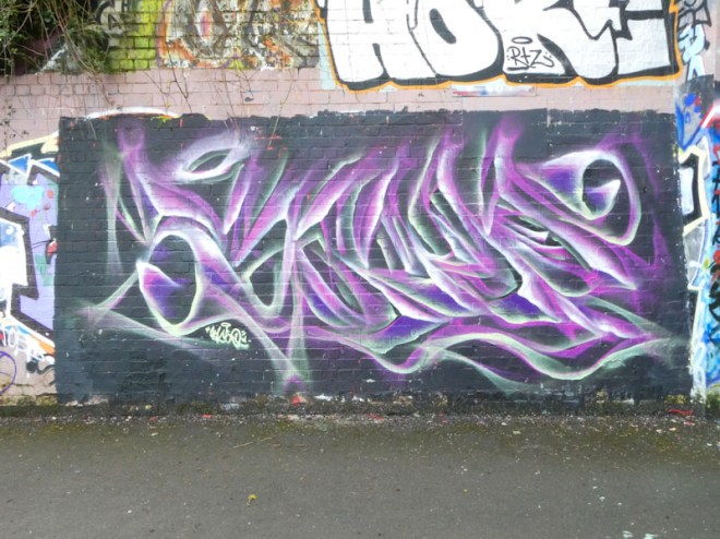
It must be time now to declare Mr Klue the ‘King of St Werburghs tunnel’. I am guessing that he must live locally, because you don’t get to see his work elsewhere in Bristol very often. In the days when The Bearpit was a thing, we would see Mr Klue pieces there and in the Stokes Croft area, but not now.
Mr Klue, St Werburghs, Bristol, April 2023
This piece spells KLUE in the artist’s preferred colouring and ephemeral abstract style. It is beautifully presented on a black background, and it is great to see one of his pieces in daylight, rather than under the tunnel lighting which distorts the colours so much. Mr Klue has certainly hit a rich vein of form and productivity, which is great news for admirers of his work.
Inca the Mole, or The Mole is an artist who paints reasonably frequently in Bristol, but who I think might live in Gloucestershire. This is a lovely piece of writing in the tunnel, although this time it is not accompanied by the peace-loving mole.
The Mole, St Werburghs, Bristol, April 2023
The three nicely chosen colours run horizontally through the letters, which pop out from the wall thanks to the deep 3D drop shadow. Although the mole isn’t there, he is in spirit with all the peace symbols running across the letters. It is always good to see that the Mole has been to visit.
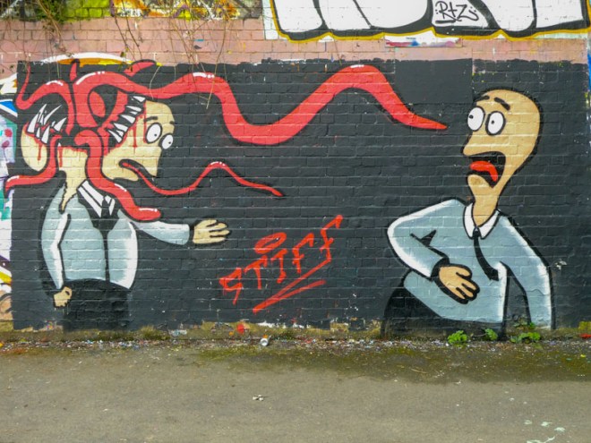
Because Stiff paints only rarely, it is always a pleasant surprise to come across one of his pieces. Stiff is one of two Bristol artists who regularly (almost exclusively) feature alien scenes in their work, the other being Nugmoose. Their styles, however, are quite different, and they are easy to distinguish from one another.
Stiff, St Werburghs, Bristol, April 2023
Stiff always paints on a black buffed wall, which instantly marks out the piece as one of his, and also provides a clean canvass on which to work. In this scene, a man is looking at a doppelgänger of himself, which turns out not to be all that it seems. His look of horror is comical, as tentacles reach out to catch him. A lovely story piece by Stiff.