.
Europa football
being an Arsenal fan
is never easy
.
by Scooj
.
Europa football
being an Arsenal fan
is never easy
.
by Scooj
I don’t get to see nearly enough work from Piro, he tends to paint in some secret abandoned building locations in the Stroud Area which I have never been to. Just occasionally though he paints in Bristol and this was part of a long collaborative wall from a few weeks ago.

His style is most akin to Epok, who he often paints alongside and did so again on this occasion. These highly designed letters spell out PIRO, although I cannot be entirely certain. The combination of straight lines, curves and colours is beautifully put together and has a touch of Art Deco influence about it.
Aah, the familiar and comforting letters spelling TES from Slim Pickings (as I call him) in Dean Lane. When all else around us is in utter chaos and flux, it is nice to have constants like this to ground us for a while, albeit a fleeting moment.

This is a big TES and very nicely done. Just two colours with a little bit of white 3D accent work demonstrate the confidence and skill of the artist. No need to embellish the work, although embellishment is always great too, don’t get me wrong. A strong and knowing piece.
Doors 139 – Once again it is some random doors from Bristol
I have a big work squeeze today, so a very short post from me. A mixture of Bristol doors. Some from last week, others from the May lockdown last year… how things are dragging on.
I hope you enjoy this little selection:


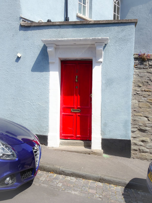
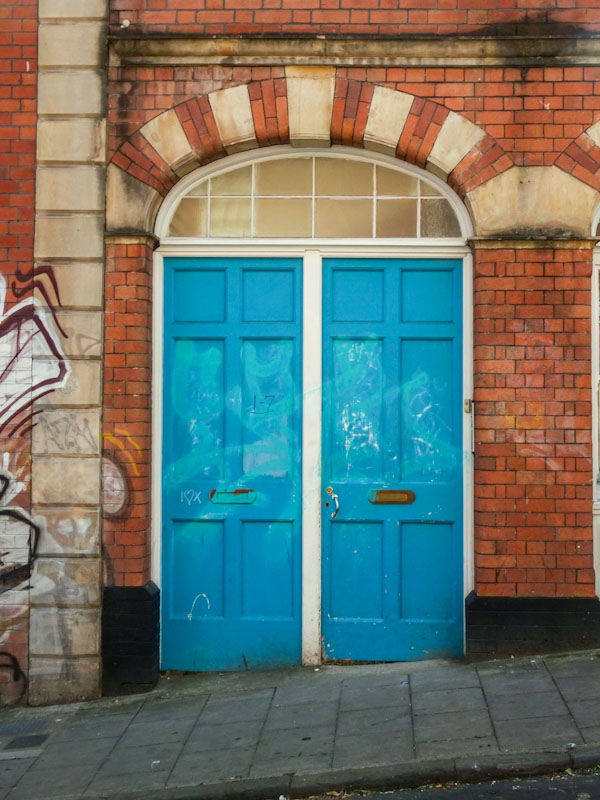


So that’s your lot for this week. Sorry for the brevity.
If you have made it this far, you probably like doors, and you really ought to take a look at the No Facilities blog by Dan Anton who has taken over the hosting of Thursday Doors from Norm 2.0 blog. Links to more doorscursions can be found in the comments section of Dan Anton’s Thursday Doors post.
.
Welcome visitor
to Natural Adventures
highest ever views
.
by Scooj
Every once in a while a visitor comes to my blog and looks at a great many posts. That happened today. I am left curious as to who they were and what their interest was. Perhaps I’ll never know. I hope they enjoyed their visit.
Because I don’t get to photograph up at Purdown Battery very often, I am not too sure whether this is a recent or an old piece by Rosalita, but either way it is an absolute cracker. This wall is tucked away a bit and takes a little bit of finding, so I don’t imagine that very many people have seen it, which in one way is a bit of a shame, but in another way it is how some artists like to do things.
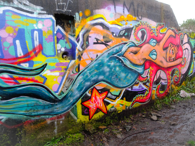
The subject of the piece is a mermaid, whose hair is made up of octopus tentacles, but instead of looking rather disgusting as in the Bill Nighy portrayal of Davey Jones from Disney’s Pirates of the Caribbean, her hair is beautiful. This is an outstanding piece and another example of great work coming from Rosalita at the moment.
It’s official, Hemper is on fire at the moment and having as productive a time of it as any that I can remember. I wonder if the ongoing lockdown situation has freed up some artists to paint walls more often than they normally would, and other ones to become almost invisible over the last year or so.
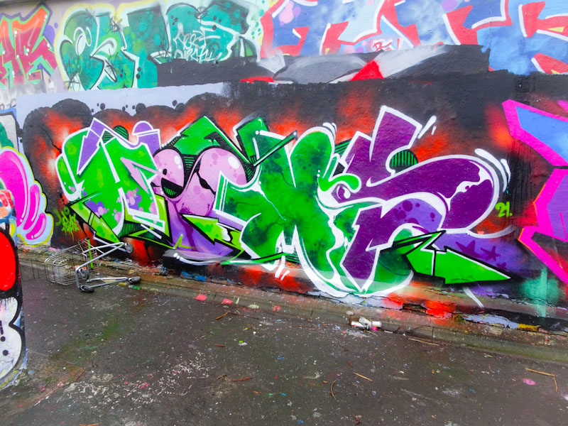
I think that Hemper has a very good eye for colour combinations and the purple and green combinations in this piece work fantastically well. Spelling out HEMS, the letters alternate between the two main colours, but each letter is uniquely fashioned and filled. Another outstanding piece of graffiti writing from this master.
.
Can’t live without it
a modern dependency
arguments ensue
.
by Scooj
A really unusual piece from Soap and the third element of a collaborative wall which included Ryder and Conrico. An all black and silver/chrome design from Soap is not what I’d expect to see at all as he usually bathes his work in bright and cheerful colours.
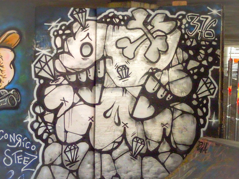
The basic style is there from Soap with gaping mouths, and he has added a geological feel to it with a rocky appearance and gems embedded within the rock, ripe for mining. A curious piece and one that is at odds with Conrico’s and Ryder’s to the left.
Right, let’s get down to business. Merny, or Morny as I call him, because that is how he signed himself once in the past at a time when he first appeared on my radar, is an artist I really like. His naive style, with children’s crayon-like scribbles is so unique and refreshing and adds a wholesome and entertaining aspect to our walls.

In this piece Mo(e)rny gives us a super truck to marvel at. Irregular wheels and a curious child-like perspective add to the interest of the work. Sadly it didn’t last very long, and there are some taggers who appear to have a particular dislike of Morny’s work, which is a little ironic, because the stuff they slap over other people’s work is usually pretty shoddy. Is it jealousy? Or just wilful nastiness? Who knows, but I hope it doesn’t discourage Morny from continuing to create these lively vibrant pieces.


