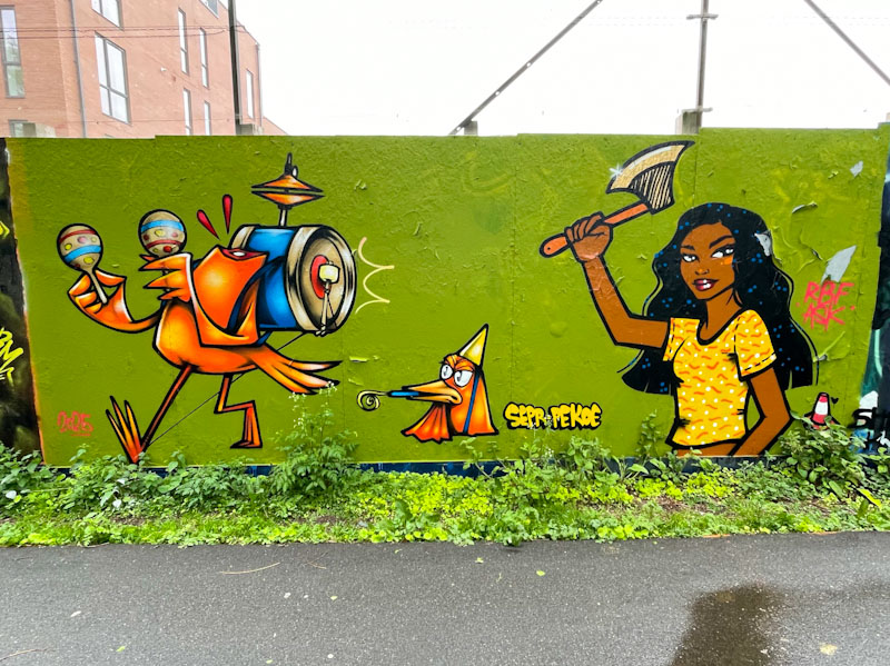
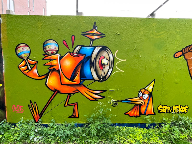
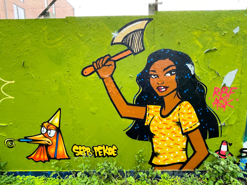
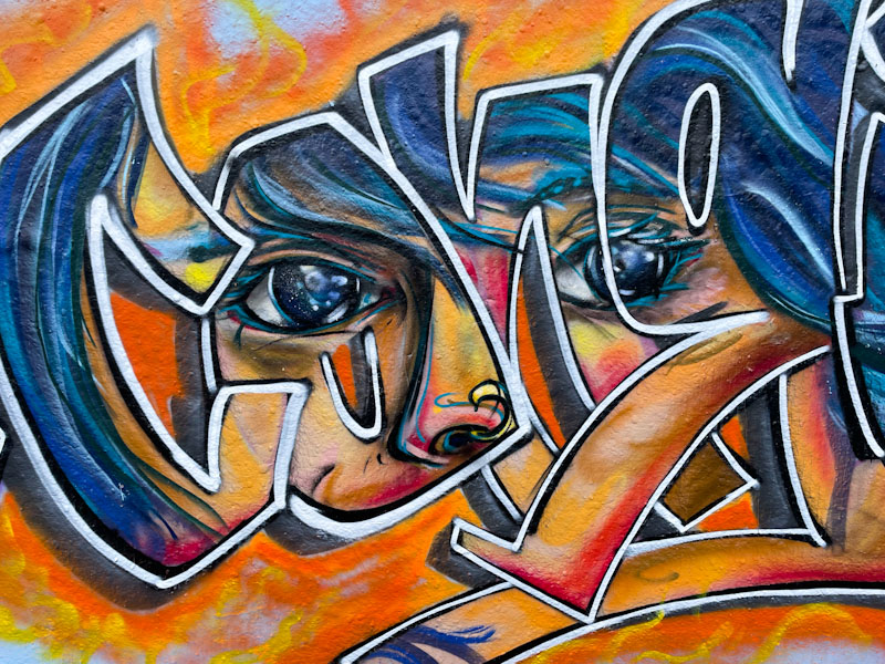
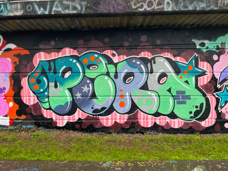
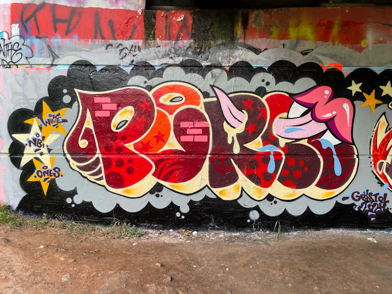
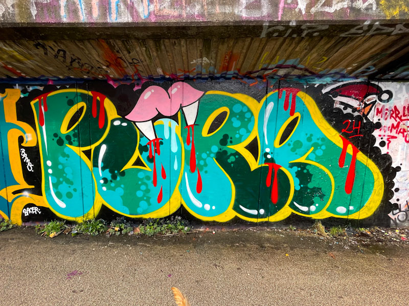
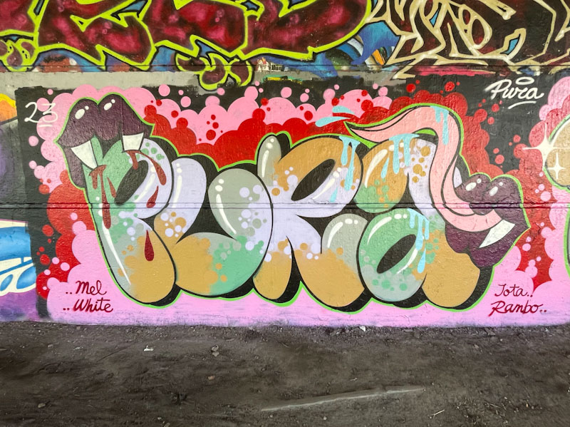
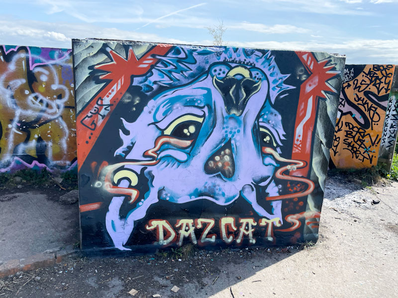
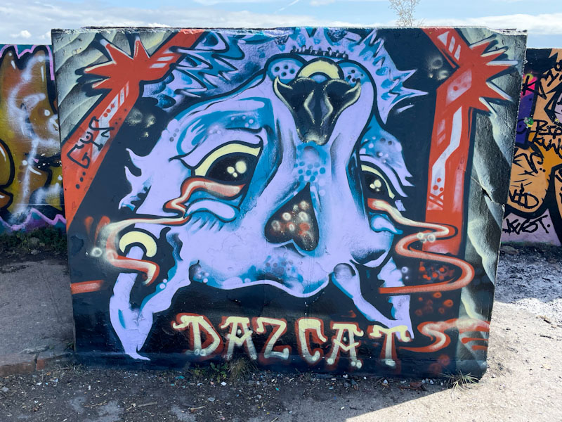
Minto has a very distinctive style, and his writing tends to be a vehicle for combining a collage of characters and icons, bringing together an eclectic selection of thoughts and ideas into a single piece.

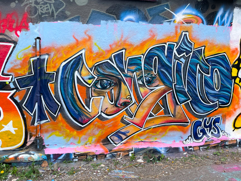
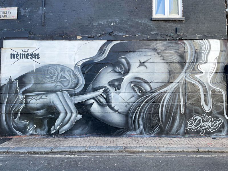
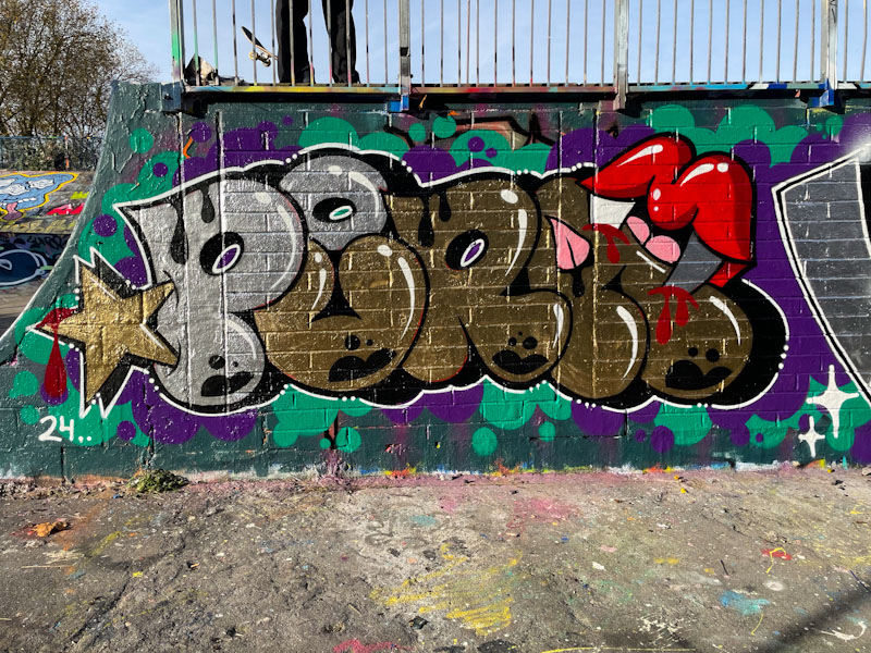
In this piece, Minto has gone for some solid fills, a different colour for each letter, and has used the parallel horizontal lines on the wall to proportion everything. His character looks a little sinister to me, as if he is up to no good. This is a well-presented piece from a very accomplished graffiti writer.