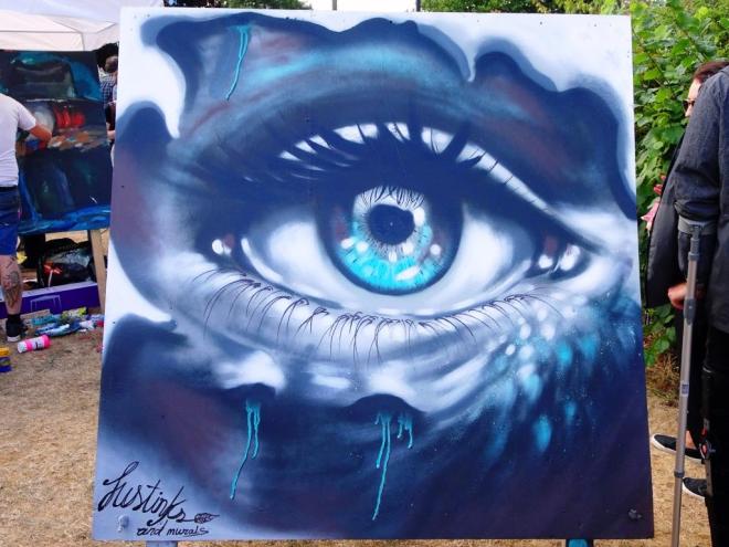
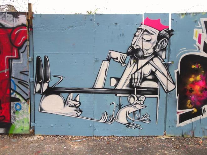
There were a great many fabulous paintings of eyes at this year’s Upfest, but I think that this one was probably the finest. It is by an artist called Justinks who gives little away about himself in the programme notes other than to say this:
‘I’m into movemental detailed artwork, I always put the wind element into my pieces and cold colors to show the power of nature.’
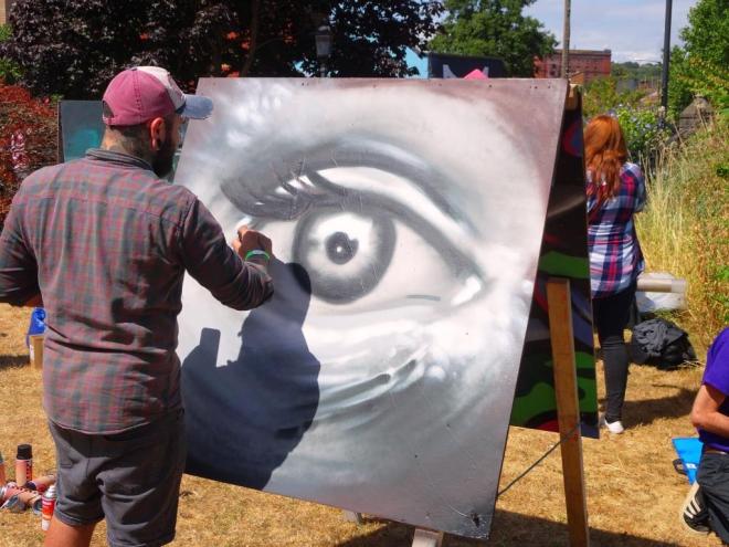
I was lucky enough to photograph the artist in action, probably on the Saturday, before the cold colours he speaks of were added. This is a fine work executed brilliantly. I’ll certainly be looking out for Justinks in the future.