
A gallery of outstanding graffiti writing and character combination pieces by Wispa.
Instagram: @willow_the_wispa
All photographs by Scooj


A gallery of outstanding graffiti writing and character combination pieces by Wispa.
Instagram: @willow_the_wispa
All photographs by Scooj
I have Covid. A pretty strong dose of it and am rather under the weather. This would go some way to explaining why I am late with today’s posts. Natural Adventures has strong ties with viruses, it was started in February 2015 while I was recovering from a really bad bout of flu. But for that I might not be sitting here writing right now.

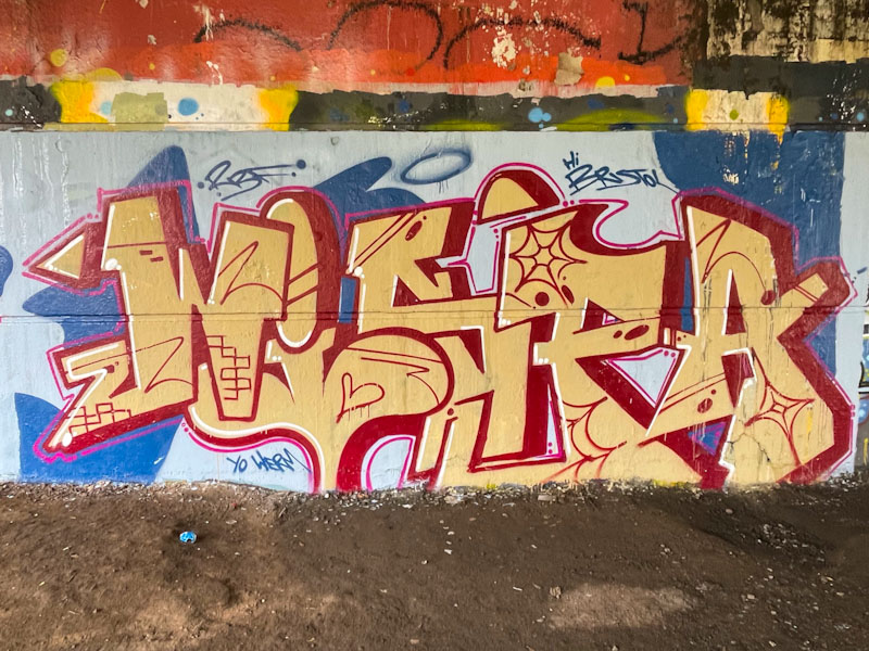
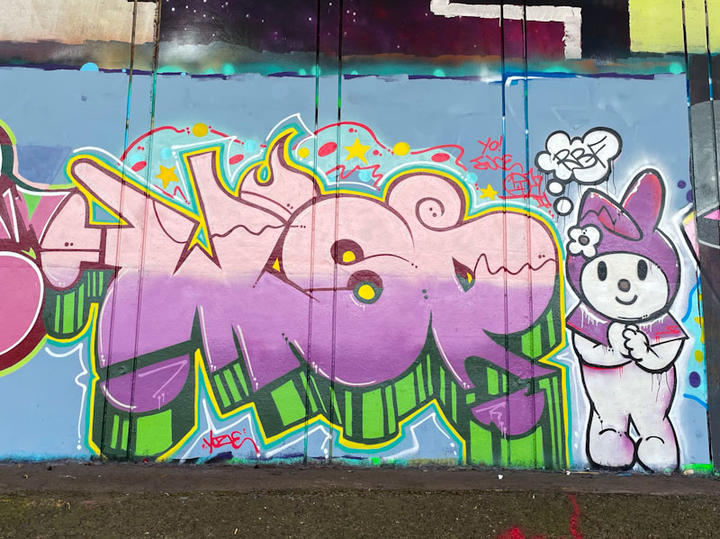
Wispa reminds me of Maria Von Trapp, a flibbertygibbet, a willow the wisp, a cloud. Her name would appear to be a good description of the way she travels the country, never staying too long, so it seems. This is a nice piece of writing that was painted alongside Werm a week or two back. Nice stuff and great to know she has been visiting.

I love Conrico’s work. He has the most incredible capacity for telling stories through his art. Rarely is there a static portrait or lettering that does nothing more than look good. The other thing that I admire in his work is his spray style that looks more like brush strokes than spray – clever stuff indeed.

This piece was painted during the paint jam to celebrate Wispa’s birthday (in absentia). I am guessing, but can’t be sure, that Conrico has painted a portrait of Wispa in honour of her birthday, which would make sense. He has included some writing, which I think might be Japanese, which I cannot read. A nice piece that is so typical of his unique style.
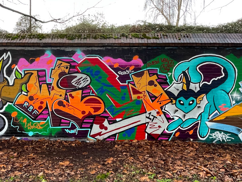
This beauty from Wispa is another fine piece from an RBF paint jam in Sparke Evans Park at the end of February. Unfortunately, there are several unpublished pieces from this wall and I simply don’t know where I’m going to find the time to post them. I felt that this one from Wispa was worth prioritising.
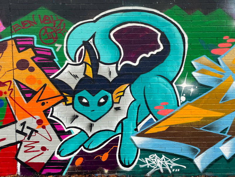
As ever, Wispa’s writing is exceptional, and she embraced the paint jam theme by incorporation this magnificent Pokémon character, Vaporeon. I love the way that Wispa drifts in and out of Bristol tantalising us with her exceptional talent, and keeping us interested. Although her pieces are occasional, they are always welcome.
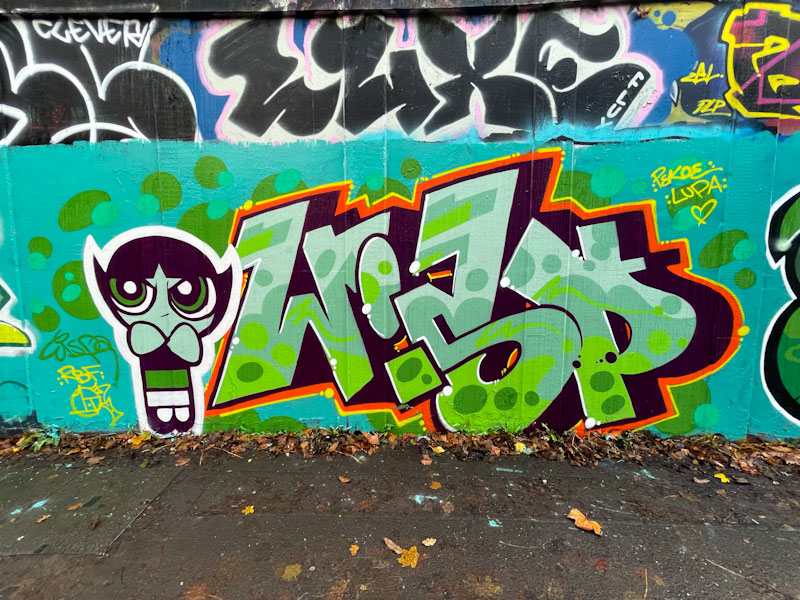
This year, as in most recent years, Pekoe really celebrated her birthday in style with the RBF crew and associates. Wispa came along for the ride and painted this fabulous writing/character combination piece.
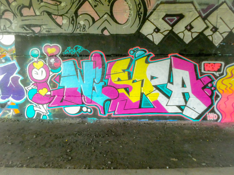
Unfortunately I don’t know who the rather cute character with attitude is, but she is painted as beautifully as you’d expect from Wispa, who always finished her work so well, with crispness and sharpness. All aspects of this piece come together really well. Bravo Wispa!

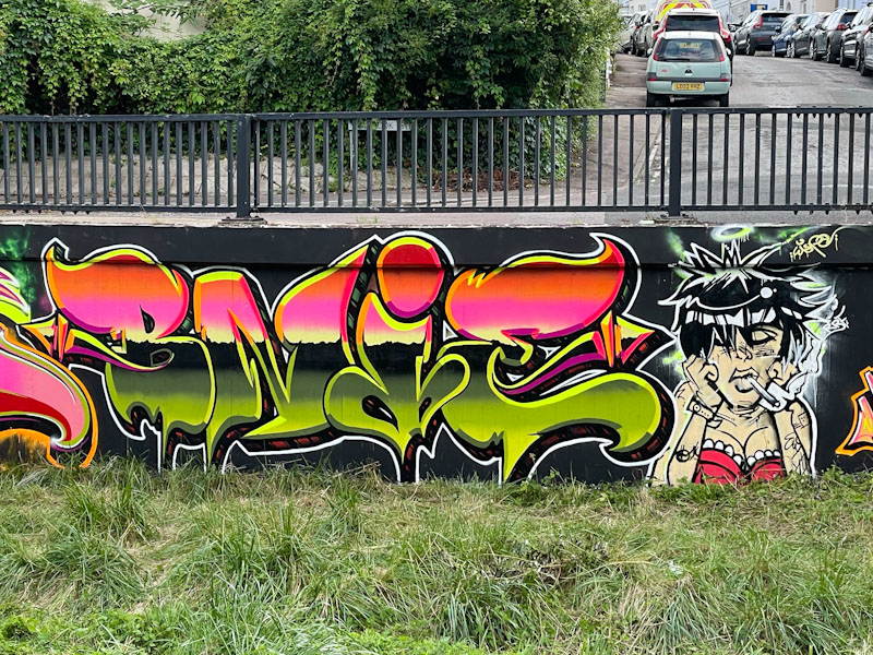
Every time I post pieces that have been painted on this wall (one of my favourites in Bristol), I am reminded that I have published a gallery of pieces from the wall over time (part of the ‘One Wall – Many Faces‘ series). I have just updated the gallery to include this lovely collaboration from Bnie and Wispa.

Both pieces have incorporated a wild and wonderful almost psychedelic fill patterning and colours and on the left, Bnie’s letter shapes also lend themselves very well to that trippy feel. This piece from Bnie is absolutely stunning and so tight, all the lines and borders are perfect and the fills magnificent.
To the right, Wispa gifts us another of her brilliantly conceived and busy pieces. As well as reflecting the colours in Bnie’s piece, Wispa has also introduced some of her own colours and touches, which doesn’t surprise me. I think, from observing her work, that Wispa has a very individual approach to her work and style, and even when collaborating, will stand out with some individualism. This is wonderful work from these two busy artists.

More from the RBF Halloween paint jam, from a week or two back, this time featuring Mena, Bnie and Wispa, in what was a fabulous turnout from the ladies and which seemed to bring the best out of each and every one of them.

To the left is a beautiful script piece by Mena, who I haven’t seen much of in recent months, so this was a genuine treat. This piece is simple yet stylish and beautifully executed and I think she is at her best when she paints these thin script letters. I fear that I have a great many unpublished pieces by Mena, and must spend a little time going through my archives and unearth them.

There is little more that I can say about Bnie that I haven’t said many times before. I consider this to be an outstanding piece of graffiti writing. Brilliant letter shapes, superb rich fill and all beautifully finished. I rather like the addition of the orange spherical things, as a nod to Halloween, but I think the lettering is so strong that even if they hadn’t been included, this would have stood out.
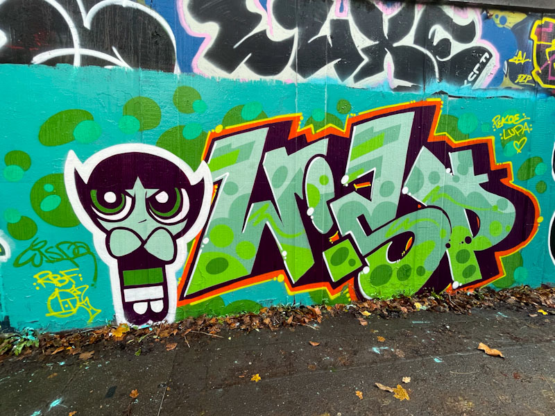
The energy that Wispa brings to her work is exceptional, not only in its presentation, but also in her incredible and seemingly inexhaustible journeying around the country to paint. The letters, spelling WISPA, are dazzling, being so full of energetic fill patterns and colours. It all looks very complicated, but I expect in her head it is all rather straightforward and obvious. The ghost character which looks like Caspar the Friendly Ghost, is the perfect foil to the busy writing. What an absolutely excellent trio of Halloween pieces.
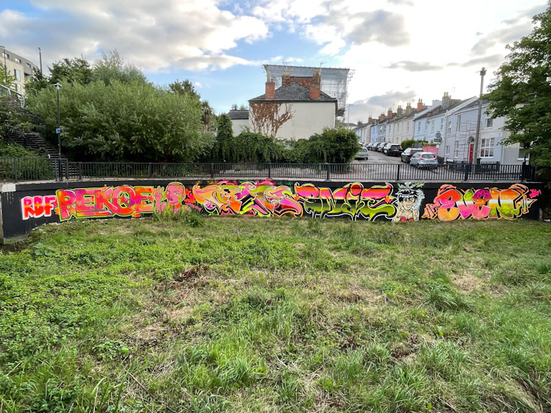
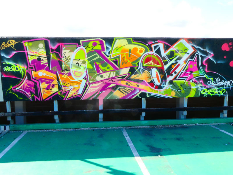
The Resting Bitchface (RBF) crew appeared to have a ball at the Cheltenham Paint Festival, painting this long collaborative wall, and then going on to decorate the multi-storey car park, which was opened up as a CPF venue for the first time this year. The dayglo colours of the piece give is a bit of a 1980s look, but with a contemporary RBF twist.

On the left and starting off the collaboration is a writing/portrait combination from Pekoe. This is as good a piece of writing I have seen from Pekoe and the character to the right is something a little different, a punk or skinhead girl with a plaster on her head. Vibrant stuff.
Next up is a classy piece of writing from Vozie, spelling out her name and breaking up different sections of the letters with different colours from the paint jam colour palette. The overall design is top class and the execution brilliant. Amazing stuff.
The next section has Bnie and Wispa snuggly side by side. Bnie’s writing picks up on the colour palette, but designs in the colours in a completely different way to Vozie. Bnie has gone for some horizontal layers, and a horizon line running through the midpoint of her BNIE. Finished to perfection, this too is an outstanding piece. Wispa has gone for a character piece overflowing with attitude. She has also decided not to go with the ‘corporate ‘colours and the impact of that is her character stands out as being a bit different. I get a feeling that the attitude isn’t constrained to Wispa, but runs through the whole collaboration in its loud colours and boldness.

Finally, the right hand end of the collaboration is represented by a fabulous piece of writing from Evey. In recent posts I have spoken about her rate of improvement this year, and this piece only goes to reinforce my view. Great letter shapes and delightfully eclectic fills that somehow work incredibly well together. This collaboration has all the hallmarks of a very successful and enjoyable day out for the RBF Crew. Outstanding.
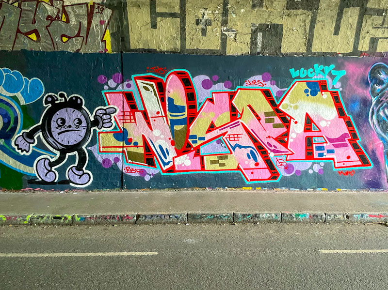
A visit to Bristol by Wispa is always very welcome, and pretty much always unexpected as she seems to travel about the country quite a lot, and you can never be sure when she will be in the area – unpredictable I think you’d call it.

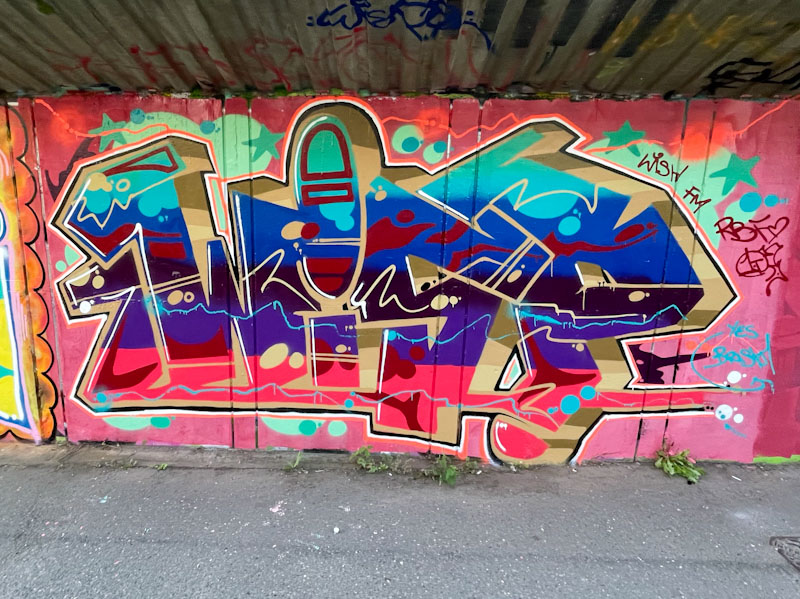
This is an absolute belter of a piece of writing from Wispa, painted as part of an RBF paint jam alongside the M32 motorway. There are two things that stand out in this piece for me, the first is the unbelievable sharpness of the lines, and outstanding finishing and the other is the bold colour selection, transitioning through a range of bold and strong colours. Bravo!
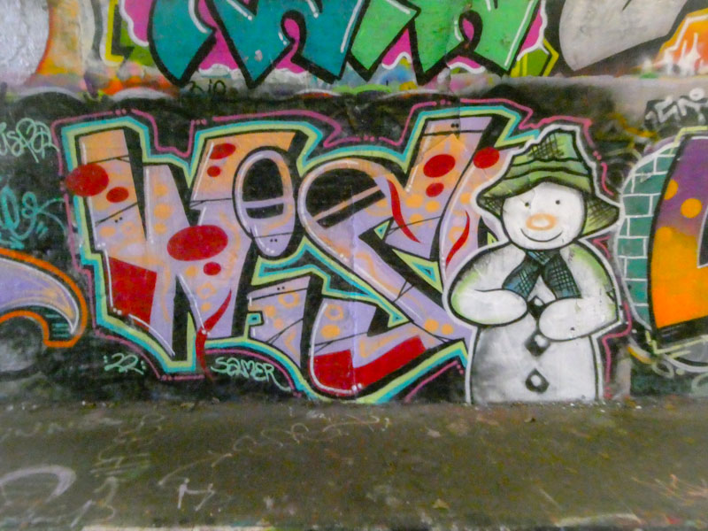
Although I have never met Wispa, I have recently had a conversation with her via Instagram messenger, and it is comforting to know that she is supportive of me sharing photographs of her work and writing posts like this one. It is just a matter of time before I am able to put a face to a name, and I only missed her by a whisker in Cheltenham. Speaking of whiskers, this is a wonderful piece featuring Tom the cat in Sparke Evans Park.

Once again Wispa delights with this outstanding piece of writing, and fills to die for. I don’t quite know how she does it, but she has great judgement in getting the right composition and proportions in her fills, supported by great colour selections. The letters spelling WISPA are nicely done and lifted with a white 3D drop shadow.
Wispa usually accompanies her work with a character and in this one we are treated to a fun Tom cat from the cartoon Tom and Jerry. It is always a great pleasure to find pieces by Wispa, and I hope she continues to visit Bristol as often as she is able to.


