
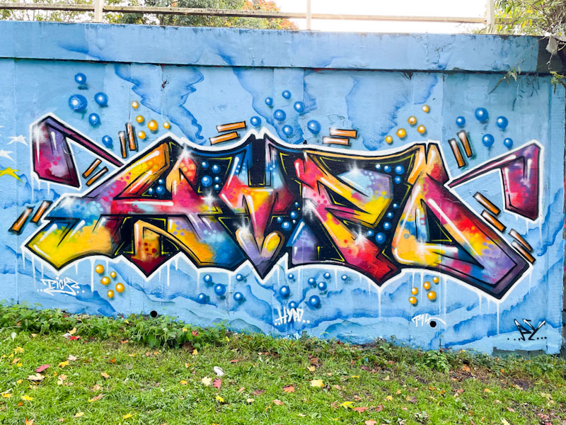
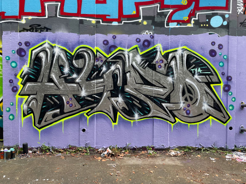
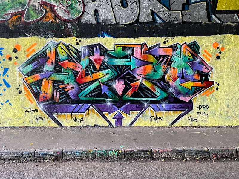
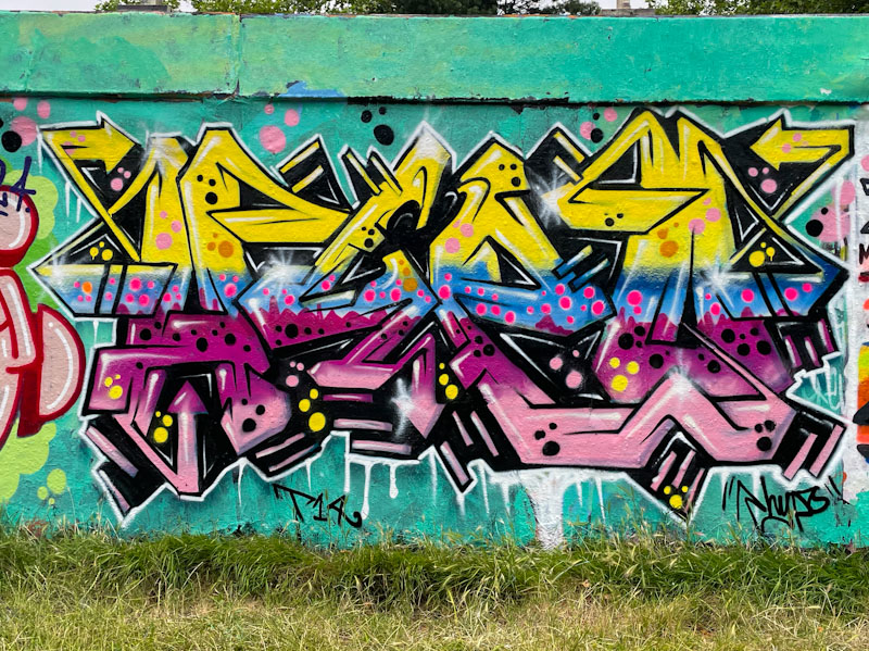
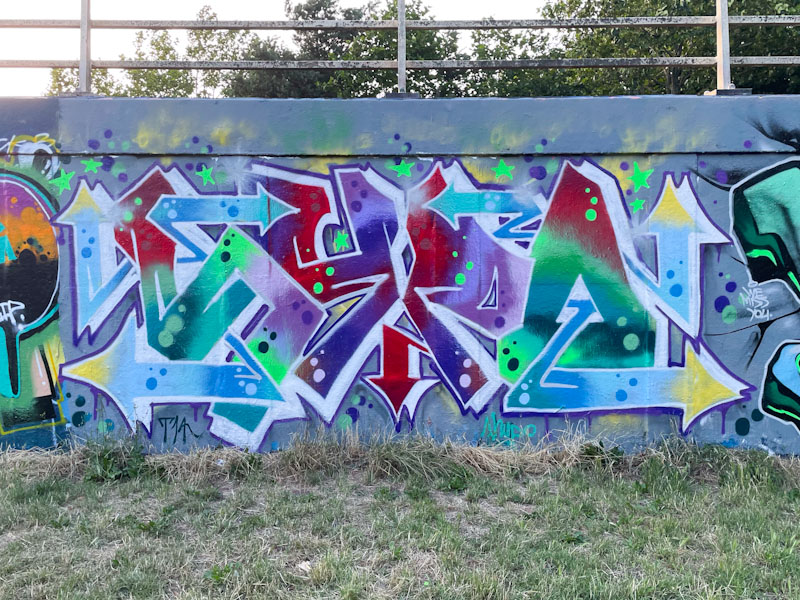
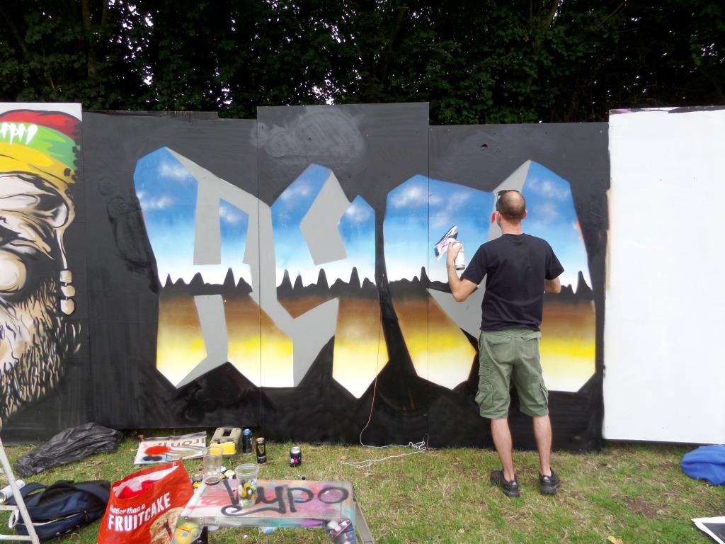
A gallery of fabulous graffiti writing from Bristol artist Hypo
Instagram: @Hypograffiti
all photographs by Scooj
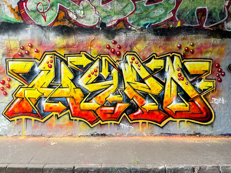


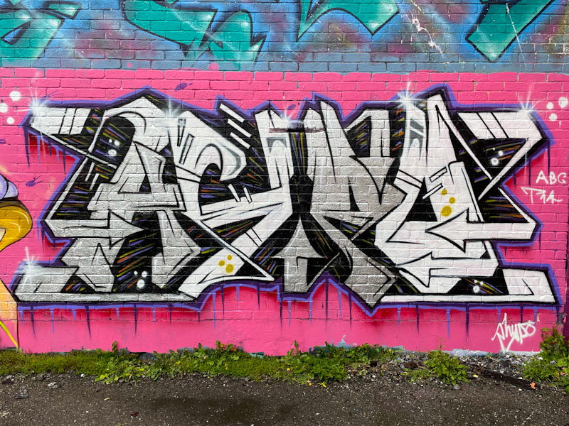

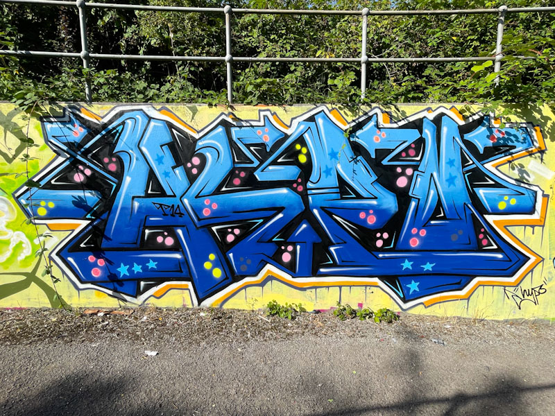


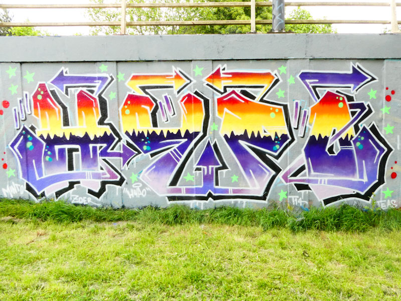


A gallery of fabulous graffiti writing from Bristol artist Hypo
Instagram: @Hypograffiti
all photographs by Scooj
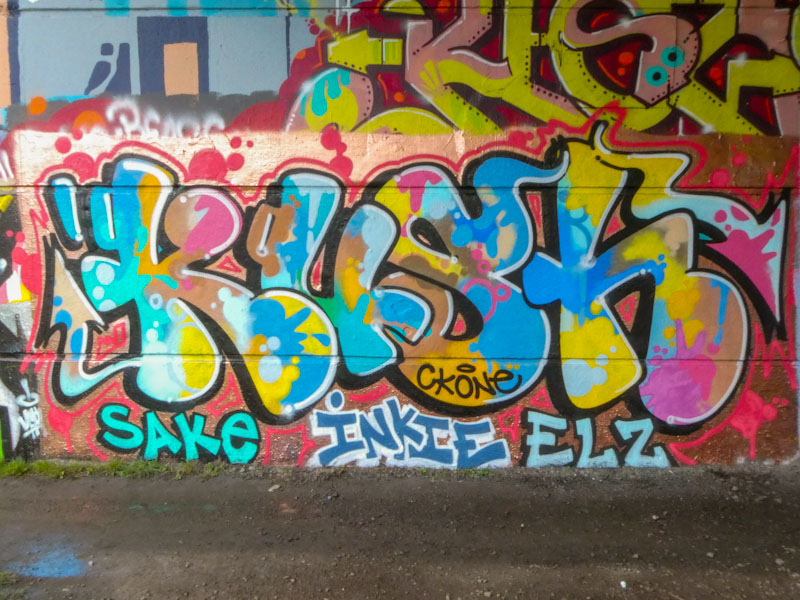
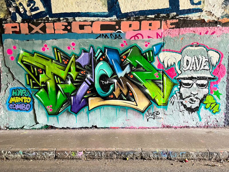
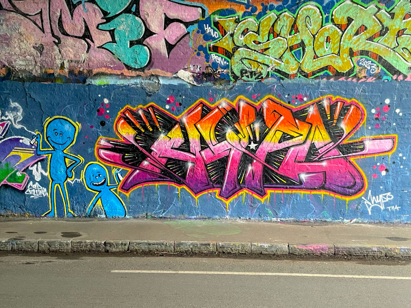
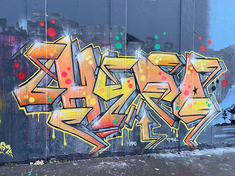
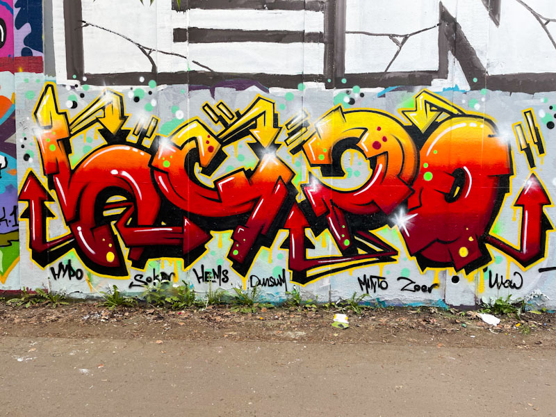
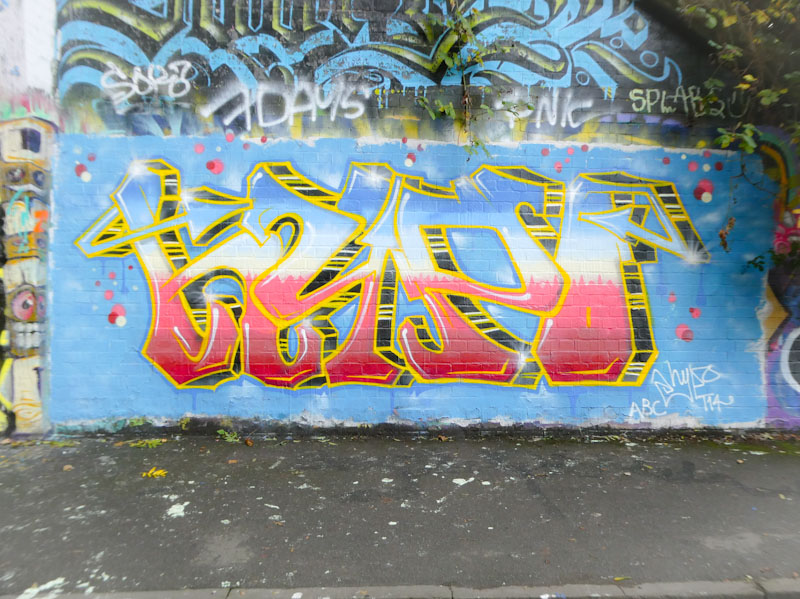
I have been photographing Kush pieces for a few years, but I think that this might be the first that I have published. I think that this horrendous under-representation on Natural Adventures has simply been down to not knowing who Kush is or even which artists he associates with. Anyhow, I feel it is time to start publishing his work, so expect to see some archive Kush pieces over the coming weeks and months.
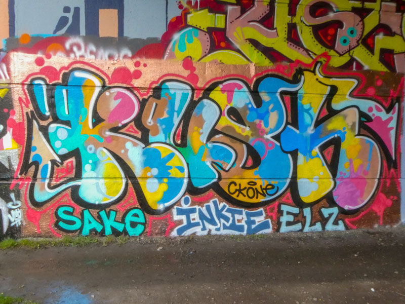
Kush is an artist who pretty much always writes the same letters but always in a different form or design, demonstrating his skill, experience and technique on every outing. This piece, under Brunel Way, has rather nice curvy, cartoonish letters which are filled with a wonderful splash of colours – this is a classy piece. It might be my imagination, but it feels like Kush is painting more frequently these days, which means I am sure to be featuring his work more often.

When I first encountered Face 1st’s work, his pieces were more commonly painted solo, with occasional PWA paint jams, particularly with Soap, but more recently he has rarely painted without some of his buddies, this piece on the M32 roundabout being an exception. Maybe all his PWA mates were busy that day.

I love the way that Face 1st constantly plays with new ideas and themes, and then adds them to his repertoire. This is a traditional Face 1st idea, a face with hair spelling FACE, but the letters are deep 3D block letters which he has been including more often recently, and there is a lot of gloopy dripping going on, something he started to include in his work about two years ago. This is a fun and eye-catching piece from the prolific Face 1st.
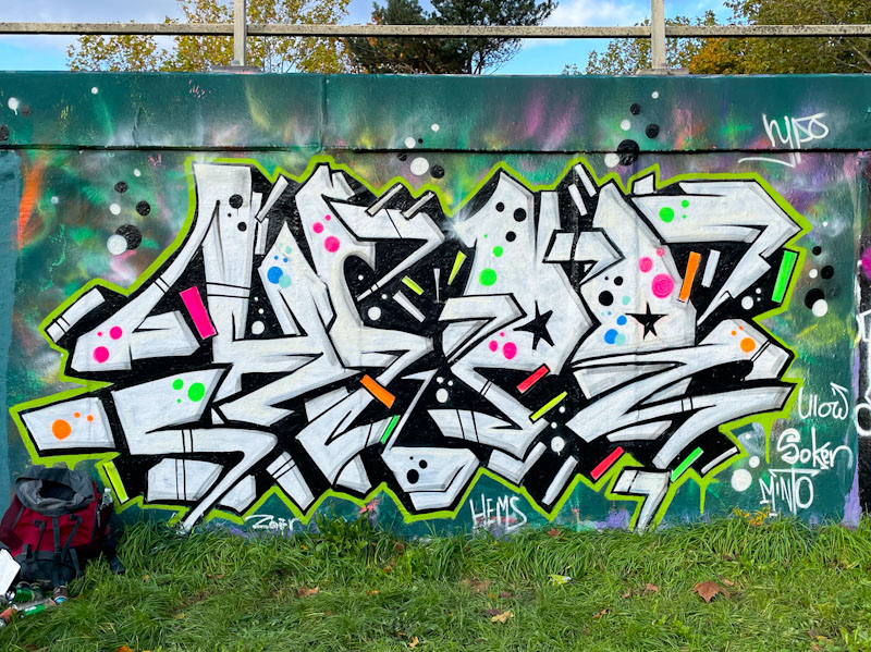
Klashwhensober continues to paint frequently, and in as many spots as he can find. These two pieces are from Cumberland Basin, in slightly different places. The first piece, on a virgin wall, is rather noticeable as it is on the side of one of the buildings that have something to do with the lock gates into the Floating Harbour. Definitely an edgy spot.
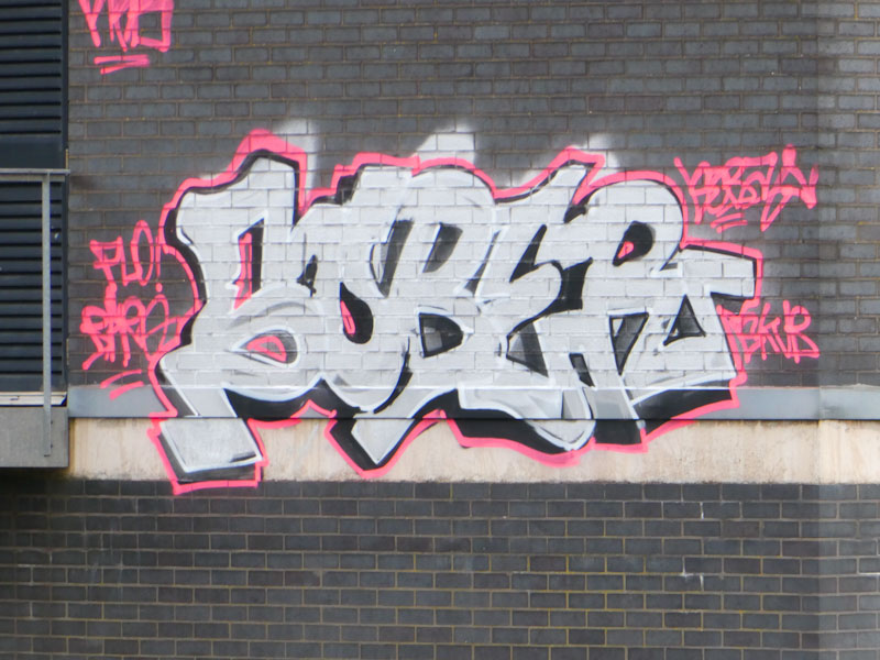
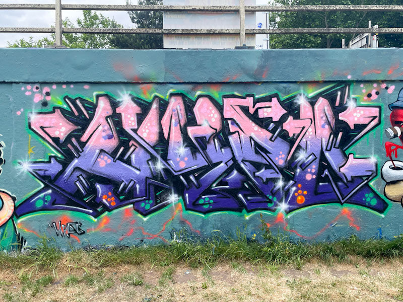
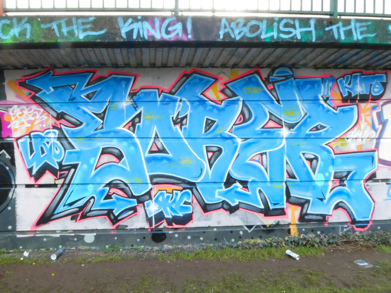
I was fortunate enough to catch up klashwhensober while he was painting this rather nice blue piece. Strangely, this was our second encounter in two days, after a long period when our paths didn’t cross at all. We got talking a lot, and it turns out that we have more in common than we might have thought, including attendance at the same school in London, although at completely different times.
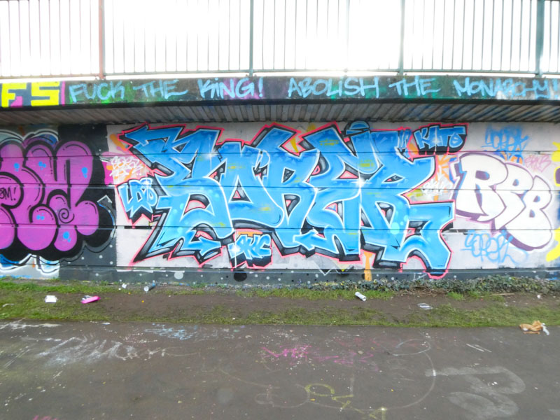
The piece itself is fairly straightforward, spelling SOBER with nicely defined letters and plenty of designs in the fills. There are no ‘explosive’ elements in the writing, which has been a bit of a trend recently, but it is nicely done nonetheless.

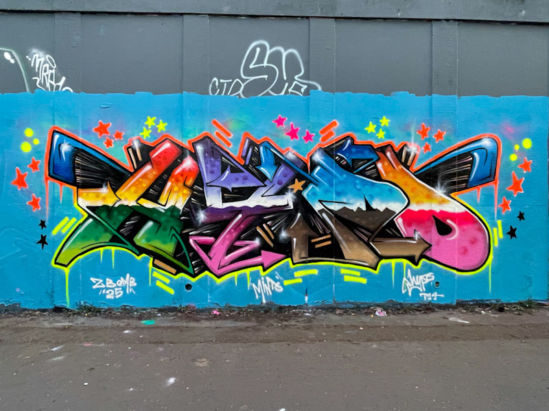
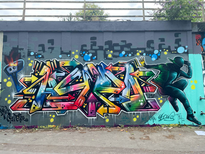
I have a feeling that we are going to see a lot more of Bbygwya’s work on Natural Adventures over the coming months. This RBF crew member has only recently arrived on my radar, but I know I already have a handful of her works in my photograph folders.
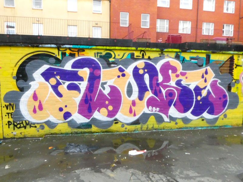
I haven’t yet worked out what the letters spell, but I am sure that Paul H will be able to help me out with that (it seems obvious now, but Paul H informs me it says FLUKS). This is accomplished writing, with a pleasing form and nicely crafted fills, drop shadow and background elements. I am also happy to see that Moon street is having a little bit of a renaissance at the moment. Watch this space for more from Bbygwya.

With this piece, that incidentally didn’t last very long, Kid Krishna demonstrated his incredible versatility. If I hadn’t met him when he was painting this piece, I’m not sure that I would have known it was one of his, although the fact that it was painted next to a Markinetic piece might have been a bit of a clue, together with the FFS, NKA and TPN.
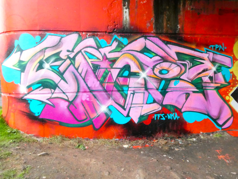
I think that I can see the letters CRIE in this rather more traditional wildstyle graffiti writing, which is so full of different textures and tones – a classy piece of work. We chatted for quite a long time, and I like it that Kid Krishna seems to be happy to stop and chew the fat – the subject of our conversation was one I seem to be having a lot lately, and the clamp down by BCC on graffiti/street art, and the recent announcement from the Government (and opposition) bout antisocial behaviour.
Of course in my mind, there is a big difference between tagging someone’s front door, which is vandalism, and painting creative artworks in places that have a culture of such. Maybe a topic of conversation for another post.

Logoe has been back in town and that can only mean one thing… lots of new pieces painted over a couple of days, liberally sprinkled in a variety of spots around the city. This is the first of his new batch I am posting, so expect a few more over the coming weeks.

Written in rather attractive colours, the beautiful script letters flow effortlessly across the wall at the end of the tunnel. There is a rather nice series of peaks at the top of the letters, and an ellipsis at the start of the word Logoe. No recent Logoe piece is complete without a spread of oval spots running along the length of the piece. Great to have him visit again.
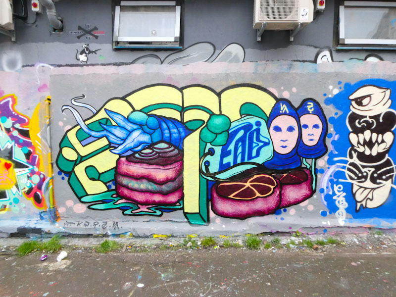
I would think that it is fair to say that Nugmoose is one of the most original artists in Bristol, and his ‘organic alien’ style is unlike anything else we see in the city. He usually paints alongside Mommy Nature these days, but unfortunately, when I got to photograph this, her adjacent jelly piece had already been painted over. You’ve got to be quick in this game.
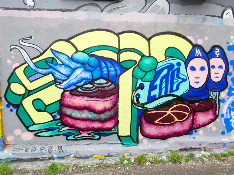
Quite what goes on in Nugmoose’s mind is unfathomable, but his pieces always generate a certain amount of curiosity. He has a way of combining alien writing with organic forms, and he has treated us to a couple of humanoid aliens, a squid-type creature and a couple of alien items of fast food, or so it looks. Weird and compelling.
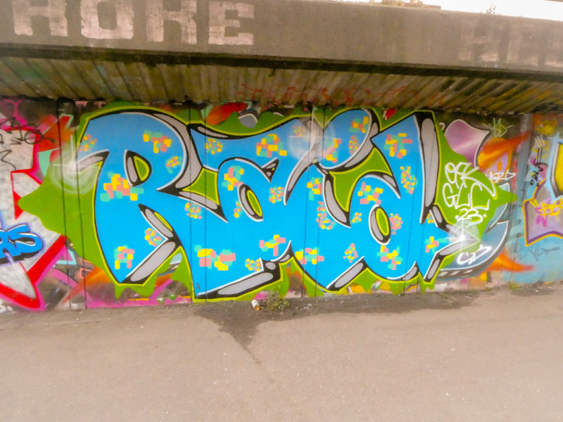
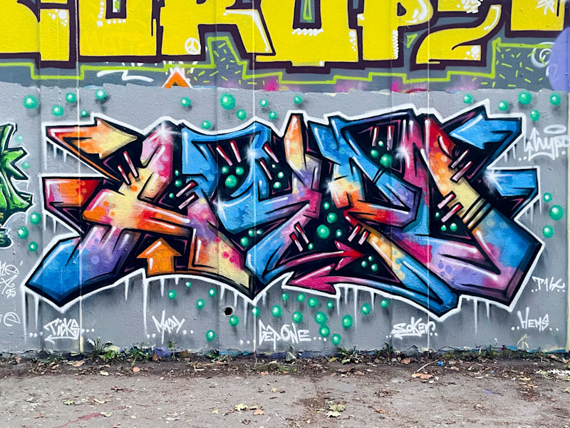
I love it when a new artist appears on my radar and I start to see their work all over the place. I think that Raid is a relative newcomer to Bristol, but he is already making an impact with his distinct and attractive writing.
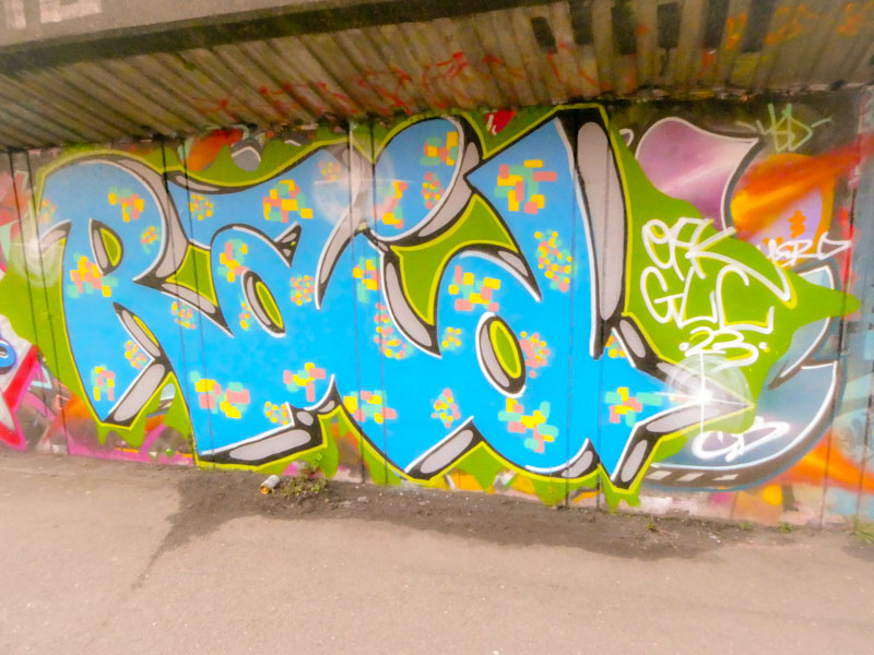
The letters spell RAID, with the ‘A’ being rather distinct. The letter shapes seem to be retained from piece to piece, so it is the drop shadow and fills that change, and he has done a superb job with this one. The drop shadow is cleverly done with a black surround and grey middle, adding character and interest. The solid blue fill is decorated with colourful pixel patterns, creating a rather joyful overall feel. More to come from Raid soon.
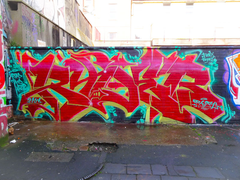
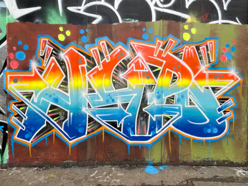
This is another piece from the archive, and is an absolute classic from RAW’s Ryder. Ryder is at the very heart of everything that is great about graffiti writing in Bristol. His work is consistently brilliant, there is always an element of edge and the style of writing has a really strong local identity to it. If you look at graffiti writing from around the world there are clearly local styles and influences, and Ryder is central to the Bristol look.
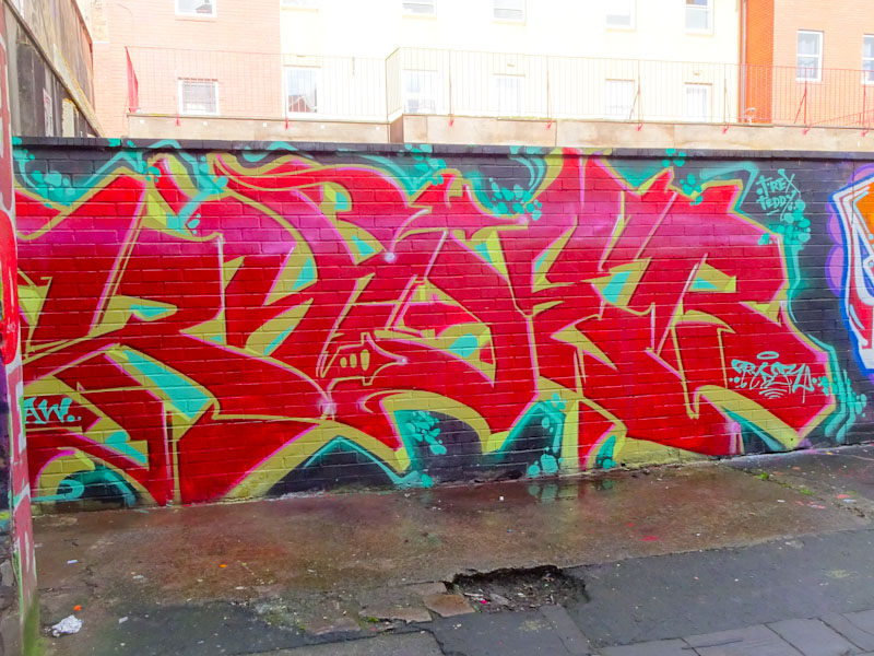
Painted in April 2018, in red and gold, the letters RYDER stand out and smack you in the face. It is weird looking at the finished piece, but it feels like the creation was effortless, maybe because of his modesty and lack of fuss. Punchy and direct, this is a no nonsense statement from the wonderful Ryder.


