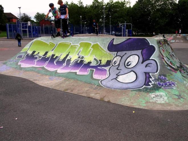
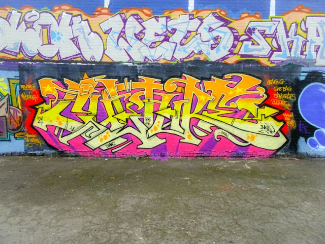
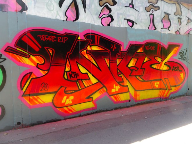
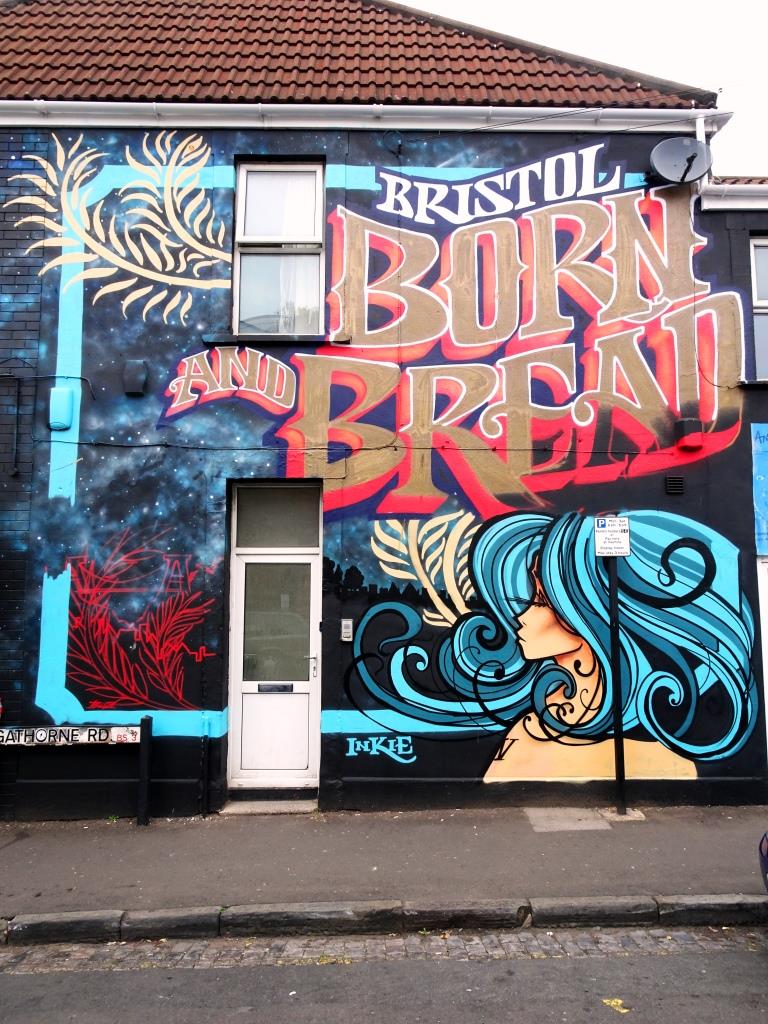
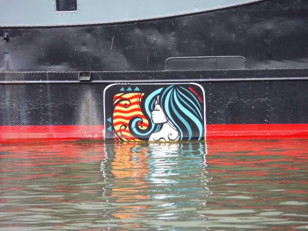
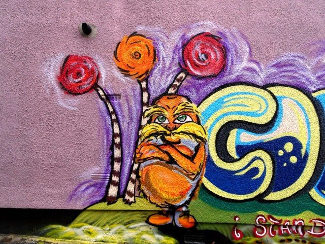
I met Rezwonk for the first time last week, and what a pleasure it was too. He was actually painting a piece at the M32 roundabout (to follow). Our conversation was brief, because both of us had to rush off. I also met at the same time another Bristol ‘hunter’ who goes by the Instagram moniker @bristol.graffiti and it was a real pleasure to meet her too (and if I am honest I has assumed incorrectly that she was a man before I met her, stumbling into the perils of unconscious bias once again). The anonymity that digital social media affords is a double-edged sword.
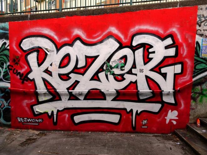
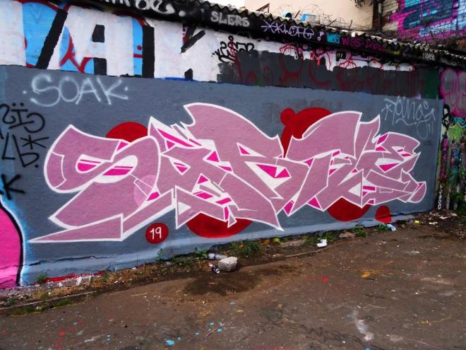
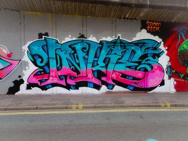
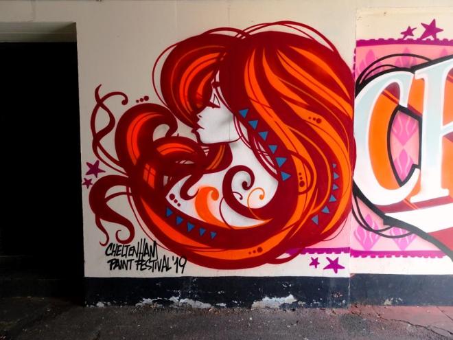
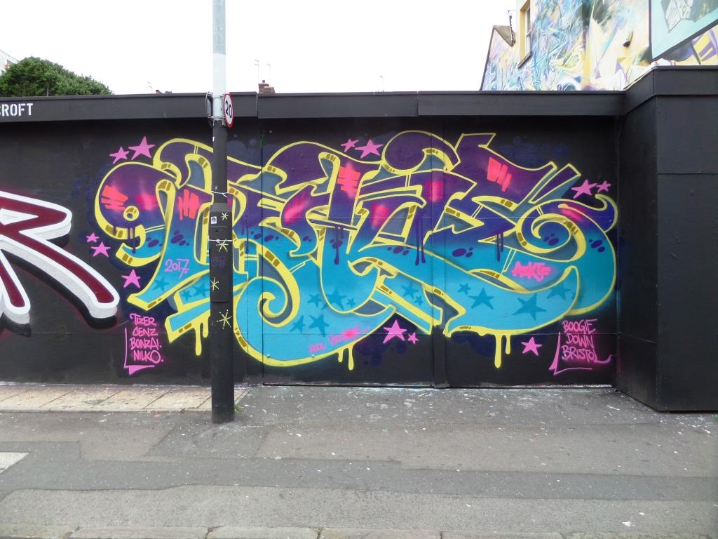
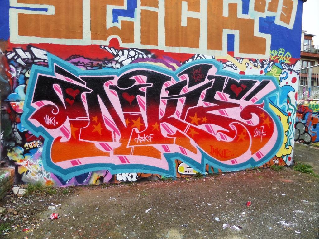
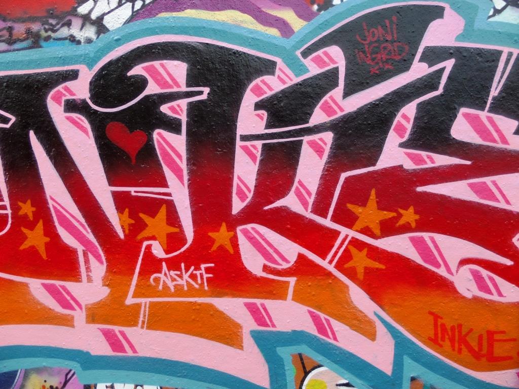
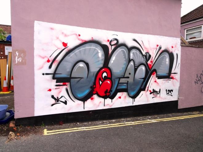
As ever, this piece by Rezwonk is sharp, creative and really demonstrates the artistic talents and range in his locker. The red and white combination (a personal favourite of mine) works exceptionally at the end of this dark tunnel – other colour combinations probably wouldn’t have the same impact. Nice work once again. Very, very prolific at the moment.