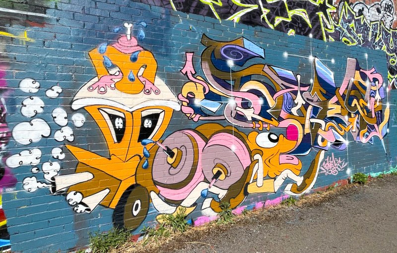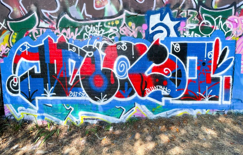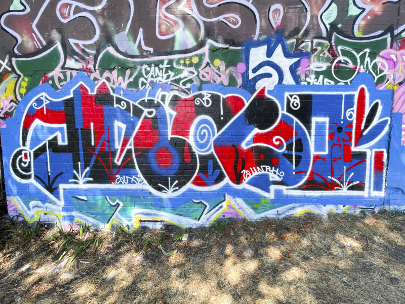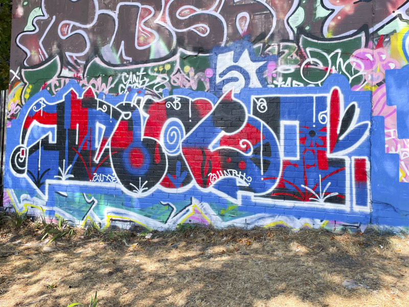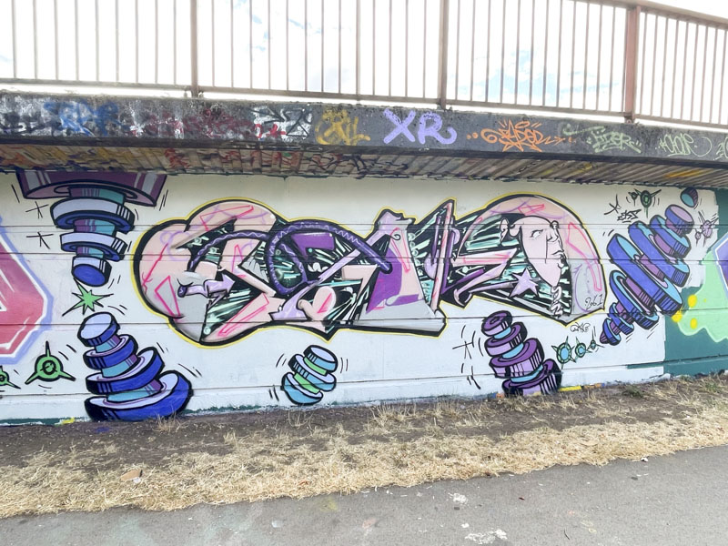
Although we have had an exceptional summer, it has at times simply been too hot and unnaturally so. The wall to wall sunshine experienced in late June, July and early August has also let to a disproportionate number of my photographs featuring disruptive shadows, about which I cabn do very little. The shadow on this lovely piece by Taboo gets to me every time I look at it.
Taboo, Cumberland Basin, Bristol, August 2026
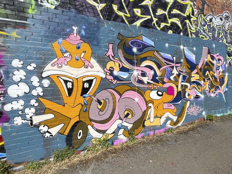
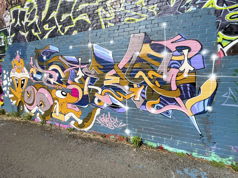
The piece appears to be a tribute to… Taboo (There is a number 25, and I wonder if that reflects 25 years of graffiti writing). The letters are made up of the letters TABOO, creating a larger TABOO and incorporating some train carriages and the words ‘Train maximalist’. All a little bit confusing. The whole thing though is great to look at and set on a buffed background. Gotta love those drips.
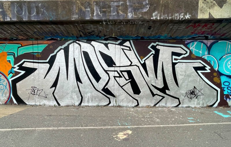
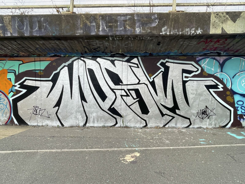
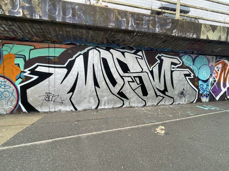
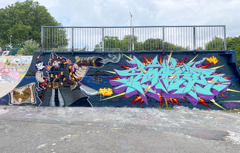
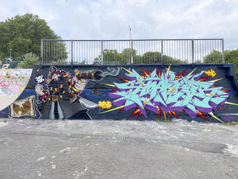
Mesk is in a great rhythm, producing at least one or two pieces a month, either alone or collaborating with others. His distinctive large letters, spelling MESK, need no signature, as his style is quite distinctive.
Mesk, Peel Street Green, Bristol, August 2026
The yellow appearance of the letters in this piece is a clever bit of work, because it is only the top layer of the letters that is actually yellow, the next two layers being green and olive, but which look like shaded yellow. The whole thing is set on two backgrounds… a black buffed wall and a blue frame, both of which contribute to helping the letters stand out. Some nice drips, highlight starbursts and tidy drop shadow round off the piece very neatly indeed.
Fantastic News… the curated framed spots on the side of Lost Horizon in Elton Street are back open for business, and some fresh pieces were painted there a couple of weeks back, including this beauty from Inkie.
Inkie, Elton Street, Bristol, August 2026
The framed boards provide a bit of a street gallery look, but are a slightly awkward shape, particularly for writers, who have to compress their letters into a slightly confined width. Naturally, Inkie achieves this with consummate ease and presents his gorgeous letters in pink and yellow with a deep green and black drop shadow. I love the way he has filled the space up at the top with black spots on a yellow background creating a strong contrast.
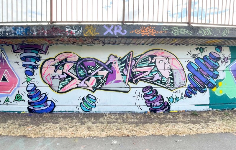
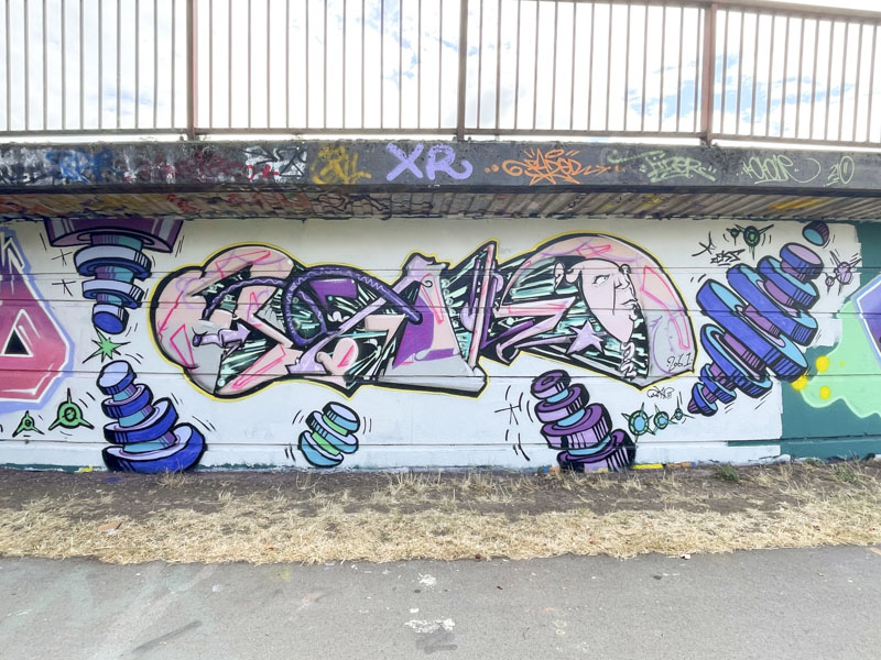
Shade One, Fade, Dibz and Sikoh, Cumberland Basin, Bristol, June 2026
This is a fabulous production collaboration painted back in June this year by Shade One, Fade, Dibz and Sikoh. It is a difficult wall to photograph in its entirety at the best of times, because of the light incursion creating reflections at different times of the day. These four really are the crème de la crème of their field.
Shade One, Cumberland Basin, Bristol, June 2026
Starting at the left, Shade One has painted an incredible cartoon realism portrait of a futuristic woman wearing pink-tinted glasses with gold rims. I’m not quite sure what the apparatus on her head is all about, but it is imaginative and creative. The pink surround creates a grerat hard defined edge to the portrait.
Fade, Cumberland Basin, Bristol, June 2026
Next up is some graffiti writing from Fade which I think reads SMOOTER and is likely dedicated to a friend. There is little more I can write about Fade and his work that I haven’t already written many times before. Precise and perfectly presented like the adjacent piece by Dibz.
Dibz, Cumberland Basin, Bristol, June 2026
The third piece in this production is by Dibz and mirrors the writing by Fade in terms of colours and to a point style. I cannot for the life of me decypher the letters, but that is wildstyle writing for you, it is intended to be disguised.
Sikoh, Cumberland Basin, Bristol, June 2026
Moving on finally to Sikoh, one of the most talented artists around, in my view. He has overlaid his piece on top of Dibz’ writing, bringing it forward and lifting it from the wall. The colours match Shade One’s bringing about a symmetry to the whole collaboration. Here a tortured skull, part human part machine appears to be yelling out, whether in pain or rage it is difficult to know. So full of movement expression and perfectlky painted. What a collaboration!
If I posted all the Mage pieces I find, thern I woulkd struggle to make space for much else. I accept that this is a bit of an exaggeration, but I do have a lot of his pieces that haven’t made it out of the archives…yet. I think that I would categorise Mage as a bit of a classy bomber. He likes to just show up and over-paint existing work, and rarely, if ever, buffs the wall first, leaving behind the remnants of the piece before it, which in this instance was by Bloem.
Mage, M32 roundabout, Bristol, June 2026
I really like this piece, which is nicely thought out and crisply painted. The deep red letter fill is broken up with brighter red plasma lines and decorated with some characterful yellow circles. The contrasting turquoise drop shadow has some nice block decorations. The only thing I am a little unsure about is the black decorations around the perimeter which I think add nothing to the piece. More to come, always.
Whenever I find a Taboo piece I always know to expect the unexpected. His anti-style approach means that conventions and regularity are thrown out of the window and you have to invest in his work and trust the process. If you submit to his style, rather than try to fight against it, it all becomes so much more enjoyable – which could be said for graffiti writing more generally.
Taboo, Greenbank, Bristol, June 2026
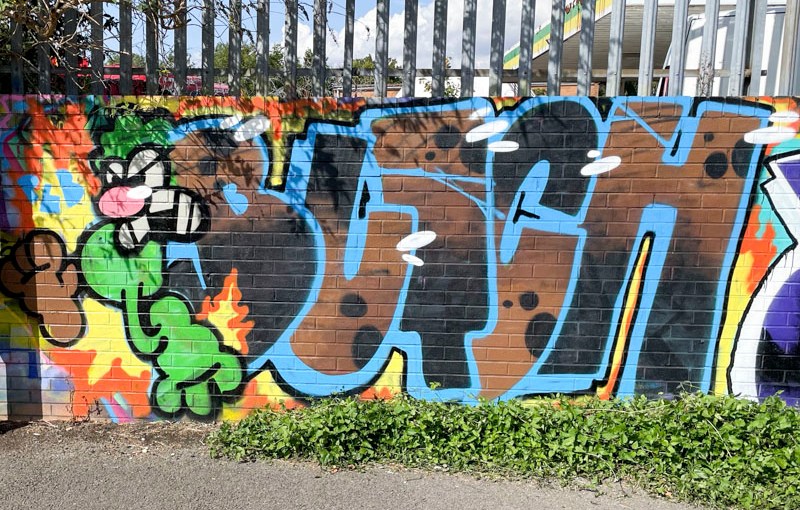
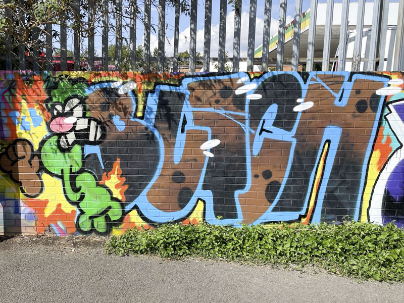
These single colour cartoonish letters with a deep drop shadow in the same colour are accompanied by a little crocodile character at the right hand side. Some little white accent spots and crocodile teeth lift the piece with subtlety and skill. The piece is accompanied with the words ‘make it snappy’ a phrase that rounds off the joke that begins ‘give me a crocodile sandwich…’. A fine but of fun from Taboo.
This beautiful piece of graffiti writing by Zinso didn’t last very long t all, I don’t know why it was painted over so quickly, but I am pleased I got a shot of it before it disappeared. It is remarkable how quickly, since his return to writing to walls in Bristol, Zinso has become a part of the furniture.
Zinso, M32 roundabout, Bristol, July 2026
His writing is always beautifully finished, but also he manages to generate creative fills that demonstrate a very accomplished hand. Here his cartoon style letters are filled with light purple spots on a lilac base. Very pretty to look at and fulfilling.
A year or two back Hemper was smashing out pieces on a ridiculously regular rhythm, but since then has been a little quieter, although I have noticed a slight increase in his activity over the last couple of months. His work is always of such quality and class that it is always a pleasure to his pieces.
Hemper, Peel Street Green, Bristol, July 2026
This one in Peel Street Green, picks up on a theme he has used before, of a chequered background, looking almost like a tablecloth, over which is painted a rather crude, but beautifully worked piece of bubble writing spelling HEMS. The yellow letters , drips and all contrast brilliantly with the backdrop. The message “Instagram makes you moody” possibly speaks to all of us. A very nice piece.
This is a lovely tribute piece for Tickz by Hypo, which is well over a year old now, but I have been slow to find this spot, hence the delayed post. The age of the piece is made more obvious with the ‘warning’ poster that has been slapped across the middle of it.
Hypo, Goodneston Road, Bristol, July 2026
Hypo has chosen some fairly modest colours that complement the sober grey hoarding to write the letters TICKS, a variant of Tickz. The drop shadow which has some streaks, stars and spots disappears to a central point behind the letters, and the whole thing looks very ‘Hypo’ if that makes sense.
This piece from Turoe is an absolute blinder. The piece is painted on the long hoarding at Goodneston road, and I expect it has been there for some time – I discovered the spot very late in the day. Although the piece has a shout-out to Tickz, I don’t think it is part of the tribute paint jam to him.
Turoe, Goodneston Road, Bristol, July 2026
The stunning red letters, spelling out TUROE, are given a huge amount of depth by the large blue drop shadow and the boulder background that the letters appear to be emerging from. This is the work of a master graffiti writer who has maintained his outstanding standards for such a long time.