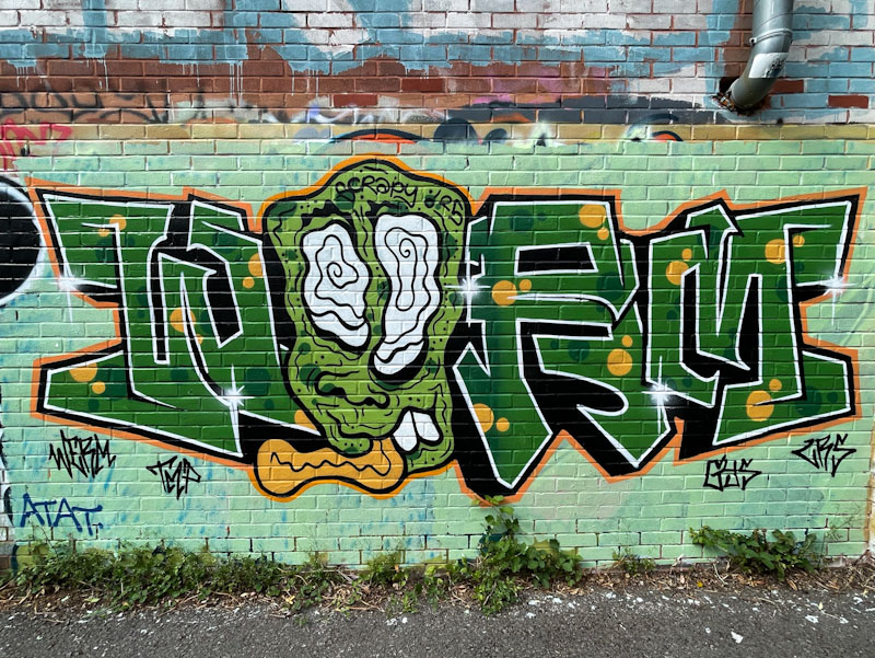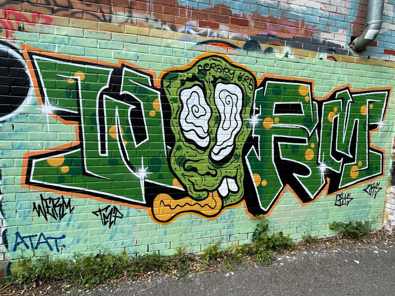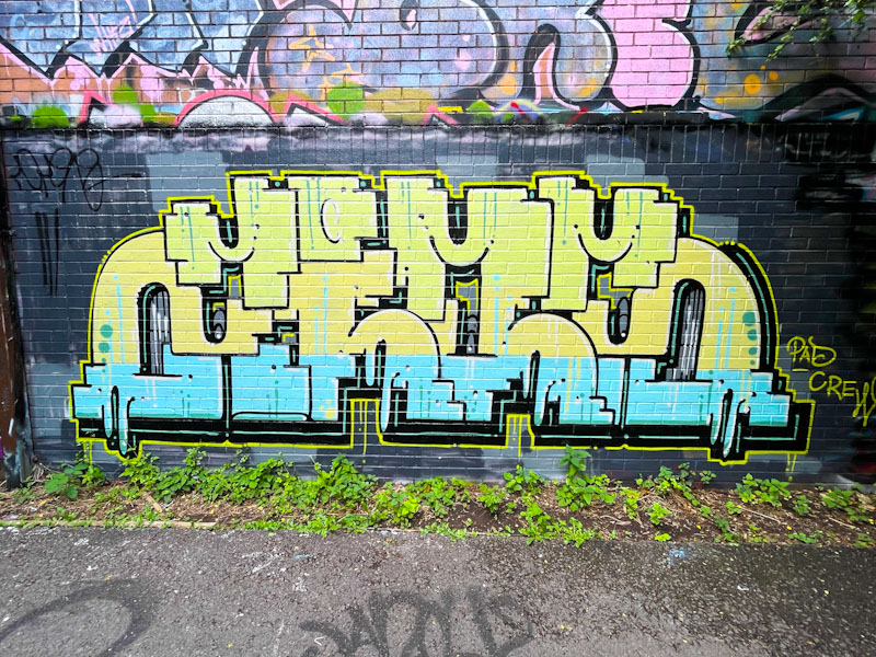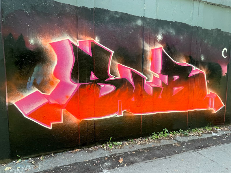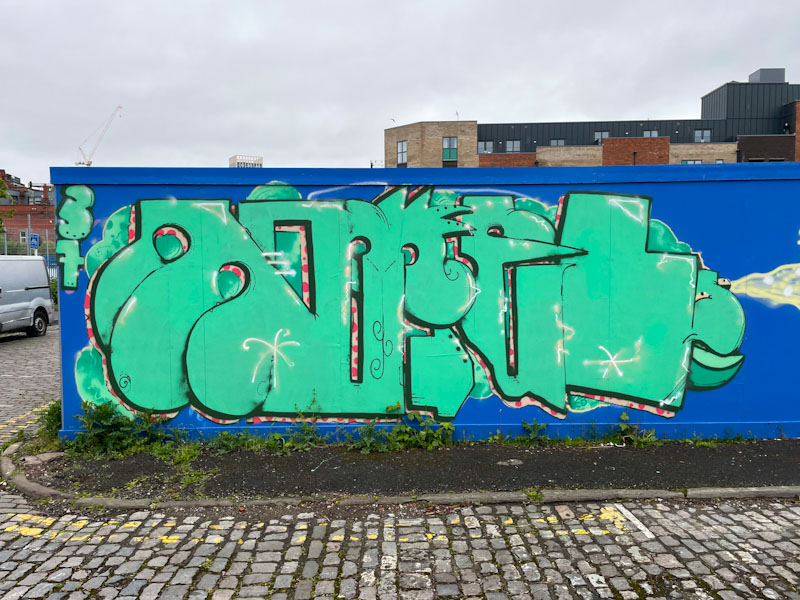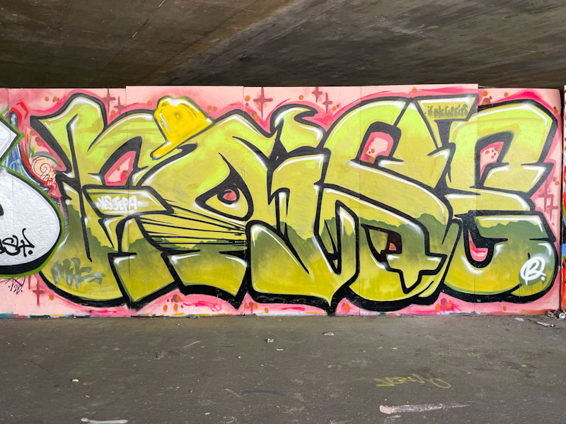
Noise has been painting in Bristol for a little over two years now, and I haven’t yet had the pleasure of meeting him. I guess our clocks just aren’t synchronised – I tend to go for my exploratory dog walks at lunchtime or after work usually on weekdays, so I imagine Noise’s paint time pattern doesn’t match… or maybe we just haven’t been at the same place at the same time. It can happen that way.

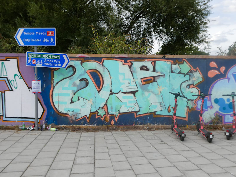
This is a big fat piece with big fat letters, which is what Noise does best. His letters are like a visual version of onomatopoeia, in so much as their size and imposition looks like noise to me. Does any of that make sense? The letters are filled with yellow, and some murky muddy colour, I suppose I would describe the piece as mustard noise. Great stuff.