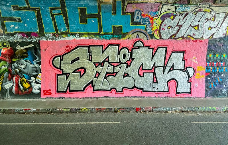
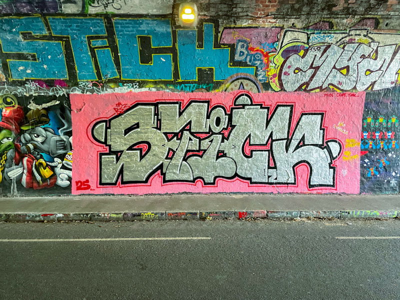
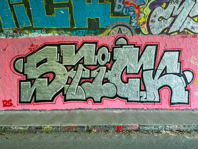
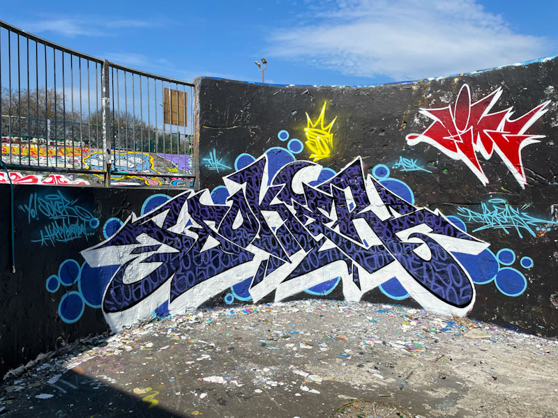
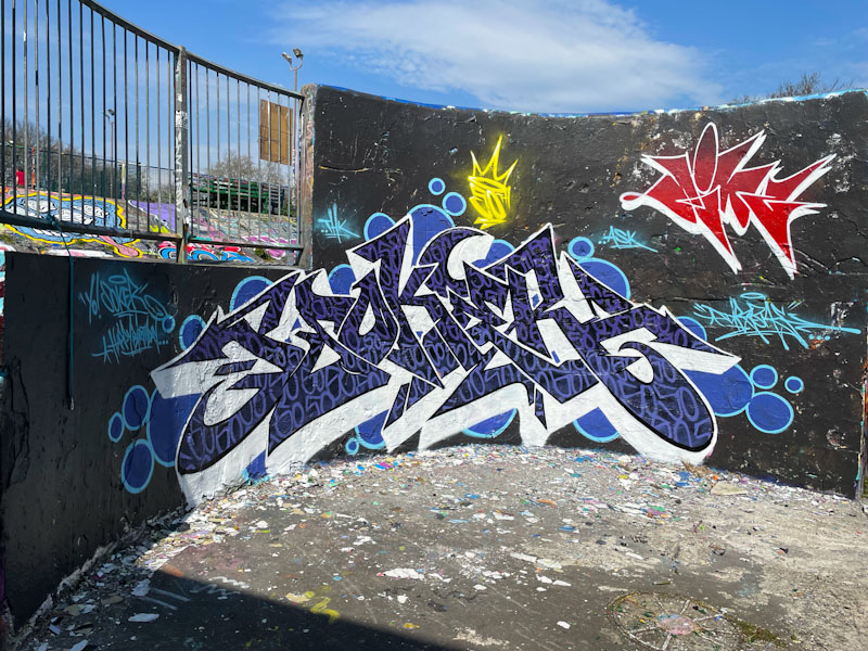
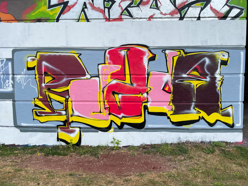
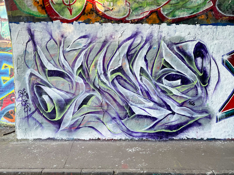
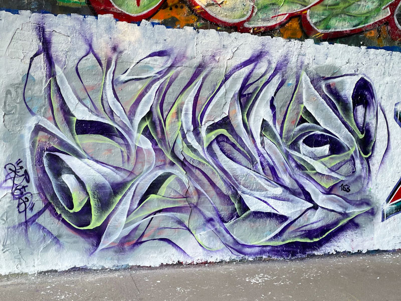
This bold piece by Corupt is in the darkest part of the St Werburghs tunnel, and I had to do a little bit of brightness and colour manipulation to bring out the best in these photographs. The tunnel is a great street art/graffiti spot, especially in wet weather, but the light conditions can make photography very challenging at times.
Corupt, St Werburghs, Bristol, April 2025
This is a really beautifully presented Chrome piece, spelling out STICK, set on a pink background, with a fine red line outside the thicker black border, a design element that is a bit of a signature of the artist’s work. There is something rather unusual and appealing about his letter style. Great piece if you can actually see it in the gloom.
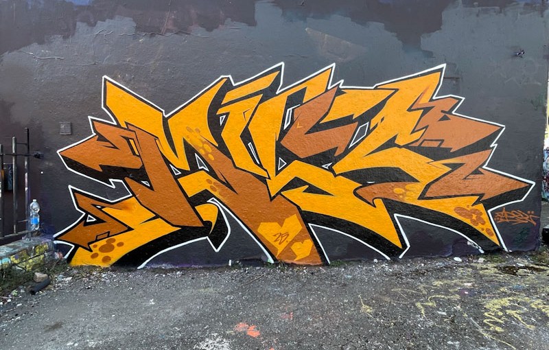
There are a couple of things that are slightly unusual about this piece by Fade. The first is that it is a solo piece and not a collaboration with Dibz and second, it has unfamiliar letters, as it is a tribute to ‘the Mrs’ to use Fade’s words, although I can’t remember her name, and I am struggling to decipher the letters.
Fade, Dean Lane, Bristol, April 2025
The graffiti writing is flawless, as you would expect, and stands out on the large wall with a black background. There is a little too much brown for my own personal taste, but I have spoken enough about that in recent posts. Really stand out work from Fade
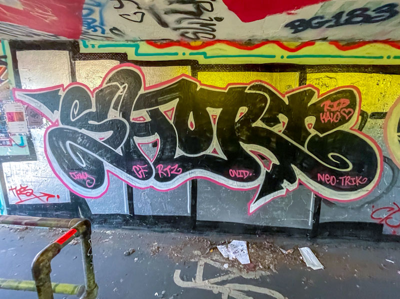
This piece, by Short, is really easy to miss. It is in one of the tunnels under the M32 roundabout where the lighting is poor, and one’s mind is focussed on not being run down by a bicycle or e-scooter rather than stopping to look at the graffiti writing. If photographing such pieces is hazardous, I can’t imagine what it is like to try and paint in such a confined space.
Short, M32 roundabout, Bristol, April 2025
The black, joined-up letters, spelling SHORT are somewhat augmented, deliberately or otherwise, by the background created by a previous artist’s large chrome letters, which creates the perfect backdrop. I am enjoying the way that Short is popping up in different places around the city, and offering us a type of graffiti writing that is a step up from throw ups, and developing all the time.
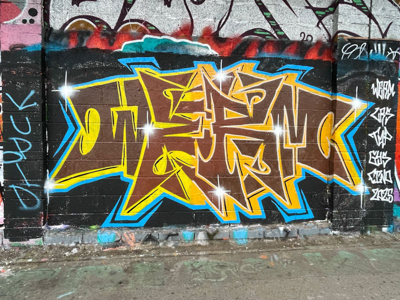
Now, regular readers will know that brown is my least favourite colour when it comes to graffiti writing, and it is a path I am unlikely to deviate from or be persuaded otherwise, so the selection of brown aside… this is a really nice tight piece by Werm.
Werm, M32 Cycle path, Bristol, April 2025
I rather like this letter style, which while keeping up the symmetry theme that Werm enjoys so much, also has something of a feel of Marvel or DC Comics about it, as if it should say ‘blam’ or ‘whack’ or something like that. Definitely a fun piece, well presented. Pity about the colour.
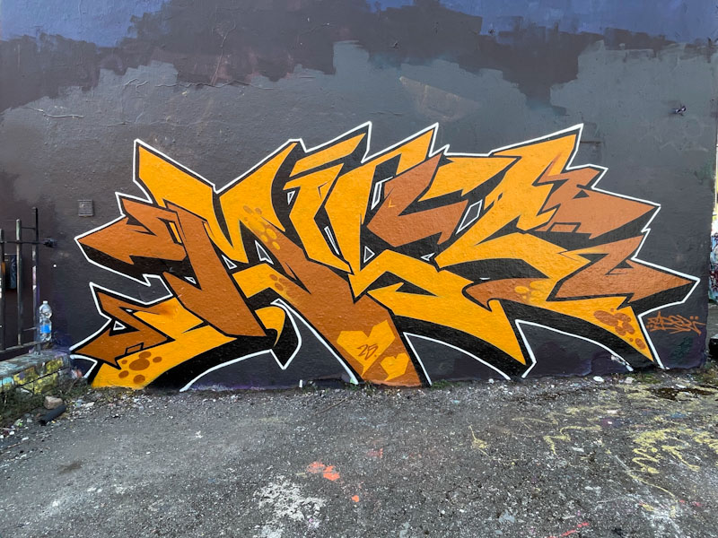
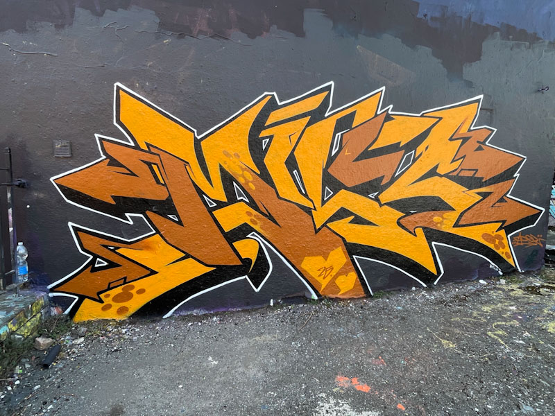
There are some newish hoardings at the bottom end of Stokes Croft, as the gentrification of the area once more picks up momentum. Kid Krishna has, as you would expect, pounced on these blank canvasses, but he left this space for Hemper, and what a banging piece it is too.
Hemper, Stokes Croft, Bristol, April 2025
Overall, the piece has a copper metallic feel to it, with the highly illustrated letters spelling out HEMS. The piece is obviously an homage to DJing and to sound systems, perhaps a reference to the Blue Mountain Club that was knocked down behind these hoardings. There is too much to describe in this sensational piece, so perhaps the best way to enjoy it is to spend a moment looking at each element of it.
Hemper, Stokes Croft, Bristol, April 2025
Of course, you can take a horse to water, but you can’t make him drink. These two are symptomatic of the world we live in, where shutting yourself off and hiding behind headphones is the norm – no effort required, no thought given to exploring the world right in front of your eyes. C’est la vie I suppose.
Painted on one of Bristol’s most iconic walls, the curved wall in Dean Lane skate park, this is a birthday tribute piece to Soker by Dibz. Pieces like this have the capacity to confuse, because the letters do not spell the artist’s name, and I have in the past misidentified pieces because of it.
Dibz, Dean Lane, Bristol, April 2025
Dibz really is a master of graffiti writing and is at the top of his game, something he has maintained for such a long time now, without any dip in form. The letters are filled with a solid black fill, and finely written ’50s’ indicating it was Soker’s 50th birthday. Great to see one of Dibz’ small signature tags in red at the top right too. Excellent work, and a fine birthday tribute.
This is an interesting wall at the entrance to St Werburghs tunnel. It is a space that can be filled with one or two or even more pieces, because of its length. There is a bit of a difficulty with the full length pieces, like this beauty from Mr Draws, and that is there is quite a bit of street furniture in the way that makes it a little challenging to photograph.
Mr Draws, St Werburghs, Bristol, April 2025
The spot also suffers from shading on sunny days, so being there at the right time is quite important. On the day I took these pictures, it was dazzlingly bright, indicative of the remarkable spring we are enjoying. Mr Draws has written his joined up letters DRAWS with a very nice horizontal striped fill pattern of magenta, turquoise, blue and yellow, which works remarkably well. The letters are broken up with a shower of ‘leopard’ spots, which offer a really interesting texture to the piece. There are some nice drips too. This is a really good large piece from Mr Draws, no messing.
I love this kind of slightly unconventional, not quite anti-style, unconventional graffiti writing, which, although it looks a bit scruffy is actually technically really well thought out, designed and pulled together.
Rozda, Cumberland Basin, Bristol, April 2025
It was painted as part of a large collaboration, with each piece sharing a common background and base colours, but each with its own unique style. I know nothing of Rozda, the artist, so would guess that they were in Bristol as a visitor for this paint jam. I like this a lot.
Mr Klue has been on fire this year and has continued to paint his ephemeral pieces in the tunnel on an alarmingly regular basis. In my view, this is a very good thing indeed, because I like his unique style, and watching him paint gives me an appreciation of how deliberate each ‘brush stroke’ is in his pieces. His work may look random, but it is based around the form of the letters KLUE, and the shading and colour patterns are carefully thought through.
Mr Klue, St Werburghs tunnel, Bristol, April 2025
As far as I can make out, Mr Klue paints each piece in a freestyle way, meaning that he doesn’t paint from a black book, but rather from the heart in a well-rehearsed, but improvised way, if that makes sense. The white and lavender colours gives this one a lightness of touch, and the subtle lime green tints on some of the edges, adds depth and rounds things off nicely. So much more to come from Mr Klue.
I have always struggled with artist naming conventions on Natural Adventures. Most artists have a name and retain it as their brand, especially old school artists like Inkie, Nick Walker, Mr Penfold, Banksy, Cheba and so on. Their Instagram accounts reflect their name – easy-peasy.
However, an awful lot of artists, graffiti writers in particular, may write a word, or sign a piece that is totally different from their Instagram name, for example: Jee See (who writes Seismic and whose Instagram is @jee.see_t.daemonic_luke.solo) or Biers (who currently writes WD40 and whose Instagram is @nofrills40). So you can see that naming artists can be a tricky thing – I blame the hacking of social media accounts, which means people are frequently changing their digital account names.
I say all of this because when I first came across Bbygwya (and it took me ages to master the name), this was her then Instagram account, however, she writes variants of the word Flux, and her current Instagram is @livelaugh_luxe. What is a man to do? The name of an artist is important for me, because it forms part of the tagging and sorting on WordPress which allows me to find past posts and images. So generally I use the first name that I came across and stick with it, even if it seems to be the wrong name now. Did any of that make sense?
Bbygwya (Flux), Dean Lane, Bristol, April 2025
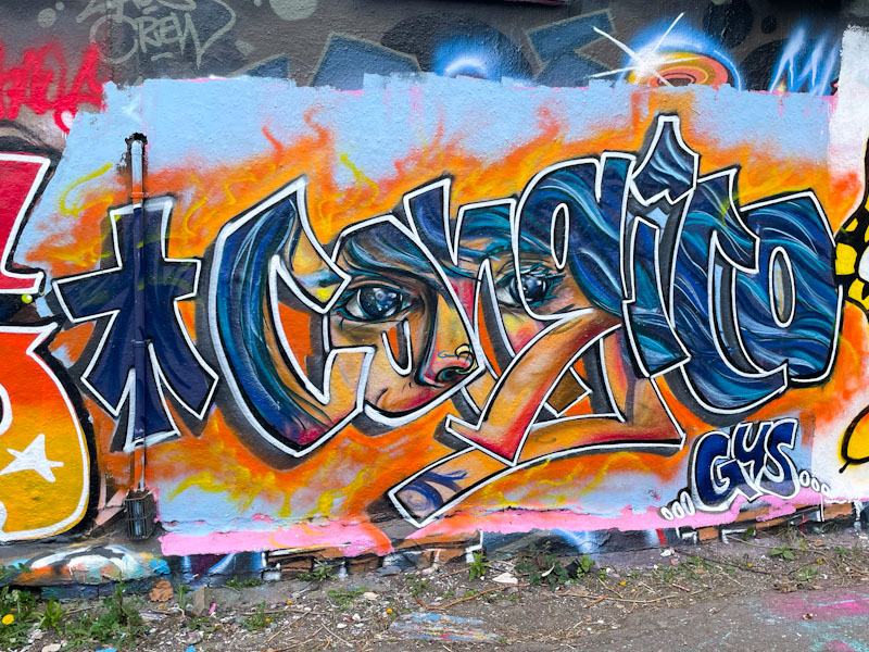
This is a real beauty by Bbygwya (Flux or Luxe – see the problem?) in Dean Lane, with plain white letters and a little bit of black detail sitting on top of a fabulous Conrico piece, featured here previously. Somehow, Bbygwya has skilfully blended her piece with Conrico’s, intentionally or otherwise, but the final look is a good one.