Herding like with like
in aggregations that yeild
dis-integration.
by Scooj
Herding like with like
in aggregations that yeild
dis-integration.
by Scooj
Yeah, the bunny is back, not the NEVERGIVEUP bunny, but the Hire bunny. This rather dark bunny carries all the hallmarks of a Hire piece. The massive buck teeth and the angular Gothic shapes that make up the fur – much of his writing also uses this sharp-edged style.

I have a very soft spot for Hire’s work, both his rabbits and his writing – there is a seriousness and melancholy about them. I’d like to know what the speech bubble says, it is probably a Polish reference. Nice little tribute to CKone as well.
Smell of apple drop
round cobbles in various
stages of decay.
by Scooj
Yet another fine collaboration between Cheo and Soker – these two seem to be on something of a roll at the moment, producing countless pieces all over the city of Bristol. This one perfectly fills the space on the hoardings in front of a new development.

The piece is bookended by a pair of mischievous spray can characters painted by Cheo, and in the middle of all of this is a dazzling piece of writing by Soker which spells out SUMOE. I guess I should know what sumoe is all about, but alas I have no idea. There is a whole bunch of #sumoe graffiti Instagram, most of it in the USA.
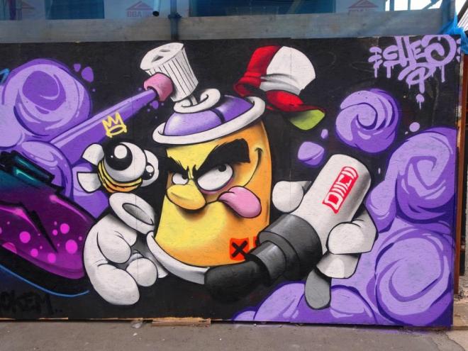
Cheo has pretty much nailed it with his bookends as he seems to with pretty much everything he does. With their dark furry eyebrows, there is something of the Muppets in his characters. Of course we are also graced with the presence of one of his signature bees.
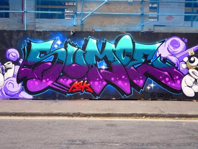
Soker’s writing is composed primarily of four horizontal layers ranging from light blue at the top through to light purple at the bottom, each layer smattered with accents or decoration. He has also worked quite an unusual double 3D shadow cast by the letters. This is a great collaboration from this ASK duo, and well worth the trip to Raleigh Road.
As is so often the case with finding new work on the street, I was not looking for this piece. On the contrary I was trying to capture a few more Upfest pieces that I hadn’t yet seen in their completed state and drove past this hoarding. I had to act quickly to pull over into a free parking space and jump out of the car for a quick snap.
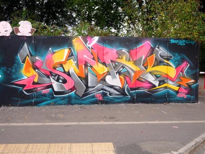
This sublime graffiti writing is by the superb Smak, and is outstanding in many ways. The colour palette is beautifully selected and the chrome/grey parts of the lettering in particular have a great 3D effect. The letters spell out SMAK but are quite nicely concealed in this piece. Really great work.
Flashes of light brown
darting through the dense thickets;
Saturday dog walk.
by Scooj
When I first saw this remarkable piece on Instagram I knew I had to get down to Dean Lane as soon as possible to see it before it got buffed or dogged. It is by the brilliant SkyHigh, who was obviously on a flying trip to Bristol.
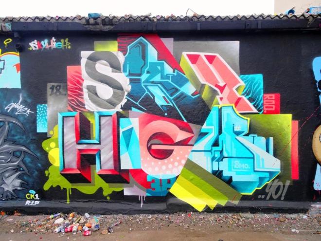
SkyHigh’s works can probably best be described as writing out his name in a mash-up of different block letter styles and colours. To some it might look messy, but to others this is a considered and stunning way to put a piece together. I love his work, and this is one of those pieces that looks great in a photograph…and even better in the flesh. I was pleased to have been able to see it. Top work. Nice little tribute to CKone and nod to his painting pal Roo.
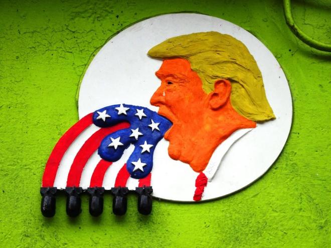
I wander up and down Leonard Lane reasonably frequently. How is it then that I have only very recently spotted this Trump piece by Will Coles? By the look of it, it has been here for some while and even been sprayed over.

This is the same as the installation he positioned in The Bearpit back in April this year. That one only lasted a few days before being torn down. This one, although dogged has fared a little better. If nothing else, this piece has reminded me to keep looking and to keep looking up.
He keeps spraying them and I keep posting them. This is yet another ‘TES’ from Slim Pickings using a rather bright colour palette of purple and light blue, which seems to work rather well.
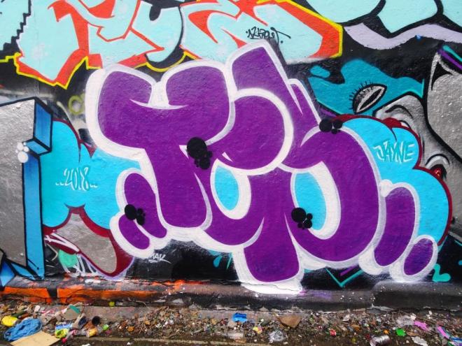
I like his work, the repetition and precision, striving for perfection. I like his colour selections looking for contrast or complememtary shades, always thinking. It is probably about time I saw another one of these.
What a lovely surprise this was in Dean Lane, a small piece from Skor85 squeezed in between some other works on the long wall. I haven’t seen anything from her in quite a while, so it was good to stumble across this one.

An interesting perspective of a dog in which the bare teeth are somehow brought into sharp focus by the blood-red background. A slightly scary piece, but really nicely presented. I like Skor85’s work very much – there is an ‘other worldly’ feel to it all…dreams and nightmares.